 HOT
HOTTailkits UI
NEWConsistent UI, zero hallucinations
Browse premium and free Tailwind CSS HTML templates to effortlessly build modern, responsive websites.
 HOT
HOTConsistent UI, zero hallucinations
 HOT
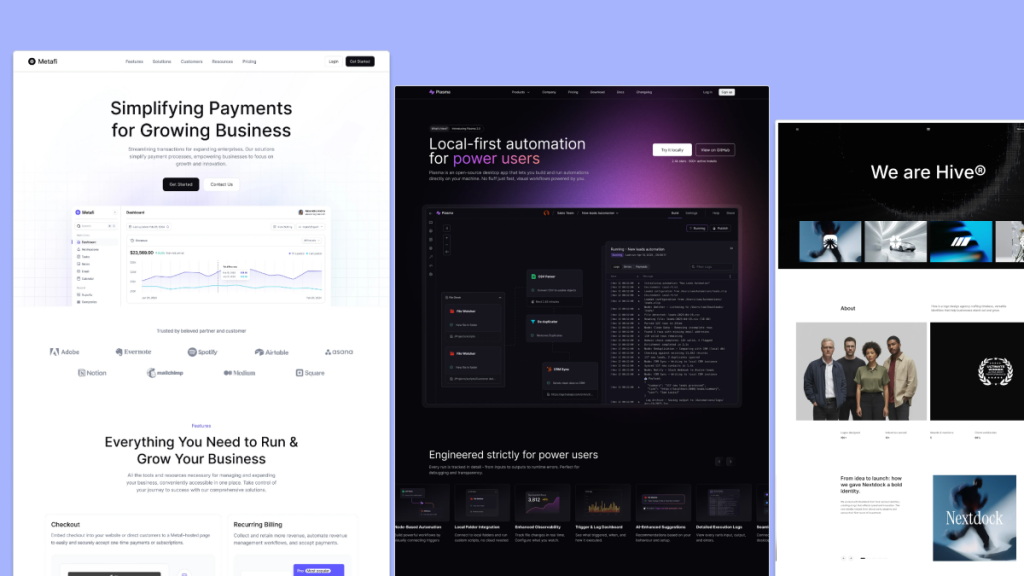
HOT12+ Shadcn Templates
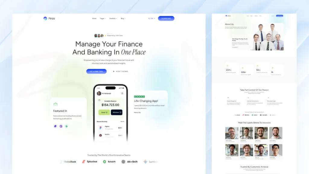
Modern finance and banking Astro template

Fast Astro theme for SaaS sites with i18n + SEO

16-page Astro theme for AI SaaS and automation teams
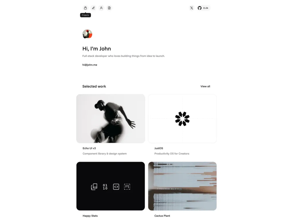
Modern personal portfolio template built with shadcn/ui.

Astro theme for AI startups and SaaS
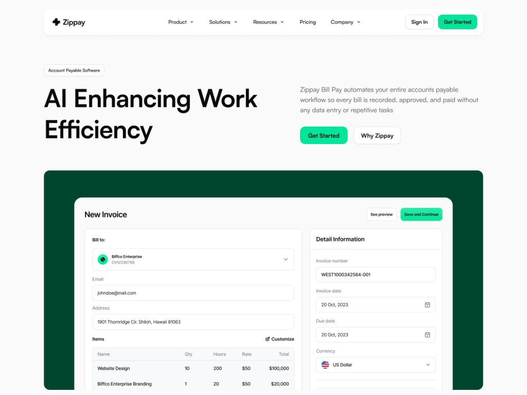
Multi-page fintech template for Next.js/Astro
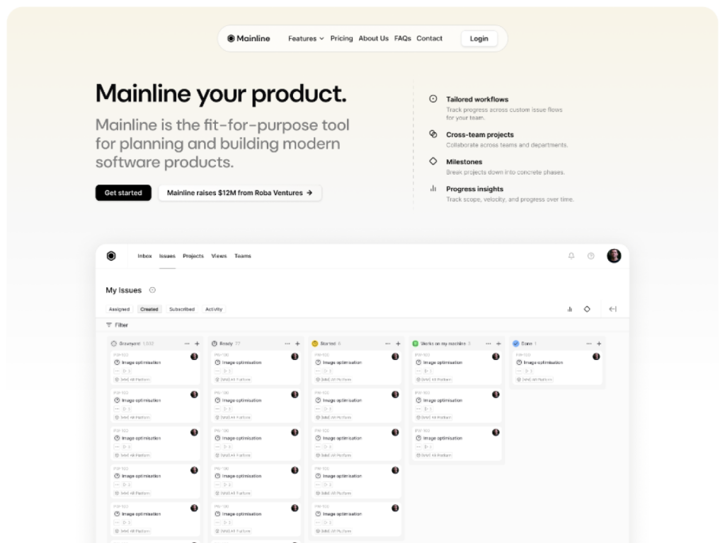
10+ page shadcn/ui template

Clarity Astro offers 14 pages, MDX support & Tailwind
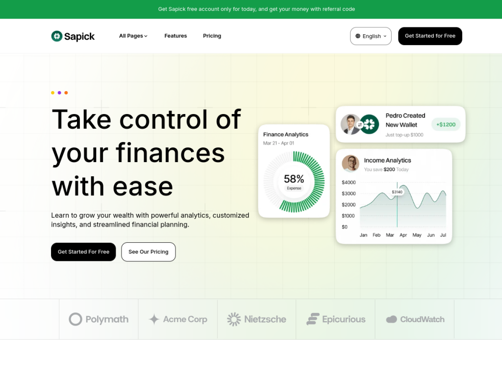
12+ pages, fast, multilingual, built for startups
Free & Pro Tailwind CSS Templates & Themes

15+ page minimal Astro template
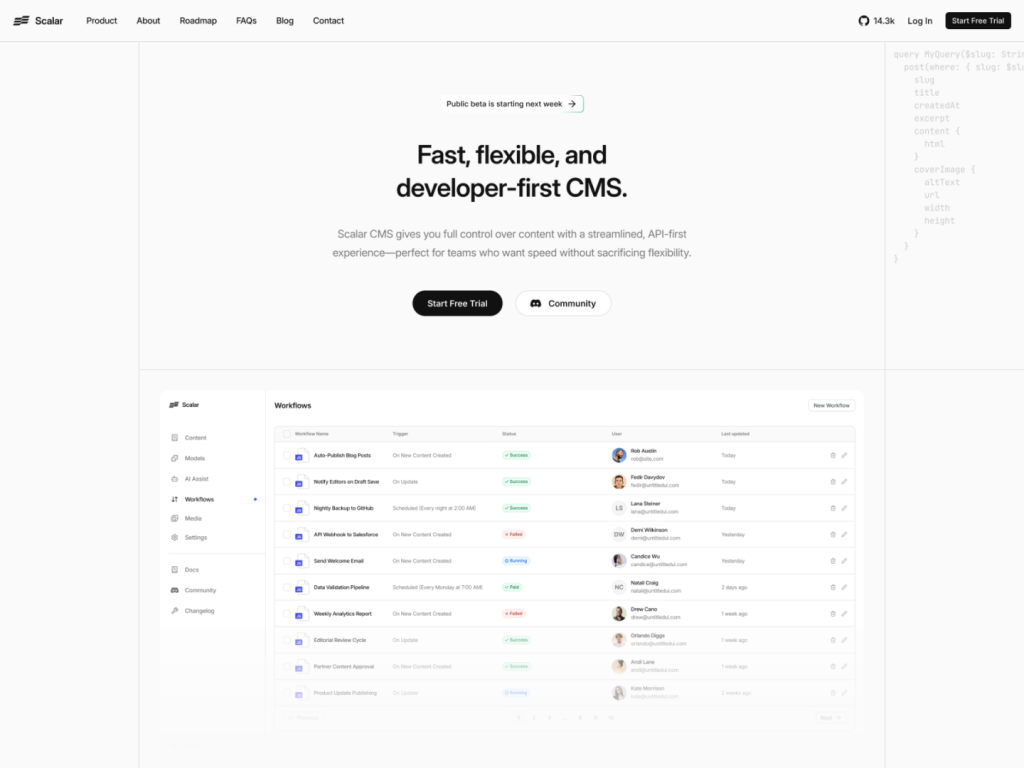
Modern SaaS template built with shadcn/ui & Tailwind
 HOT
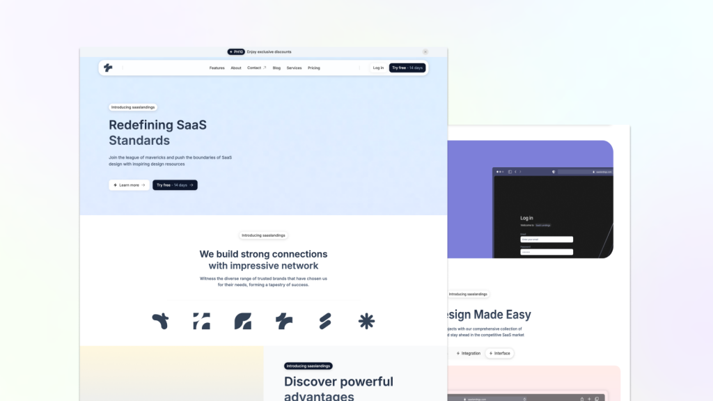
HOTFast, clean Astro Tailwind theme
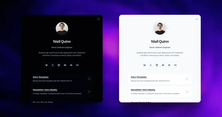
personal Link in-bio template
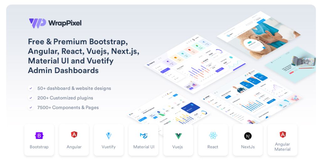
One pass. All WrapPixel templates.

Modern template for SaaS apps
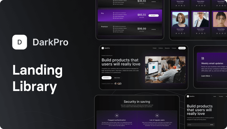
90+ dark Tailwind UI components
Force your AI to use a professional design system. Build brand-matched, consistent UIs with 200+ vetted components.

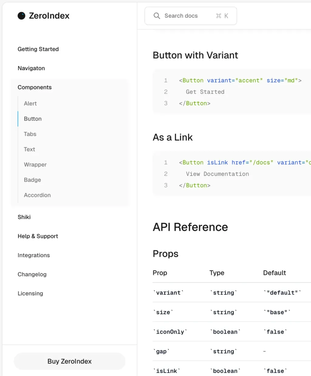
Astro + Tailwind docs template built for speed.

Sleek, fast Astro SaaS theme for startups

13 page fast SaaS theme for startups
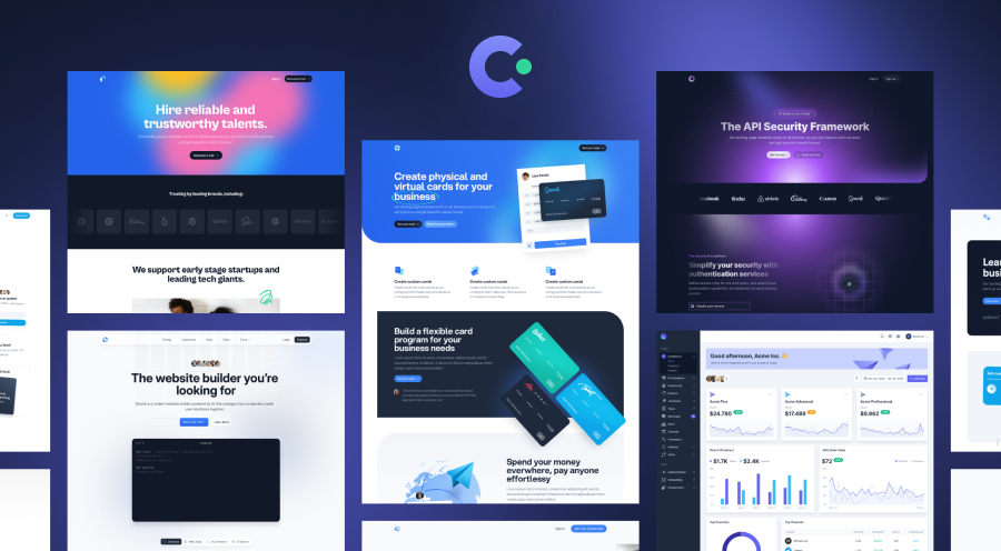
20 beautifully designed Tailwind CSS templates

Fast IT template with Tailwind and Astro v5
 HOT
HOT43 Tailwind templates and 7,500+ UI components

Elegant, fast restaurant template

Lightning-fast Astro template for SaaS websites
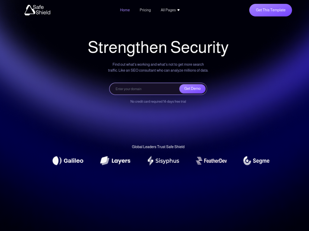
Security-ready SaaS Astro template, 13+ pages
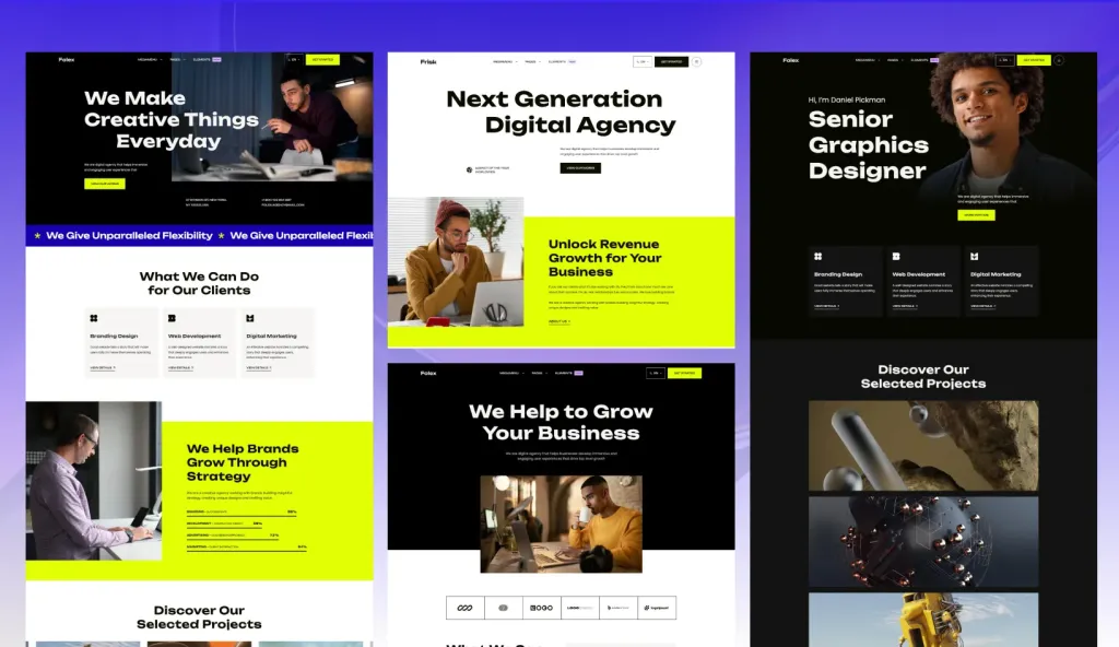
Fast Astro theme for agencies.
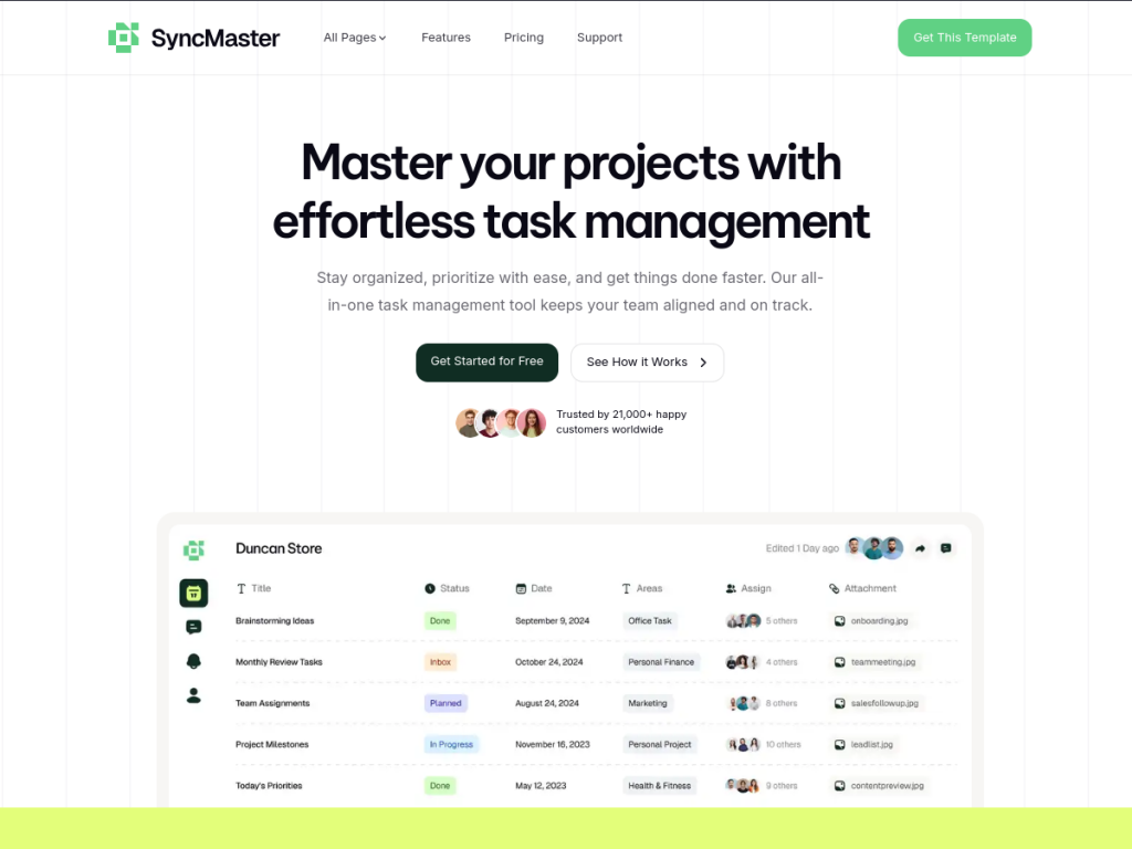
Responsive SaaS template built with Astro & Tailwind

Fast Astro template for service businesses
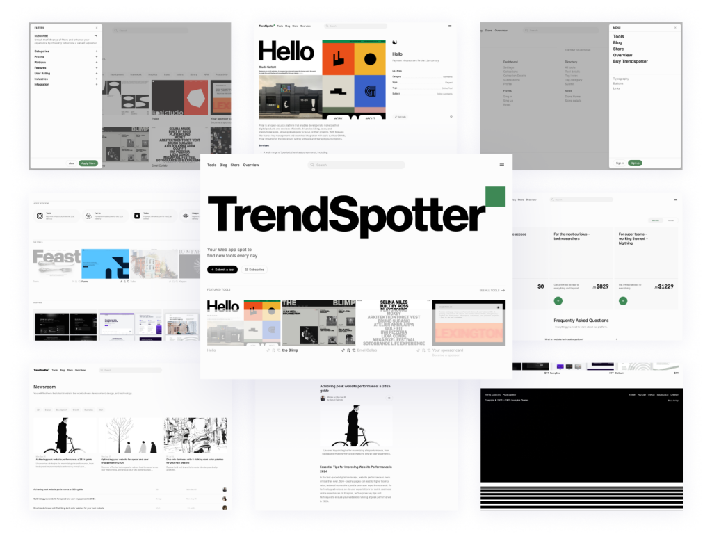
Curated directory template with 30+ pages
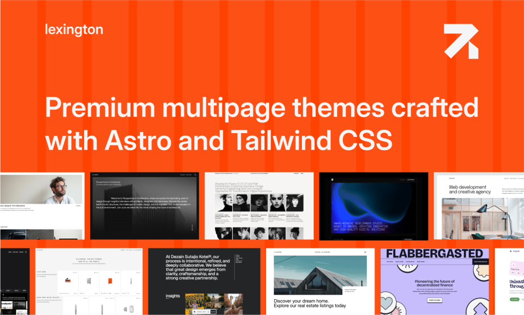
31+ Astro & Tailwind Templates
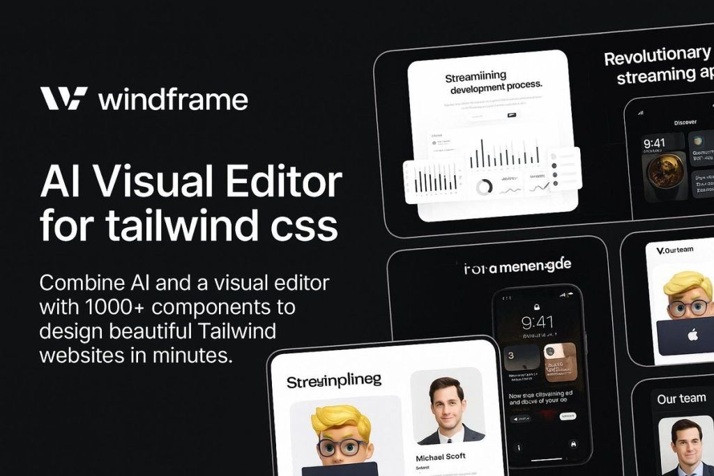
1000+ Tailwind UI components + AI Visual editor
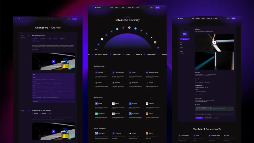
Sleek, multilingual Astro template for startups.

15‑page Tailwind theme to launch SaaS sites faster
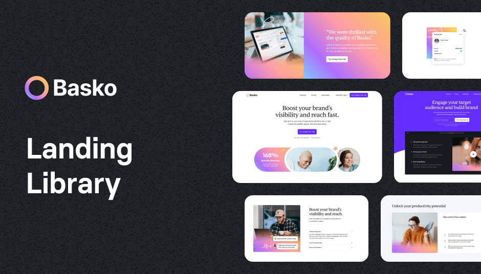
209 colorful components for vibrant design
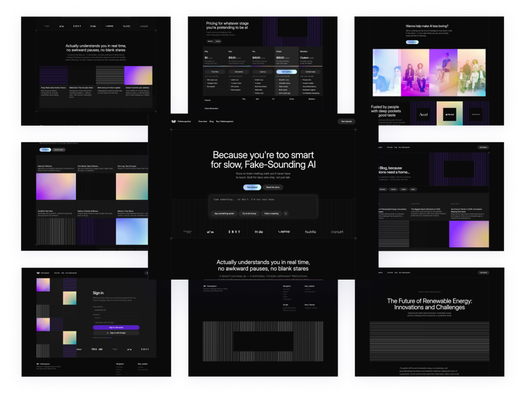 HOT
HOTDark-mode Astro SaaS theme with 40+ pages
 HOT
HOT220 colorful Tailwind blocks for instant layouts

345 Tailwind CSS components ready to use
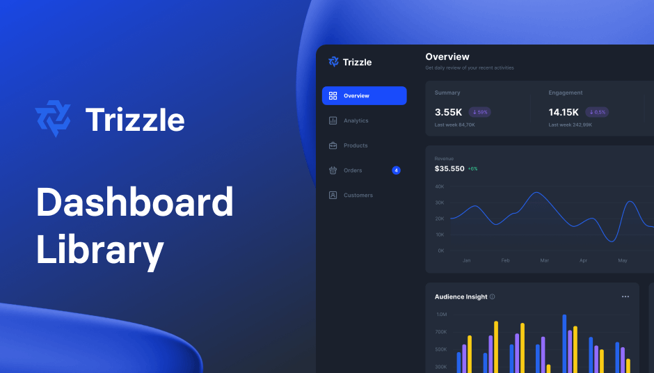
143 dashboard UI components in dark mode for Tailwind CSS

High-performance Astro theme for business sites

186+ Tailwind admin components
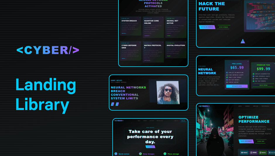
110 dark mode customizable UI components

Modern dark Astro theme
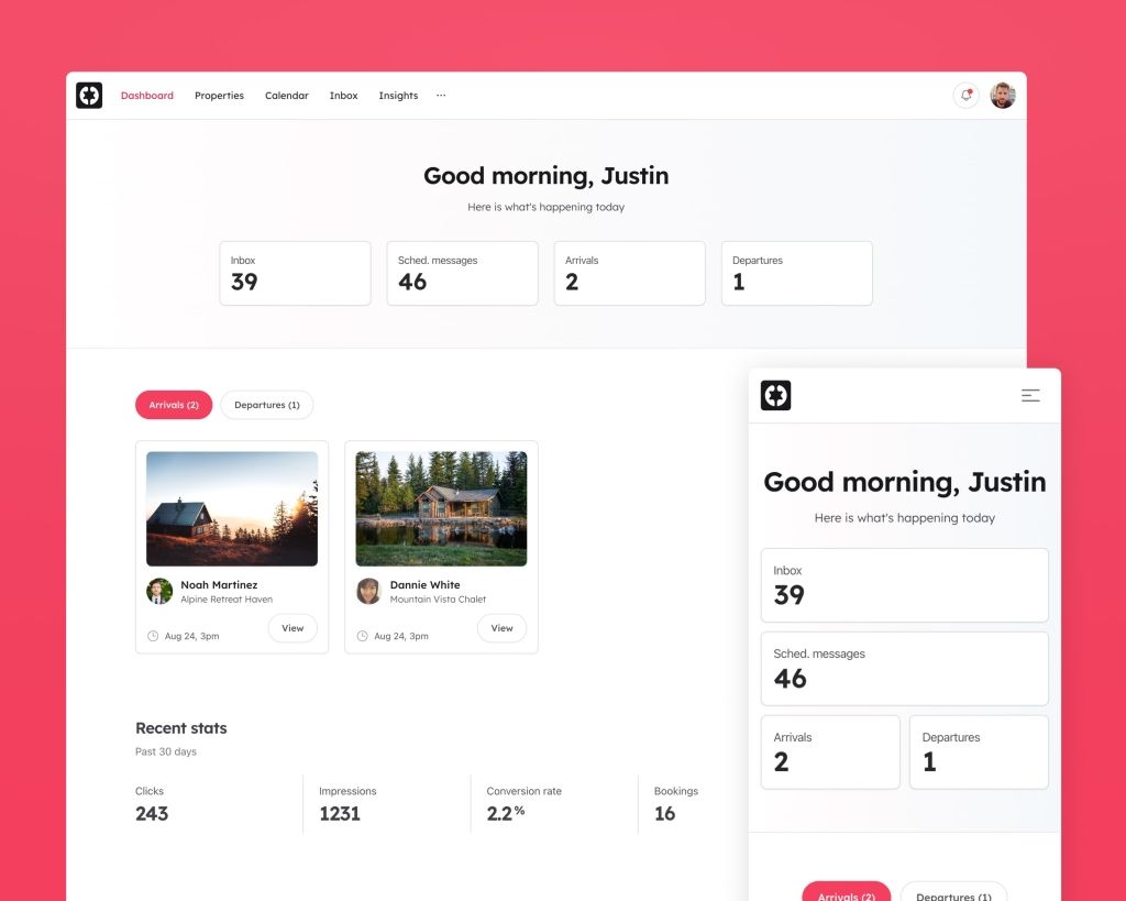
Airbnb-style website UI

Tailwind business theme with 20 + ready pages
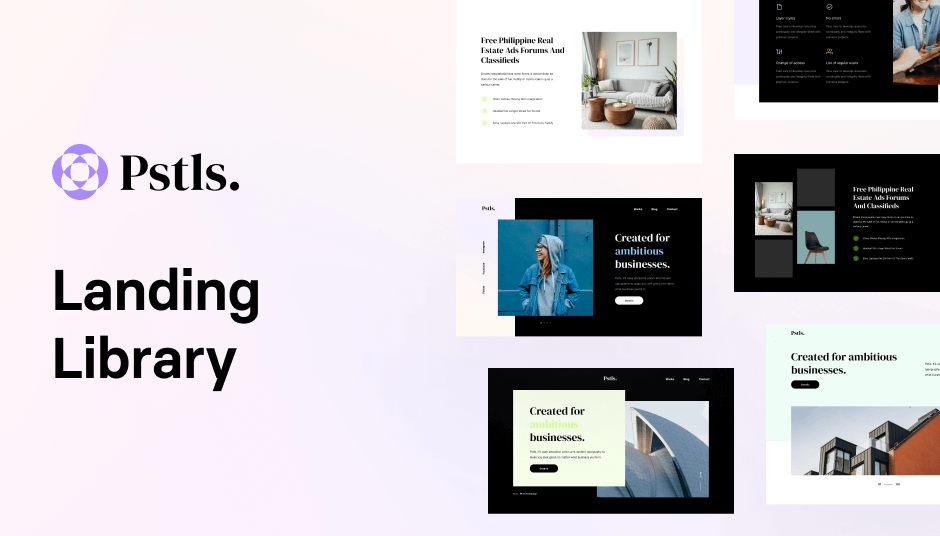
149 Tailwind components in Shuffle Editor
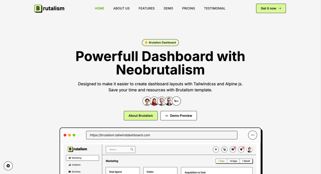
Create bold, brutalist dashboards
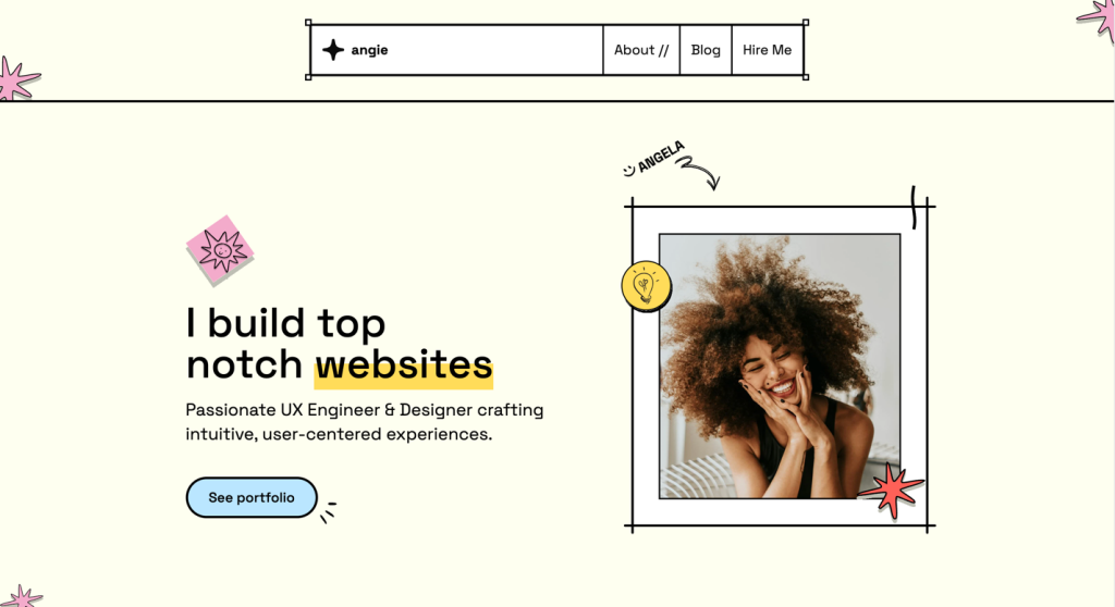
brutalist Astro template for devs & designers

113 glassmorphic UI components for modern websites

Colorful Astro job board template with 80+ components
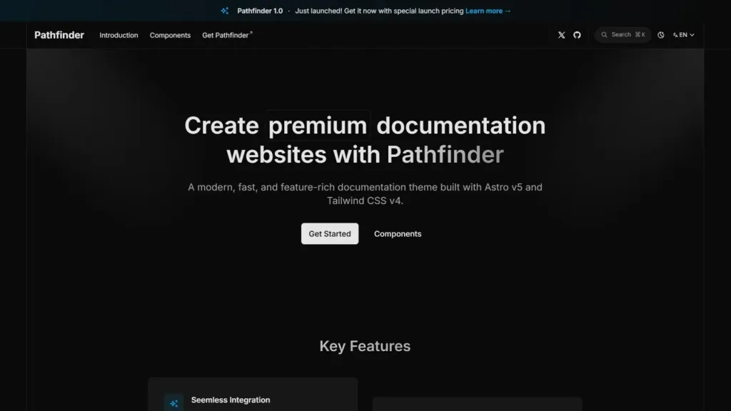
Astro, Tailwind documentation template
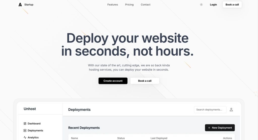
minimal startup landing page template

86 responsive UI components
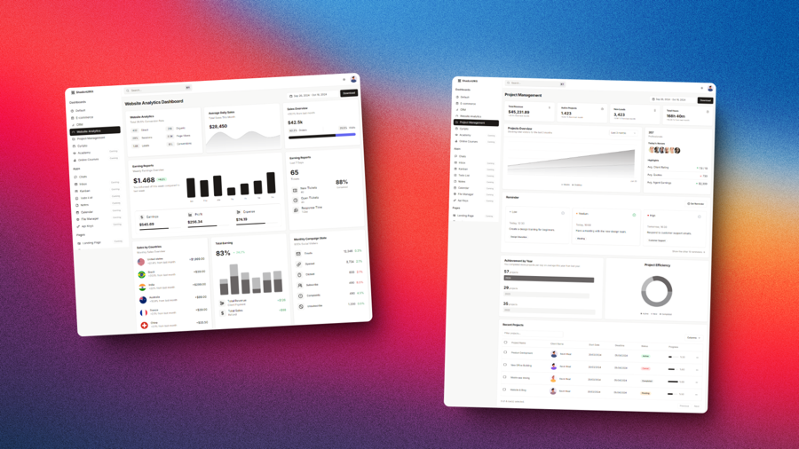
A collection of Tailwind CSS templates, dashboards, and UI components
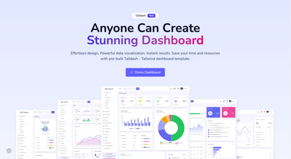
Developer-friendly dashboard template
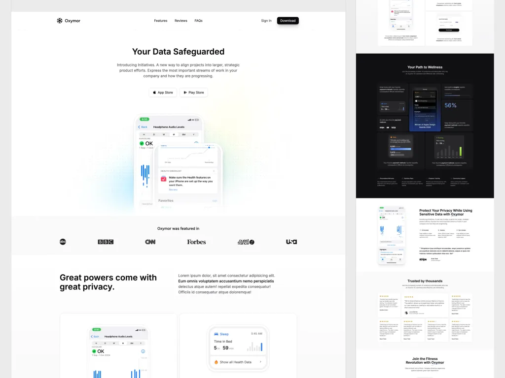
modern, fully customizable landing page template ideal for mobile apps.
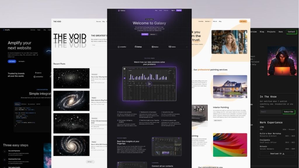
Production-ready Astro and Tailwind CSS templates
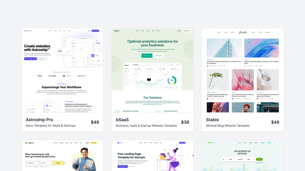
A bundle of 9+ modern templates
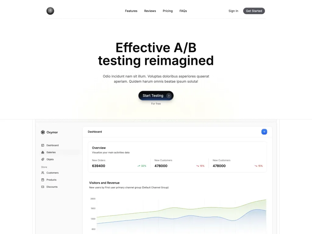
Experience modern design and responsive layouts
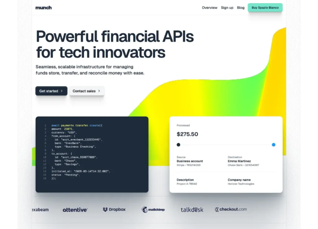
Modern Astro & Tailwind SaaS template
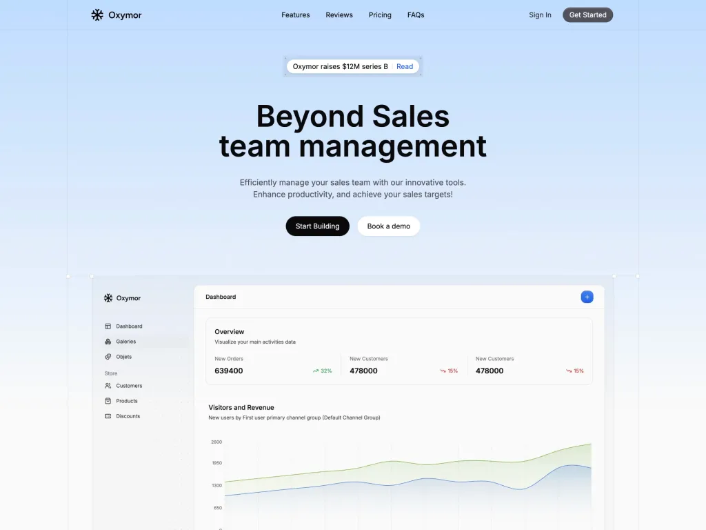
a modern landing page, built to showcase apps and services

176+ Tailwind components for modern web design

17‑page business template
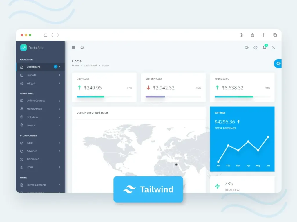
130 page admin template
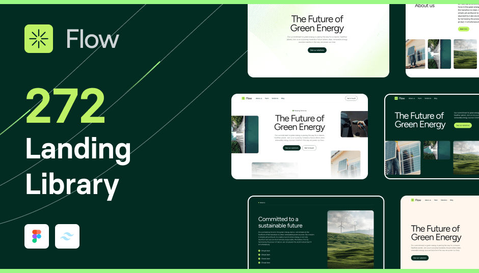
293 component SaaS template with Alpine.js support
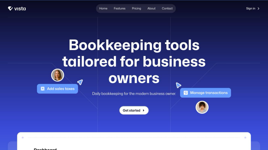
Modern Tailwind SaaS template with 306 UI elements
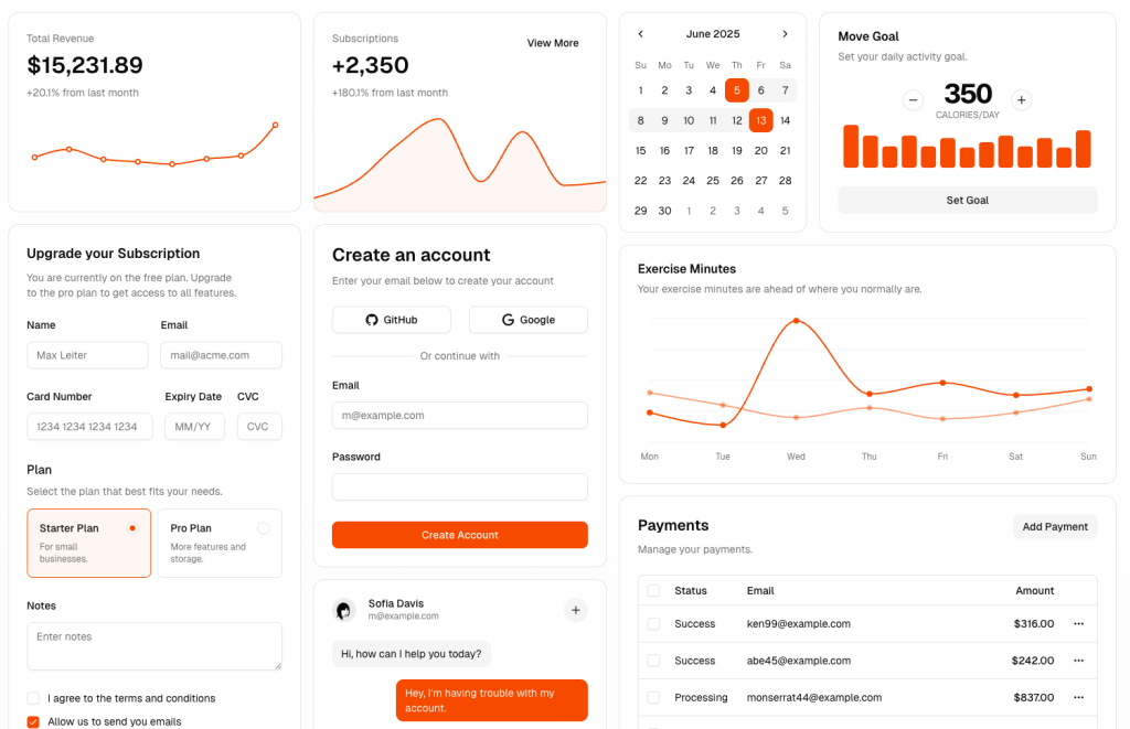 HOT
HOTshadcn/ui Blocks: setup, sources, tips
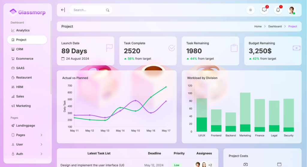
Glassmorphism admin template
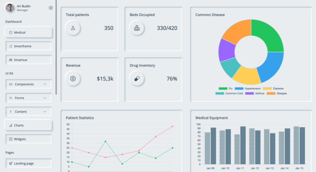
Neumorphism style admin template
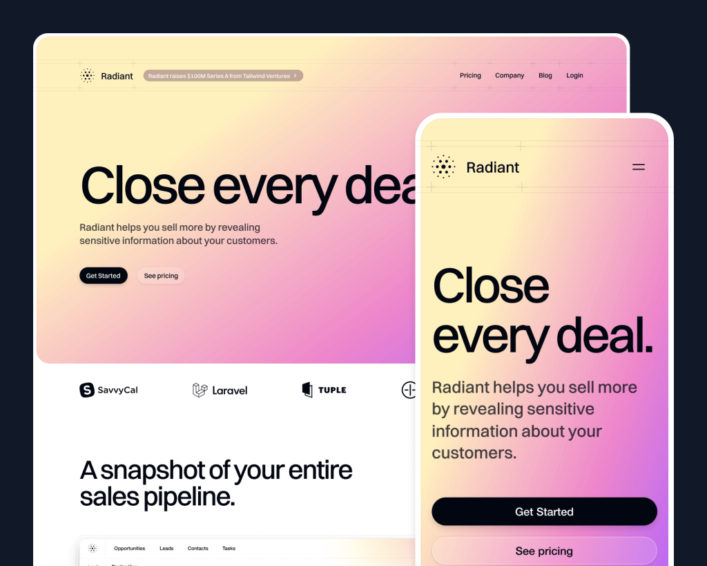
Tailwind SaaS marketing template from Tailwind Labs

Material Design 3 & Tailwind v4 dashboard template
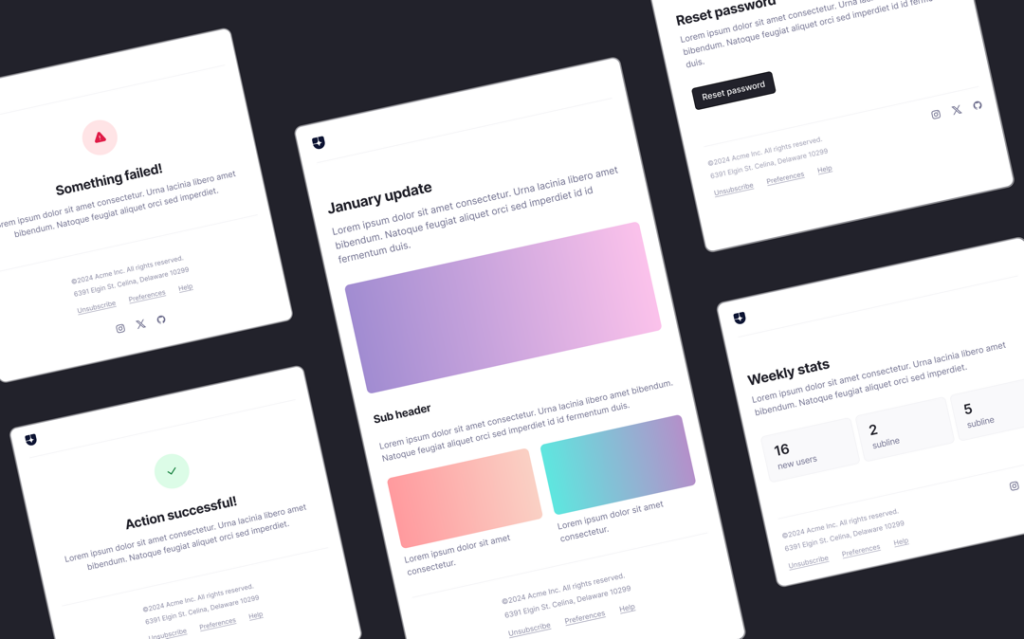
Fireball email templates for SaaS & Marketing
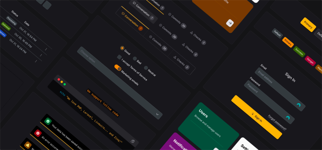
Laravel Livewire UI Toolkit

Tailwind template for consulting sites
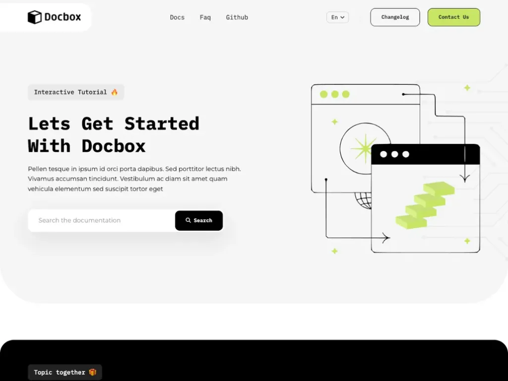
Create beautiful docs quickly with the Docbox
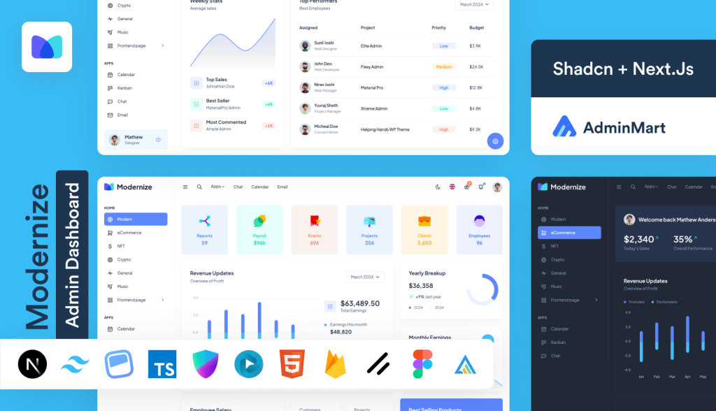
Feature rich Next.js admin template
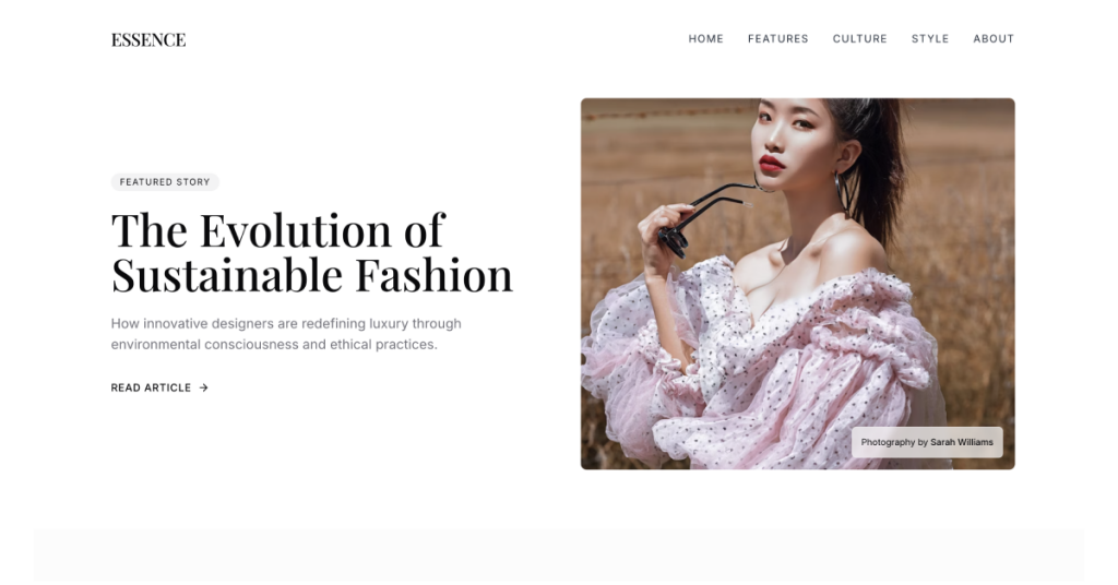
Free magazine template
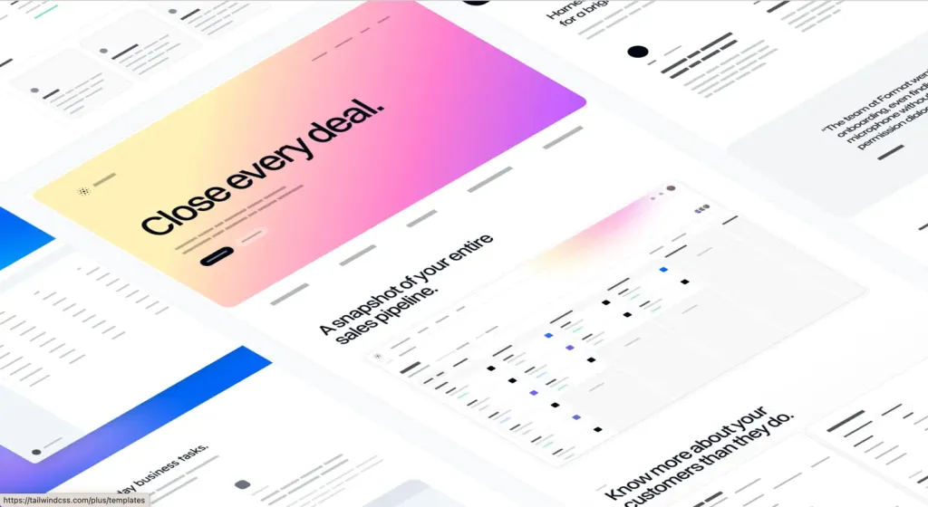
Official Tailwind CSS React & Next.js templates
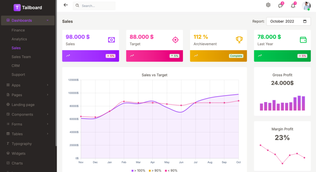
Tailwind v4 dashboard template
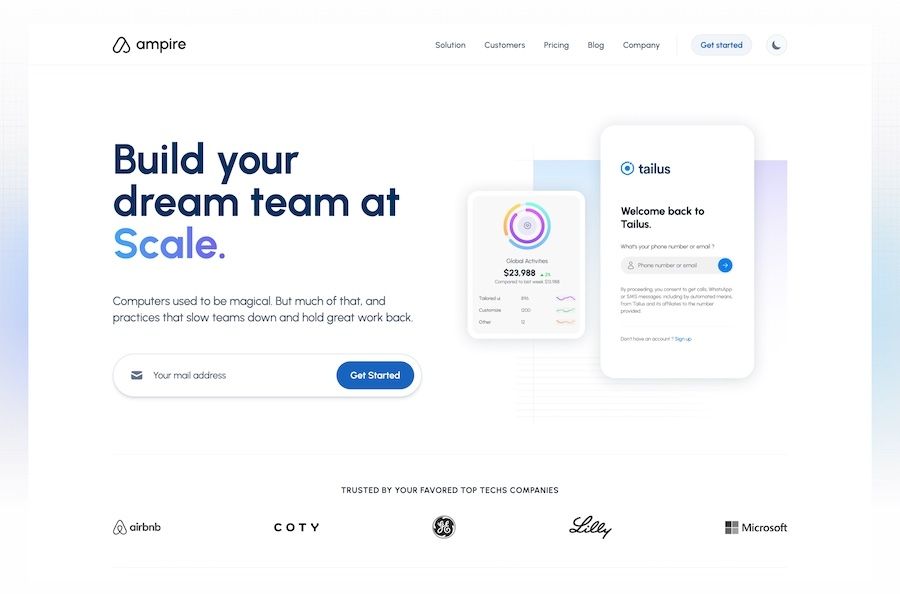
13 page SaaS UI landing page components for Tailwind CSS
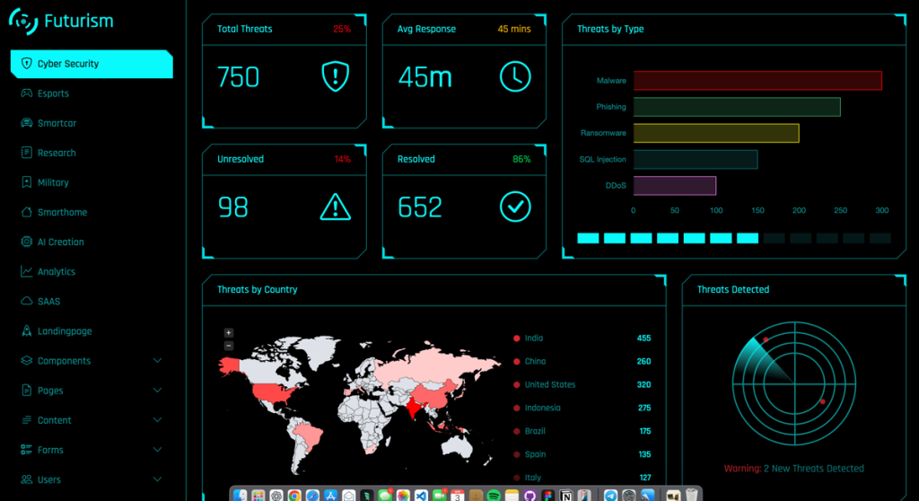
sci-fi themed dashboard template
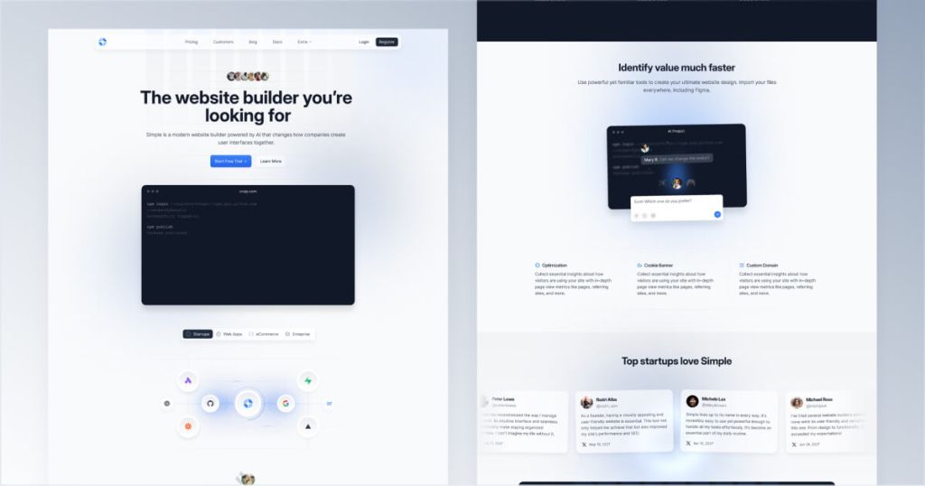
Clean, minimal Tailwind website template

Astro SaaS template with 10+ pages
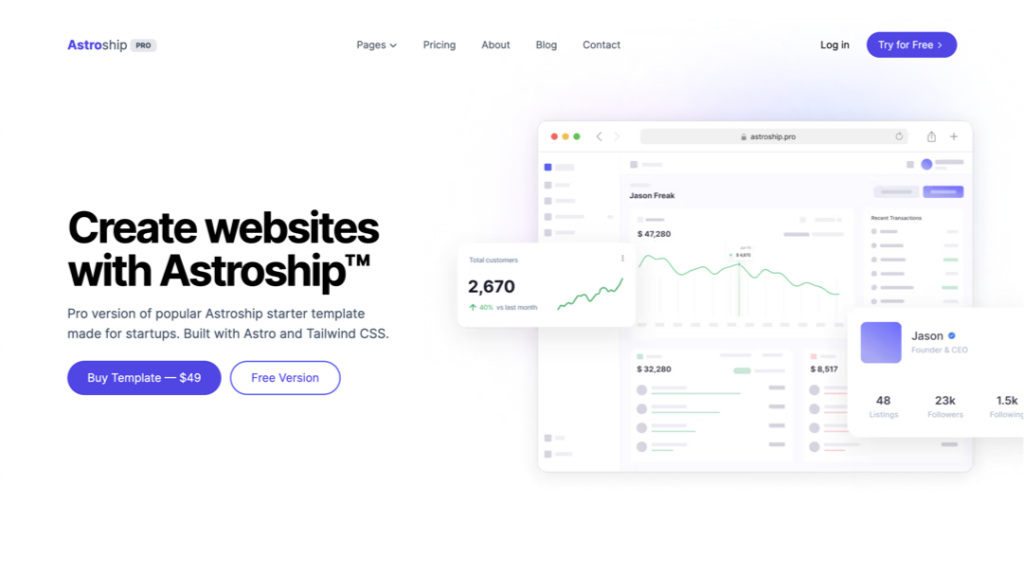
Tailwind & Astro SaaS template with 10+ pages
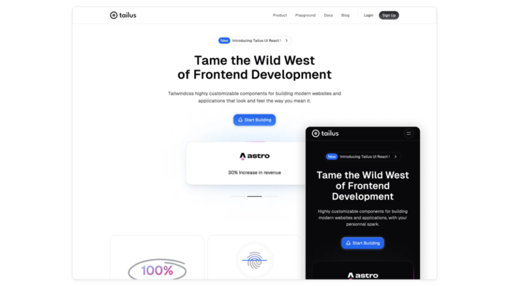
Modern, responsive landing page template
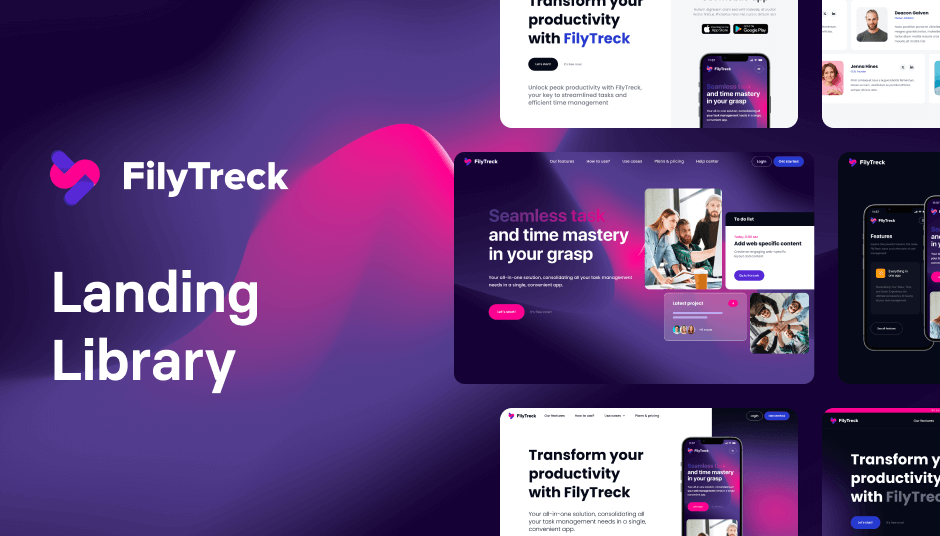
110 responsive Tailwind UI components

43-Page Astro template with MDX blog
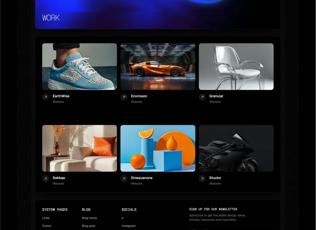
39 pages & 100+ sections for agencies
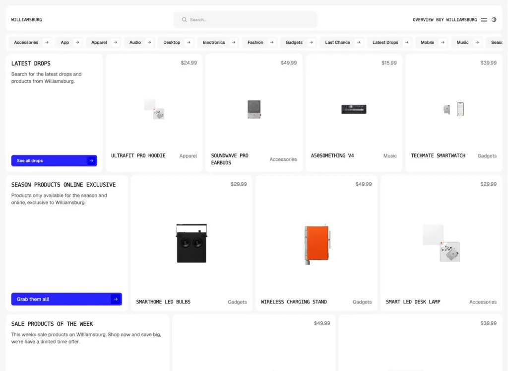
Brutalist Astro/Tailwind listing theme
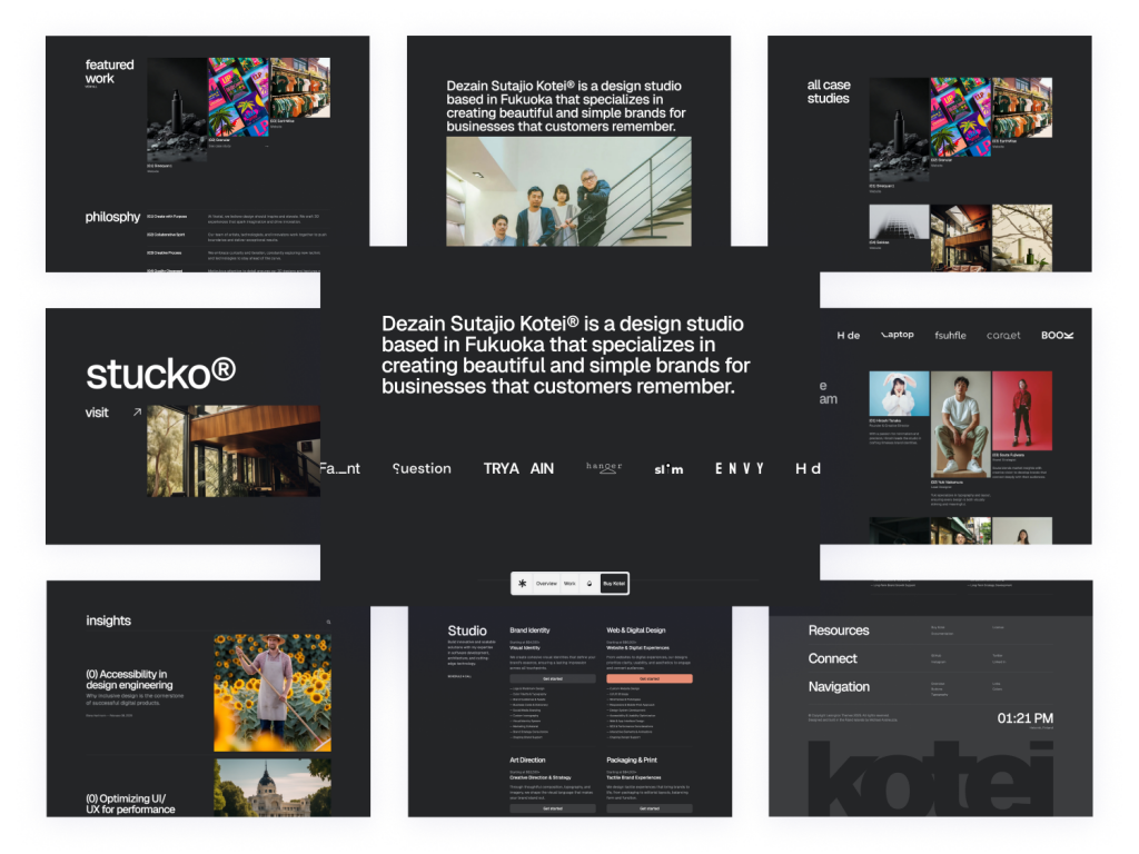
Swiss-inspired Astro theme with 100+ Tailwind components
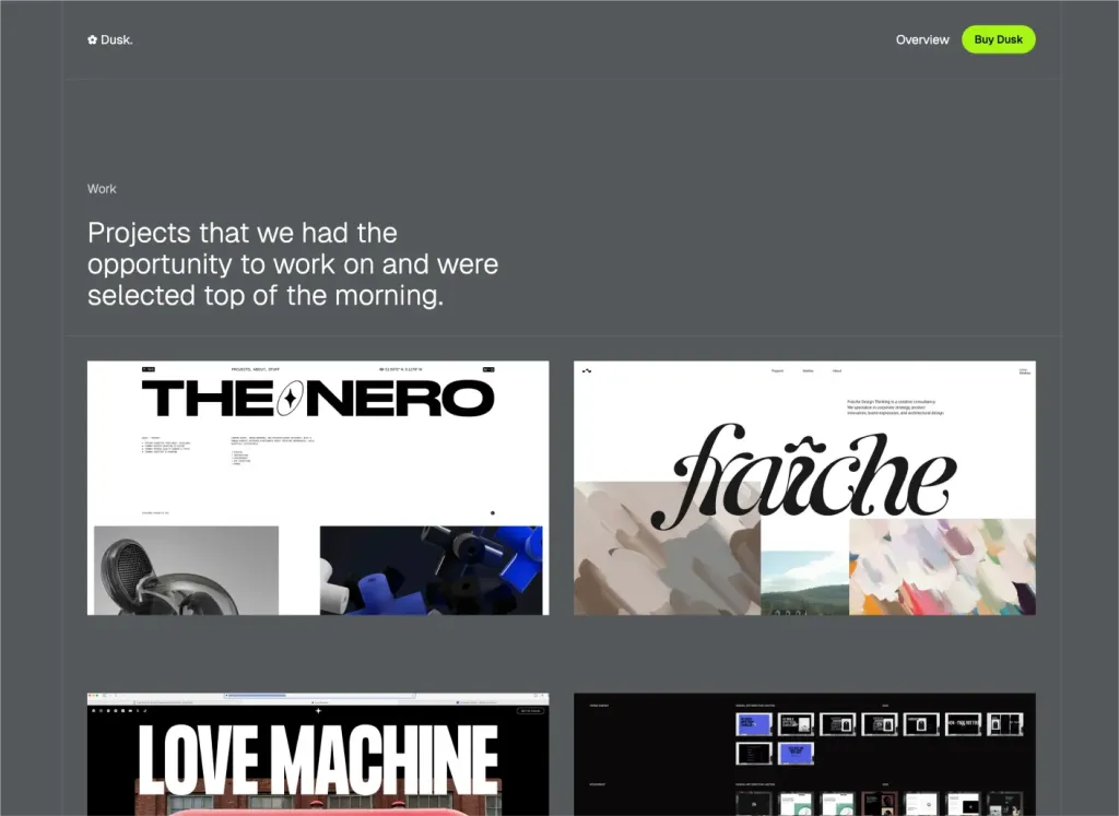
Minimal Astro & Tailwind agency theme
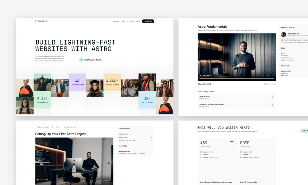
Edu‑centric Tailwind course platform, SEO‑friendly
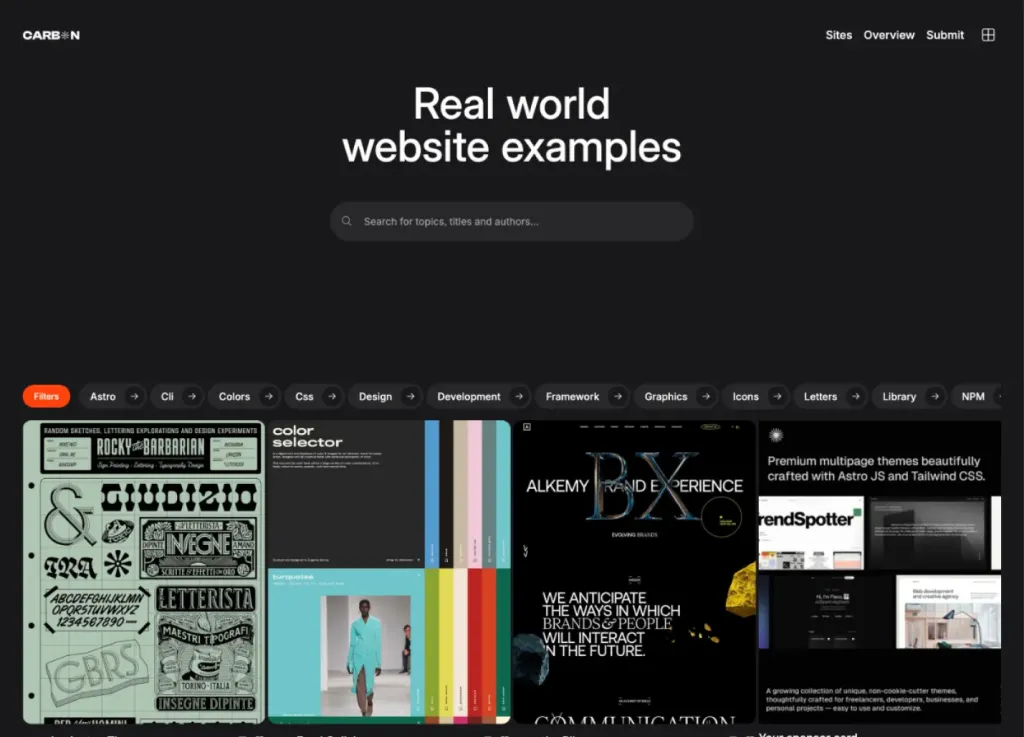
Bold dark directory theme
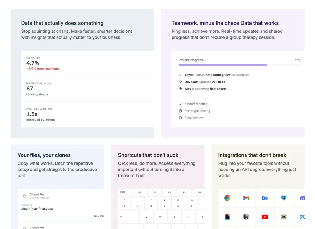
40+ pages and 100+ components SaaS template

Multi-page SaaS and hiring platform landing page
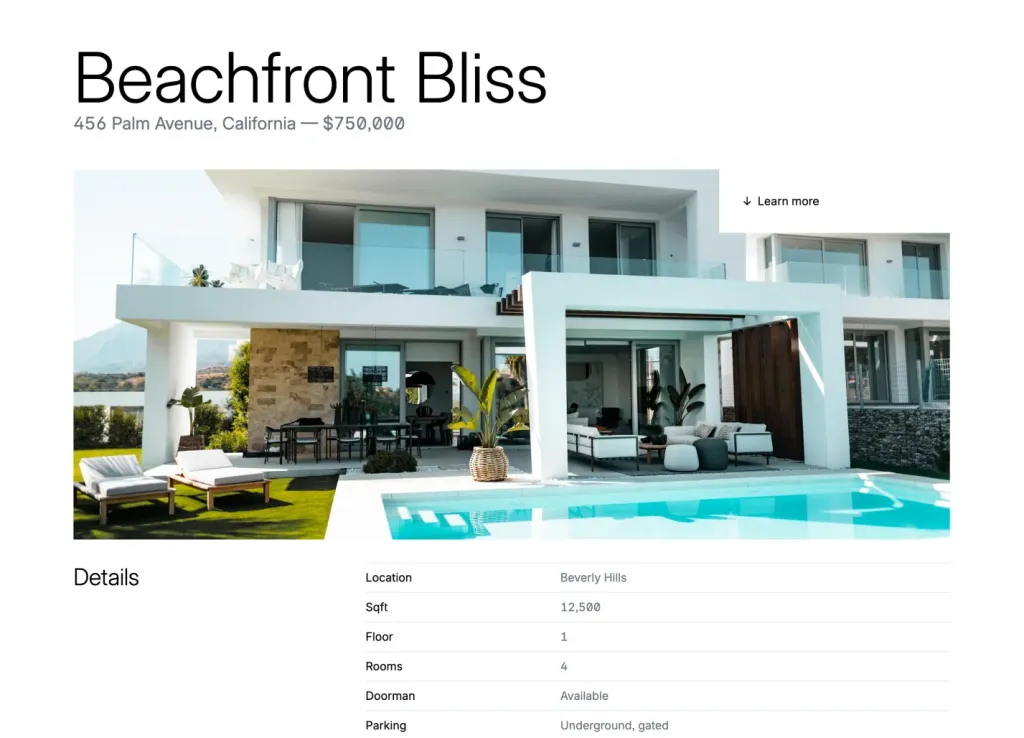
Quartiere: 48-page real estate theme

125 components for modern landing pages
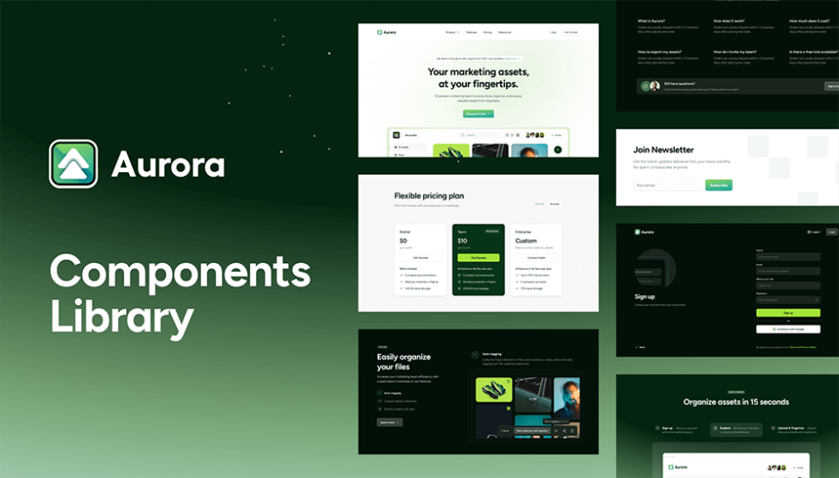
105 components for modern web design
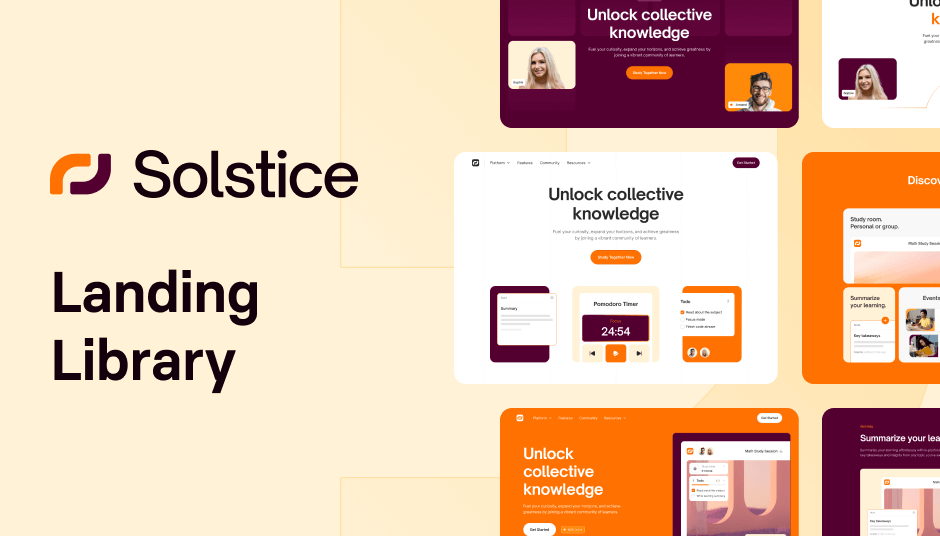
561 ready-to use UI elements
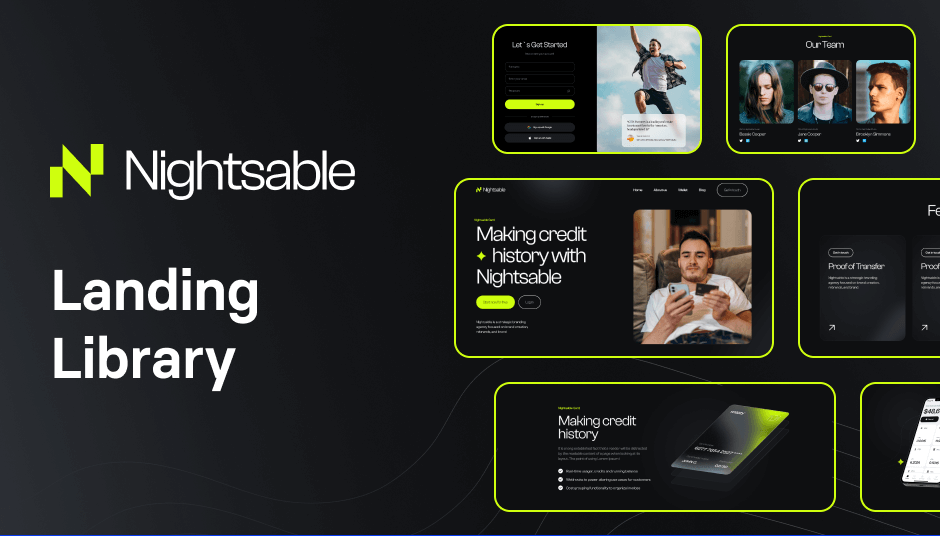
122 dark-mode components for modern, responsive sites
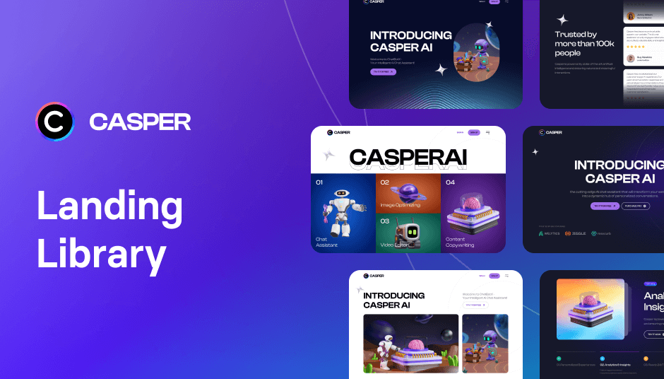
Build with 152 dark mode components

122 UI elements to power minimal websites
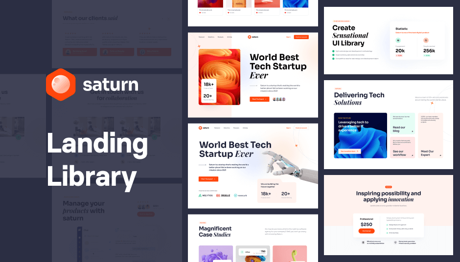
137 Tailwind components in Shuffle Editor

Modern Tailwind CSS landing page template

Free Astro landing page template

Minimalist Tailwind portfolio template
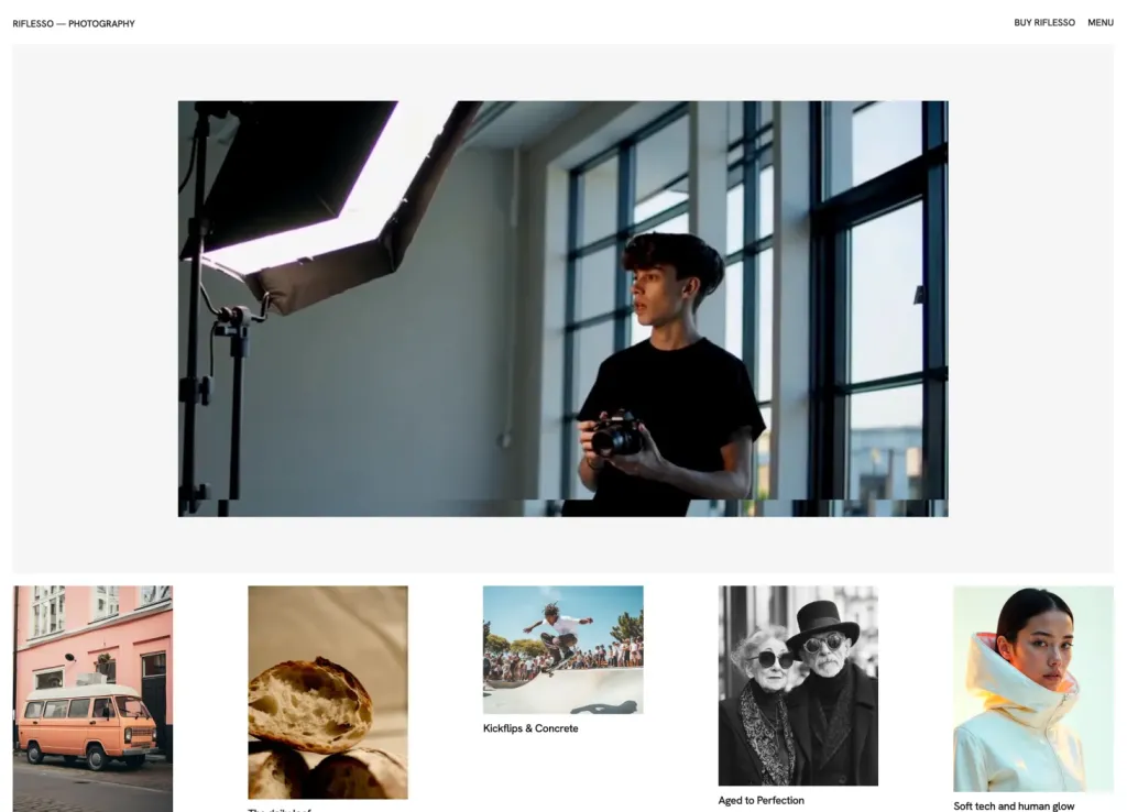
Minimalist template for agencies and portfolios

44-page modern theme for online courses

89 Tailwind components in Shuffle Editor.
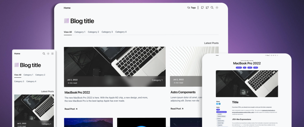
Astro-powered minimalist blog template
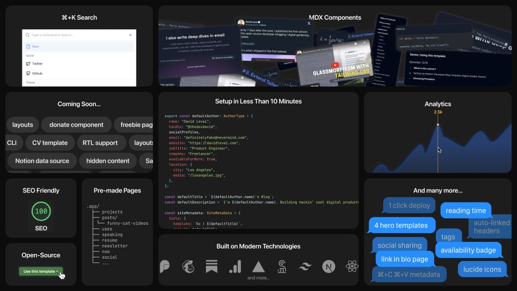
Customizable digital garden for developers
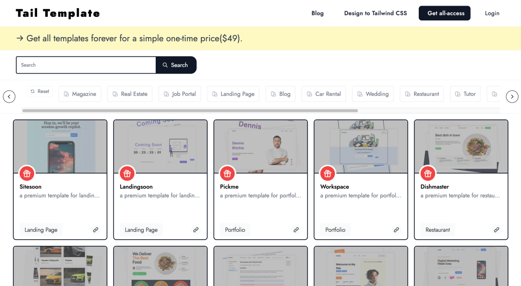
58+ handcrafted Tailwind CSS templates for your project

Build stores fast with 250 ready components
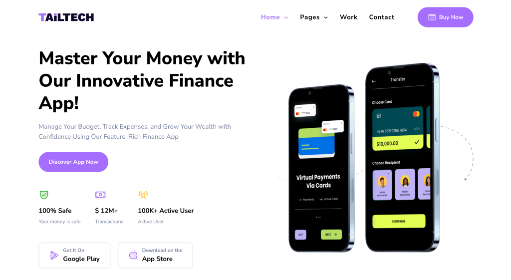
8 page clean landing page template made with Tailwind CSS
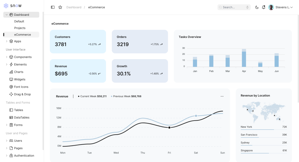
Tailwind admin template w/ Alpine.js
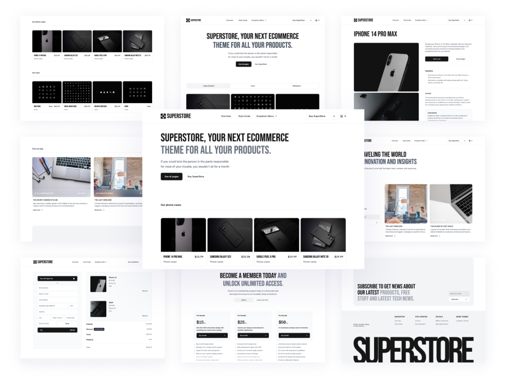
24+ page marketplace template built with AstroJS and Tailwind CSS

20+ Tailwind Templates built with 805+ components
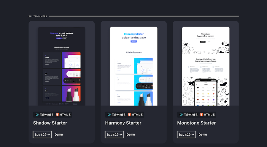
Wicked Tailwind UI Kits in one bundle
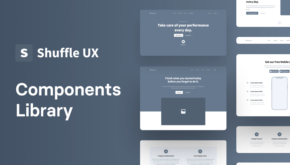
140 Tailwind components in Shuffle Editor with Alpine.js support

40 page Laravel admin template
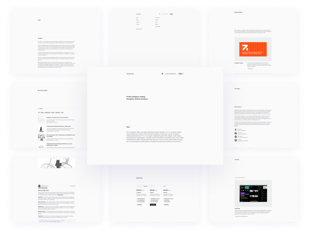
Clean, elegant blog template
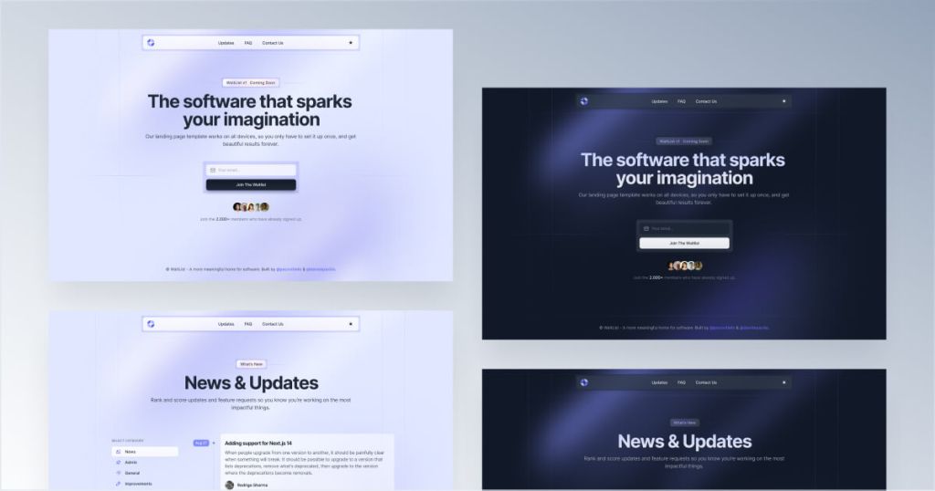
Coming soon email capture template
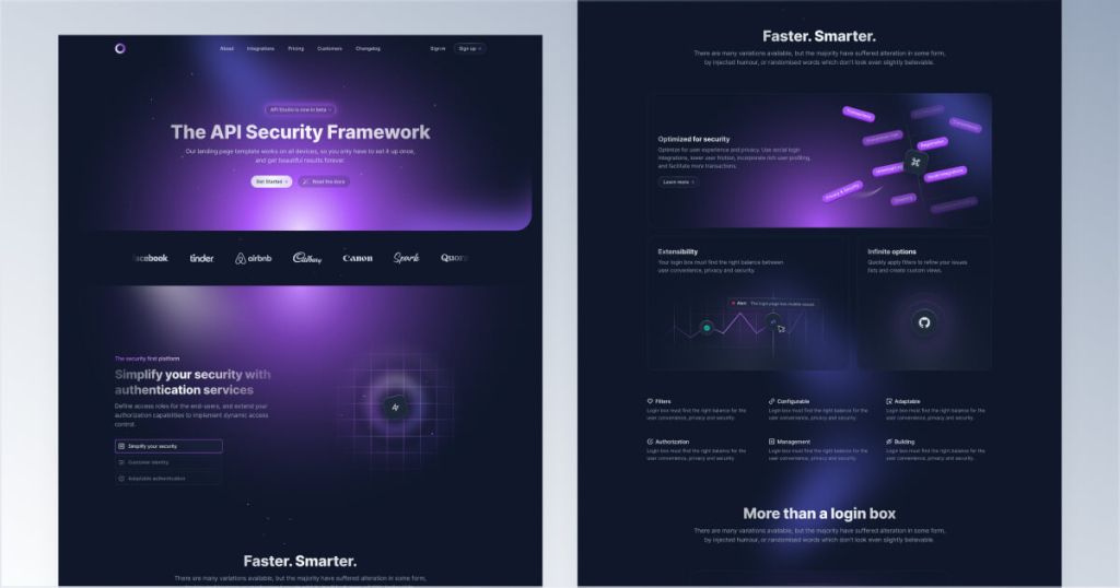
Eye-catching dark UI template for Tailwind & Next.js
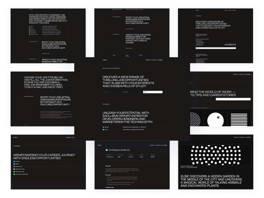
Minimal Astro & Tailwind template
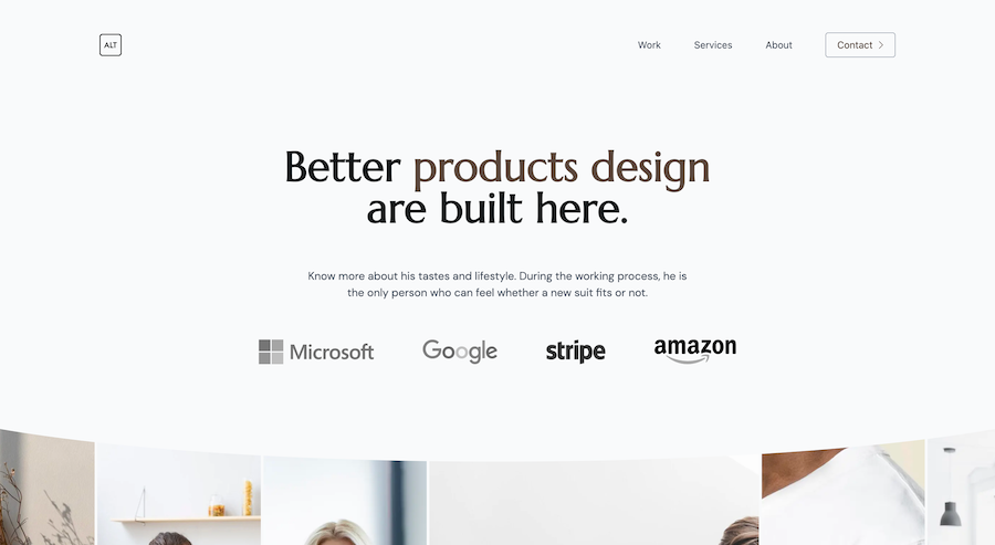
7-page minimalist agency Tailwind template
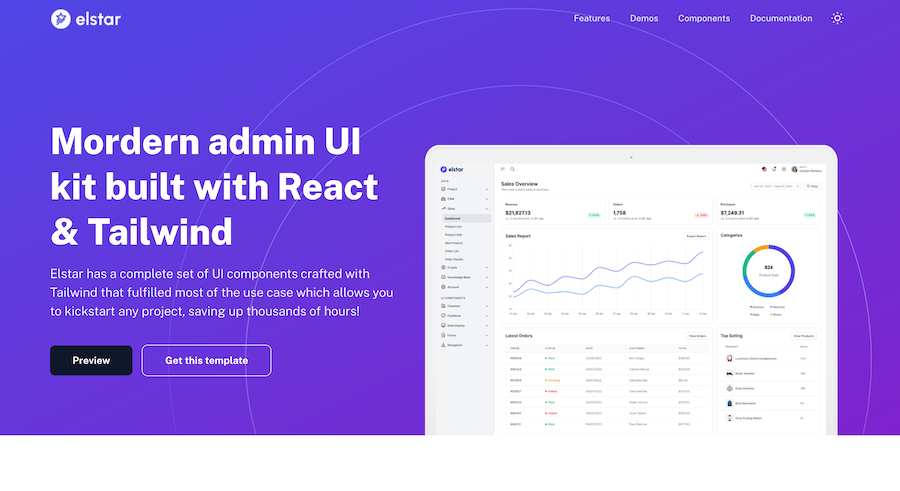
Tailwind React admin UI kit with themes & RTL
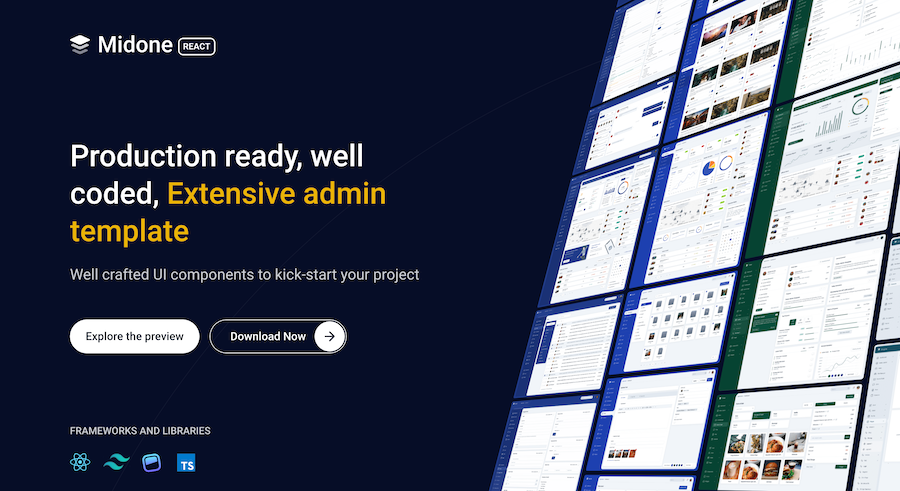
Customizable React admin UI kit with HTML version
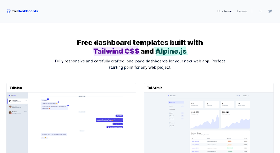
One-page Tailwind CSS & Alpine.js dashboards
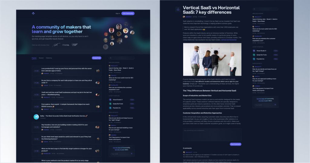
Responsive Tailwind forum template
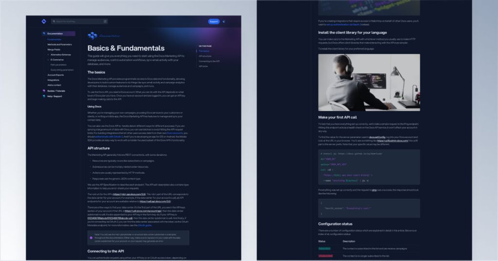
Customizable Tailwind CSS documentation kit
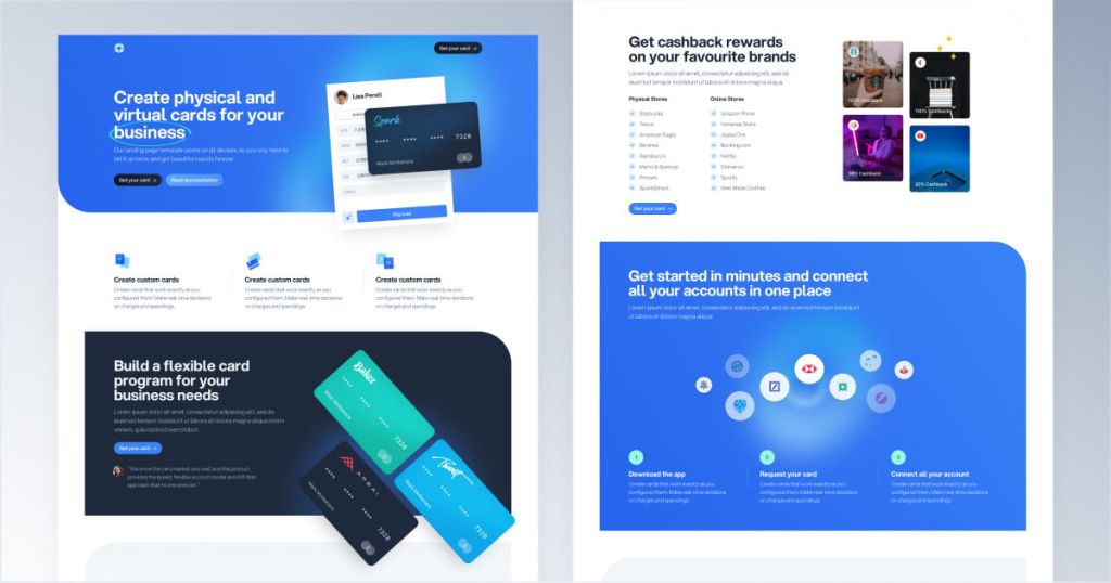
Next.js & Tailwind CSS landing page for finance apps.
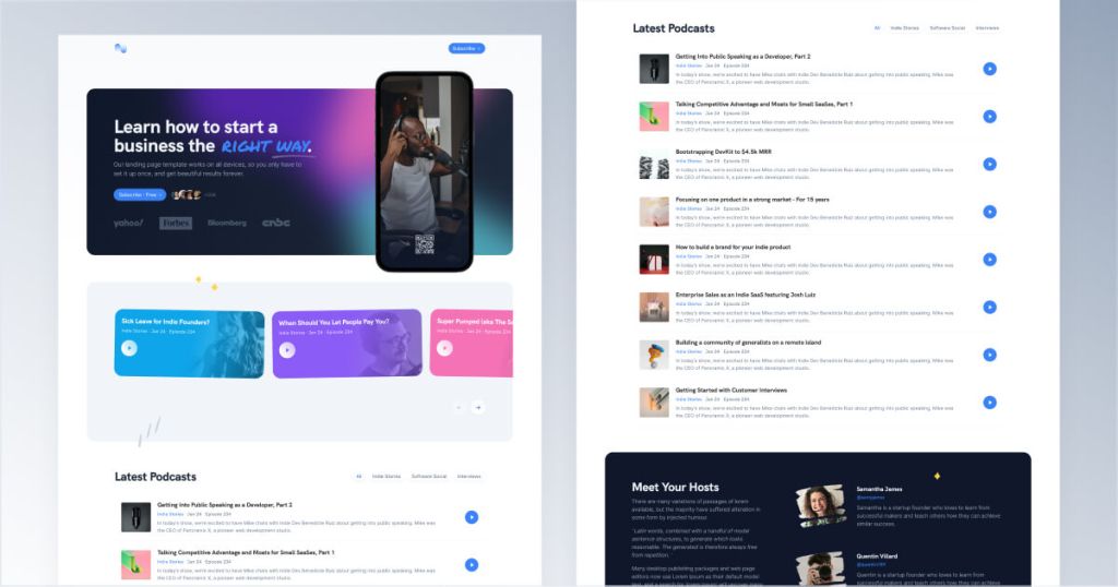
Tailwind podcast template with built-in audio player
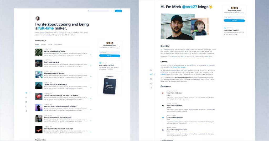
Modern Tailwind CSS blog template for developers
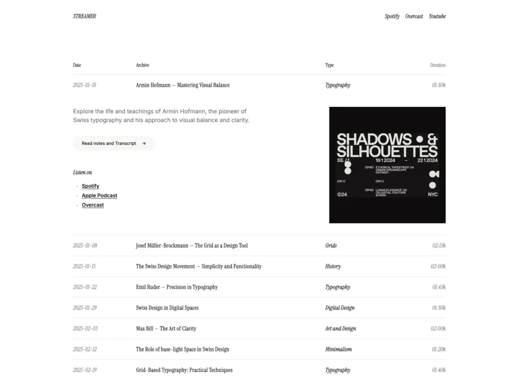
Responsive one-page streaming site template

Minimalist one-page Astro landing template
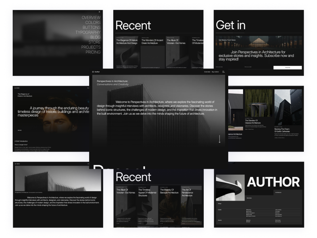
20 pages & 60+ Tailwind components for bloggers
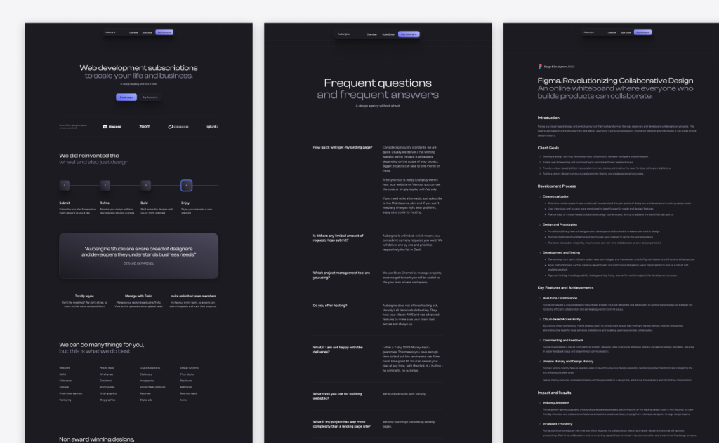
20-page Astro template for agencies
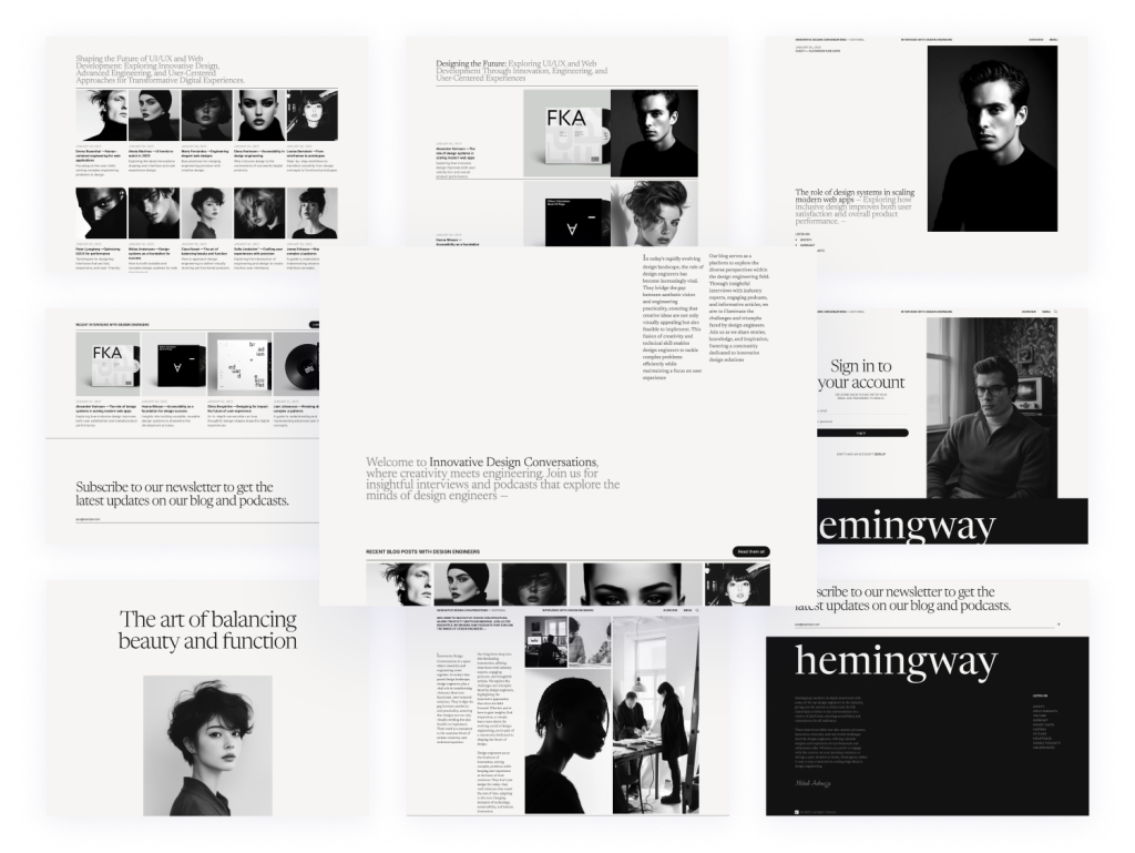
25-page Astro blog template with search
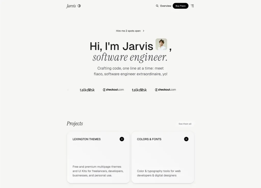
Sleek Astro & Tailwind CSS portfolio theme
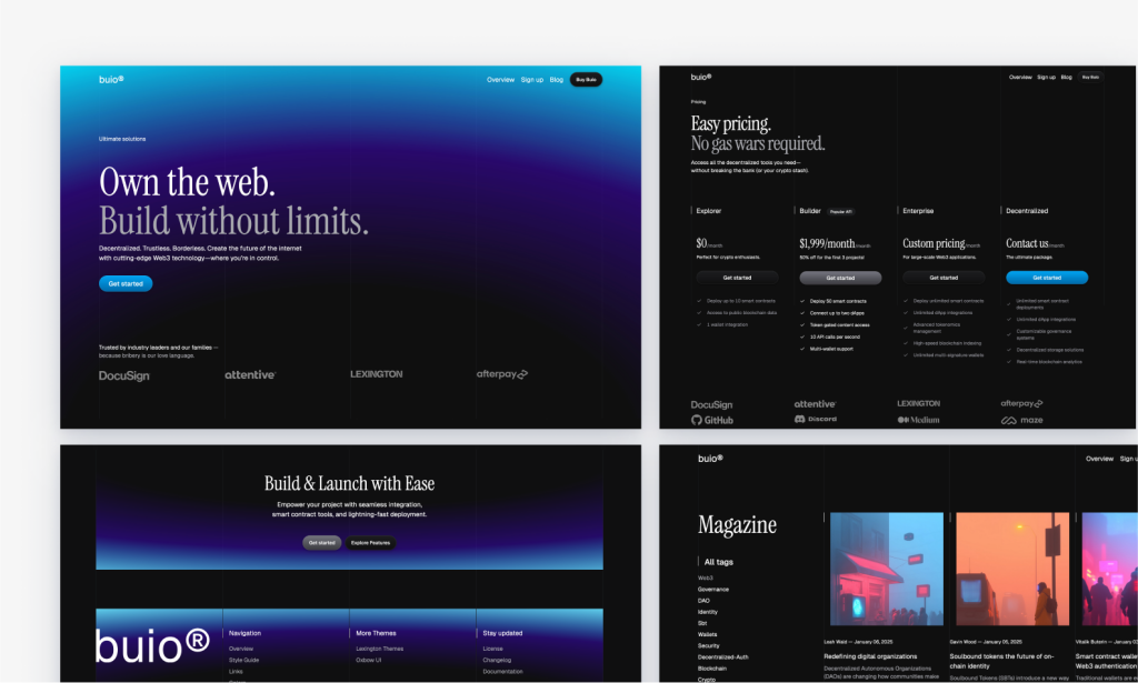
Blue-lit dark SaaS template built with Astro

42 page minimal blog template
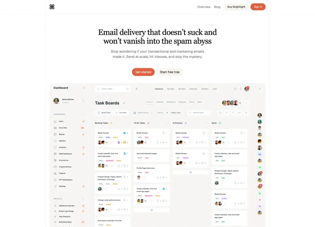
Astro + Tailwind SaaS template with 30+ ready pages
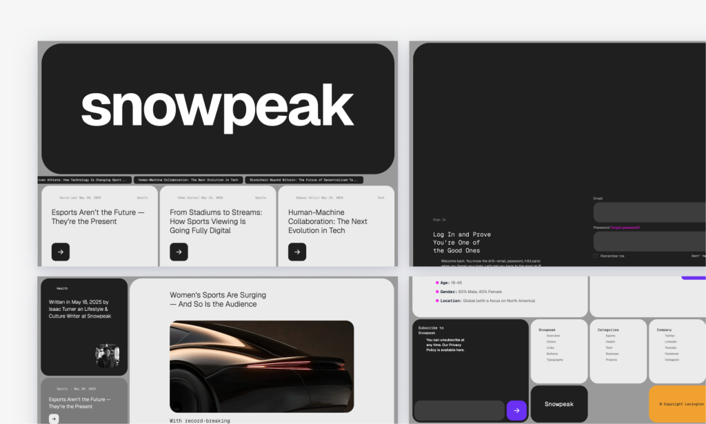
Bold Astro news theme for blogs and podcasts
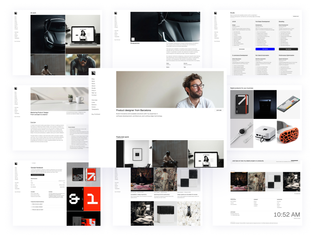
Modern, responsive Astro portfolio theme
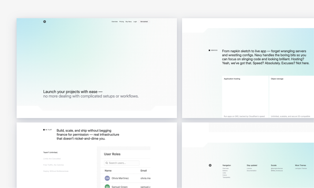
Light-mode Astro SaaS template with key pages
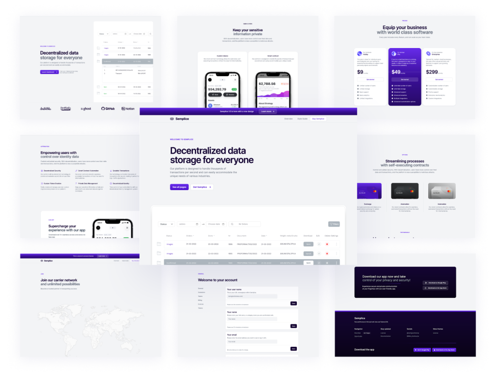
Modern multipage theme for tech startups
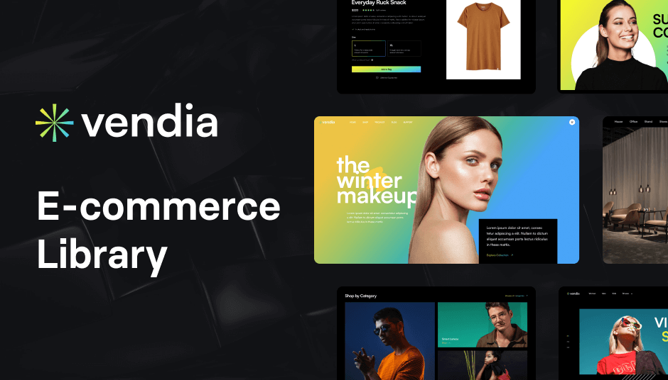
324 e-commerce UI components
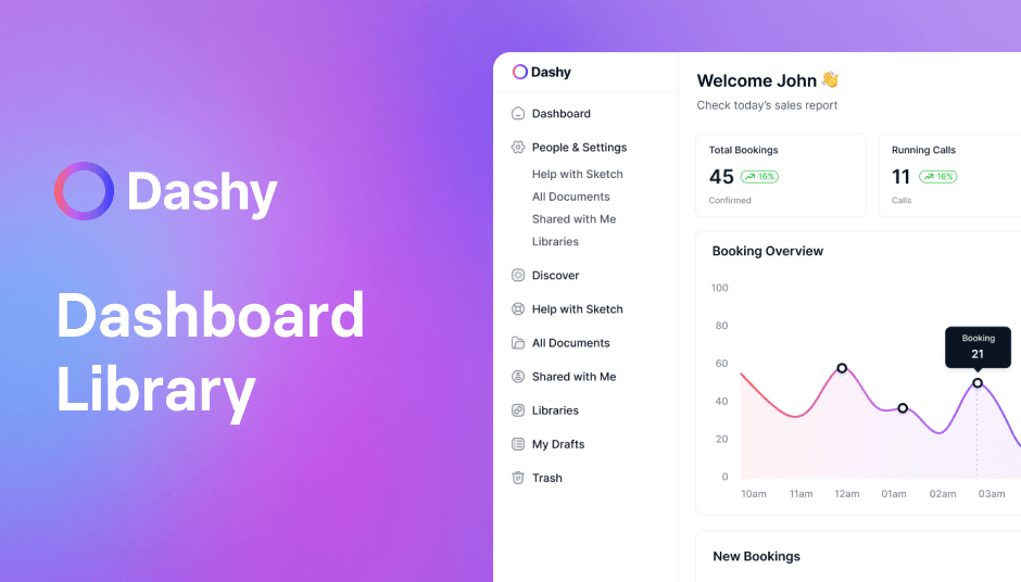
124 admin UI components
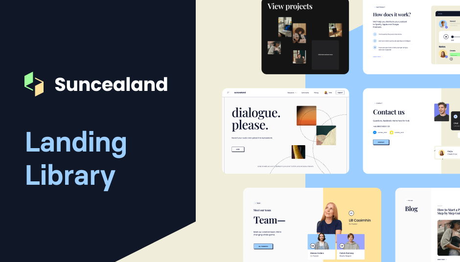
124 Tailwind components in Shuffle Editor

213+ Tailwind E-commerce UI components
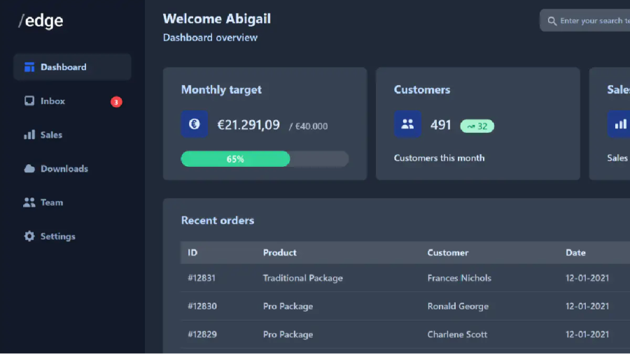
Responsive admin template
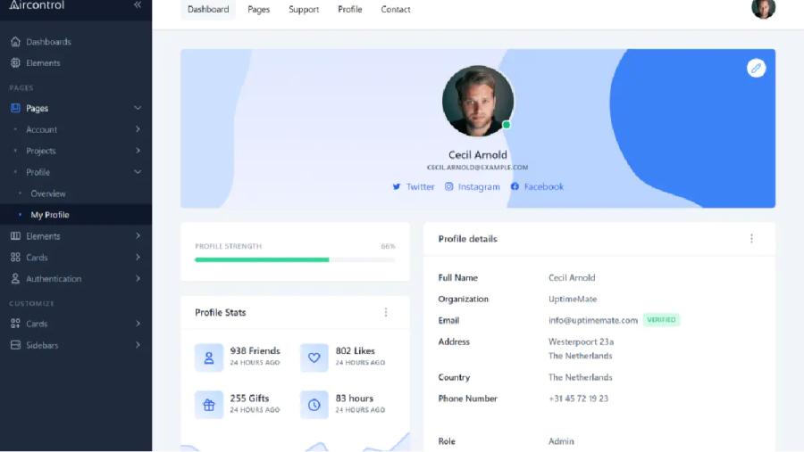
191 Tailwind admin pages

Tailwind template for modern business sites.

Tailwind CSS portfolio template
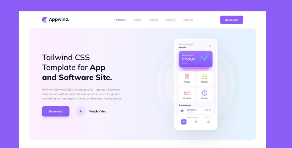
App landing page built with Tailwind CSS
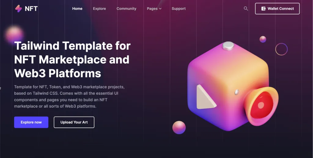
NFT marketplace template

7 section landing page template

Plain Business Template
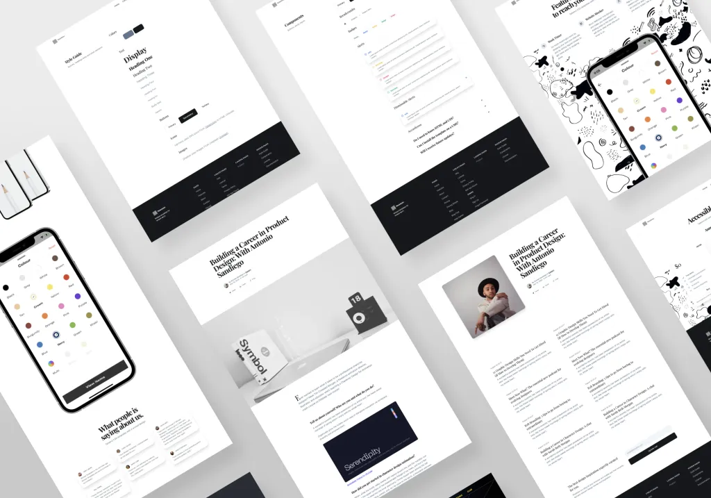
Minimal Tailwind UI Kit with 50+ components

Tailwind UI Kit with 100+ components
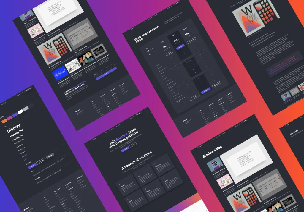
Dark Tailwind UI Kit with 100+ components
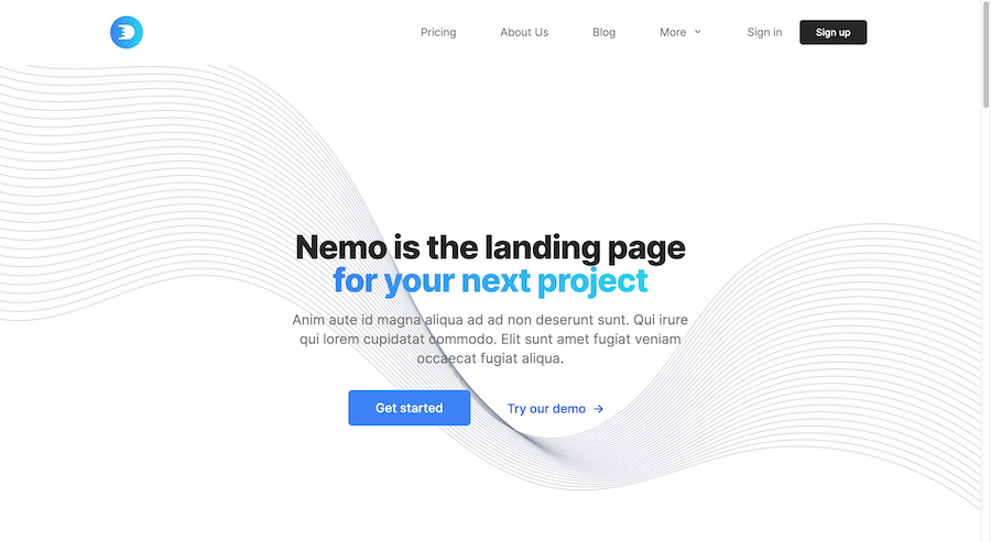
Multi-page HTML template with Tailwind
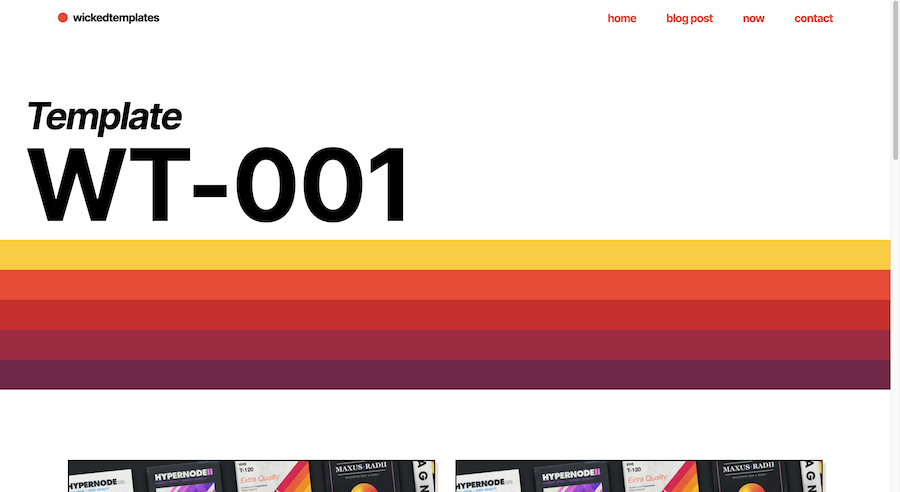
Retro landing & blog template
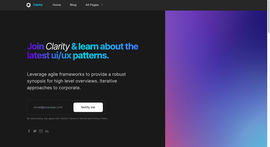
Responsive Tailwind blog template
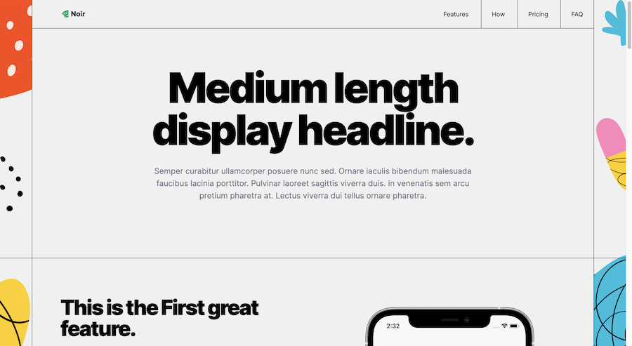
Responsive HTML template with Tailwind

Tailwind CSS admin dashboard template
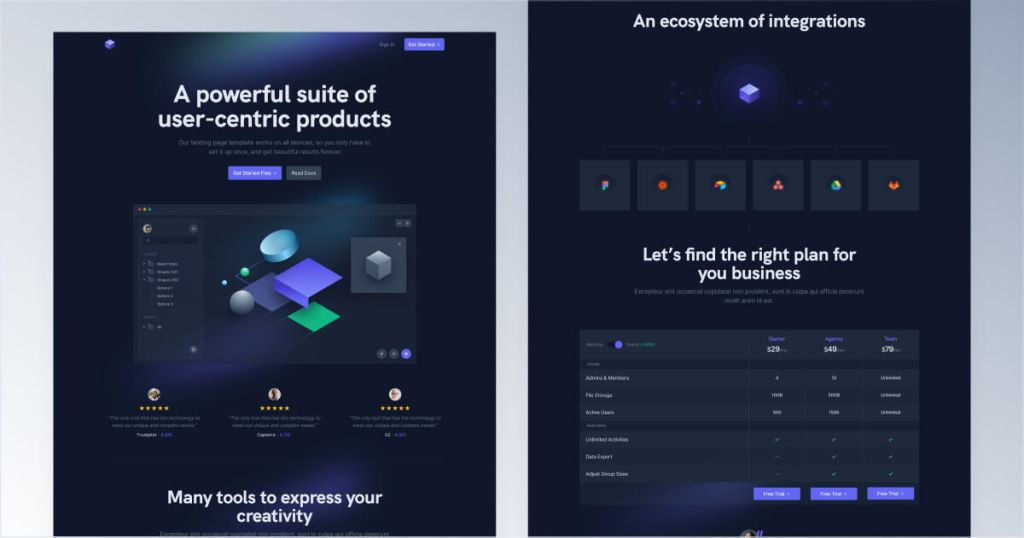
Modern Tailwind landing page template

Modern dark-themed landing page template
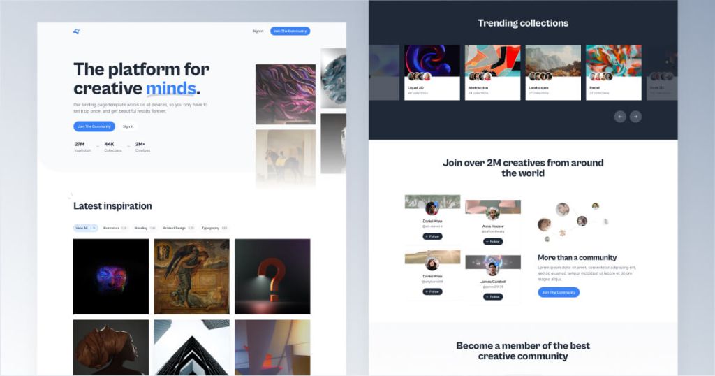
Tailwind template for creative communities
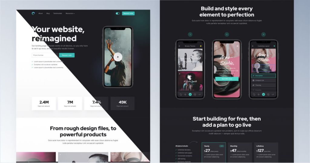
Tailwind template for mobile apps

12-page corporate website template
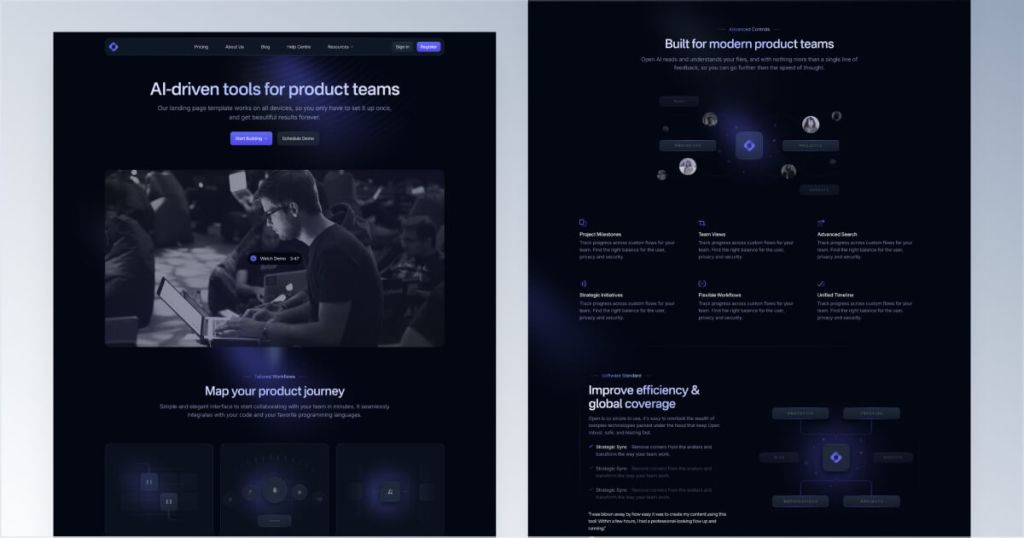
12 page Sleek SaaS template for startups

Tailwind CSS job board template

90+ Tailwind CSS components for SaaS landing pages

90 dark-mode components
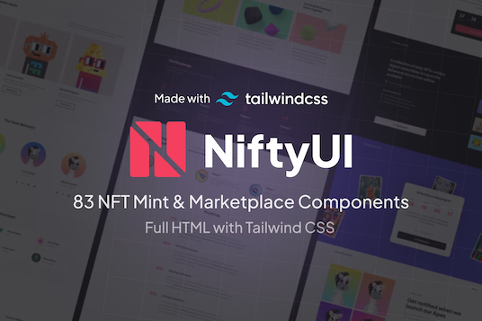
83 NFT UI components
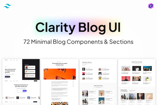
72 blog UI components for Tailwind

111 dashboard components
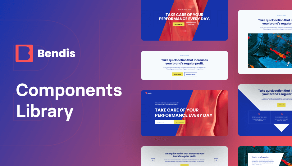
418 Tailwind components for company sites
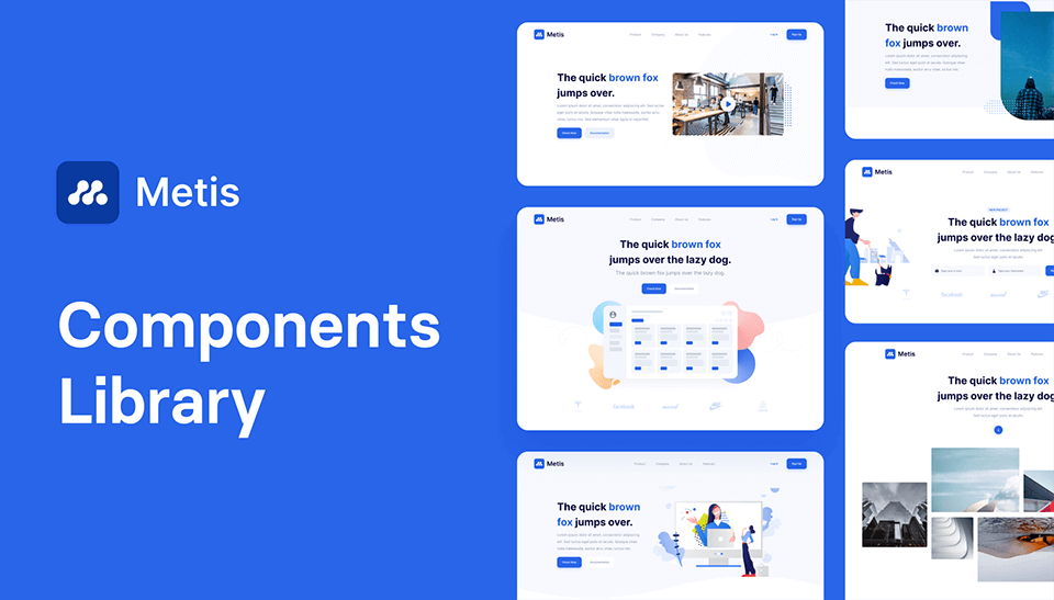
342 Tailwind components & builder
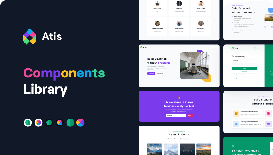
404 Tailwind components in 6 color themes in Shuffle Editor
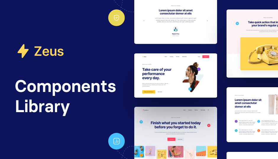
593 Tailwind components with UI editor

141 Tailwind components in dark mode
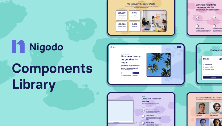
319 brutalist Tailwind components

344 responsive UI components for e-commerce

285 Tailwind e-commerce components

130 Tailwind components in Shuffle Editor
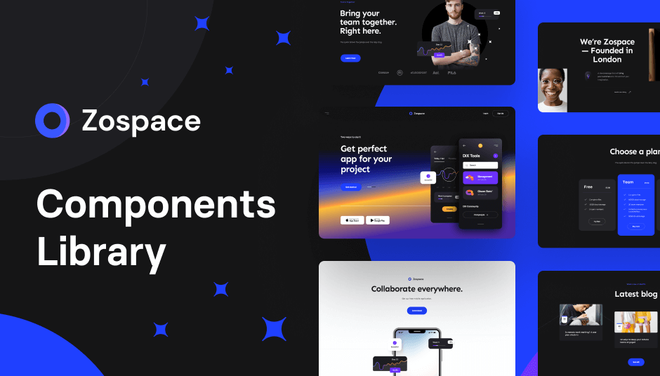
240 dark-mode Tailwind components
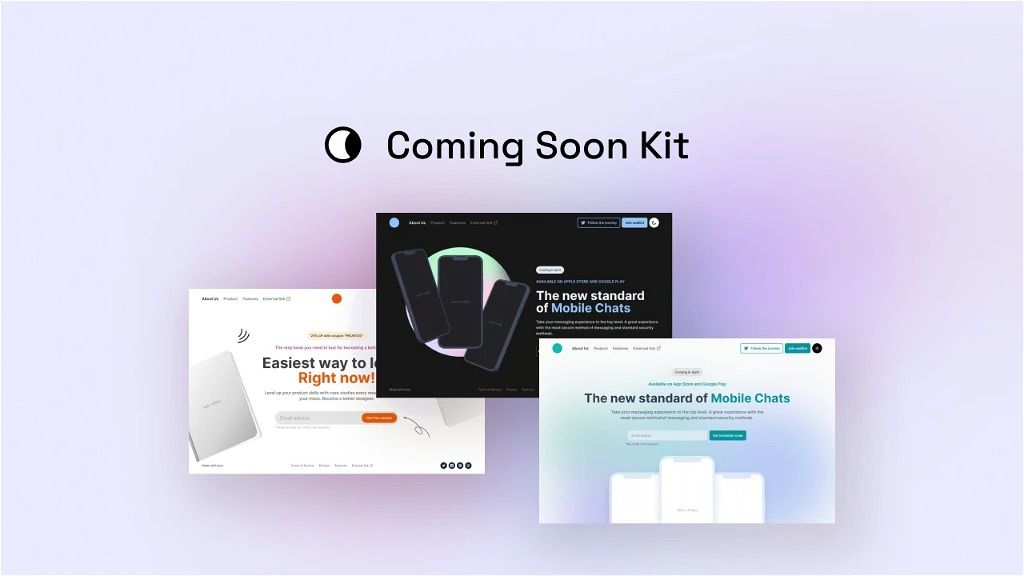
150+ Coming soon templates
The best Tailwind templates & UI kits for landing pages & dashboards.
200+ ready-to-use Tailwind CSS components with MCP integration. Let AI generate complete pages from your prompts — one command, production-ready UI.
Explore Components
Why Use Templates?
Save Time: Jumpstart your project with pre-built designs, focusing your effort on functionality rather than styling from scratch.
Learn by Example: For beginners, templates serve as practical examples of how to structure and style components using Tailwind.
Consistency: Templates ensure design consistency across different pages and components.
Customization: Tailwind templates are highly customizable, allowing you to tweak styles to match your brand identity.
Selecting the perfect template can be daunting, but here's a roadmap to guide you:
Identify Your Project Needs:
Purpose: Is it a blog, portfolio, e-commerce site, or admin dashboard?
Features: Do you need forms, interactive elements, charts, or animations?
Design Style: Modern, minimalist, corporate, or creative?
Consider Customization and Scalability:
Code Quality: Well-organized code makes customization easier.
Documentation: Comprehensive documentation aids in understanding and modifying the template.
Support: Premium templates often come with support from the developers.
Review Responsiveness and Browser Compatibility:
Responsive Design: Ensure the template looks good on all devices.
Cross-Browser Compatibility: Check if it works smoothly across different browsers.
Assess Licensing:
Usage Rights: Free templates may have limitations on commercial use.
Attribution Requirements: Some templates require you to credit the author.
Make the Template Yours:
Customize the Configuration File: Adjust the tailwind.config.js to modify default styles like colors, fonts, and spacing.
Use Utility Classes Wisely: Leverage Tailwind's utility classes to tweak styles directly in your HTML.
Add Custom Components: For repeated patterns, create your own components to keep the code DRY (Don't Repeat Yourself).
Stay Organized:
Comment Your Code: Leave notes to explain complex sections.
Modularize: Break down your code into smaller, manageable chunks.
Version Control: Use Git to track changes and collaborate effectively.
Optimize for Performance:
Purge CSS: Remove unused styles in production to reduce file size.
Lazy Loading: Implement lazy loading for images and scripts when necessary.
Embrace the Utility-First Mindset:
Tailwind's power lies in its utility classes. Get comfortable styling directly in your markup.
Consistent Design System:
Establish Design Tokens: Define colors, typography, and spacing in the configuration.
Use Variants and Responsive Utilities: Tailwind makes it easy to handle hover states, dark mode, and responsive designs.
Keep Accessibility in Mind:
Semantic HTML: Use proper HTML tags for better accessibility.
Contrast Ratios: Ensure text is readable against background colors.
Keyboard Navigation: Test your site for keyboard-only users.
Stay Updated:
Tailwind CSS regularly releases updates. Keep your version current to enjoy the latest features and improvements.
Tailwind CSS vs. Bootstrap:
Design Freedom: Tailwind offers more flexibility, while Bootstrap provides predefined components.
Learning Curve: Tailwind requires understanding utility classes, whereas Bootstrap uses more traditional CSS classes.
Size: Tailwind can result in smaller CSS files after purging unused styles.
Tailwind CSS vs. Bulma:
Approach: Bulma is component-based, similar to Bootstrap, whereas Tailwind is utility-first.
Customization: Tailwind offers greater customization without overriding styles.
Why Choose Tailwind CSS?
If you prefer complete control over your design without writing extensive custom CSS, Tailwind is an excellent choice.
A: Integrating Tailwind CSS with build tools enhances your development workflow.
For Webpack:
Install Dependencies:
npm install tailwindcss postcss-loader autoprefixer --save-devConfigure PostCSS:
Create a postcss.config.js file:
module.exports = {
  plugins: [require('tailwindcss'), require('autoprefixer')],
};
Update Webpack Config:
In your webpack.config.js, add the PostCSS loader:
module.exports = {
  // ...other configurations
  module: {
    rules: [
      {
        test: /\\\\.css$/,
        use: ['style-loader', 'css-loader', 'postcss-loader'],
      },
    ],
  },
};
For Parcel:
Install Dependencies:
npm install tailwindcss autoprefixer --save-devConfigure PostCSS:
Create a .postcssrc or postcss.config.js file similar to the Webpack setup.
Import Tailwind in Your CSS:
@import 'tailwindcss/base';
@import 'tailwindcss/components';
@import 'tailwindcss/utilities';
Parcel automatically picks up the PostCSS configuration during the build.
You can find answers for commonly asked questions about templates.
Yes, you can integrate Tailwind CSS into WordPress themes or other CMS platforms. **For WordPress:** - **Custom Themes:** Incorporate Tailwind CSS into your theme development process using tools like Laravel Mix or Gulp. - **Plugins:** Some WordPress plugins and starter themes come with Tailwind CSS pre-configured. **Considerations:** - Ensure that your build process compiles Tailwind CSS and enqueues the resulting stylesheet in WordPress.