 HOT
HOTTailkits UI
NEWConsistent UI, zero hallucinations
Discover our collection of Alpine.js templates to build lightweight, reactive web interfaces effortlessly. Choose from premium and free options designed for developers.
 HOT
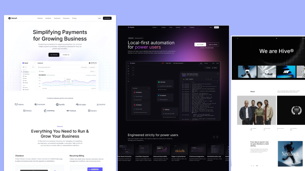
HOTConsistent UI, zero hallucinations
 HOT
HOT12+ Shadcn Templates
 HOT
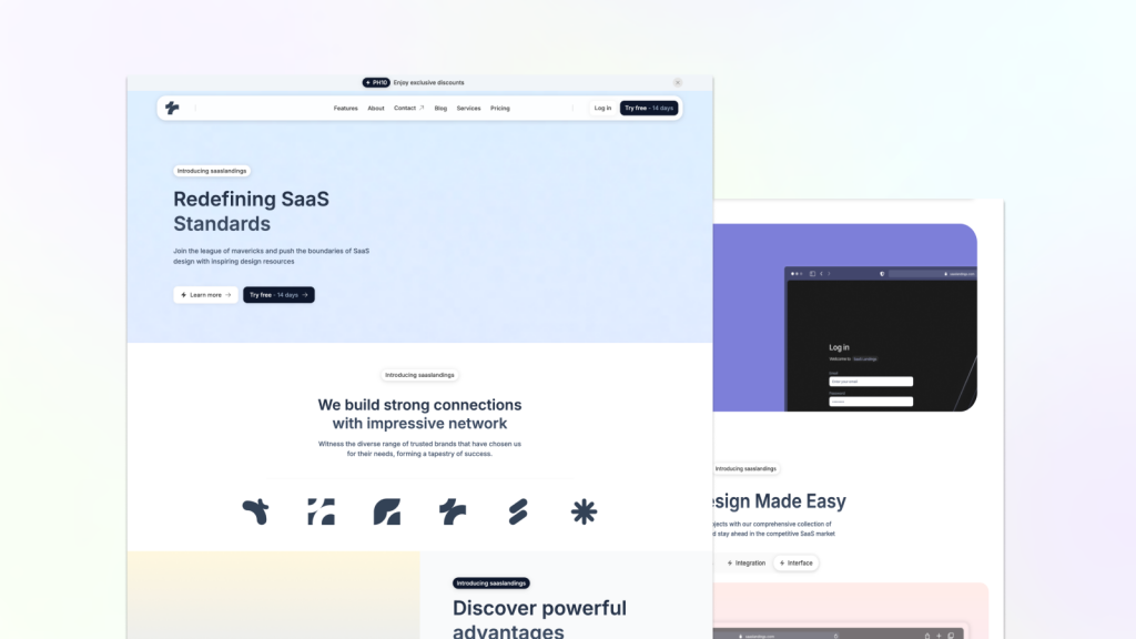
HOTFast, clean Astro Tailwind theme

20 beautifully designed Tailwind CSS templates
 HOT
HOT43 Tailwind templates and 7,500+ UI components

Curated directory template with 30+ pages

31+ Astro & Tailwind Templates
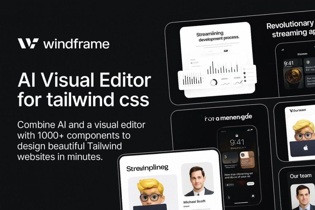
1000+ Tailwind UI components + AI Visual editor
 HOT
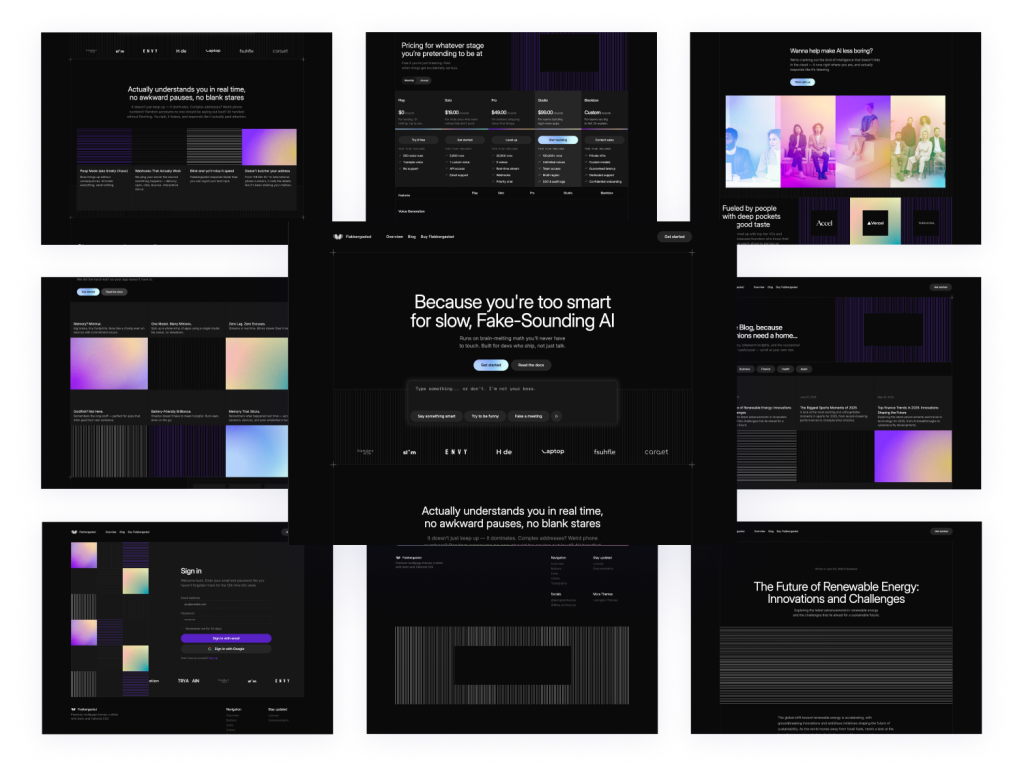
HOTDark-mode Astro SaaS theme with 40+ pages
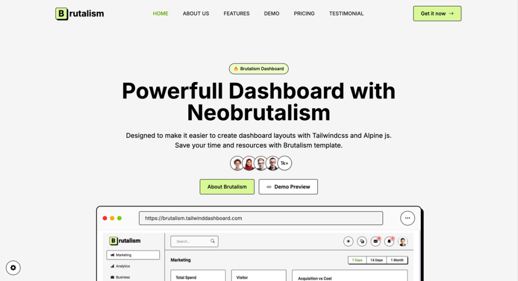
Create bold, brutalist dashboards

Colorful Astro job board template with 80+ components
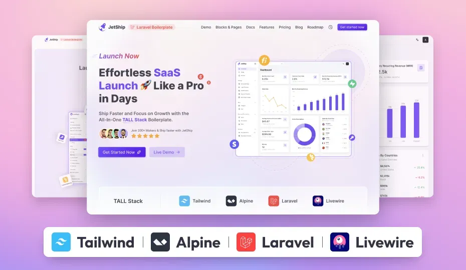
The Ultimate Laravel Starterkit for SaaS devleopers.
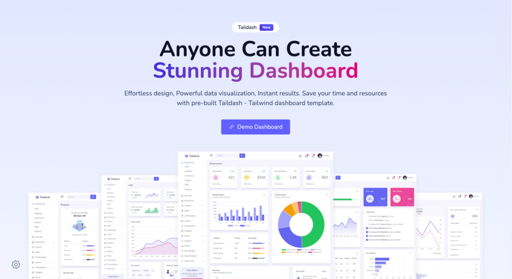
Developer-friendly dashboard template

A bundle of 9+ modern templates
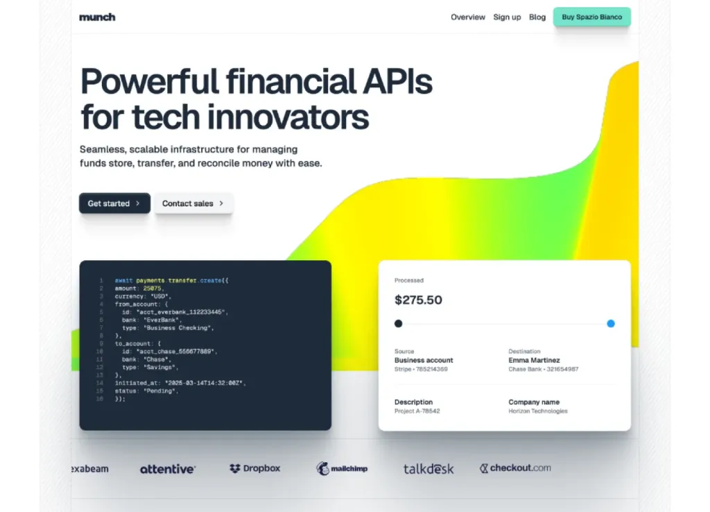
Modern Astro & Tailwind SaaS template

293 component SaaS template with Alpine.js support
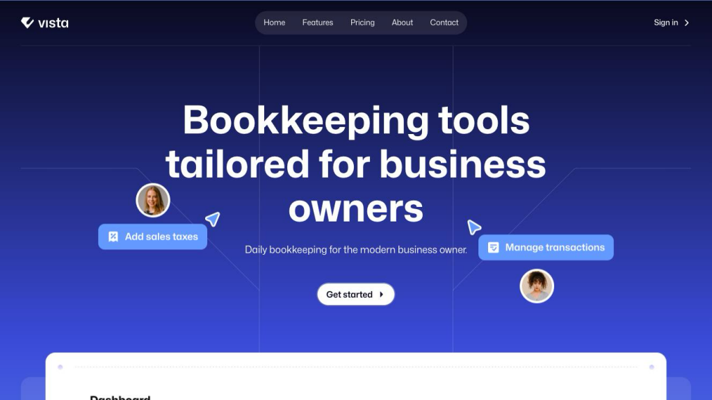
Modern Tailwind SaaS template with 306 UI elements
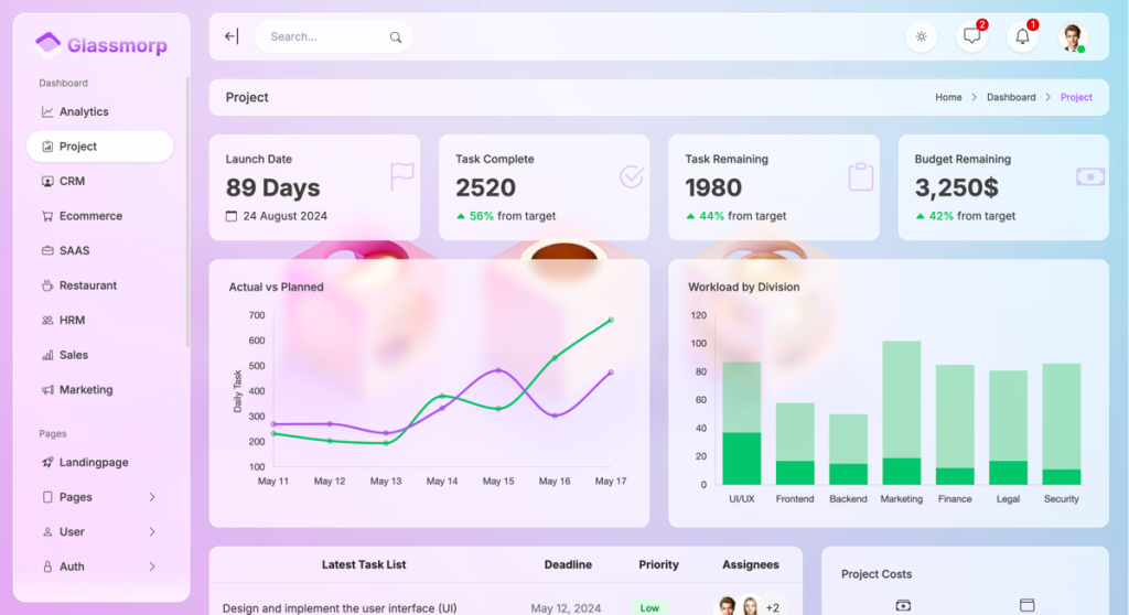
Glassmorphism admin template

Neumorphism style admin template
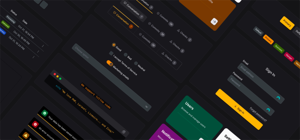
Laravel Livewire UI Toolkit

Tailwind template for consulting sites
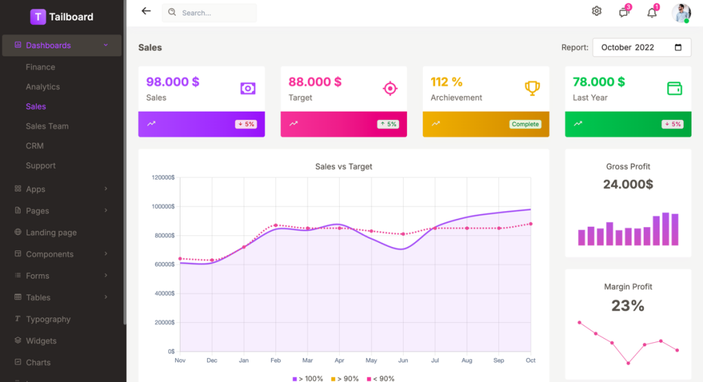
Tailwind v4 dashboard template
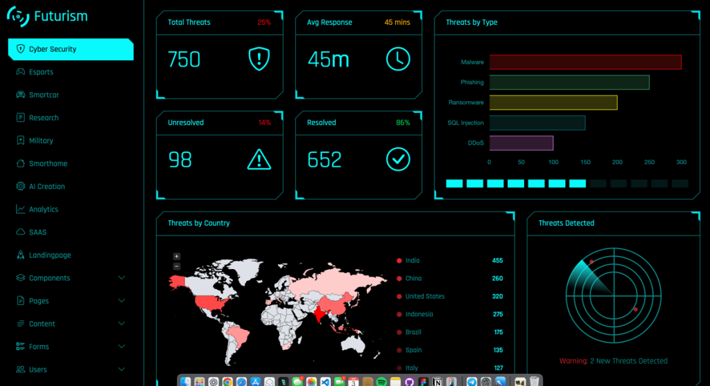
sci-fi themed dashboard template
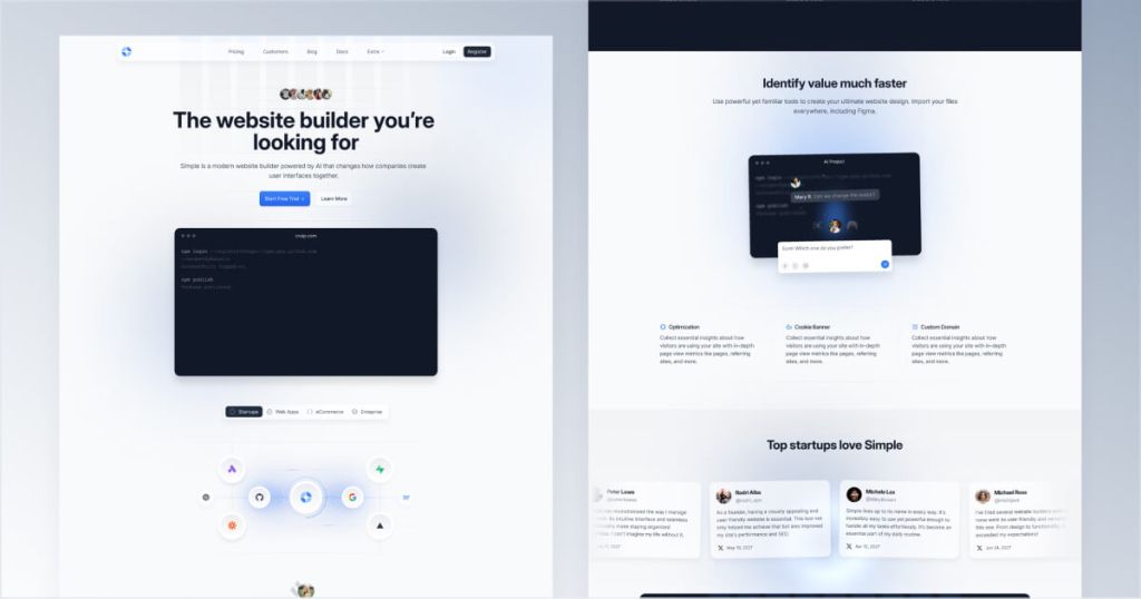
Clean, minimal Tailwind website template

110 responsive Tailwind UI components
Force your AI to use a professional design system. Build brand-matched, consistent UIs with 200+ vetted components.


43-Page Astro template with MDX blog
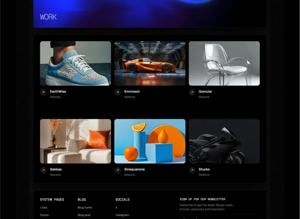
39 pages & 100+ sections for agencies
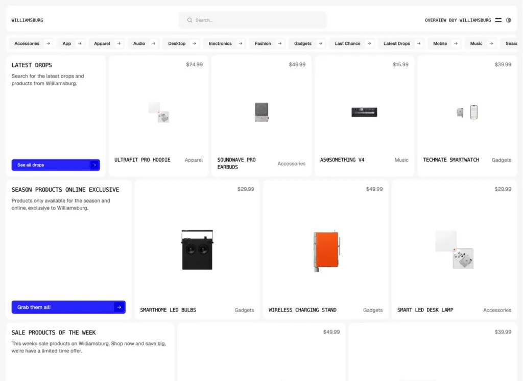
Brutalist Astro/Tailwind listing theme
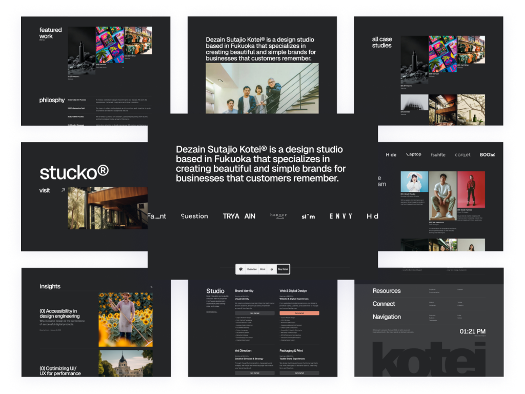
Swiss-inspired Astro theme with 100+ Tailwind components
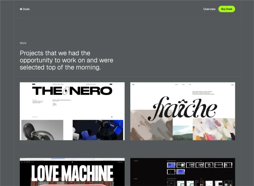
Minimal Astro & Tailwind agency theme
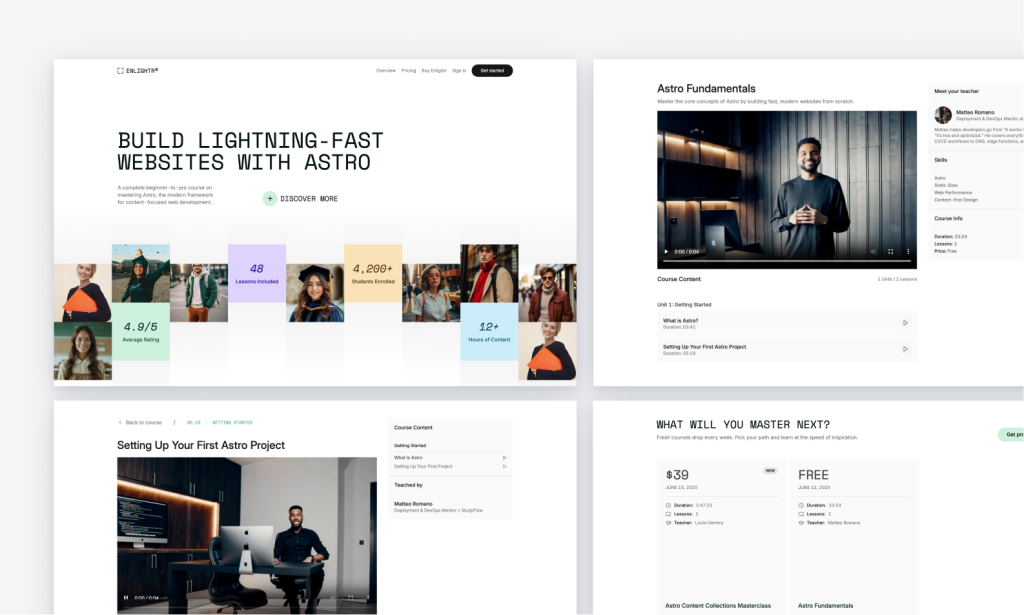
Edu‑centric Tailwind course platform, SEO‑friendly
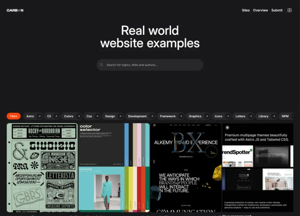
Bold dark directory theme
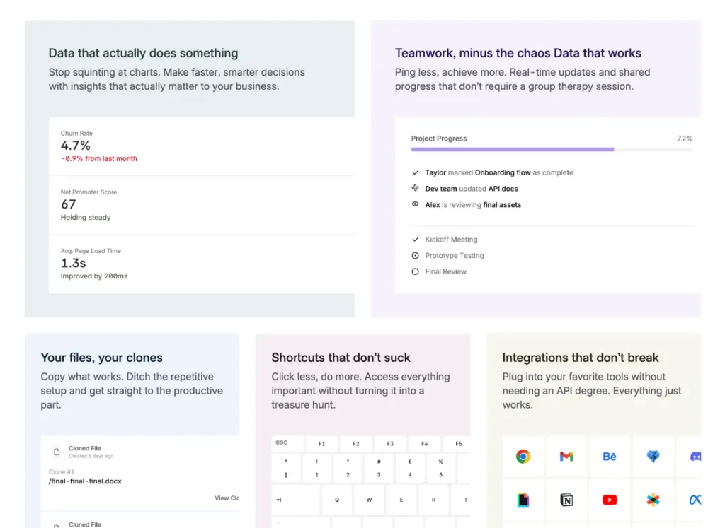
40+ pages and 100+ components SaaS template

Multi-page SaaS and hiring platform landing page
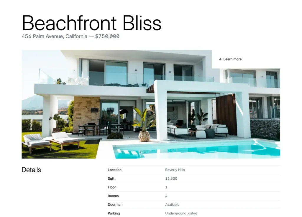
Quartiere: 48-page real estate theme

Minimalist template for agencies and portfolios

44-page modern theme for online courses
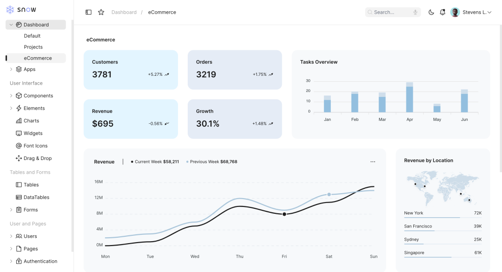
Tailwind admin template w/ Alpine.js
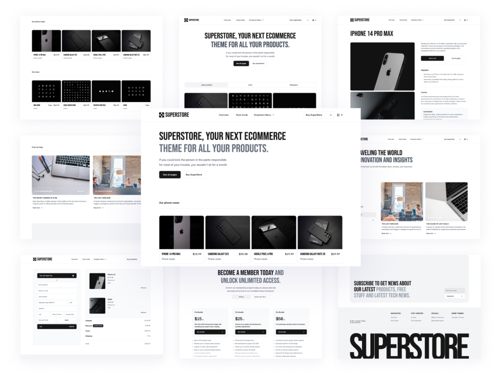
24+ page marketplace template built with AstroJS and Tailwind CSS
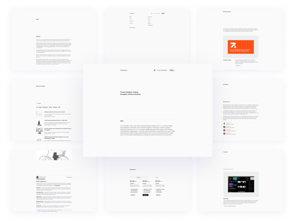
Clean, elegant blog template
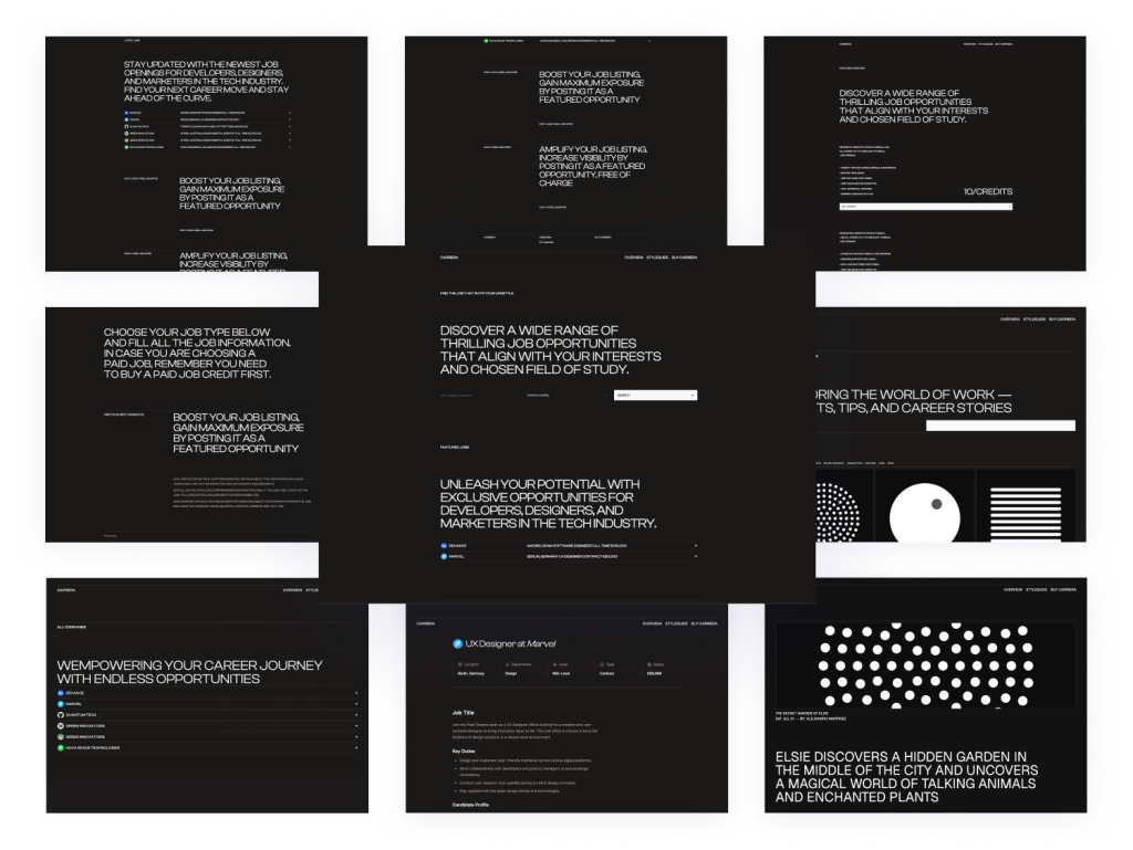
Minimal Astro & Tailwind template
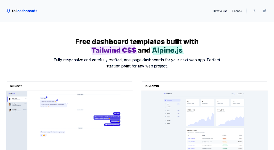
One-page Tailwind CSS & Alpine.js dashboards
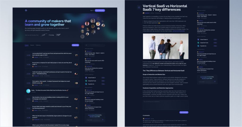
Responsive Tailwind forum template
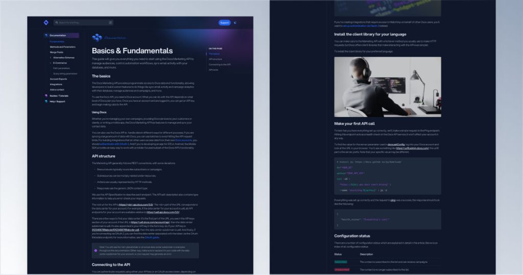
Customizable Tailwind CSS documentation kit
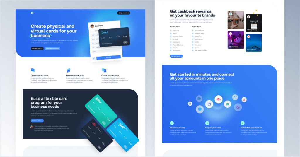
Next.js & Tailwind CSS landing page for finance apps.
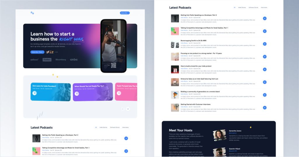
Tailwind podcast template with built-in audio player
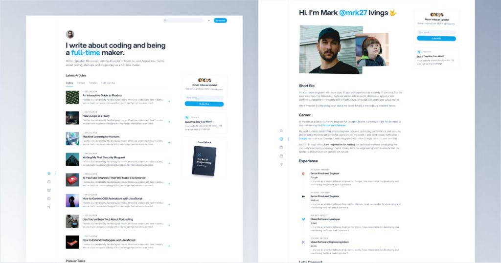
Modern Tailwind CSS blog template for developers
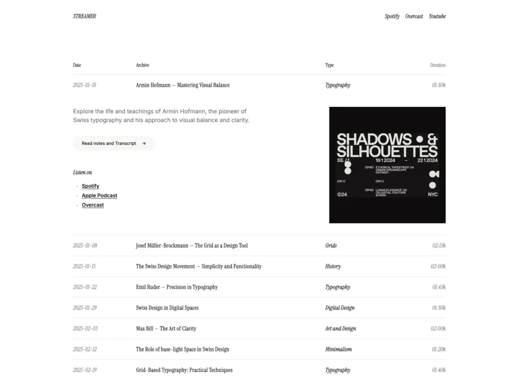
Responsive one-page streaming site template

20 pages & 60+ Tailwind components for bloggers
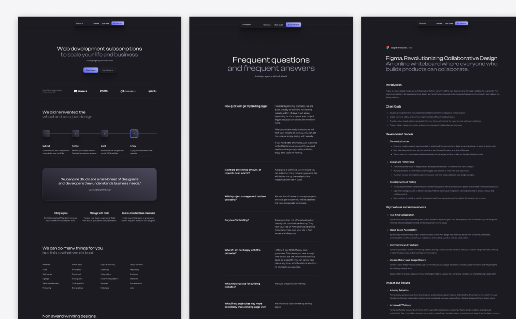
20-page Astro template for agencies

25-page Astro blog template with search
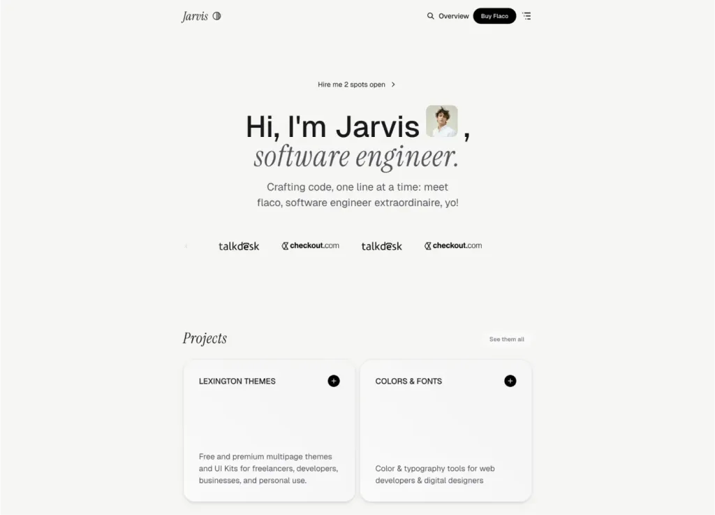
Sleek Astro & Tailwind CSS portfolio theme
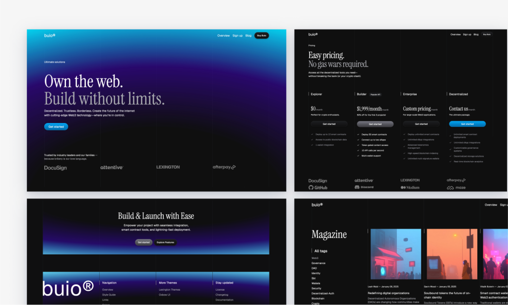
Blue-lit dark SaaS template built with Astro

42 page minimal blog template
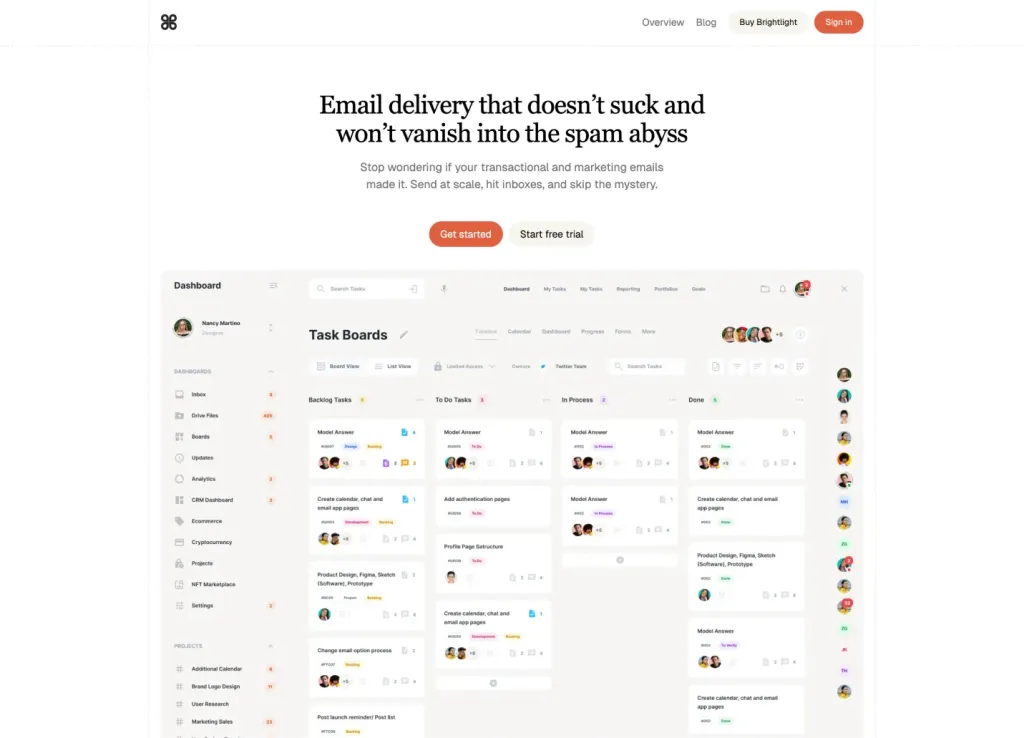
Astro + Tailwind SaaS template with 30+ ready pages
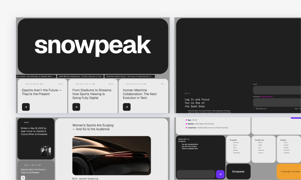
Bold Astro news theme for blogs and podcasts

Modern, responsive Astro portfolio theme
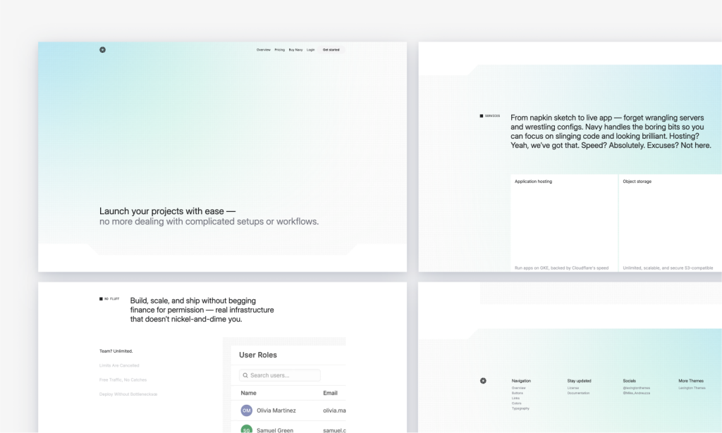
Light-mode Astro SaaS template with key pages

Modern multipage theme for tech startups
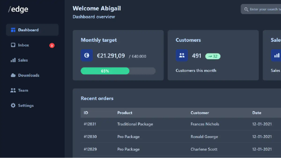
Responsive admin template

Minimal Tailwind UI Kit with 50+ components

Tailwind UI Kit with 100+ components
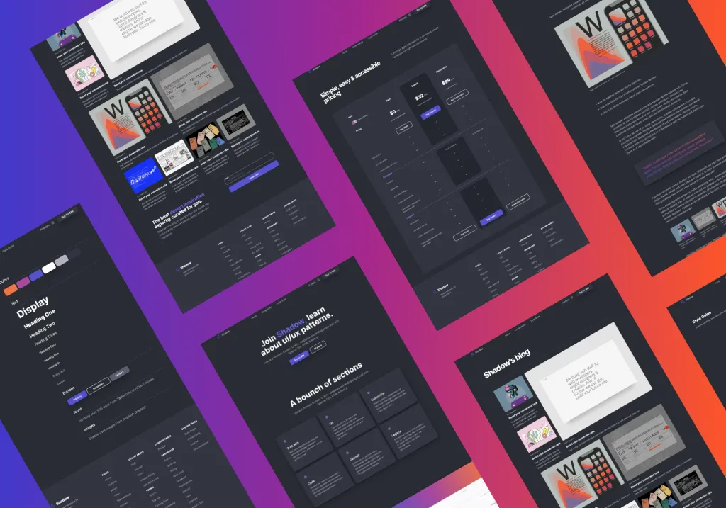
Dark Tailwind UI Kit with 100+ components
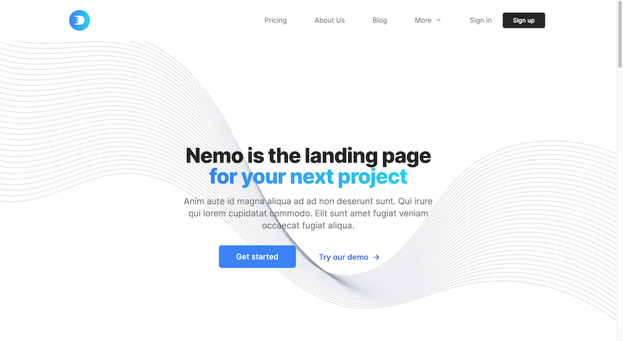
Multi-page HTML template with Tailwind
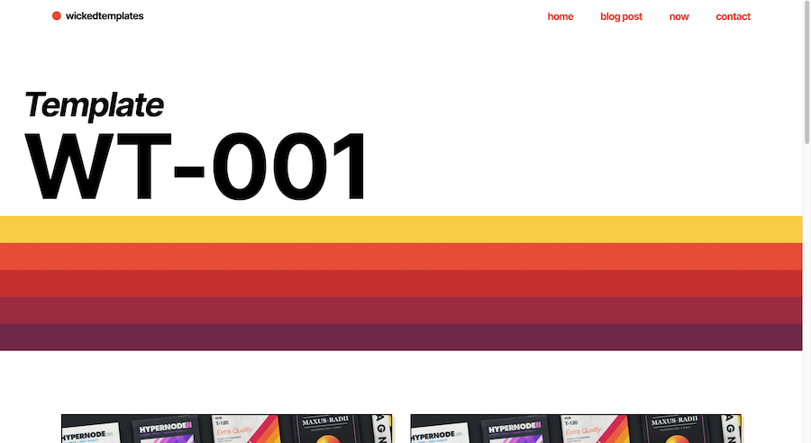
Retro landing & blog template
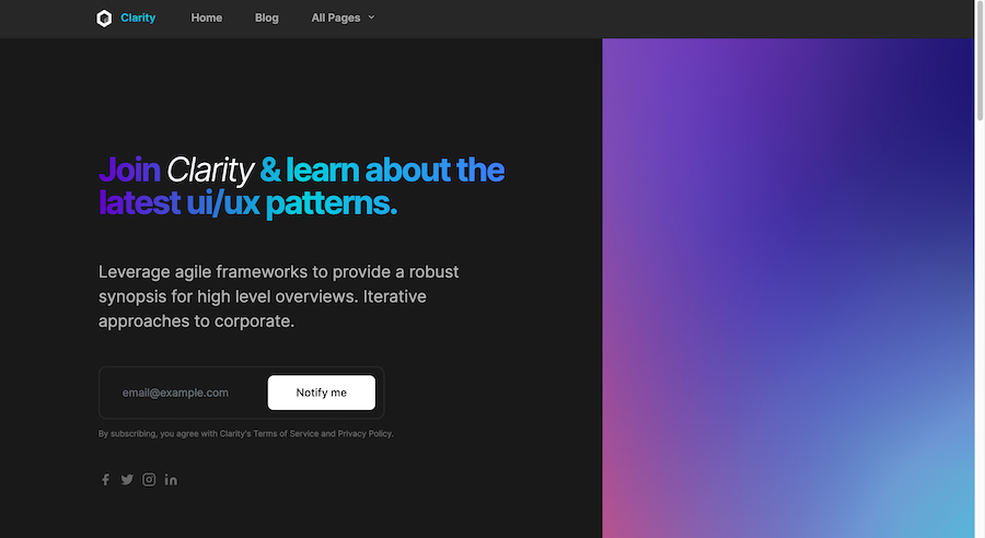
Responsive Tailwind blog template
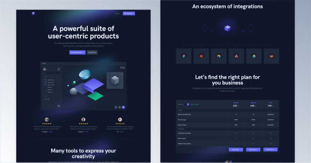
Modern Tailwind landing page template

Modern dark-themed landing page template

Tailwind template for creative communities
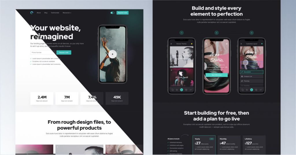
Tailwind template for mobile apps

12-page corporate website template
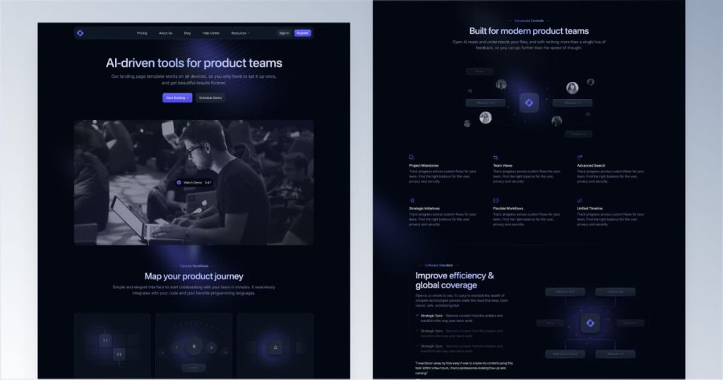
12 page Sleek SaaS template for startups
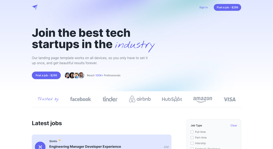
Tailwind CSS job board template

90+ Tailwind CSS components for SaaS landing pages

90 dark-mode components

83 NFT UI components

72 blog UI components for Tailwind
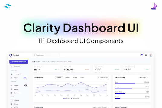
111 dashboard components

150+ Coming soon templates
The best Tailwind templates & UI kits for landing pages & dashboards.
200+ ready-to-use Tailwind CSS components with MCP integration. Let AI generate complete pages from your prompts — one command, production-ready UI.
Explore Components
Alpine.js is a lightweight JavaScript framework designed for adding interactivity to your HTML markup with minimal effort. It offers a declarative syntax similar to frameworks like Vue.js and React but is much simpler and ideal for enhancing static pages. Alpine.js Templates refer to the HTML structures enhanced with Alpine's directives to create dynamic, reactive, and interactive user interfaces.
Alpine.js is often described as "Tailwind for JavaScript" because it provides the power of JavaScript without the complexity of larger frameworks. It's particularly useful for adding interactivity to server-rendered HTML where full-fledged frameworks might be overkill.
Key Features:
Minimalistic: Small footprint (~10kB minified).
Declarative Syntax: Uses directives directly in HTML.
Reactivity: Supports reactive data binding.
Component-Based: Enables encapsulation of interactive parts.
To start using Alpine.js, include it via a <script> tag in your HTML. You can use a CDN for quick setup:
<!DOCTYPE html>
<html lang="en">
<head>
    <meta charset="UTF-8">
    <title>Alpine.js Example</title>
    <!-- Include Alpine.js from CDN -->
    <script src="<https://cdn.jsdelivr.net/npm/[email protected]/dist/cdn.min.js>" defer></script>
</head>
<body>
    <!-- Alpine.js code will go here -->
</body>
</html>
Note: The defer attribute ensures that Alpine.js initializes after the HTML is parsed.
Alpine.js uses a declarative approach with various directives to manage state and behavior. Some of the core directives include:
x-data: Defines a component's reactive state.
x-bind: Binds HTML attributes to JavaScript expressions.
x-model: Creates two-way data bindings on form inputs.
x-on: Attaches event listeners.
x-if, x-show: Conditional rendering.
x-for: Looping over lists.
x-text, x-html: Updates text or HTML content.
x-data and x-text<div x-data="{ message: 'Hello, Alpine!' }">
<span x-text="message"></span>
</div>This initializes a component with a message property and binds its value to the <span> element.
Alpine.js templates leverage HTML enhanced with Alpine's directives to define interactive components. These templates can include state management, event handling, conditional rendering, and more—all within your HTML.
<div x-data="{ /* state */ }" x-init="/* initialization */">
    <!-- HTML content with Alpine directives -->
</div>x-data: Initializes the component's state.
x-init: Runs JavaScript when the component is initialized.
Organize your templates by wrapping interactive parts in containers with x-data. Inside these containers, use Alpine directives to control behavior.
<div x-data="{ open: false }">
    <button @click="open = !open">Toggle</button>
    <div x-show="open">
        <p>This content is toggled.</p>
    </div>
</div>
Here, clicking the button toggles the visibility of the <div> containing the paragraph.
Let's explore more detailed examples to illustrate how Alpine.js templates work.
A common use case is toggling the visibility of elements, such as showing and hiding sections or modals.
<!DOCTYPE html>
<html lang="en">
<head>
    <meta charset="UTF-8">
    <title>Toggle Example</title>
    <script src="<https://cdn.jsdelivr.net/npm/[email protected]/dist/cdn.min.js>" defer></script>
</head>
<body>
    <div x-data="{ open: false }" class="p-4">
        <button @click="open = !open" class="px-4 py-2 bg-blue-500 text-white rounded">
            Toggle Content
        </button>

        <div x-show="open" class="mt-4 p-4 border rounded">
            <p>Here is some toggled content!</p>
        </div>
    </div>
</body>
</html>
Explanation:
x-data="{ open: false }" initializes the open state.
@click="open = !open" toggles the open state when the button is clicked.
x-show="open" conditionally displays the content based on the open state.
Alpine.js makes handling form inputs straightforward with x-model for two-way data binding.
<!DOCTYPE html>
<html lang="en">
<head>
    <meta charset="UTF-8">
    <title>Form Example</title>
    <script src="<https://cdn.jsdelivr.net/npm/[email protected]/dist/cdn.min.js>" defer></script>
</head>
<body>
    <div x-data="{ name: '', email: '' }" class="p-4">
        <form @submit.prevent="alert(`Name: ${name}, Email: ${email}`)" class="space-y-4">
            <div>
                <label class="block">Name:</label>
                <input type="text" x-model="name" class="border px-2 py-1"/>
            </div>
            <div>
                <label class="block">Email:</label>
                <input type="email" x-model="email" class="border px-2 py-1"/>
            </div>
            <button type="submit" class="px-4 py-2 bg-green-500 text-white rounded">Submit</button>
        </form>
    </div>
</body>
</html>
Explanation:
x-model binds the input values to the component's state (name and email).
The form's @submit.prevent prevents the default submission and triggers an alert with the input values.
Rendering lists dynamically using x-for allows you to iterate over arrays and display items accordingly.
<!DOCTYPE html>
<html lang="en">
<head>
    <meta charset="UTF-8">
    <title>List Example</title>
    <script src="<https://cdn.jsdelivr.net/npm/[email protected]/dist/cdn.min.js>" defer></script>
</head>
<body>
    <div x-data="{ items: ['Apple', 'Banana', 'Cherry'], newItem: '' }" class="p-4">
        <form @submit.prevent="if(newItem) { items.push(newItem); newItem = '' }" class="flex space-x-2">
            <input type="text" x-model="newItem" placeholder="Add new item" class="border px-2 py-1 flex-1"/>
            <button type="submit" class="px-4 py-2 bg-blue-500 text-white rounded">Add</button>
        </form>

        <ul class="mt-4">
            <template x-for="(item, index) in items" :key="index">
                <li class="flex justify-between items-center p-2 border-b">
                    <span x-text="item"></span>
                    <button @click="items.splice(index, 1)" class="text-red-500">Delete</button>
                </li>
            </template>
        </ul>
    </div>
</body>
</html>
Explanation:
x-for iterates over the items array, rendering each as a list item.
x-model="newItem" binds the input to the newItem state.
Submitting the form adds newItem to the items array.
The delete button removes the corresponding item from the array.
Keep It Simple: Use Alpine.js for enhancing static HTML. For complex applications, consider more robust frameworks.
Encapsulate Components: Break down your UI into reusable Alpine components using x-data.
Leverage Tailwind CSS: Alpine.js pairs exceptionally well with Tailwind CSS for styling.
Avoid Global State: Keep state scoped within components to prevent unintended side effects.
Use x-ref When Needed: For referencing DOM elements directly, use x-ref responsibly.
Alpine.js is a powerful tool for adding interactivity without the overhead of larger frameworks. By understanding and utilizing its template syntax and directives, you can create dynamic, responsive, and maintainable web interfaces with ease.
You can find answers for commonly asked questions about templates.
Alpine.js is a lightweight JavaScript framework designed for adding interactive behavior to your web pages. It's much simpler and more minimal than frameworks like React or Vue, making it ideal for smaller projects or when you want to enhance HTML without a complex build process.
You add a script tag to your HTML, and you're ready to go, making it more like jQuery in terms of ease of use.
Yes, Alpine.js can manage complex functionalities like form interactions and animations. For example, x-model is great for binding form inputs to data, and x-transition allows you to apply CSS transitions easily.
You can perform AJAX requests in Alpine.js using the Fetch API within your x-data objects or event handlers. Define a method in x-data that makes the fetch call, then update your data properties based on the response to dynamically reflect changes in the UI.
Yes, Alpine.js works well with Laravel. You can use Blade templates for server-side rendering and sprinkle Alpine.js directives into your HTML for client-side interactivity, allowing you to build dynamic features without a heavy frontend framework.
Alpine.js supports two-way data binding using the x-model directive. Apply x-model to form inputs to automatically sync the input value with a data property in x-data, enabling reactive updates as users interact with the form.