 HOT
HOTTailkits UI
NEWConsistent UI, zero hallucinations
Discover over 64 Tailwind CSS portfolio templates for modern, responsive websites. Perfect for personal portfolios and professional profiles.
 HOT
HOTConsistent UI, zero hallucinations
 HOT
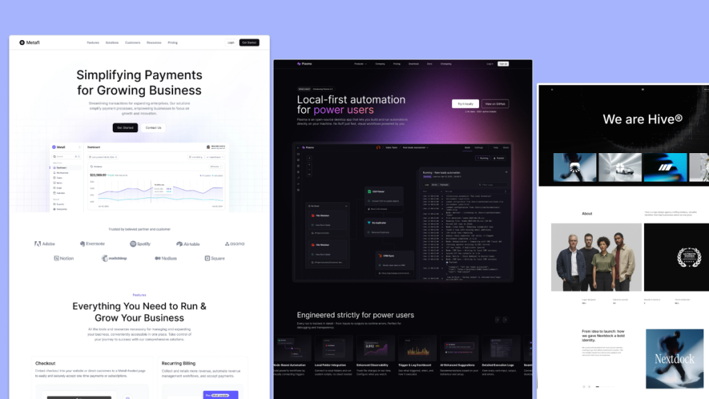
HOT12+ Shadcn Templates
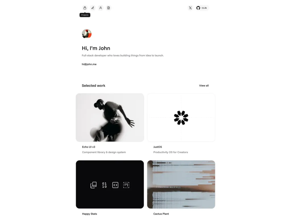
Modern personal portfolio template built with shadcn/ui.
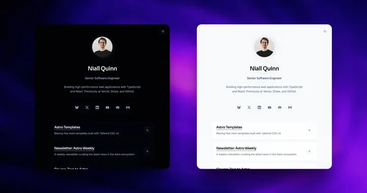
personal Link in-bio template
 HOT
HOT43 Tailwind templates and 7,500+ UI components
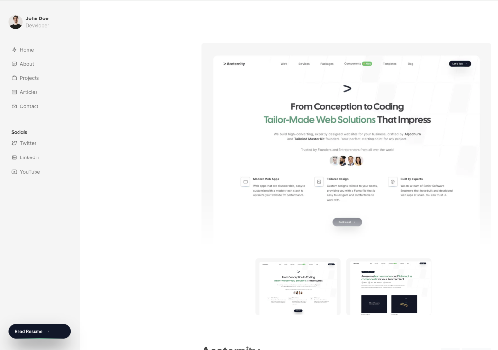
Developer portfolio with sidebar, blog, and projects
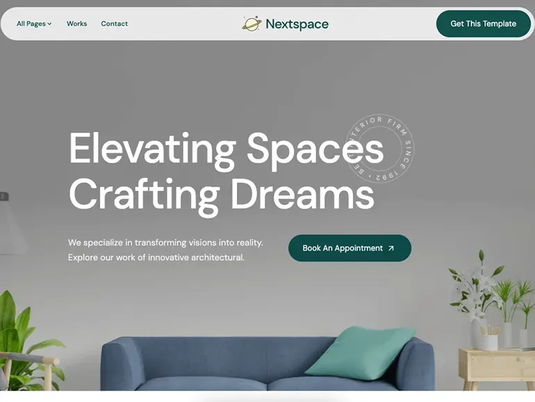
Astro theme for architecture & interior portfolios.
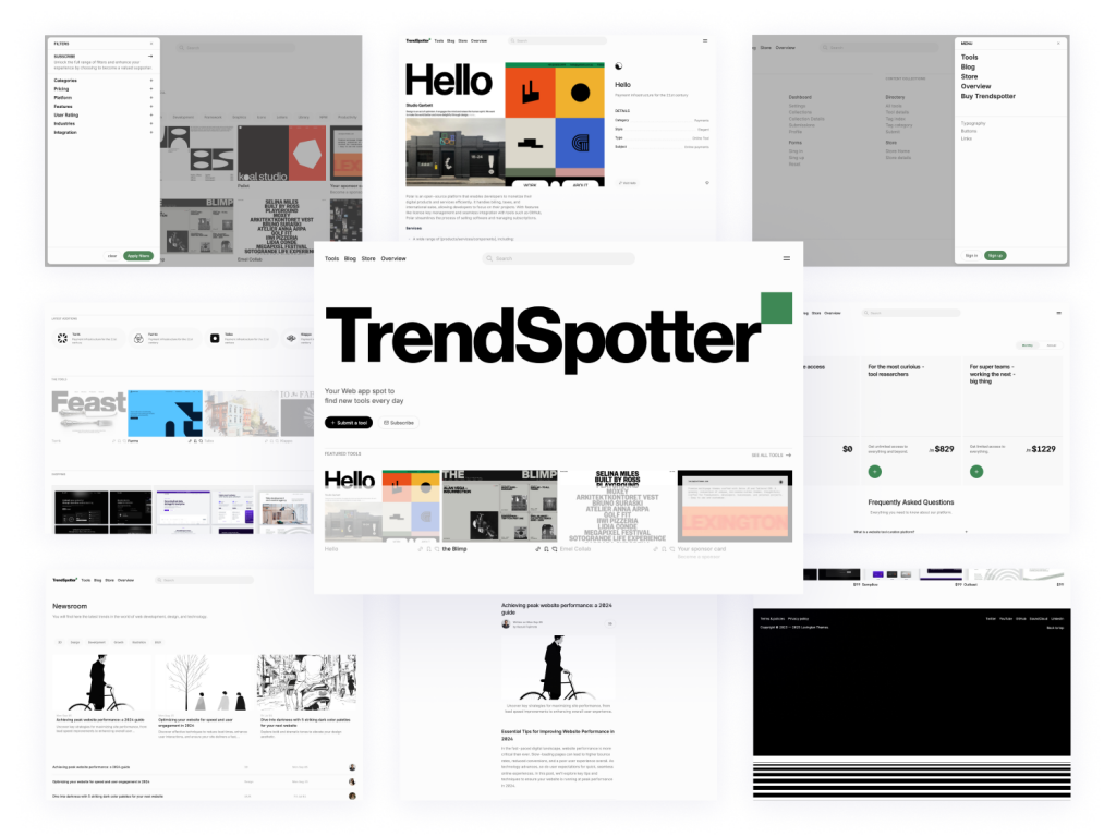
Curated directory template with 30+ pages
 HOT
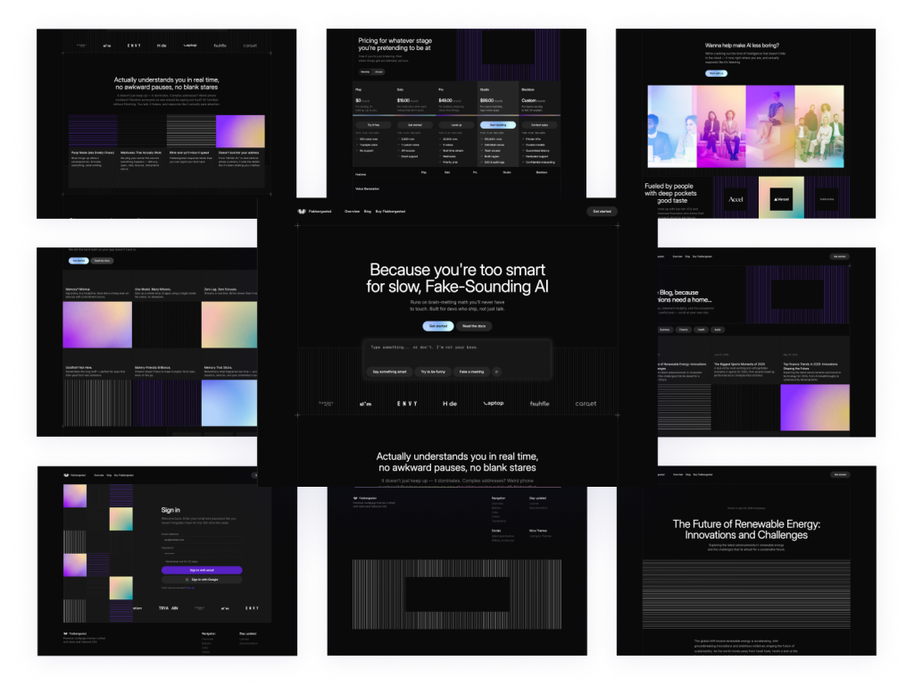
HOTDark-mode Astro SaaS theme with 40+ pages
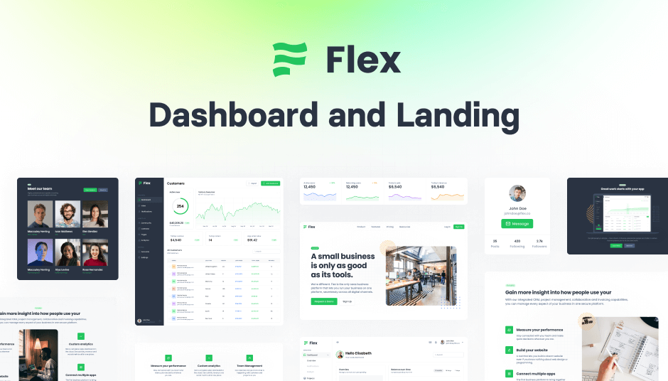
345 Tailwind CSS components ready to use
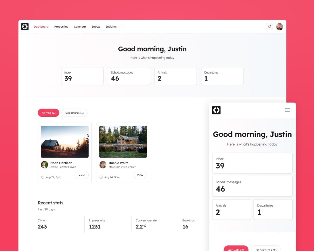
Airbnb-style website UI
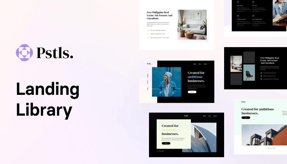
149 Tailwind components in Shuffle Editor
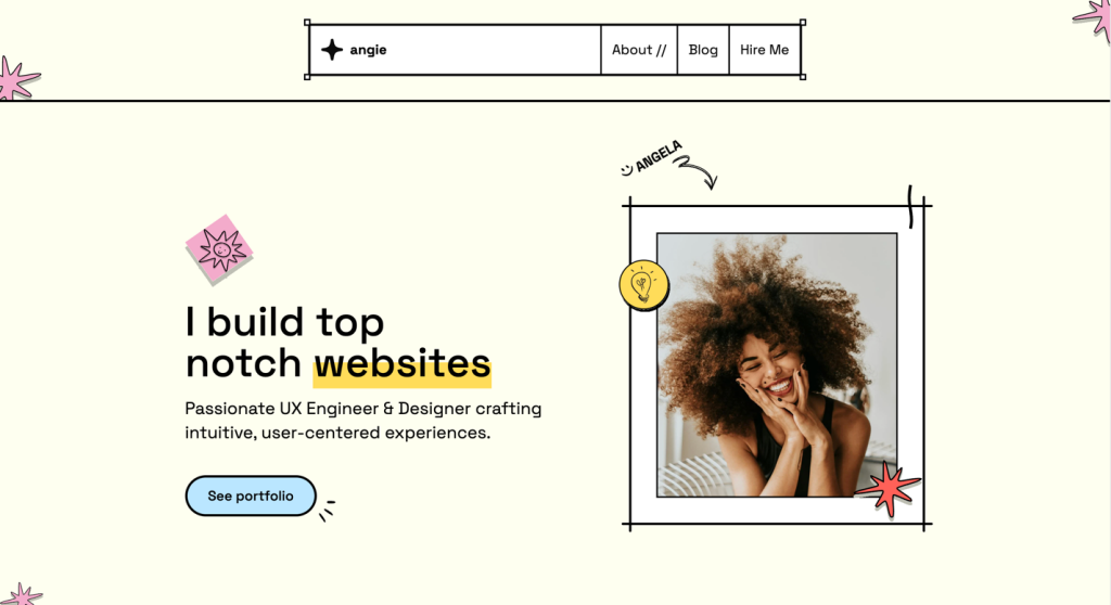
brutalist Astro template for devs & designers
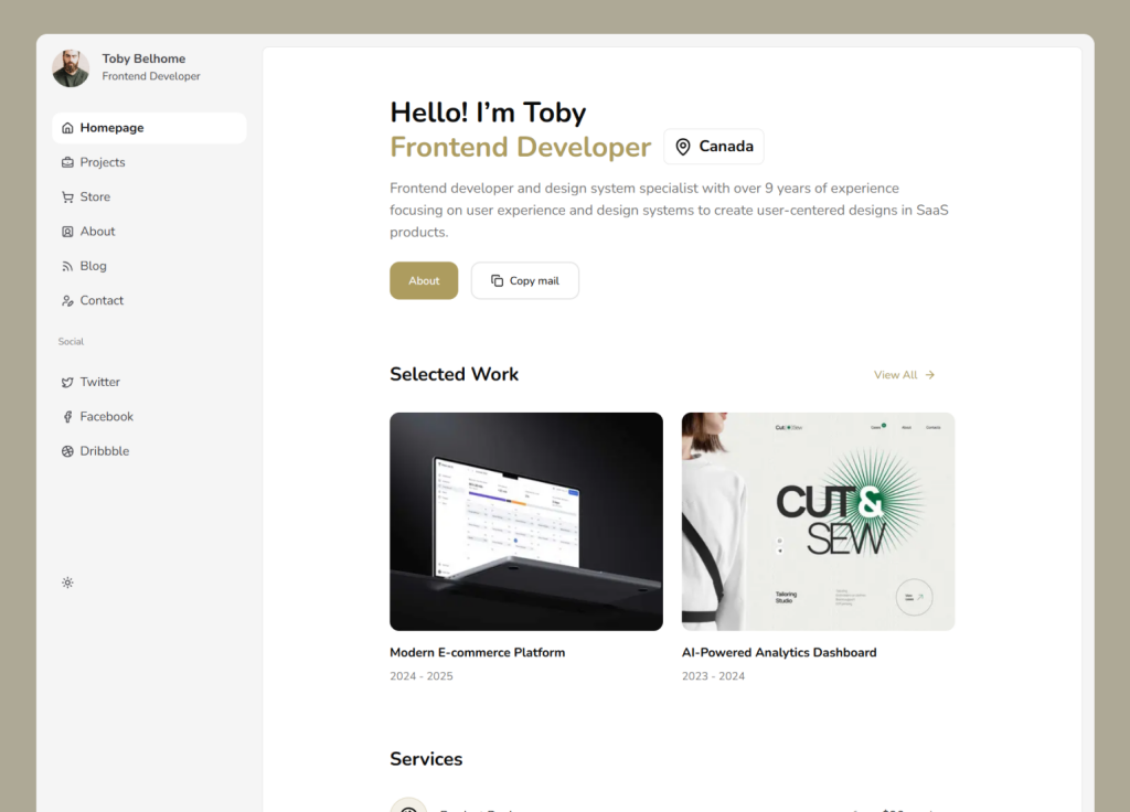
Dashboard-style shadcn/ui portfolio template
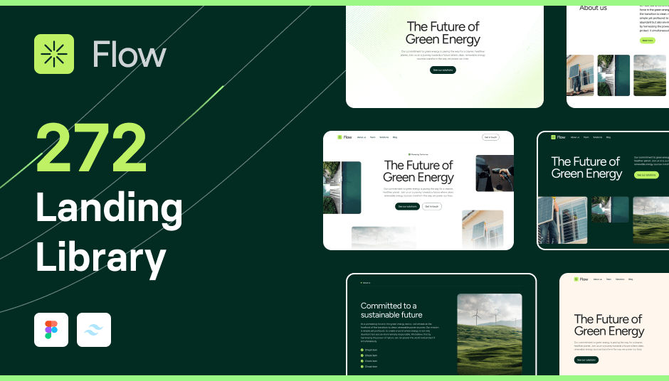
293 component SaaS template with Alpine.js support
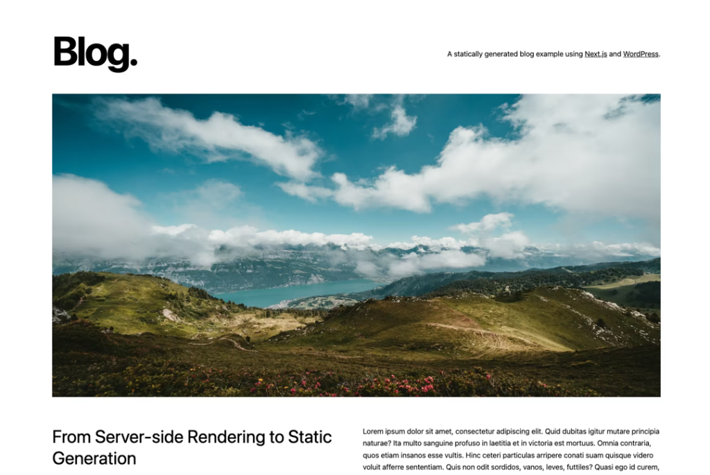
Next.js blog template with ISR
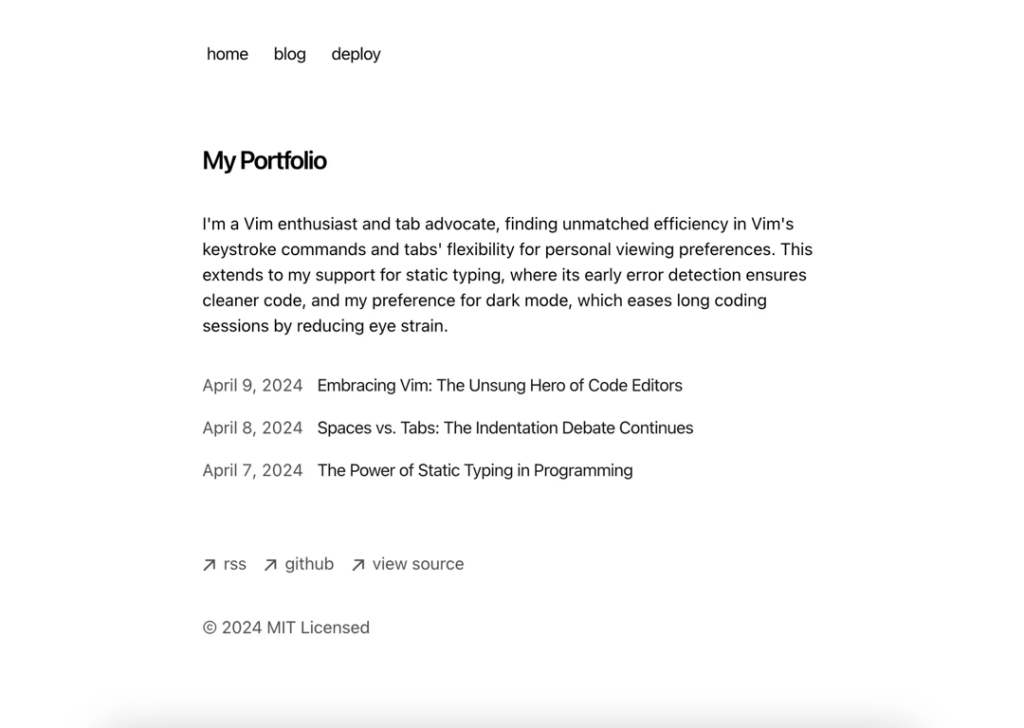
Static Next.js blog template
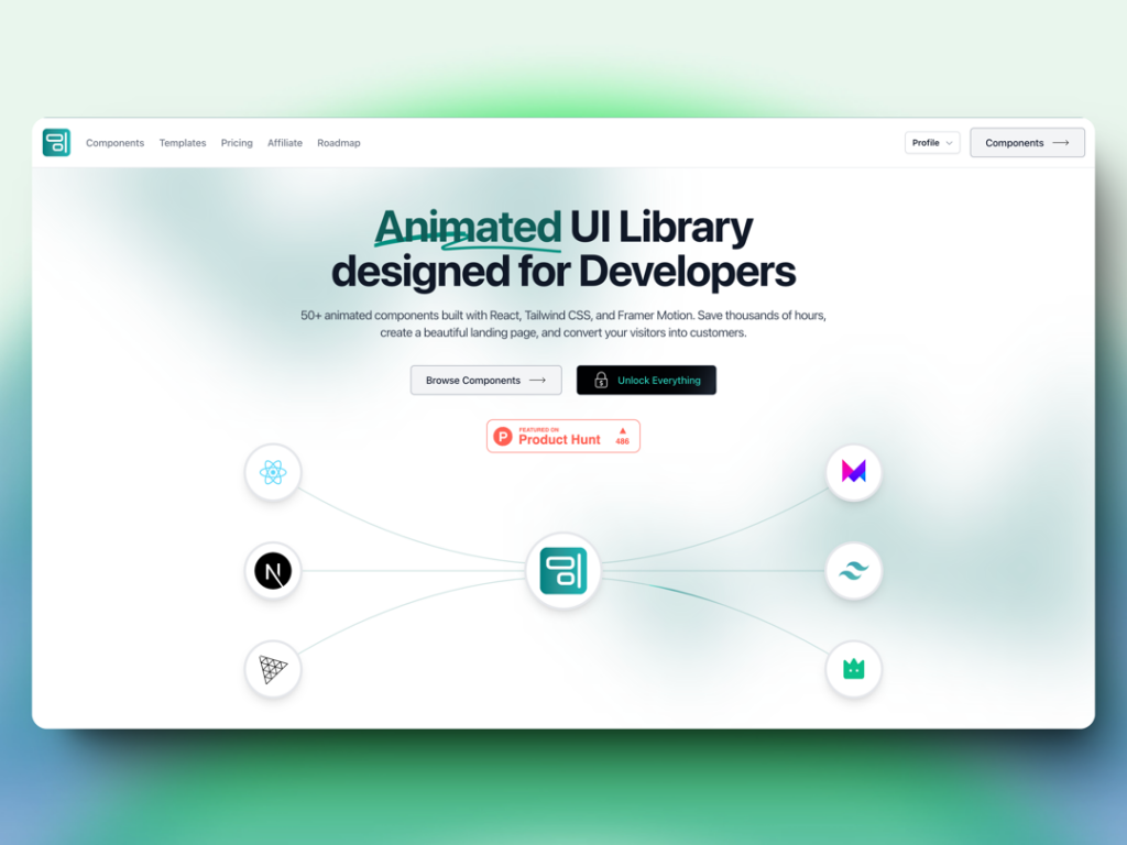
70+ animated React components & templates with Framer Motion
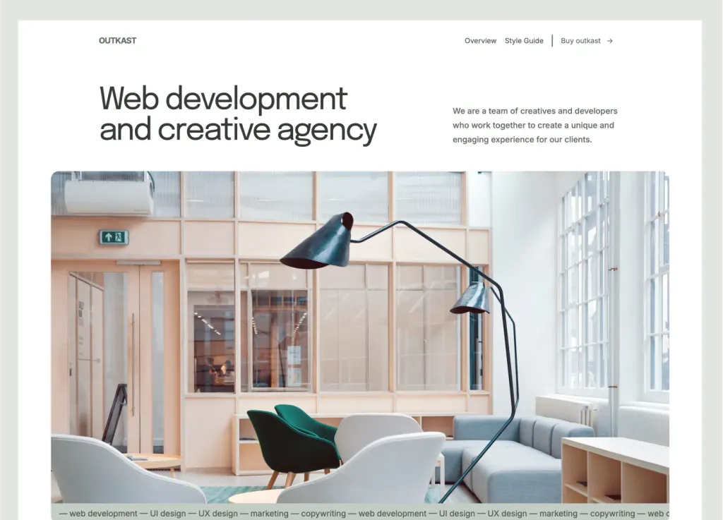
43-Page Astro template with MDX blog
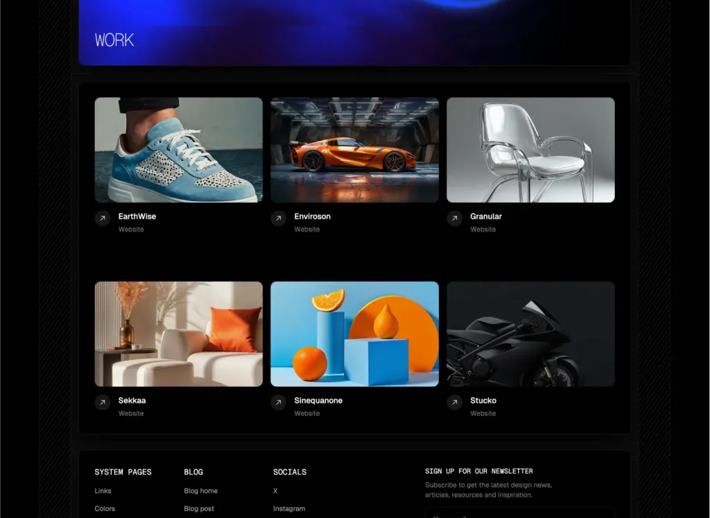
39 pages & 100+ sections for agencies
Force your AI to use a professional design system. Build brand-matched, consistent UIs with 200+ vetted components.

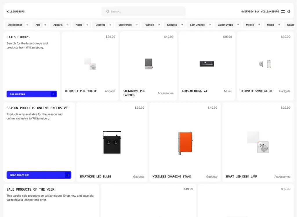
Brutalist Astro/Tailwind listing theme
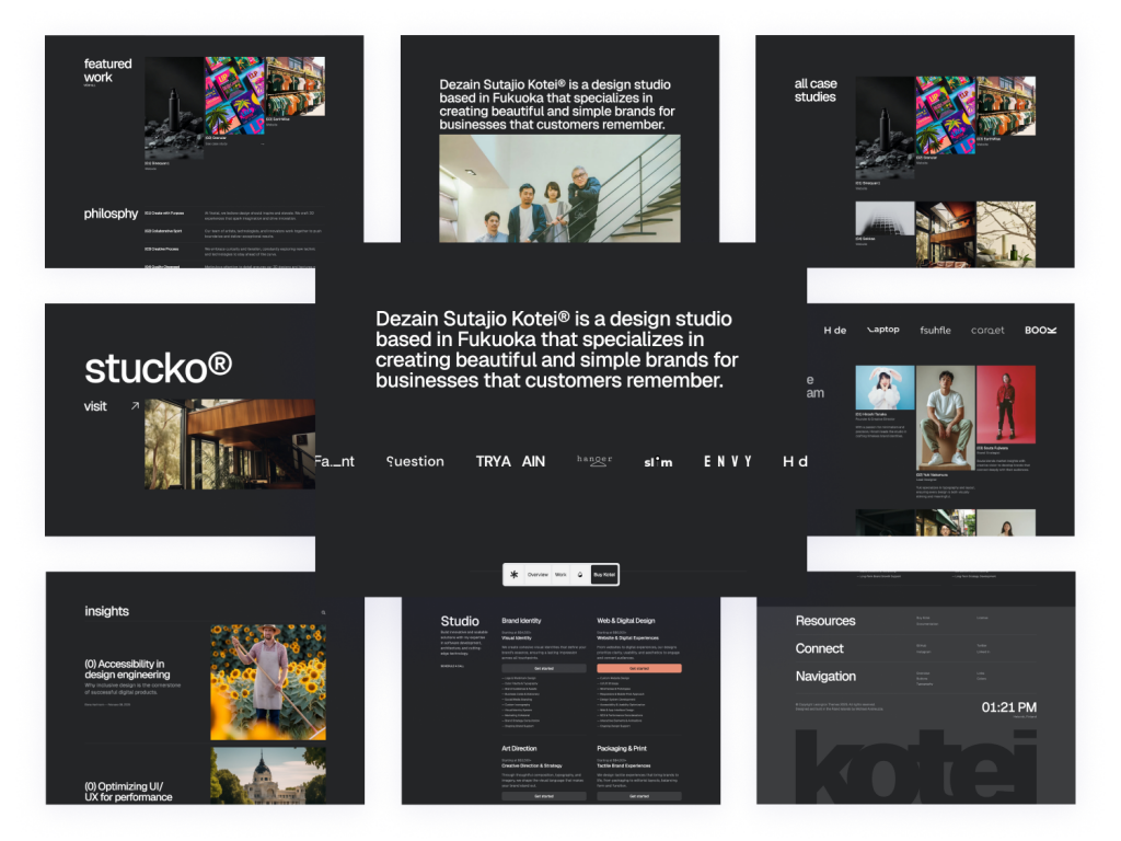
Swiss-inspired Astro theme with 100+ Tailwind components
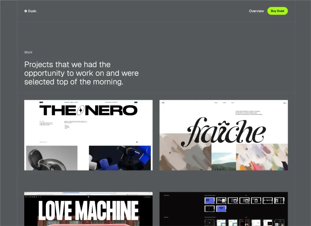
Minimal Astro & Tailwind agency theme
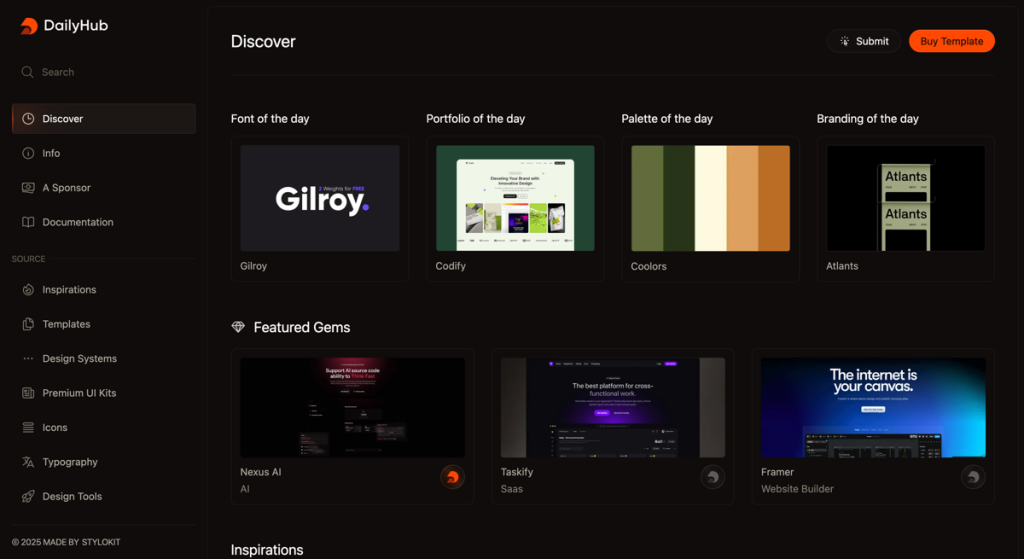
Modern directory template
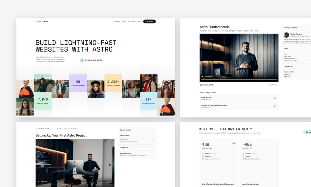
Edu‑centric Tailwind course platform, SEO‑friendly
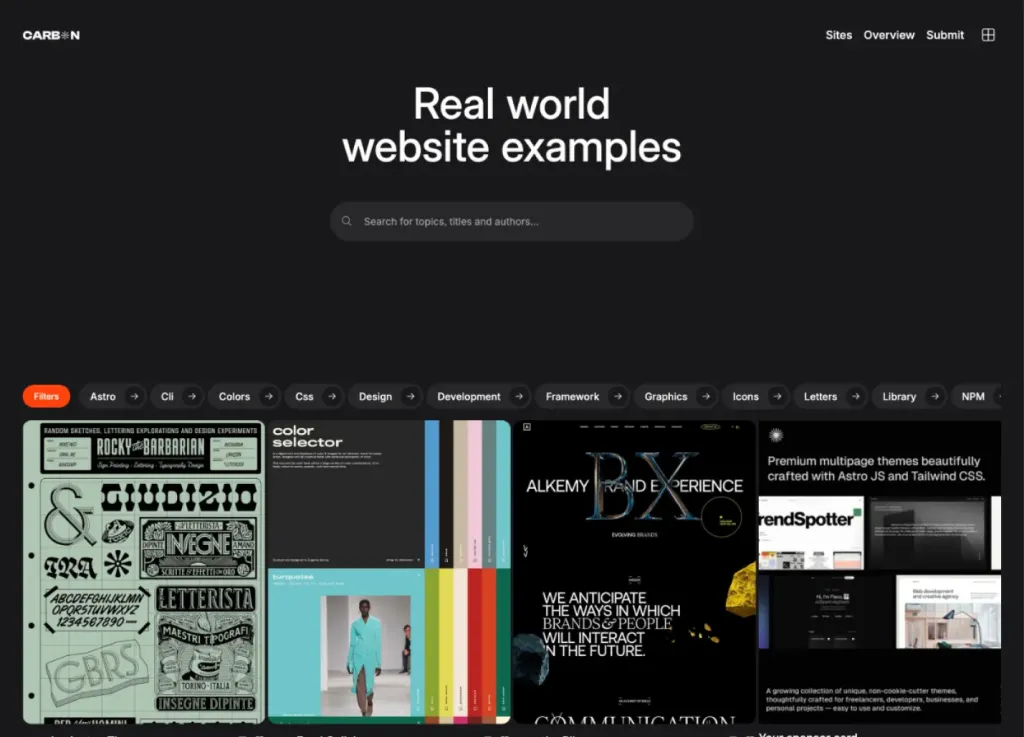
Bold dark directory theme
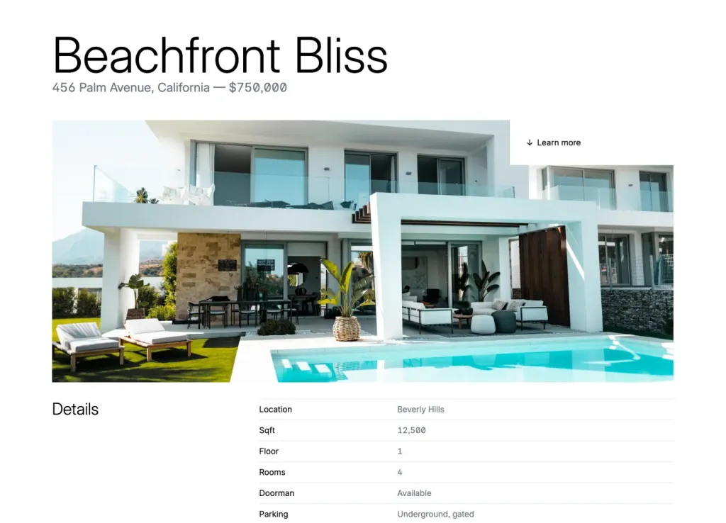
Quartiere: 48-page real estate theme
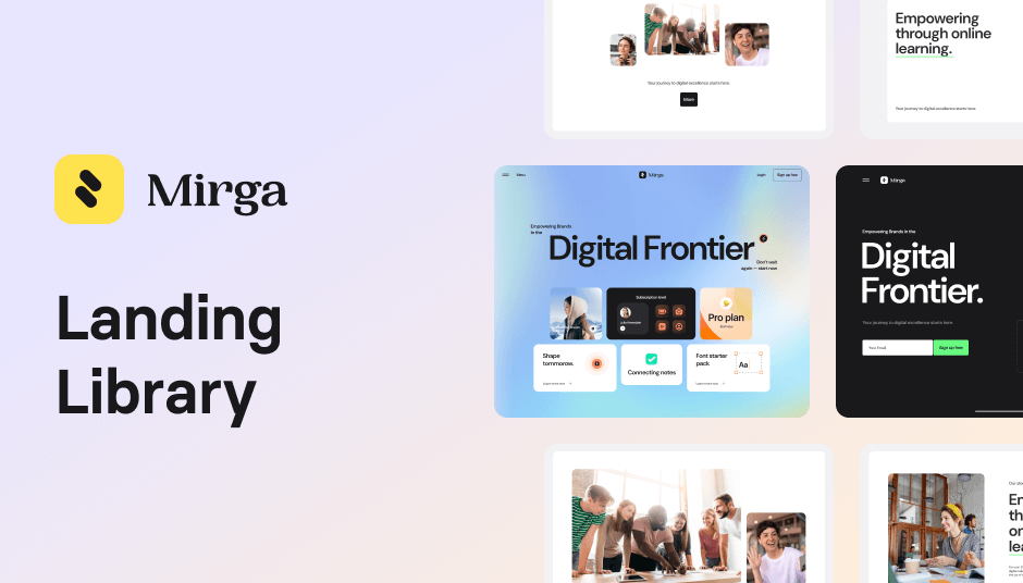
125 components for modern landing pages
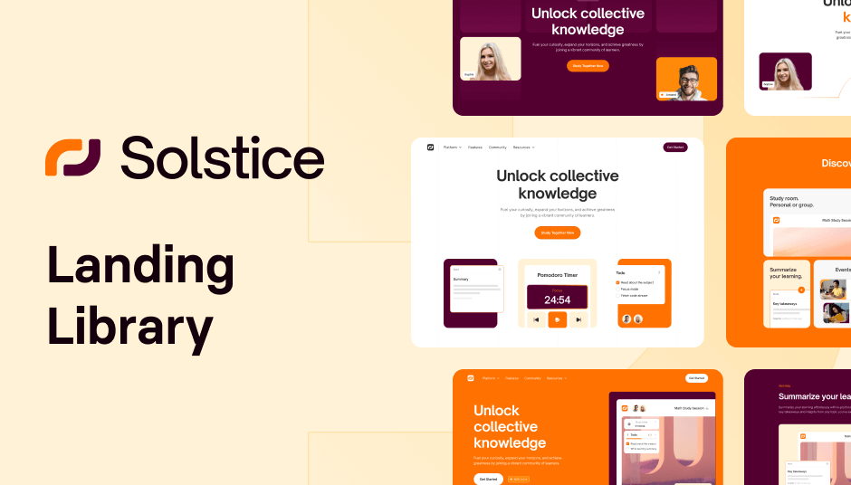
561 ready-to use UI elements
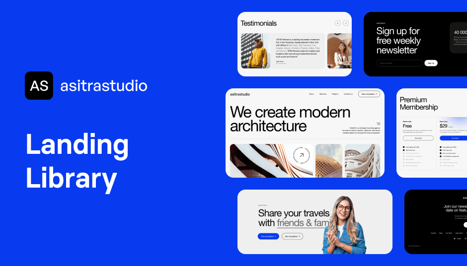
122 UI elements to power minimal websites
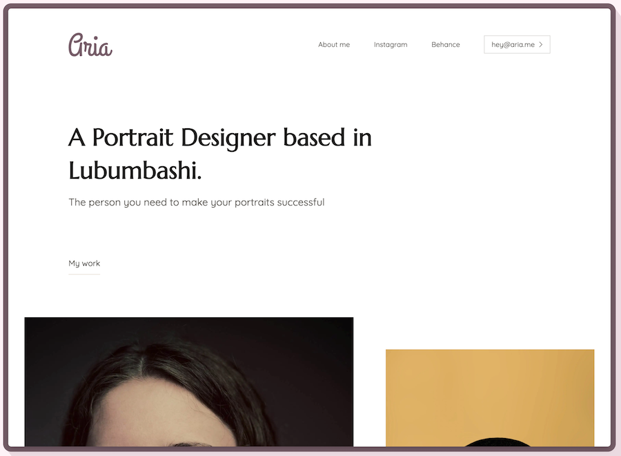
Minimalist Tailwind portfolio template
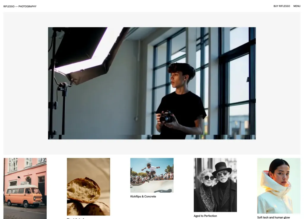
Minimalist template for agencies and portfolios
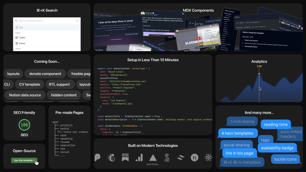
Customizable digital garden for developers
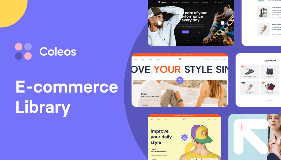
Build stores fast with 250 ready components
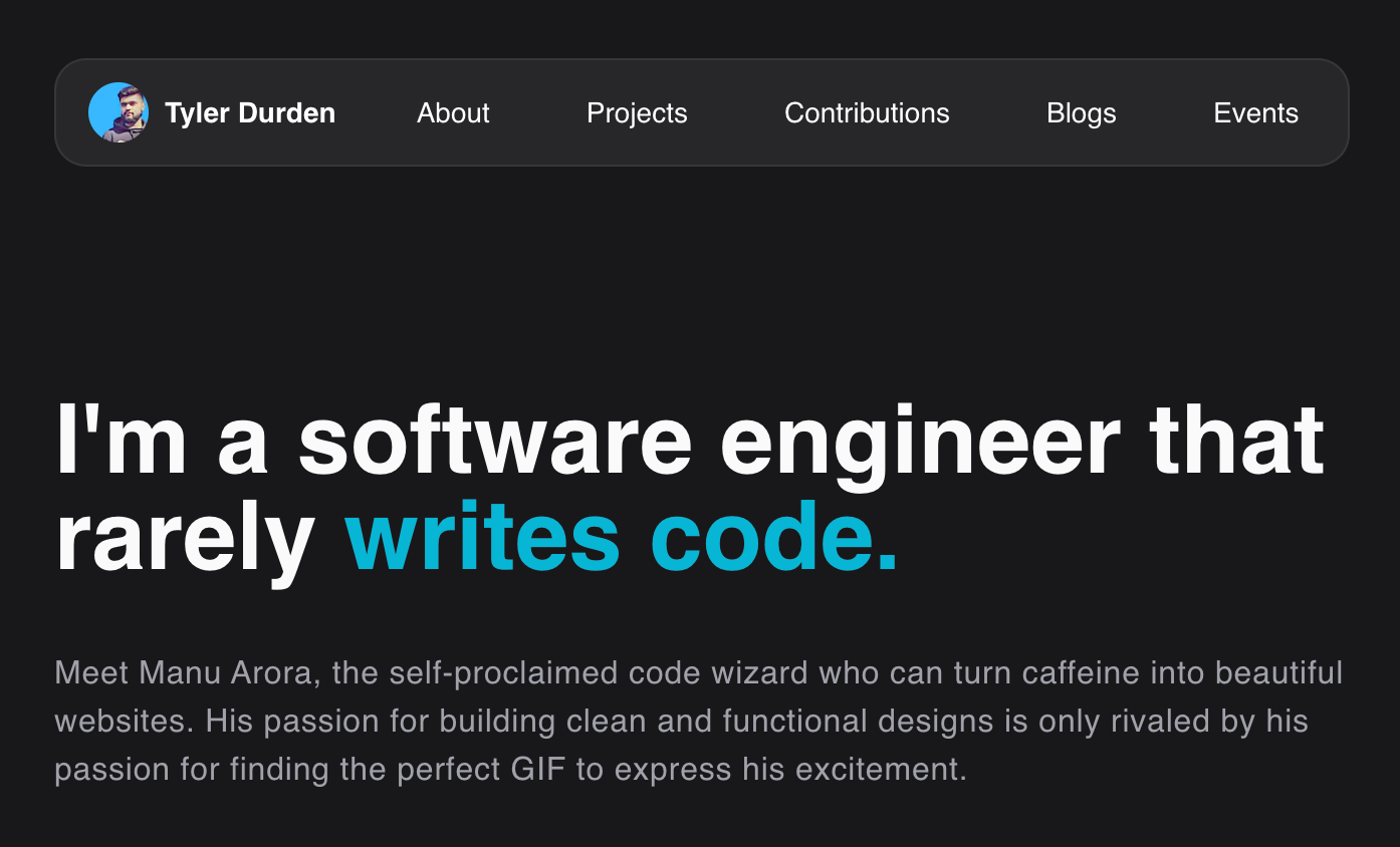
A clean portfolio website template for developers
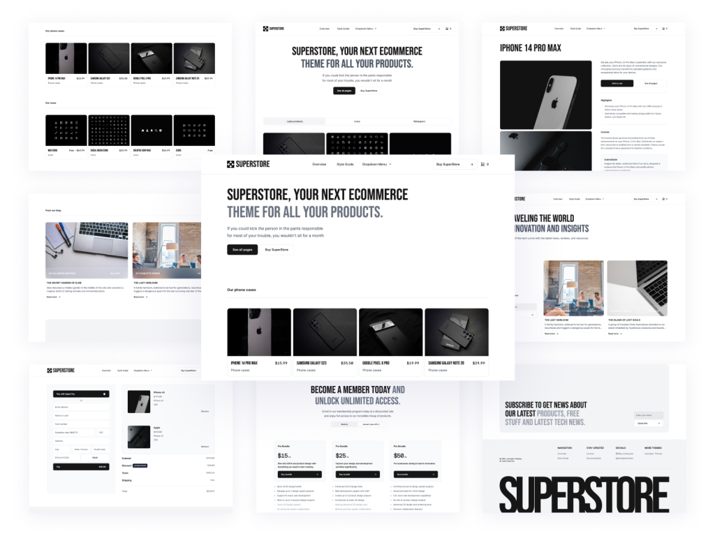
24+ page marketplace template built with AstroJS and Tailwind CSS
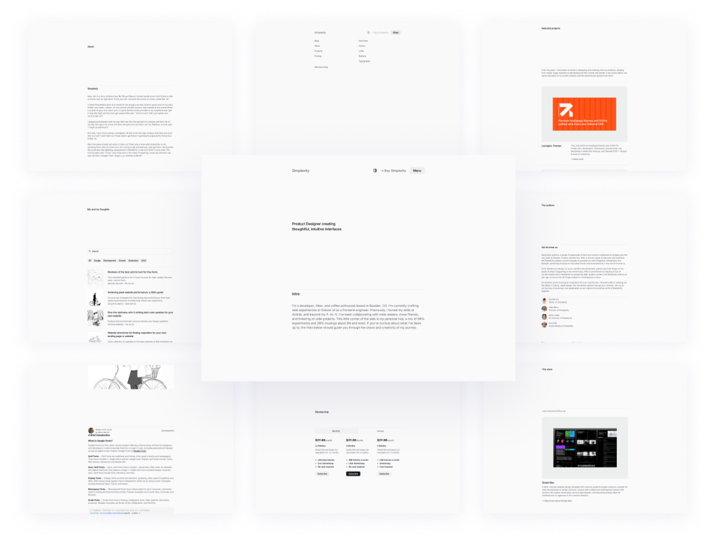
Clean, elegant blog template
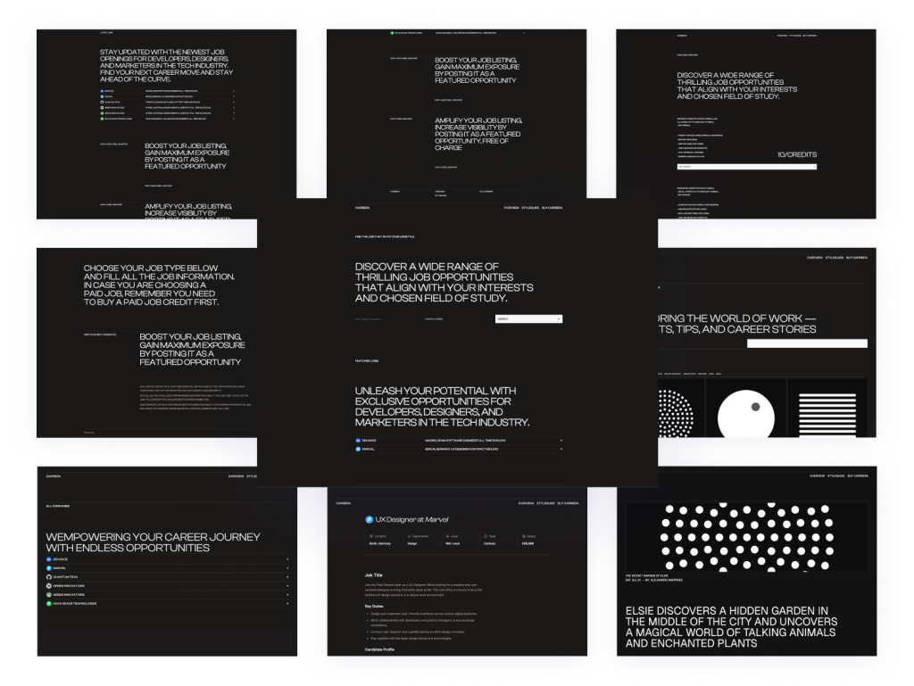
Minimal Astro & Tailwind template
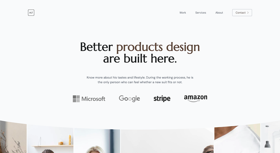
7-page minimalist agency Tailwind template
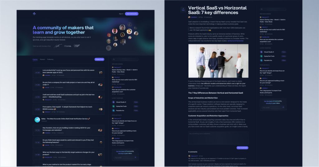
Responsive Tailwind forum template
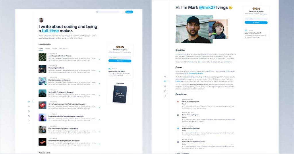
Modern Tailwind CSS blog template for developers
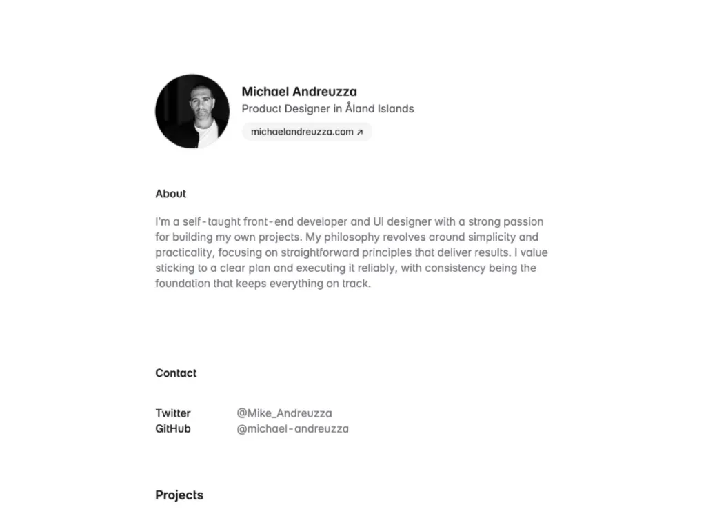
Minimalist one-page Astro landing template
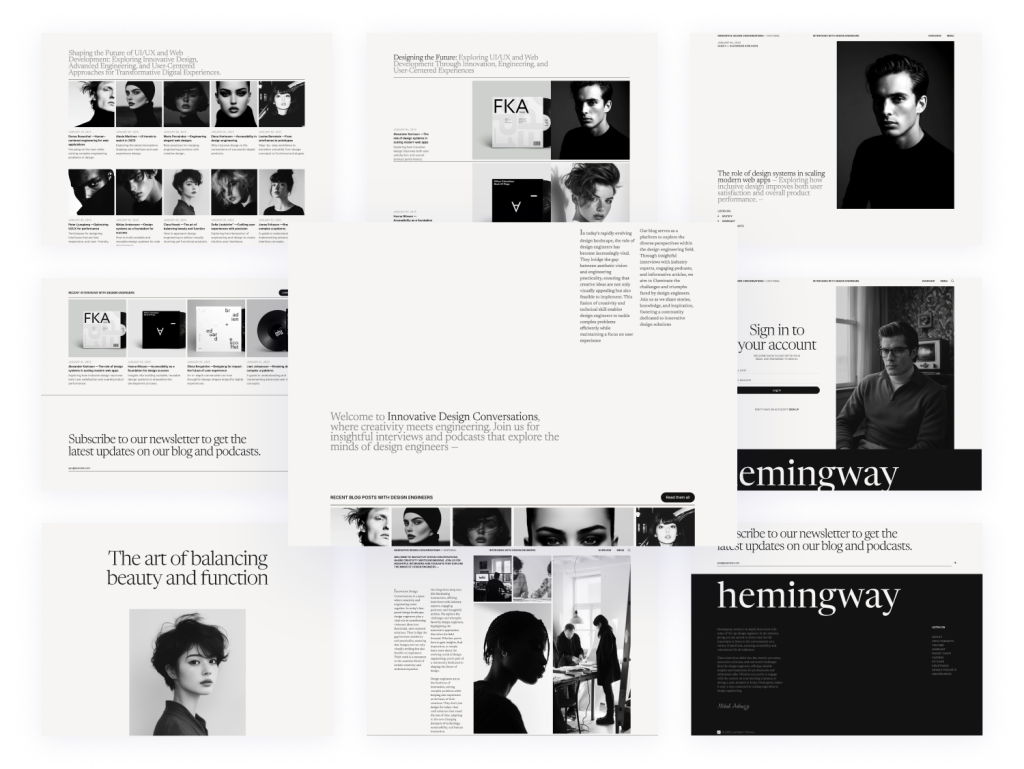
25-page Astro blog template with search
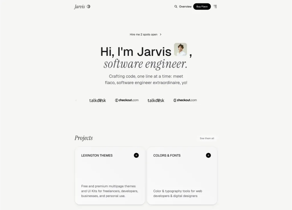
Sleek Astro & Tailwind CSS portfolio theme
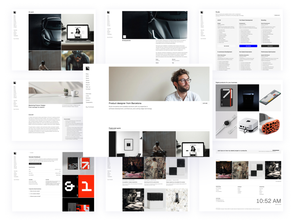
Modern, responsive Astro portfolio theme
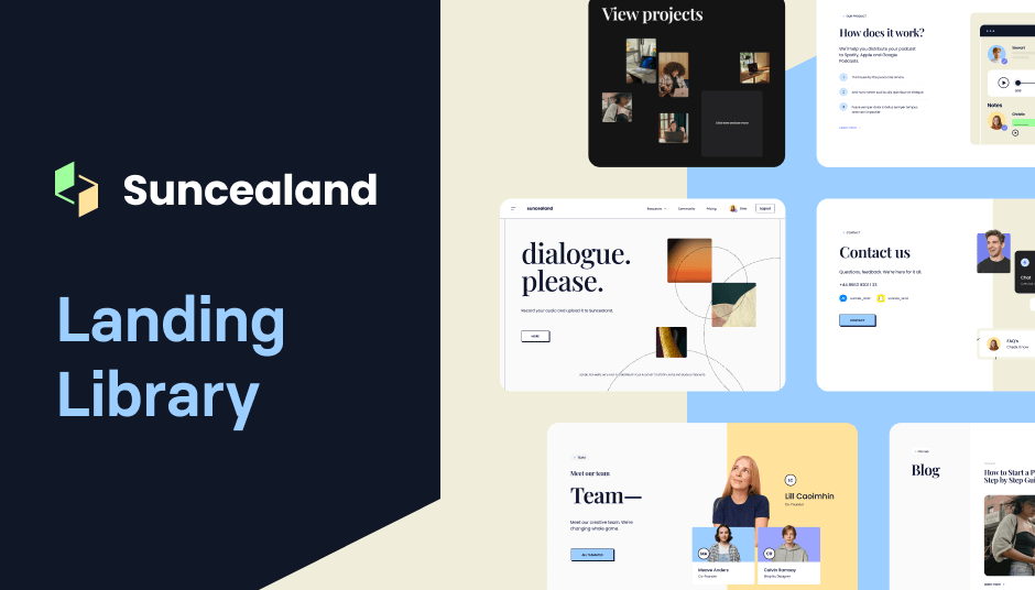
124 Tailwind components in Shuffle Editor
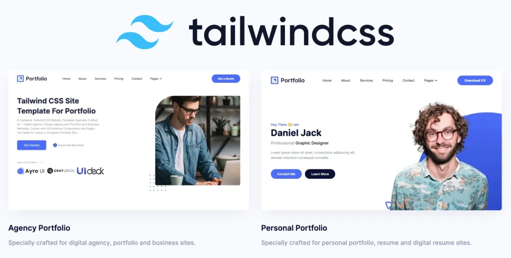
Tailwind CSS portfolio template
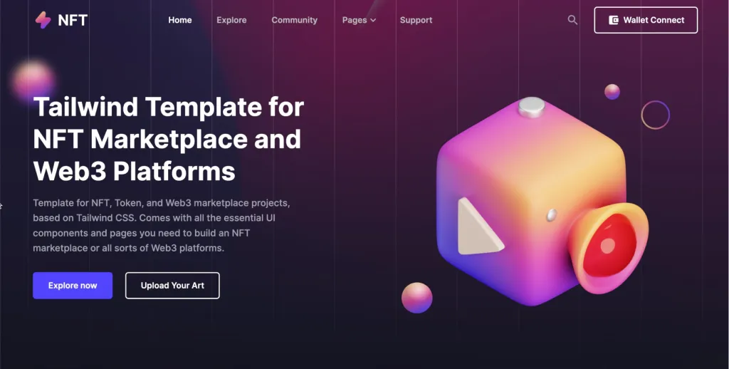
NFT marketplace template
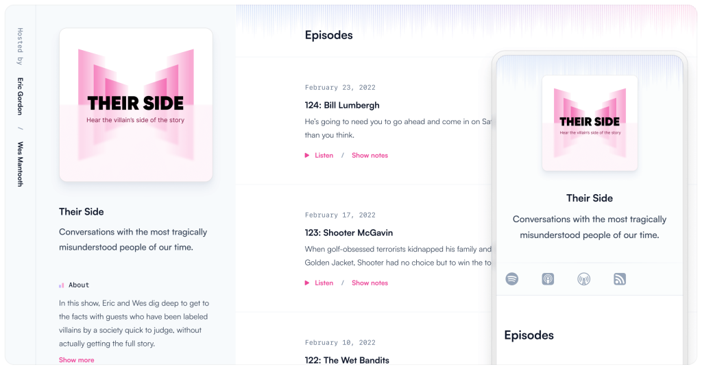
Tailwind CSS podcast website template
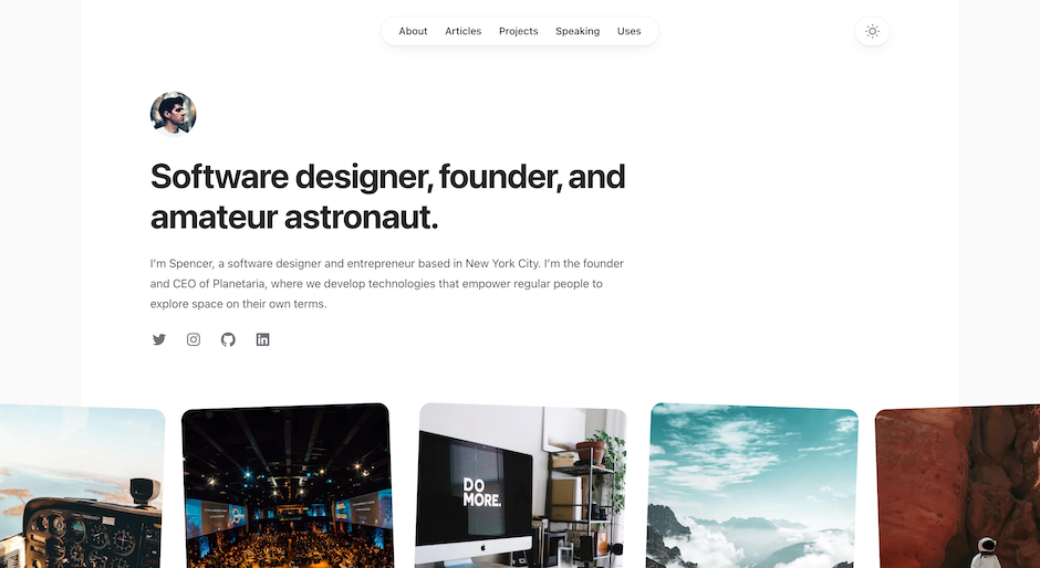
Build your personal site with Spotlight
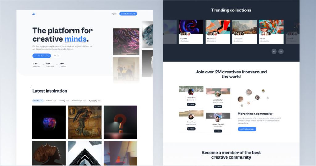
Tailwind template for creative communities
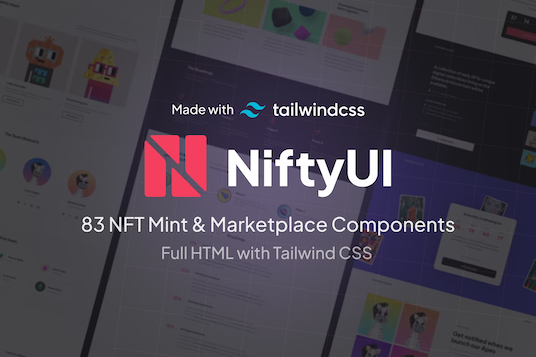
83 NFT UI components
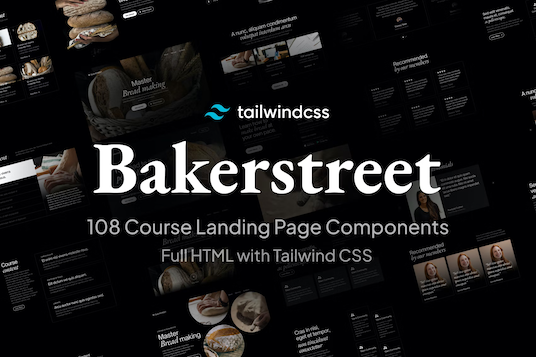
104 dark-mode components
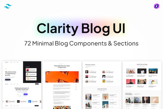
72 blog UI components for Tailwind
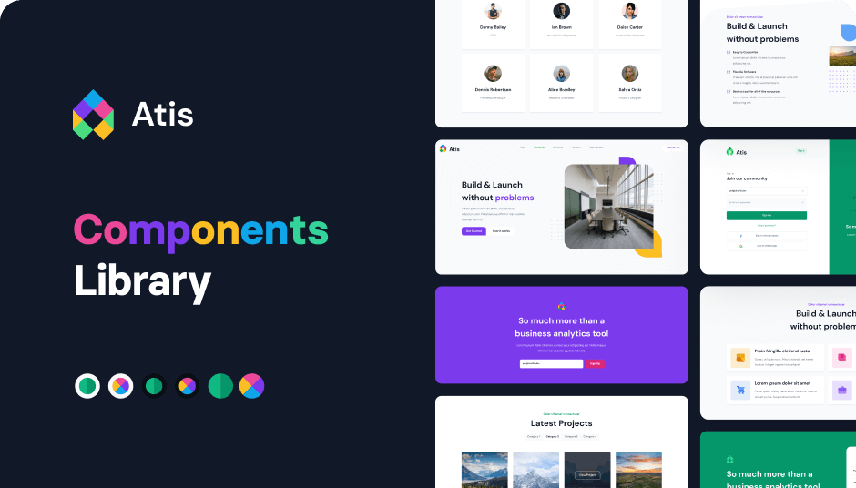
404 Tailwind components in 6 color themes in Shuffle Editor
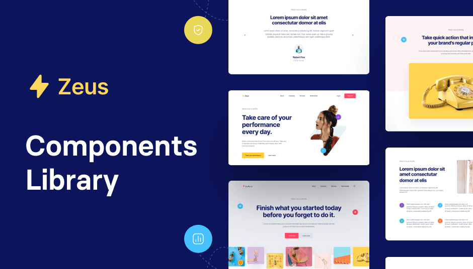
593 Tailwind components with UI editor

130 Tailwind components in Shuffle Editor
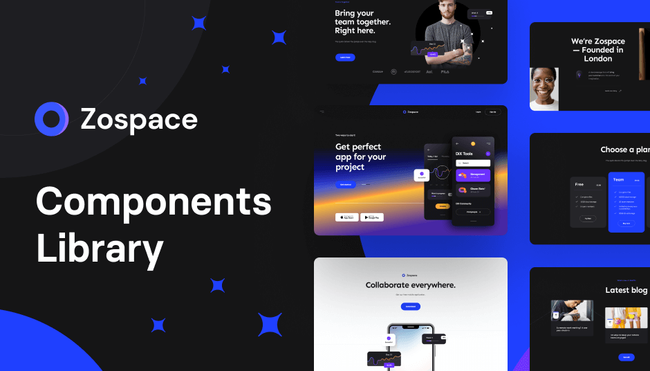
240 dark-mode Tailwind components
The best Tailwind templates & UI kits for landing pages & dashboards.
200+ ready-to-use Tailwind CSS components with MCP integration. Let AI generate complete pages from your prompts — one command, production-ready UI.
Explore Components
Tailwind CSS templates are gaining popularity for a reason. They offer a range of benefits that make them ideal for creating portfolios. Here's why you should consider using them:
Customizable: Tailwind CSS is highly flexible, allowing you to customize templates to fit your unique style.
Responsive Design: These templates ensure your portfolio looks great on all devices, from desktops to smartphones.
Time-Saving: Pre-designed templates save you hours of design and coding time.
Consistent Styling: Tailwind CSS ensures a consistent look and feel throughout your portfolio.
SEO-Friendly: Many Tailwind templates are optimized for search engines, helping you reach a wider audience.
When choosing a Tailwind CSS portfolio template, there are several key features you should keep in mind to make sure it meets your needs:
Clean and Modern Design
A clean and modern design is essential for making a strong first impression. Look for templates with minimalistic layouts and ample white space to let your work shine.
Easy Customization
The ability to easily customize your template is crucial. Whether you want to change colors, fonts, or layout elements, the template should allow for easy modifications without requiring extensive coding knowledge.
Responsive Layout
In today's mobile-first world, a responsive layout is non-negotiable. Ensure the template you choose looks great on all devices, from large desktop monitors to small smartphone screens.
Fast Loading Speed
Loading speed can make or break your portfolio's user experience. Opt for templates that are lightweight and optimized for fast loading times.
SEO Optimization
Good SEO practices are essential for getting your portfolio noticed. Look for templates that are built with SEO in mind, featuring clean code and proper meta tags.
Selecting the perfect Tailwind CSS portfolio template can be overwhelming, given the plethora of options available. Here are some tips to help you make the right choice:
Before diving into the selection process, clearly define what you want to achieve with your portfolio. Are you looking to attract clients, showcase your projects, or land a job? Your goals will guide your template choice.
Think about who will be viewing your portfolio. Are they potential clients, employers, or collaborators? Choose a template that will appeal to your target audience and highlight the aspects of your work that are most relevant to them.
Make a list of must-have features for your portfolio. This could include a blog section, contact form, or social media integration. Ensure the template you choose offers these features or can be easily customized to include them.
Most Tailwind CSS templates come with a live demo. Spend some time exploring the demo to get a feel for the template's layout, design, and functionality. This will help you determine if it's a good fit for your needs.
User reviews and ratings can provide valuable insights into the template's quality and performance. Look for templates with positive feedback and high ratings from other users.
Tailkits offers a diverse range of portfolio templates, catering to different needs and preferences. Here are some popular categories to explore:
Perfect for freelancers and individual creatives, personal portfolio templates focus on showcasing your skills, experience, and projects. They often include sections for an about me page, portfolio gallery, and contact information.
Agency portfolio templates are designed for creative agencies and studios. They typically feature a sleek, professional design with sections for team members, services, case studies, and client testimonials.
Developer portfolio templates cater to software developers and engineers. They highlight your technical skills, projects, and coding experience, often including sections for a resume and blog.
Designer portfolio templates are tailored for graphic designers, UI/UX designers, and visual artists. They emphasize your creative work, with visually appealing layouts and sections for project galleries, client testimonials, and contact forms.
Customizing your Tailwind CSS portfolio template is key to making it uniquely yours. Here are some tips to help you get started:
A unique color scheme can make your portfolio stand out. Tailwind CSS makes it easy to customize colors. Choose a palette that reflects your personality or brand identity. Use Tailwind's utility classes to apply your chosen colors consistently across your portfolio.
Typography plays a significant role in your portfolio’s aesthetics. Experiment with different fonts to find one that complements your design style. Tailwind CSS supports custom fonts, so you can easily integrate Google Fonts or any other web fonts into your template.
High-quality images can elevate the look of your portfolio. Use professional photos of your projects and consider adding subtle animations or hover effects to make your portfolio more interactive. Tailwind CSS provides utilities for adding transitions and animations without much effort.
A fast-loading portfolio is crucial for retaining visitors. Optimize your images, use lazy loading, and minimize the use of heavy scripts. Tailwind CSS is designed to be lightweight, but you can further optimize your template by removing unused CSS classes.
Make it easy for visitors to connect with you on social media. Add social media icons and links to your profiles. Tailwind CSS includes utility classes for creating stylish social media buttons.
Good SEO can help your portfolio rank higher in search engine results. Use proper heading tags, meta descriptions, and alt attributes for images. Tailwind CSS templates often come with built-in SEO features, but it's worth double-checking and optimizing further.
Creating a portfolio that truly represents your skills and creativity is essential in today's competitive market. Tailwind CSS portfolio templates from Tailkits provide a robust and flexible foundation to build your online presence
You can find answers for commonly asked questions about templates.
A Tailwind CSS portfolio template is a pre-designed webpage layout built using Tailwind CSS, specifically designed to showcase personal or professional projects, skills, and experiences.
Tailwind CSS offers utility-first classes that make customization straightforward. You can easily change colors, fonts, layouts, and other design elements by modifying the Tailwind configuration file or using utility classes directly in your HTML.
Tailkits offers both free and premium Tailwind CSS portfolio templates. You can choose from a variety of free templates to get started or opt for premium ones for more advanced features and designs.
With Tailwind CSS templates, you can create various types of portfolios, including personal portfolios, agency portfolios, developer portfolios, and designer portfolios. Each template category is tailored to highlight different aspects of your work and skills.
While some basic knowledge of HTML and CSS is helpful, Tailwind CSS templates are designed to be user-friendly. You can customize many aspects of the template using Tailwind's utility classes without extensive coding knowledge.