HOT
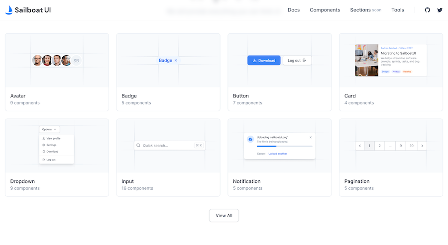
HOTTailkits UI
NEWConsistent UI, zero hallucinations
Explore 90+ Tailwind HTML component libraries. Copy-paste ready snippets for vanilla HTML - no framework required. Compare free options from Flowbite, Preline & more.
HOTConsistent UI, zero hallucinations
 HOT
HOT12+ Shadcn Templates

shadcn/ui without React

Preline: 740+ Tailwind pages & components

Open source Tailwind CSS & Alpine.js components

500+ Tailwind Plus UI components
225+ responsive Tailwind CSS components

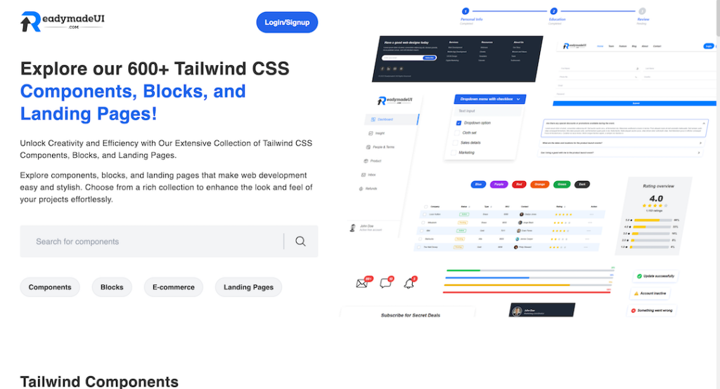
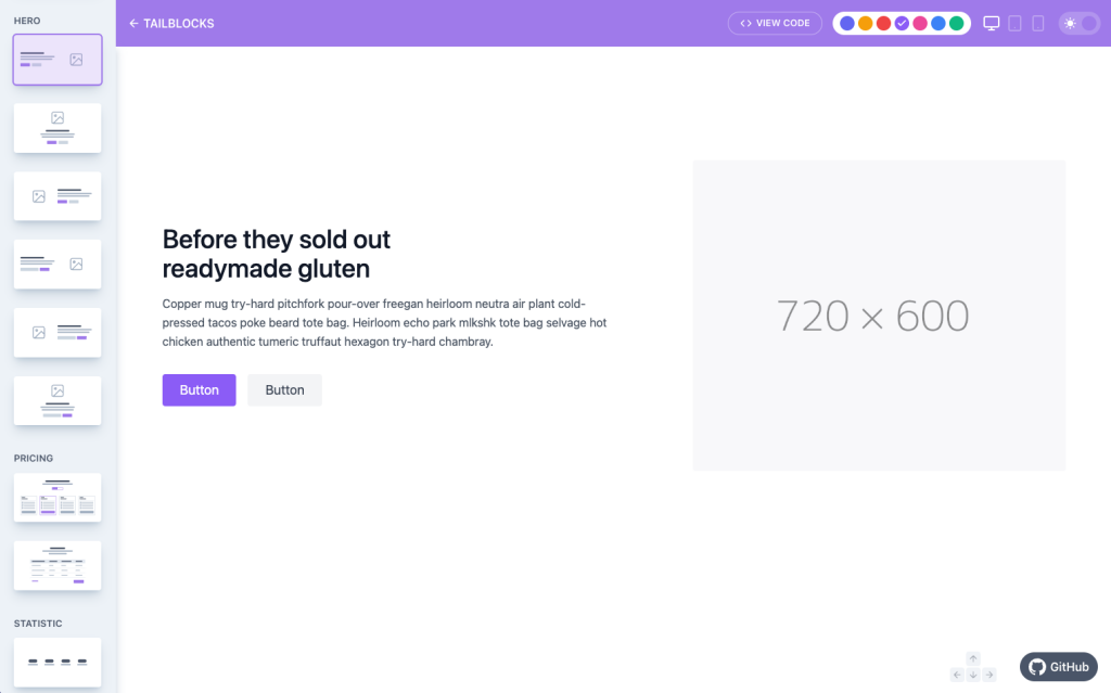
600+ ready-made Tailwind CSS components
TailwindCSS and shadcn/ui UI kit
300+ drop-in Tailwind UI blocks for rapid design
Framer Motion components from ibelick

400+ UI Components for Tailwind CSS
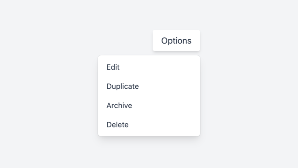
Tailwind dropdown component with Alpine.js
50+ UI Components for Tailwind CSS
Responsive Tailwind grid components in HTML

Tailwind contact form component & sections
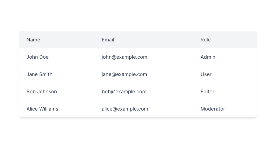
Responsive and minimal table component built with Tailwind CSS.
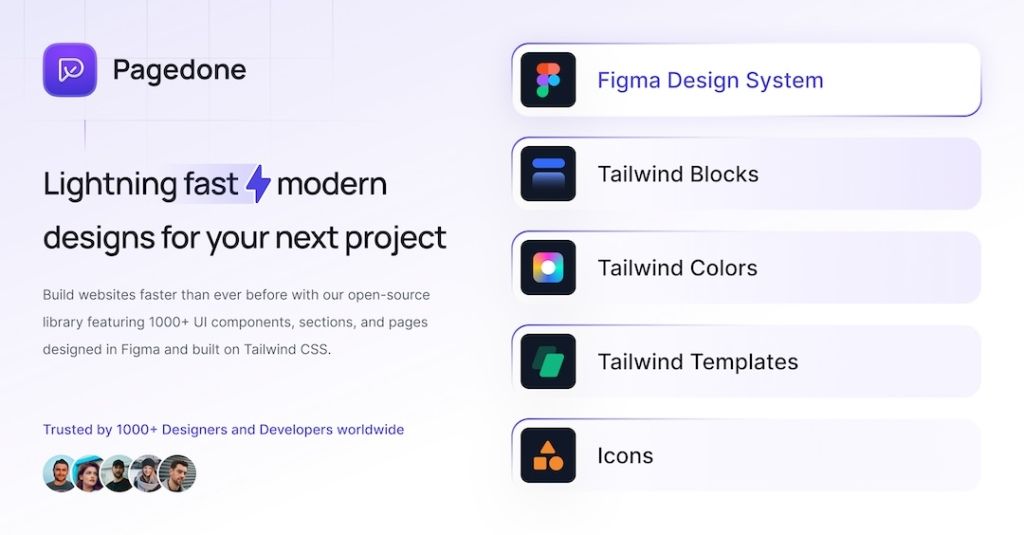
500+ Tailwind components with Figma file
Tailwind roadmap, timeline component
Tailwind logo cloud components
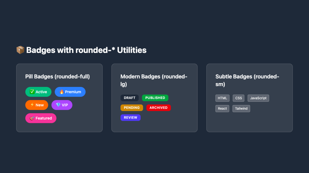
Responsive, rounded badge components
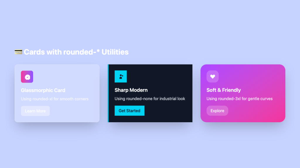
Sleek glass card UI in pure Tailwind

Tailwind integrations components
Tailwind filter components
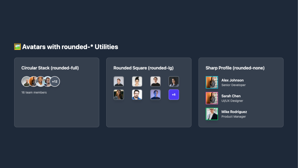
Overlapping circular avatars in a neat stack

Tailwind 404, error page components
Force your AI to use a professional design system. Build brand-matched, consistent UIs with 200+ vetted components.
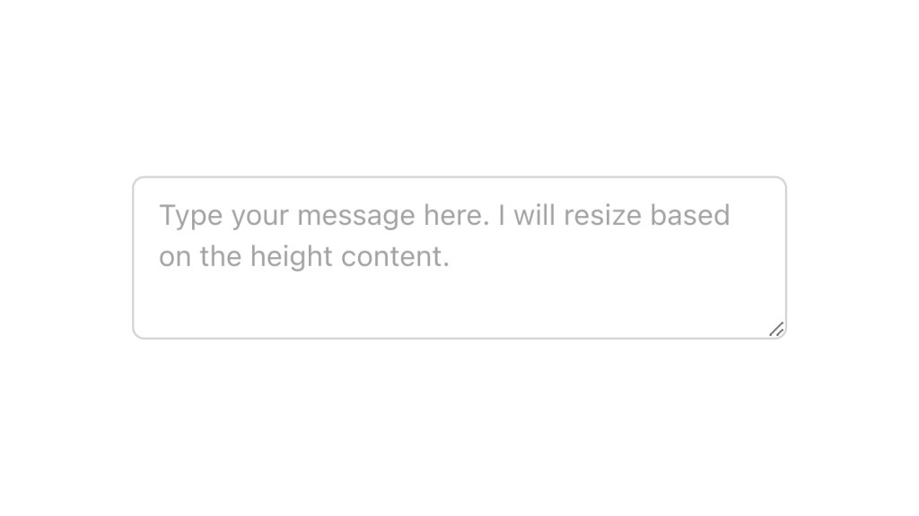
Alpine.js and Tailwind text area component by Pines UI Library.
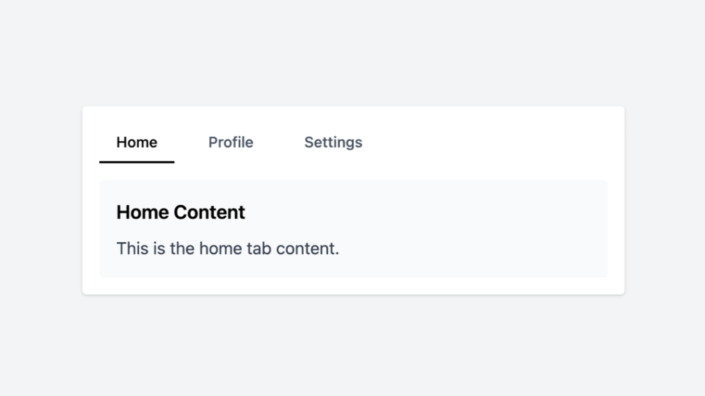
Tailwind tabs component with Alpine.js
450+ UI components for Tailwind CSS
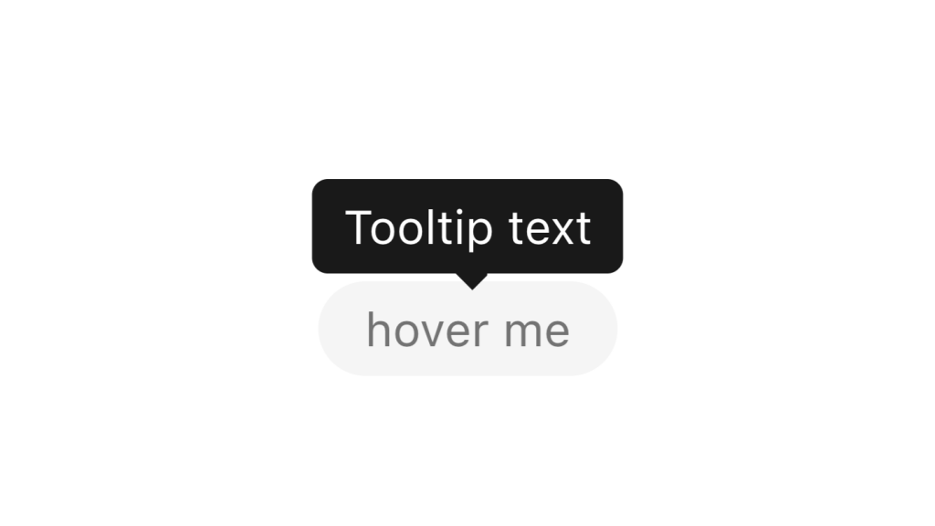
Alpine.js and Tailwind tooltip component by Pines UI Library.
Alpine.js and Tailwind popover component by Pines UI Library.

Alpine.js and Tailwind toggle component by Pines UI Library.
Alpine.js and Tailwind image gallery component by Pines UI Library.
Alpine.js and Tailwind progress component by Pines UI Library.
Alpine.js and Tailwind radio group component by Pines UI Library.

Alpine.js and Tailwind video component by Pines UI Library.

Alpine.js and Tailwind image gallery component by Pines UI Library.
A clean sidebar that has hover states for navigation items
Alpine.js and Tailwind menu component by Pines UI Library.
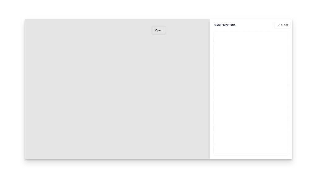
Alpine.js and Tailwind slide-over component by Pines UI Library.
Alpine.js and Tailwind animated text component by Pines UI Library.
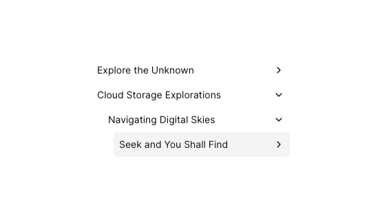
Tailwind tree view menu component

Alpine.js and Tailwind toast notification component by Pines UI Library.

Alpine.js and Tailwind hover card component by Pines UI Library.

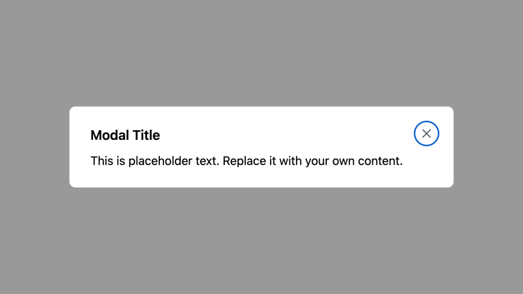
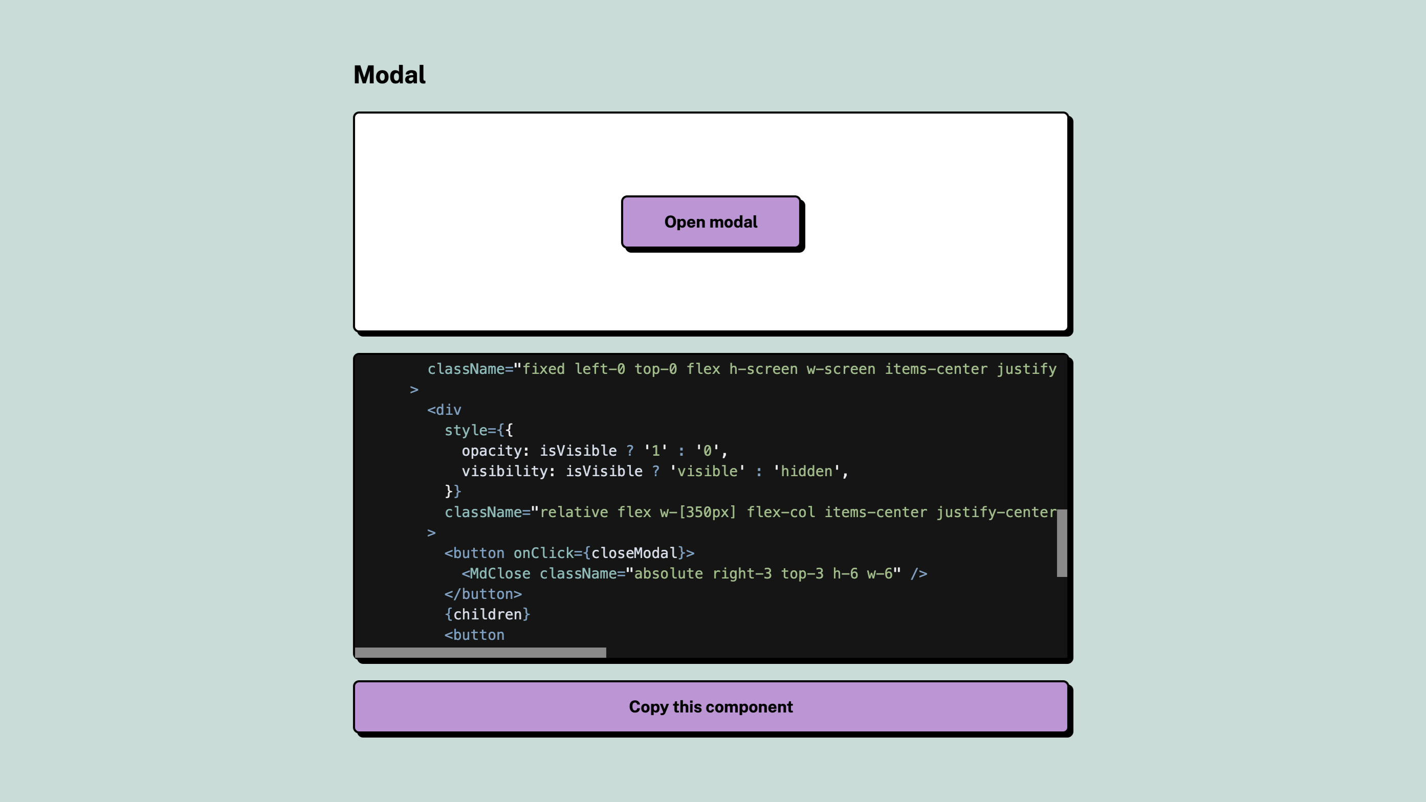
Alpine.js and Tailwind modal component by Pines UI Library.
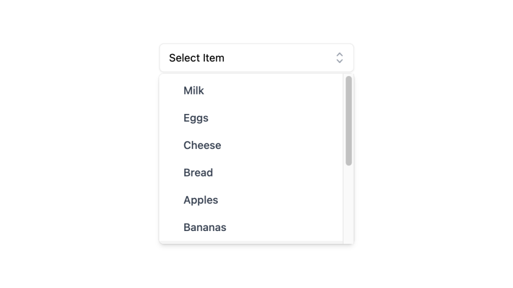
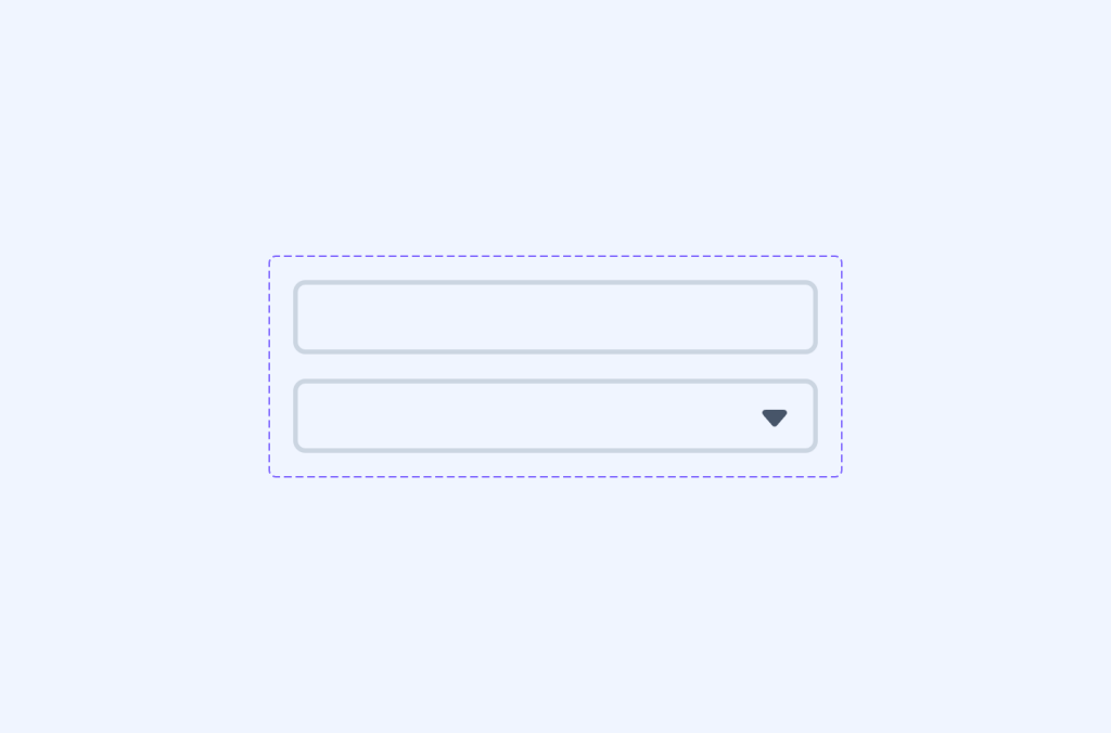
Alpine.js and Tailwind select dropdown menu component by Pines UI Library.
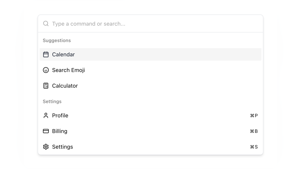
Alpine.js and Tailwind command palette component by Pines UI Library.
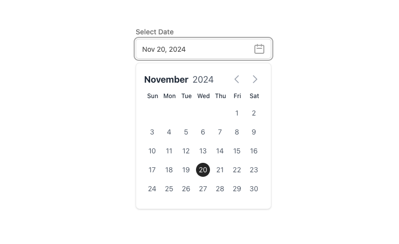
Alpine.js and Tailwind date picker component by Pines UI Library.
52 Free to use Tailwind buttons
300+ copy-paste Tailwind CSS UI components
600+ Tailwind CSS Components and blocks
500+ customizable Tailwind components for React
Alpine.js Tailwind banner component to add a sticky CTA on landing pages.
Tailwind accordion component with Alpine.js

0 javascript infinite carousel-slider component with logo cloud example
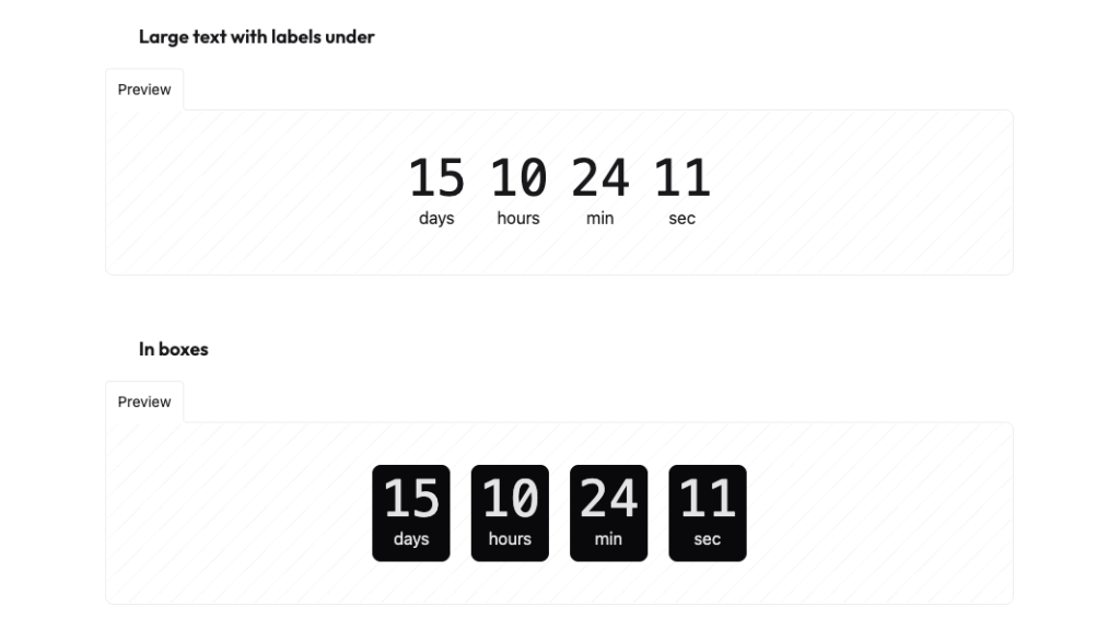
Countdown with transition effect
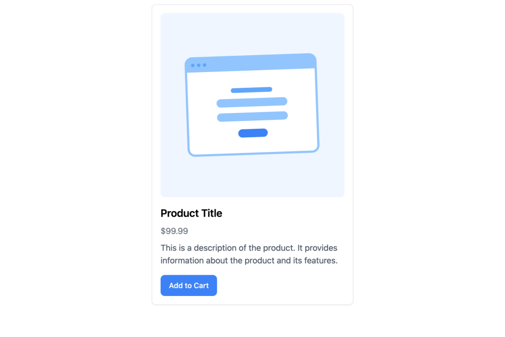
Responsive product Detail card built with Tailwind CSS

Tailwind CSS coupon code component
Open-source neobrutalism Tailwind UI component library
Free Tailwind & Alpine component library

Sticky bottom button for Tailwind CSS

Customizable password reset form built with Tailwind CSS
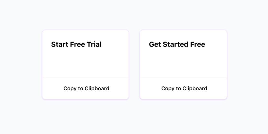
Copy to clipboard component with Alpine.js and Tailwind CSS

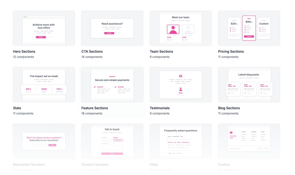
130+ Free Tailwind UI Sections
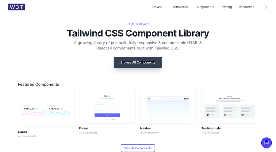
19 HTML & React UI components
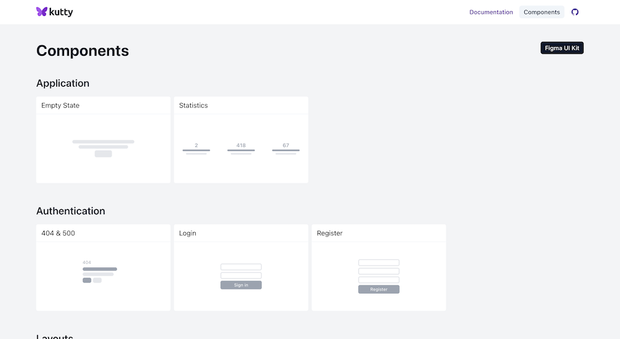
Accessible, responsive UI components for Tailwind projects
80+ ready-made Tailwind CSS components
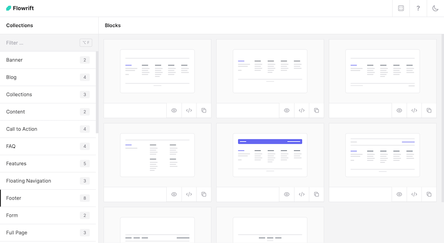
60+ customizable Tailwind CSS blocks
55 themeable components for rapid web design.
226 Free & Open Source Tailwind CSS Components
Generate Tailwind CSS components using Claude 3.5 Sonnet

600+ TailGrids UI blocks for instant Tailwind designs
Production-ready Tailwind components for React, Next.js, Vue & HTML. Responsive, accessible UI blocks optimized for Tailwind v4 with MCP integration.
200+ ready-to-use Tailwind CSS components with MCP integration. Let AI generate complete pages from your prompts — one command, production-ready UI.
Explore Components
Tailwind HTML components are pre-built UI elements styled with Tailwind CSS utility classes that work in any HTML file - no React, Vue, or build tools required. Simply copy the code and paste it into your project.
These vanilla HTML components let you style native HTML elements with production-ready designs instantly. Whether you need navigation bars, hero sections, or form layouts, copy-paste Tailwind snippets save hours of development time while maintaining full customization control.
Below you'll find 90+ curated component libraries from Flowbite, Tailkits UI, HyperUI, and other trusted sources. Filter by free or premium to find the right Tailwind HTML library for your project.
Unlike React or Vue components that require framework knowledge and build configurations, vanilla HTML Tailwind components work anywhere. Drop them into a static HTML file, a WordPress theme, or any backend template language. No npm install, no bundler setup - just copy, paste, and ship.
Each library in our directory serves different needs:
Tailkits UI curates 200+ production-ready components with native MCP support
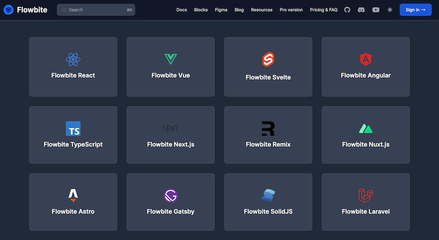
Flowbite offers a complete ecosystem with JavaScript interactions, Figma files, and extensive documentation - ideal for larger projects
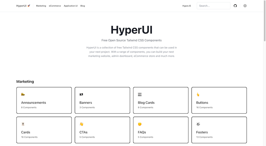
HyperUI focuses on zero-configuration simplicity with pure HTML/CSS components - perfect for quick prototypes
Preline UI provides 840+ free components with built-in accessibility features - great for comprehensive projects on a budget
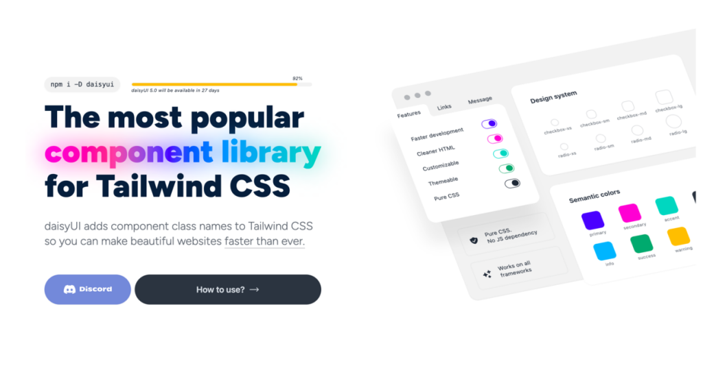
DaisyUI uses semantic class names that reduce code bloat by up to 88% - best for developers who prefer cleaner markup
These components style standard HTML elements directly with Tailwind utilities. You maintain full control over markup structure and can integrate them into any tech stack - from simple landing pages to complex server-rendered applications.
You can find answers for commonly asked questions about components.
HTML components are copy-paste code snippets that work in any HTML file without a JavaScript framework. React and Vue components require their respective frameworks, build tools, and specific syntax. HTML components offer simpler integration and work across any tech stack, making them ideal for static sites, WordPress themes, or backend templates.
No build system is required. You can use Tailwind via CDN and paste components directly into any HTML file. For production sites, we recommend the Tailwind CLI or PostCSS setup for smaller file sizes, but it's not mandatory to get started.
Web Components (capitalized) refers to a browser standard using Shadow DOM and Custom Elements for encapsulated, framework-agnostic widgets. Tailwind CSS components are simply pre-styled HTML snippets using utility classes — they don't use Shadow DOM and are much simpler to implement and customize.
Most libraries in our directory offer free components under MIT or similar permissive licenses, allowing commercial use. Premium components typically require a paid license. Always check each library's specific licensing terms before using in commercial projects.
: It depends on your needs. Choose Flowbite for a complete ecosystem with JS interactions. Pick HyperUI for simple, no-config components. Select Preline UI for the largest free collection. Try DaisyUI if you prefer semantic class names. Our directory lets you compare all options in one place.