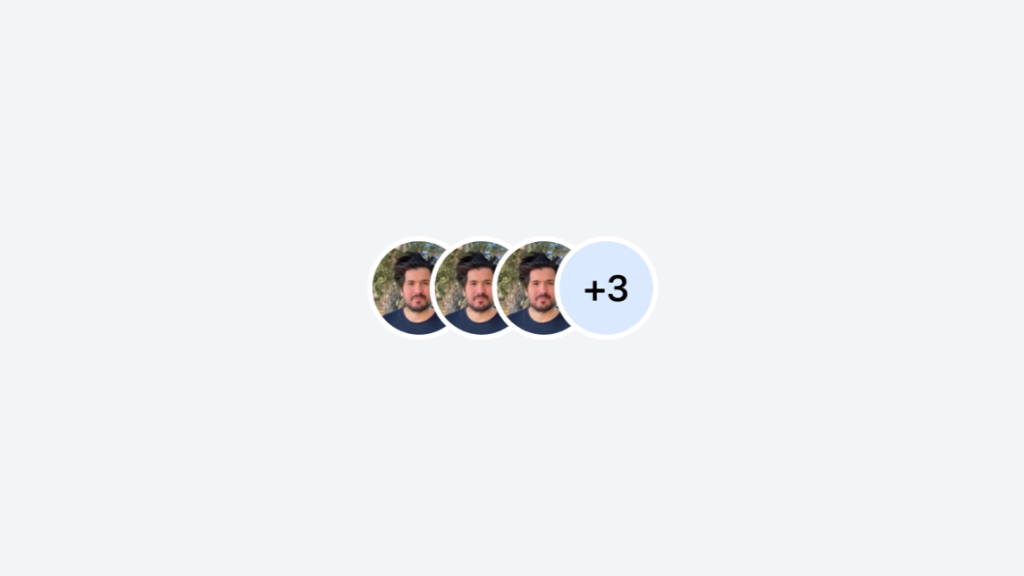
Avatar Group
Stacked or grid Tailwind avatar group component

- Open Source
- JavaScript Plugin
- Copy & Paste
- Tailwind CSS v3
- Responsive
Code sample of the component above
<div class="flex min-h-screen items-center justify-center bg-gray-100">
  <div class="inline-flex -space-x-4 overflow-hidden rounded-lg">
    <img class="h-10 w-10 rounded-full border-2 border-white" src="https://tailkits.com/_ipx/s_100x100/yucel-faruk-sahan.jpg" alt="Avatar 1" />
    <img class="h-10 w-10 rounded-full border-2 border-white" src="https://tailkits.com/_ipx/s_100x100/yucel-faruk-sahan.jpg" alt="Avatar 2" />
    <img class="h-10 w-10 rounded-full border-2 border-white" src="https://tailkits.com/_ipx/s_100x100/yucel-faruk-sahan.jpg" alt="Avatar 3" />
    <span class="flex h-10 w-10 items-center justify-center rounded-full border-2 border-white bg-blue-100 text-sm font-medium">+3</span>
  </div>
</div>
What Are Tailwind Avatar Components?
At their core, avatar components are visual representations of users, typically displayed as images, initials, or icons. They serve as identifiable markers in user interfaces, appearing in profiles, comments, navigation bars, and more. Tailwind CSS streamlines the creation of these components by providing utility classes that handle styling efficiently without writing extensive custom CSS.
Getting Started with Tailwind Avatars
Creating a basic avatar with Tailwind is straightforward. You can start with an image wrapped in a div, applying Tailwind's utility classes to control size, shape, and borders. For instance, using classes like w-12 h-12 sets the width and height, while rounded-full transforms the image into a perfect circle, a common avatar shape.
Example:
<img class="w-12 h-12 rounded-full" src="path-to-image.jpg" alt="User Avatar">This simple snippet creates a circular avatar with a fixed size, ensuring consistency across your application.
Customizing Avatar Components
Tailwind's versatility shines when customizing avatar components to match your design requirements. Here are some ways to enhance your avatars:
1. Initials as Avatars
Not every user may have uploaded an image. Displaying initials can be an elegant fallback. By combining Tailwind classes with SVG or plain text, you can create initials-based avatars.
Example:
<div class="flex items-center justify-center w-12 h-12 bg-blue-500 text-white rounded-full">
  AB
</div>
This creates a blue circular avatar with white initials centered within.
2. Adding Borders and Shadows
Borders can accentuate avatars, while shadows add depth. Utilize classes like border, border-gray-300, or shadow-lg to style accordingly.
Example:
<img class="w-12 h-12 rounded-full border-2 border-gray-300 shadow-md" src="path-to-image.jpg" alt="User Avatar">3. Interactive Avatars
Avatars can also be interactive elements. For example, adding hover effects or clickable features enhances user experience.
Example:
<a href="#" class="w-12 h-12 rounded-full overflow-hidden hover:shadow-lg">
  <img src="path-to-image.jpg" alt="User Avatar">
</a>
Responsive Design with Tailwind Avatars
Ensuring avatars look great on all devices is essential. Tailwind's responsive utilities make it easy to adjust avatar sizes based on screen size.
Example:
<img class="w-10 h-10 sm:w-12 sm:h-12 md:w-16 md:h-16 rounded-full" src="path-to-image.jpg" alt="User Avatar">This avatar scales from w-10 h-10 on small screens to larger sizes on medium and larger devices, maintaining clarity and proportion.
Integrating Avatars with Other UI Components
Avatars often coexist with various UI elements like dropdowns, badges, and notifications. Tailwind's utility classes facilitate seamless integration.
Example: Avatar with Notification Badge
<div class="relative">
  <img class="w-12 h-12 rounded-full" src="path-to-image.jpg" alt="User Avatar">
  <span class="absolute top-0 right-0 inline-flex items-center justify-center px-2 py-1 text-xs font-bold leading-none text-red-100 bg-red-600 rounded-full">3</span>
</div>
This positions a red badge at the top-right of the avatar, indicating notifications or messages.
What Is the Tailwind Avatar Group?
The Tailwind Avatar Group is a lightweight UI component that arranges multiple profile pictures in an overlapping (facepile) or grid format, perfect for showing team members, followers, or participants at a glance.
Integration
Install: Add Tailwind CSS (v3+) and Alpine.js via CDN or npm
Markup: Insert the provided
<div>structure into your layoutCustomize: Tweak
classattributes for sizing, colors, and spacingBehavior: Use
x-data/x-show(Alpine.js) for tooltips and dropdownsDeploy: Works in static HTML, React, Vue, or any frontend framework
FAQ
How do I make avatars clickable for user profiles?
To make avatars clickable, wrap the avatar component within an anchor (<a>) tag or a button element. Apply Tailwind's hover and focus utilities to enhance interactivity and accessibility.
Is it possible to create multi-color avatars with Tailwind?
Yes, you can create multi-color avatars by combining Tailwind's background and text color utilities. This is especially useful when displaying user initials with varying background colors for personalization.
How do I handle avatars for users without profile pictures?
For users without profile pictures, it's best to display their initials or a default icon. You can achieve this by conditionally rendering the avatar image or the fallback content using your preferred JavaScript framework.