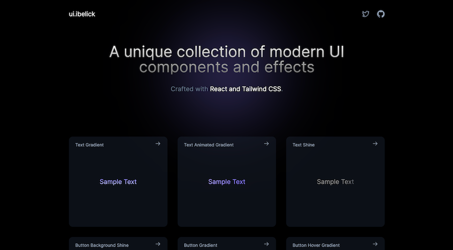
HOT
HOTTailkits UI
NEWConsistent UI, zero hallucinations
Discover curated Tailwind React components, libraries, and UI kits. Free and premium options with TypeScript support, accessibility features, and production-ready code.
HOTConsistent UI, zero hallucinations
 HOT
HOT16+ Shadcn Templates
 HOT
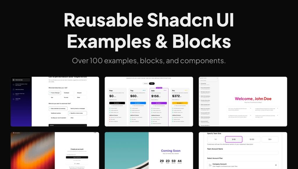
HOTReusable shadcn/ui examples, blocks, and components.

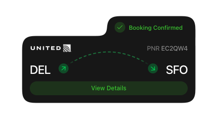
Launch UI - shadcn/ui Blocks for Landing Pages
 HOT
HOT1216 shadcn/ui blocks for Tailwind
Refined animated React components for design engineers
Premium React UI components
Open-source charts built on shadcn/ui for React
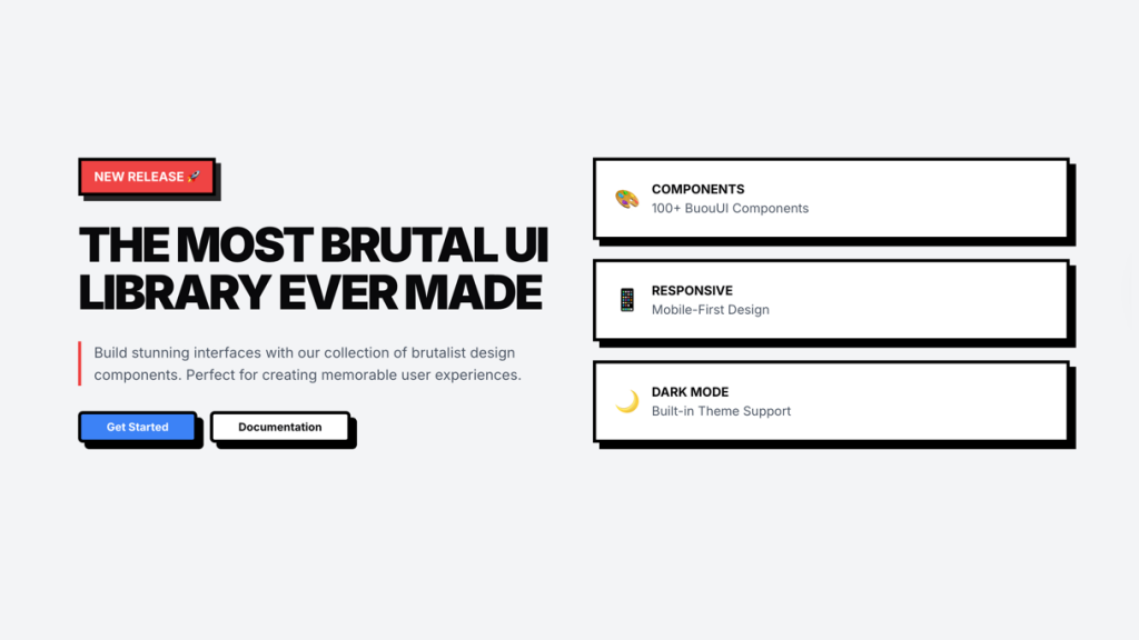
Premium neo-brutalist blocks for React
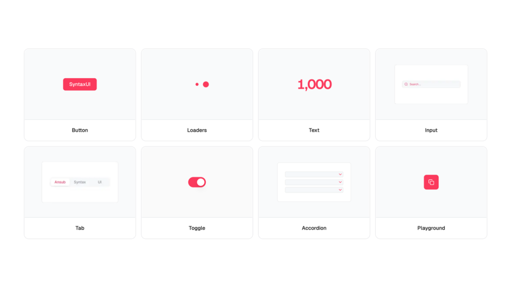
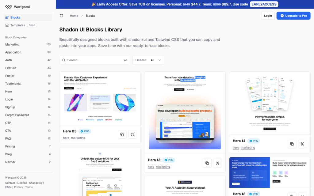
Free shadcn/ui patterns, 966+ components for React
AI site builder, Next.js, Tailwind, no code
Animated toast alerts, beautiful by default
Premium animated React components, blocks, templates
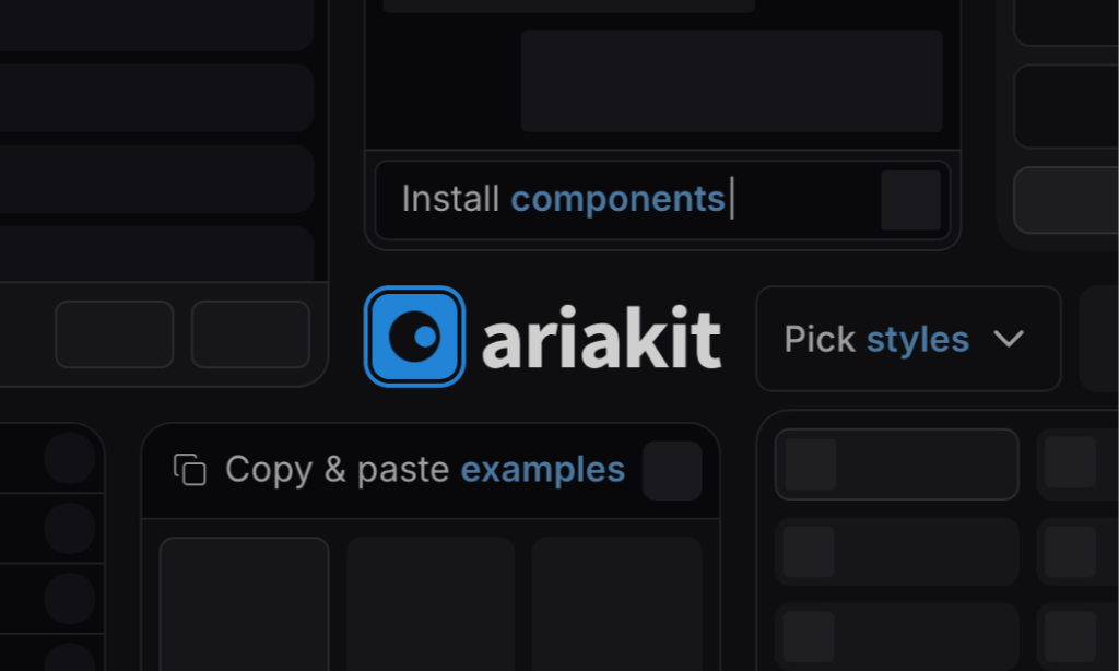
Unstyled, accessible React components

Animated React components for Tailwind projects

UI Components for React

shadcn/ui without React
React UI blocks for Tailwind + shadcn
70+ animated shadcn/ui components for Next.js
Free and premium Shadcn blocks

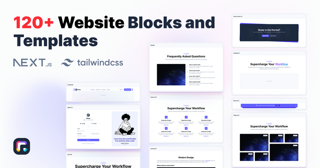
120+ responsive UI blocks for React.
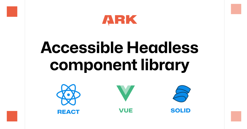
Unstyled components for React, Vue, Solid, Svelte
5 000+ Tailwind React components
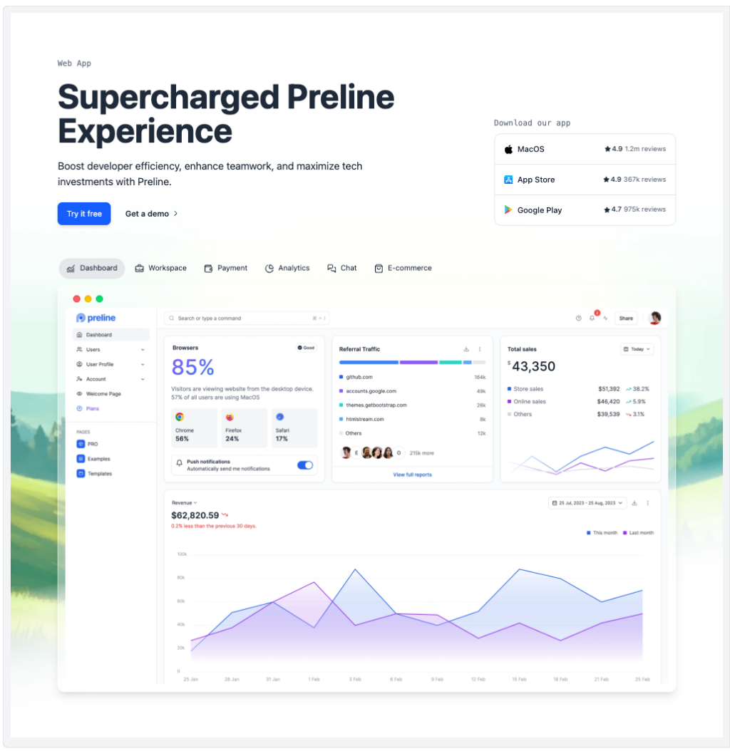
Preline: 740+ Tailwind pages & components
Force your AI to use a professional design system. Build brand-matched, consistent UIs with 200+ vetted components.
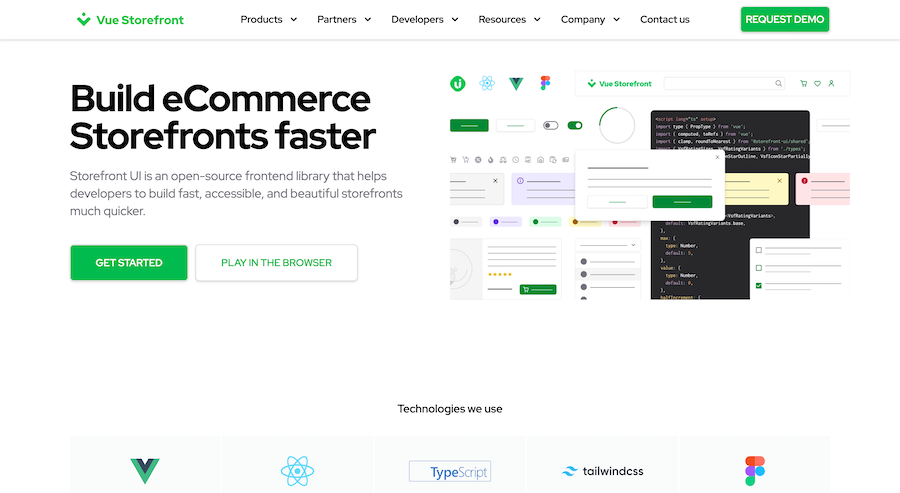
Open-source Tailwind and Next.js components

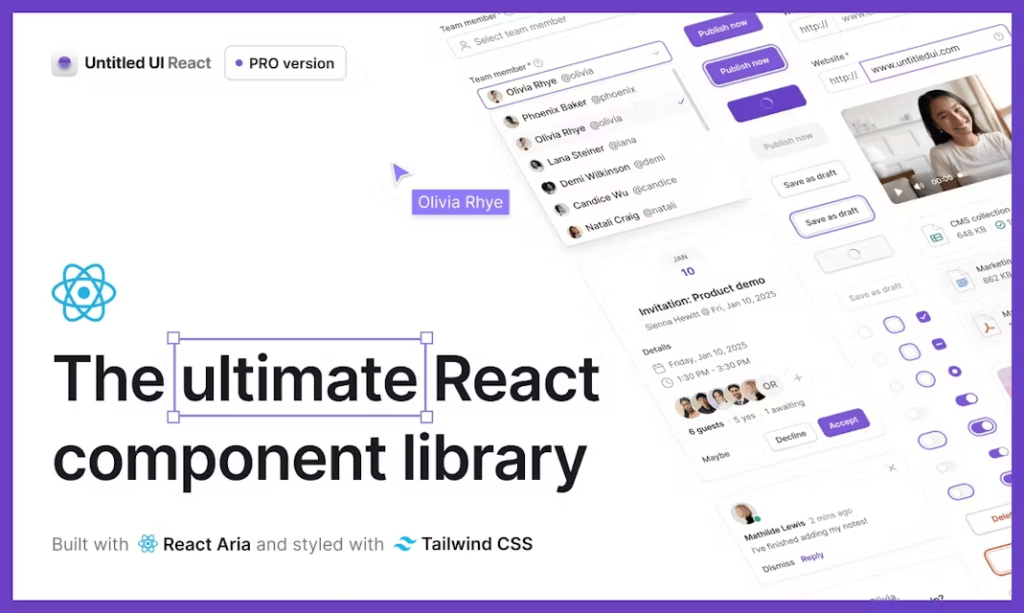
500+ Tailwind Plus UI components
50+ animated sections and 3+ templates
100+ shadcn/ui components for Tailwind & React.
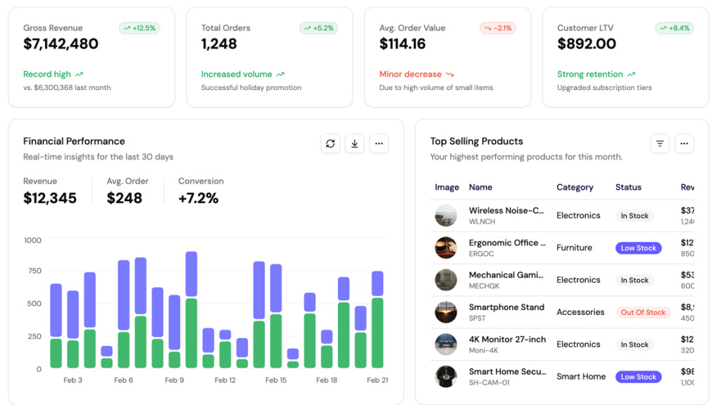
UI blocks for dashboards, built with shadcn/ui

600+ ready-made Tailwind CSS components
Free Tailwind & React UI components for rapid builds
Accessible, unstyled React UI primitives with examples
Retro Tailwind components ready to copy‑paste

Copy-paste Tailus UI components, ready to customize
300+ drop-in Tailwind UI blocks for rapid design
Interactive Tailwind components for React and Vue.js
180+ shadcn/ui blocks
Animated Tailwind components using Framer Motion
UI components built with Tailwind CSS for React and Next.js
400+ UI Components for Tailwind CSS
Reusable shadcn/ui elements

Accessible, unstyled React components and hooks

Free Tailwind CSS components
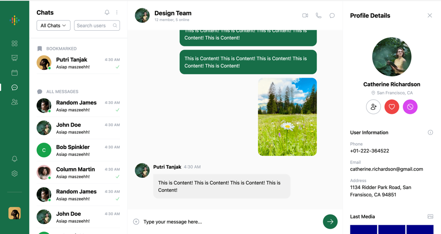
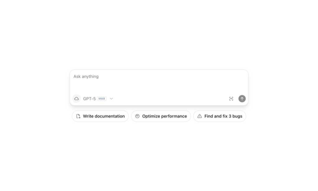
Chat UI component built with Tailwind and Next.js.
Tailwind roadmap, timeline component
47+ React UI Components for Tailwind CSS
Tailwind filter components

Tailwind 404, error page components
450+ UI components for Tailwind CSS
300+ copy-paste Tailwind CSS UI components

16 React & Vue UI components
500+ customizable Tailwind components for React
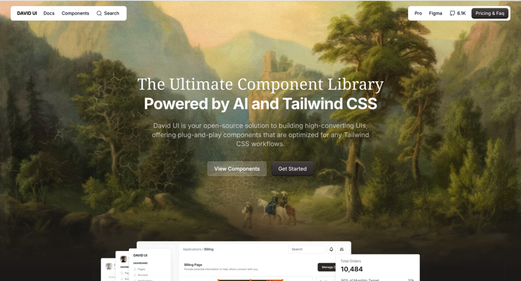
Open source React and Figma design system
Open-source neobrutalism Tailwind UI component library
18+ free React & Tailwind CSS UI Components
Fast, accessible, and fully customizable components built for e-commerce
130+ Free Tailwind UI Sections
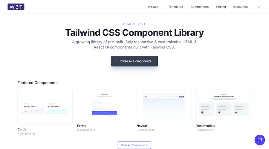
19 HTML & React UI components
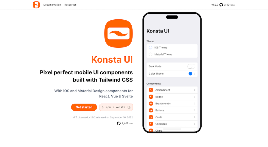
Mobile first Tailwind UI kit for React, Vue & Svelte

600+ TailGrids UI blocks for instant Tailwind designs
Production-ready Tailwind components for React, Next.js, Vue & HTML. Responsive, accessible UI blocks optimized for Tailwind v4 with MCP integration.
200+ ready-to-use Tailwind CSS components with MCP integration. Let AI generate complete pages from your prompts — one command, production-ready UI.
Explore Components
Tailwind React components combine the utility-first flexibility of Tailwind CSS with React's component-based architecture, enabling developers to build modern, type-safe user interfaces efficiently. These pre-built components eliminate repetitive styling work while maintaining full customization control through Tailwind's utility classes.
Using Tailwind React components accelerates development by providing accessible, responsive, and well-tested building blocks. Whether you need headless UI primitives, complete design systems, or specialized interactive elements, React components integrate seamlessly with TypeScript, support server-side rendering, and follow React best practices out of the box.
Below you'll find a curated collection of the best tailwind react components and libraries available today. Each option has been selected for code quality, documentation, and active maintenance. Explore free open-source libraries alongside premium UI kits to find the perfect React components for your next project.
Tailwind React components offer significant advantages over vanilla CSS solutions or traditional component libraries. The tight integration between Tailwind's utility classes and React's compositional model creates a powerful development workflow where styling and functionality coexist naturally. You gain full IntelliSense support, type safety with TypeScript, and the ability to customize every aspect without fighting framework constraints.
React-specific implementations leverage hooks, context, and component composition patterns that vanilla JavaScript alternatives cannot match. Features like controlled/uncontrolled component patterns, proper event handling, and React 18+ concurrent features work seamlessly. Many libraries also provide headless components that separate logic from presentation, giving you maximum flexibility while handling complex accessibility requirements behind the scenes.
The ecosystem maturity matters significantly. Established Tailwind React libraries receive regular updates, maintain compatibility with Next.js and other React frameworks, and include comprehensive documentation with TypeScript definitions. Whether building a marketing site, dashboard, or complex application, choosing components specifically designed for React ensures better performance, developer experience, and long-term maintainability compared to framework-agnostic alternatives.
You can find answers for commonly asked questions about components.
A1: The best production-ready options include Headless UI for accessible primitives, Shadcn UI for copy-paste components with full customization, and Tremor for data visualization dashboards. Consider your project needs: Headless UI excels for custom designs, Shadcn offers rapid prototyping, while premium libraries like Tailwind UI provide polished, enterprise-ready components with extensive documentation.
Most Tailwind React libraries install via npm or yarn alongside your existing Tailwind CSS setup. For Next.js projects, ensure you have Tailwind configured, then install your chosen library. Many use a CLI for component installation (like Shadcn), while others import directly from node_modules. Check library-specific documentation for Next.js 13+ App Router compatibility and server component support.
Yes, React Components are designed to be reusable. By encapsulating functionality and styling, components can be easily shared and integrated into different projects, promoting consistency and reducing development time.
Functional components are simple JavaScript functions that return JSX and, with Hooks, can manage state and side effects. Class components are ES6 classes that extend React.Component and use lifecycle methods. Functional components are now preferred due to their simplicity and the power of Hooks.
React Hooks are functions that let you use React features like state and lifecycle methods in functional components. They simplify state management and side effects, making functional components more powerful and easier to work with.
Headless UI provides unstyled, accessible component primitives focused purely on behavior and keyboard interactions. You apply all styling using Tailwind classes. Regular Tailwind React components come pre-styled with opinionated designs. Headless components offer maximum flexibility for custom designs, while styled components accelerate development with ready-to-use interfaces.