HOT
HOTTailkits UI
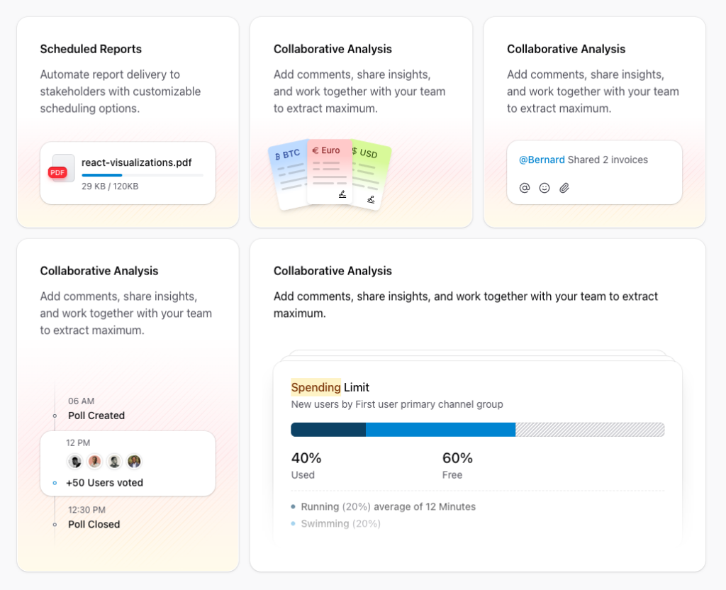
NEWConsistent UI, zero hallucinations
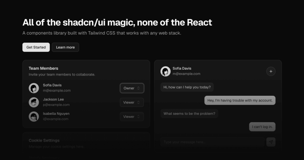
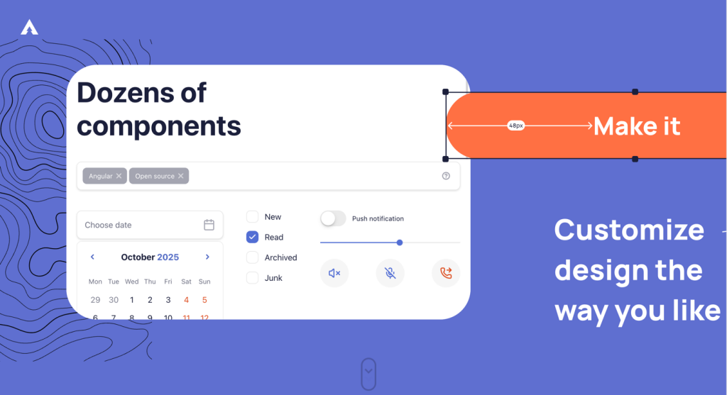
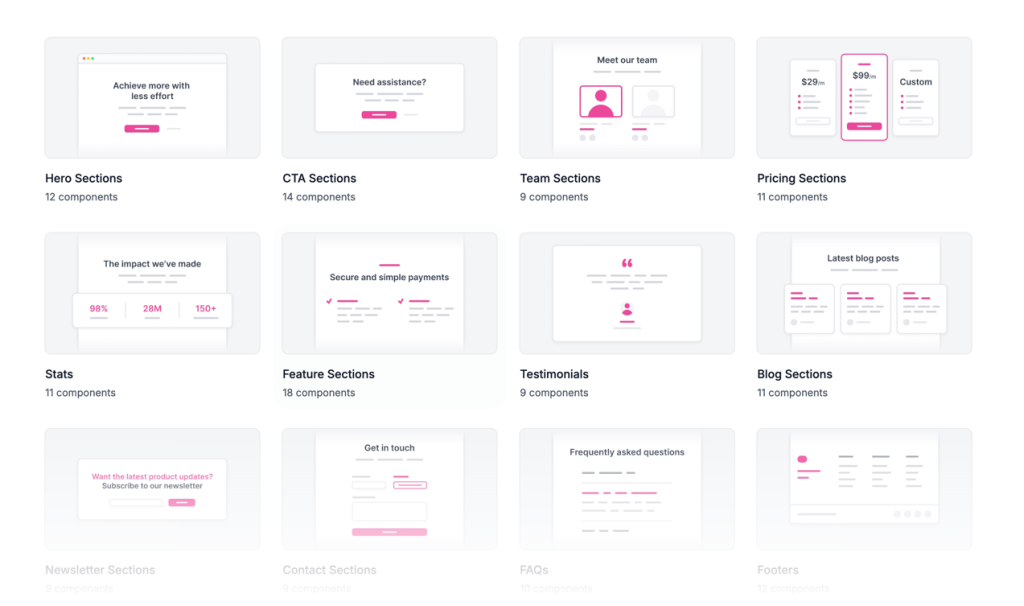
160+ Tailwind components for React, Next.js & Vue. Responsive, accessible UI blocks with dashboards, forms & marketing sections. Tailwind v4 ready.
HOTConsistent UI, zero hallucinations
 HOT
HOT16+ Shadcn Templates
Production-ready Tailwind components for React, Next.js, Vue & HTML. Responsive, accessible UI blocks optimized for Tailwind v4 with MCP integration.
 HOT
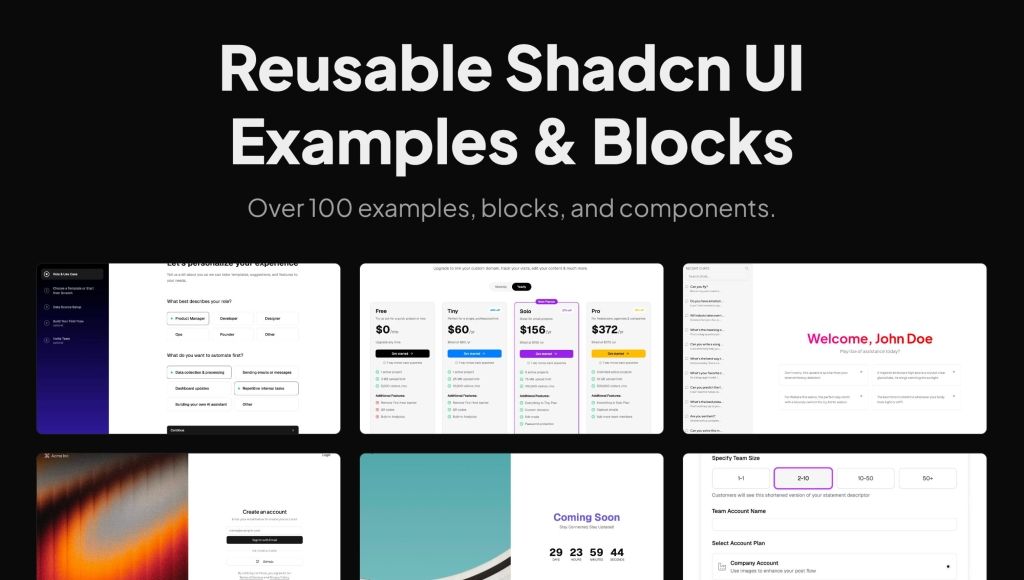
HOTReusable shadcn/ui examples, blocks, and components.

Launch UI - shadcn/ui Blocks for Landing Pages
 HOT
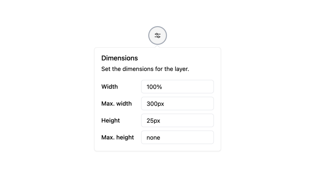
HOT1216 shadcn/ui blocks for Tailwind
Refined animated React components for design engineers
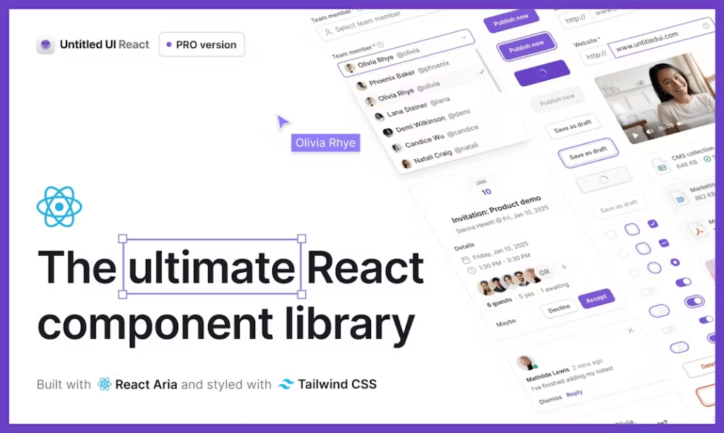
Premium React UI components
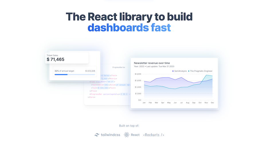
Open-source charts built on shadcn/ui for React
Premium neo-brutalist blocks for React
Official Livewire components, free and Pro
Free shadcn/ui patterns, 966+ components for React
AI site builder, Next.js, Tailwind, no code
Animated toast alerts, beautiful by default
Premium animated React components, blocks, templates
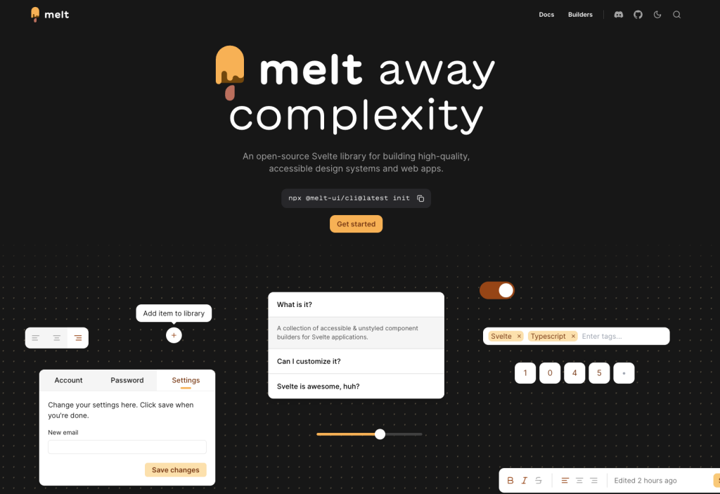
Headless Svelte components with accessibility built in

Unstyled, accessible React components

Animated React components for Tailwind projects

UI Components for React
shadcn/ui without React
React UI blocks for Tailwind + shadcn
Angular component kit with 130+ building blocks
70+ animated shadcn/ui components for Next.js
Free and premium Shadcn blocks

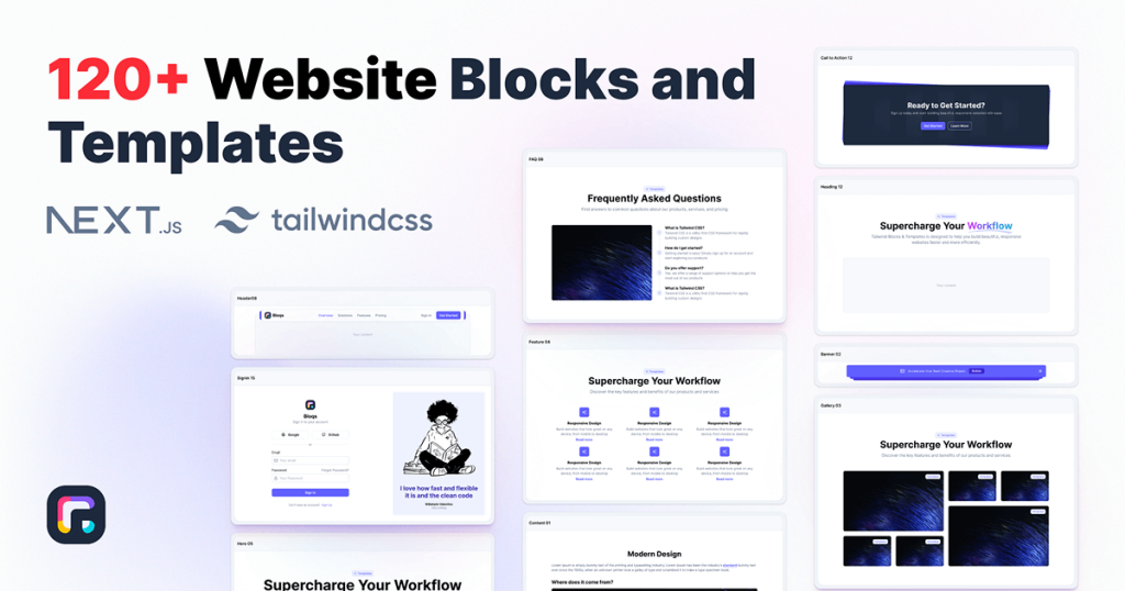
120+ responsive UI blocks for React.
Force your AI to use a professional design system. Build brand-matched, consistent UIs with 200+ vetted components.
Unstyled components for React, Vue, Solid, Svelte
5 000+ Tailwind React components
Unstyled Svelte components with WAI-ARIA support
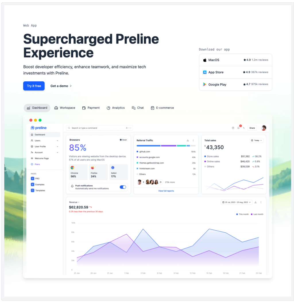
Preline: 740+ Tailwind pages & components
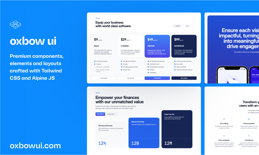
Open source Tailwind CSS & Alpine.js components
Open-source Tailwind and Next.js components

500+ Tailwind Plus UI components
50+ animated sections and 3+ templates
225+ responsive Tailwind CSS components
100+ shadcn/ui components for Tailwind & React.
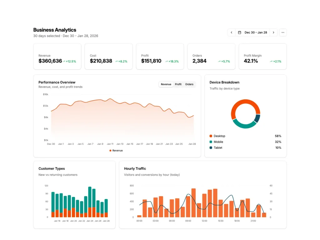
UI blocks for dashboards, built with shadcn/ui

Launch Rails apps quickly with ready Tailwind components
600+ ready-made Tailwind CSS components
Free Tailwind & React UI components for rapid builds
Accessible, unstyled React UI primitives with examples
Retro Tailwind components ready to copy‑paste
TailwindCSS and shadcn/ui UI kit

Copy-paste Tailus UI components, ready to customize
300+ drop-in Tailwind UI blocks for rapid design

Accessible Angular UI primitives, Tailwind ready
Interactive Tailwind components for React and Vue.js
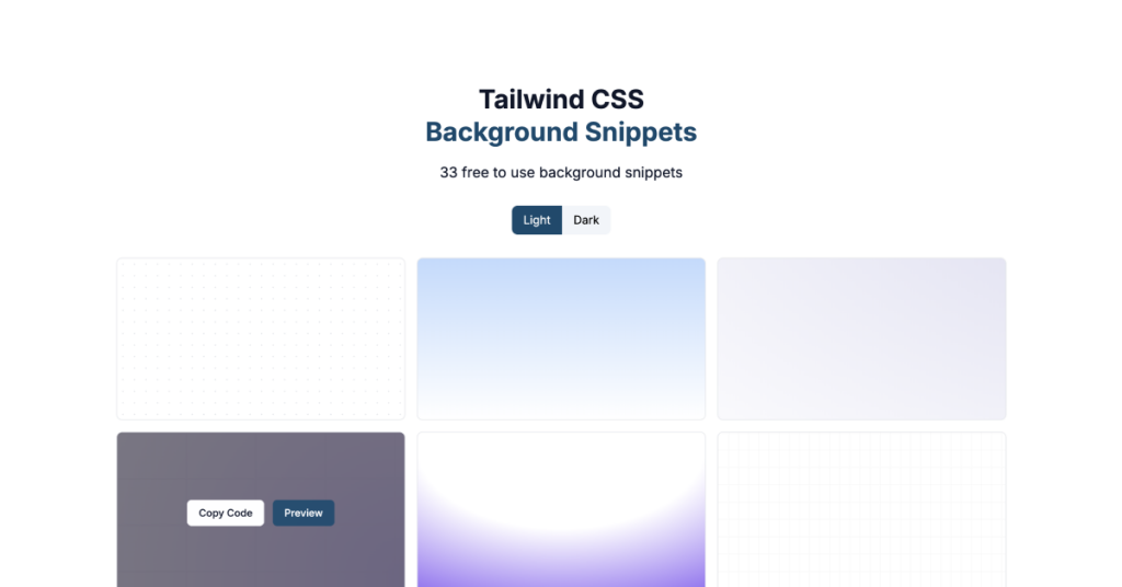
33 free to use background snippets
180+ shadcn/ui blocks
Animated Tailwind components using Framer Motion
Framer Motion components from ibelick
UI components built with Tailwind CSS for React and Next.js
400+ UI Components for Tailwind CSS
Reusable shadcn/ui elements

Accessible, unstyled React components and hooks

Free Tailwind CSS components
Tailwind dropdown component with Alpine.js
50+ UI Components for Tailwind CSS
Responsive Tailwind grid components in HTML
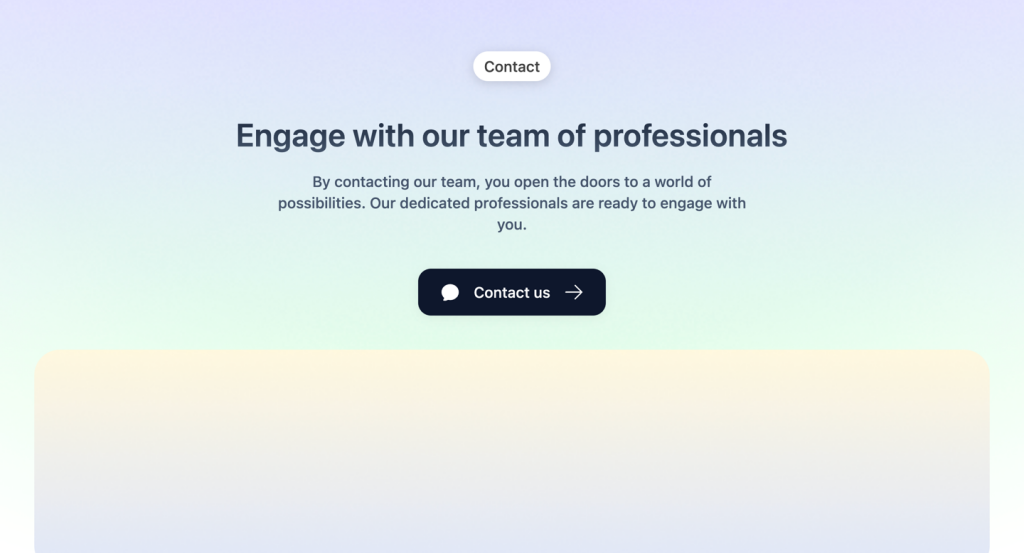
Tailwind contact form component & sections
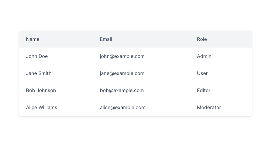
Responsive and minimal table component built with Tailwind CSS.
500+ Tailwind components with Figma file
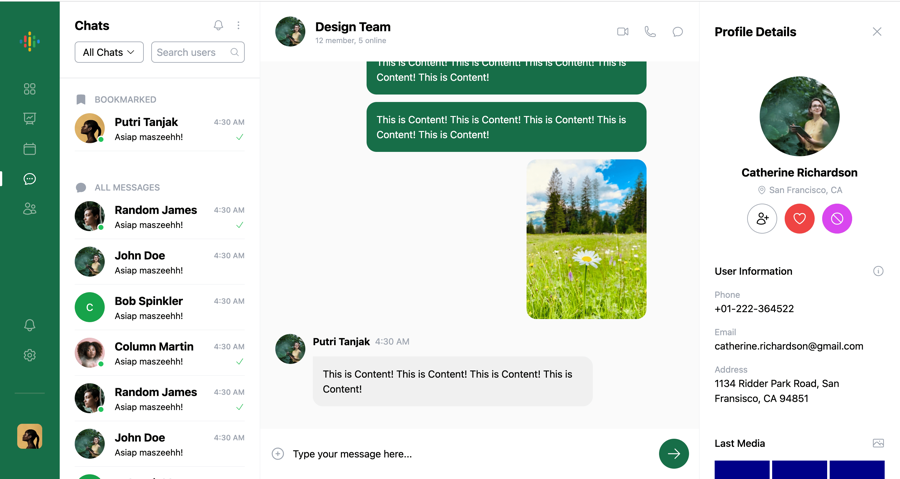
Chat UI component built with Tailwind and Next.js.

Tailwind roadmap, timeline component
47+ React UI Components for Tailwind CSS
Tailwind logo cloud components
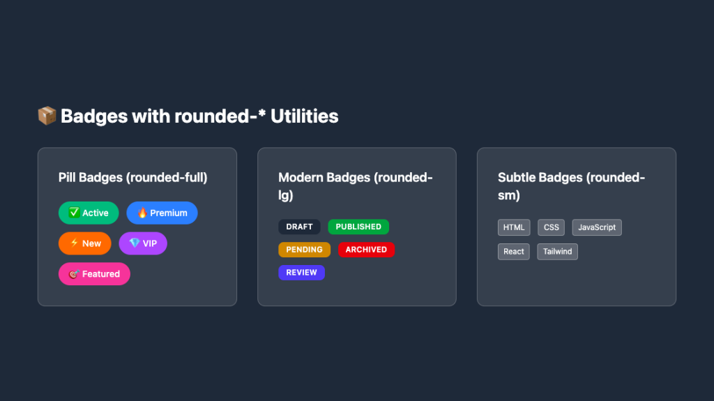
Responsive, rounded badge components
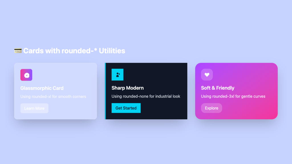
Sleek glass card UI in pure Tailwind

Tailwind integrations components
Tailwind filter components
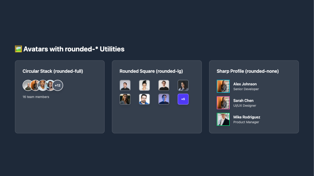
Overlapping circular avatars in a neat stack

Tailwind 404, error page components
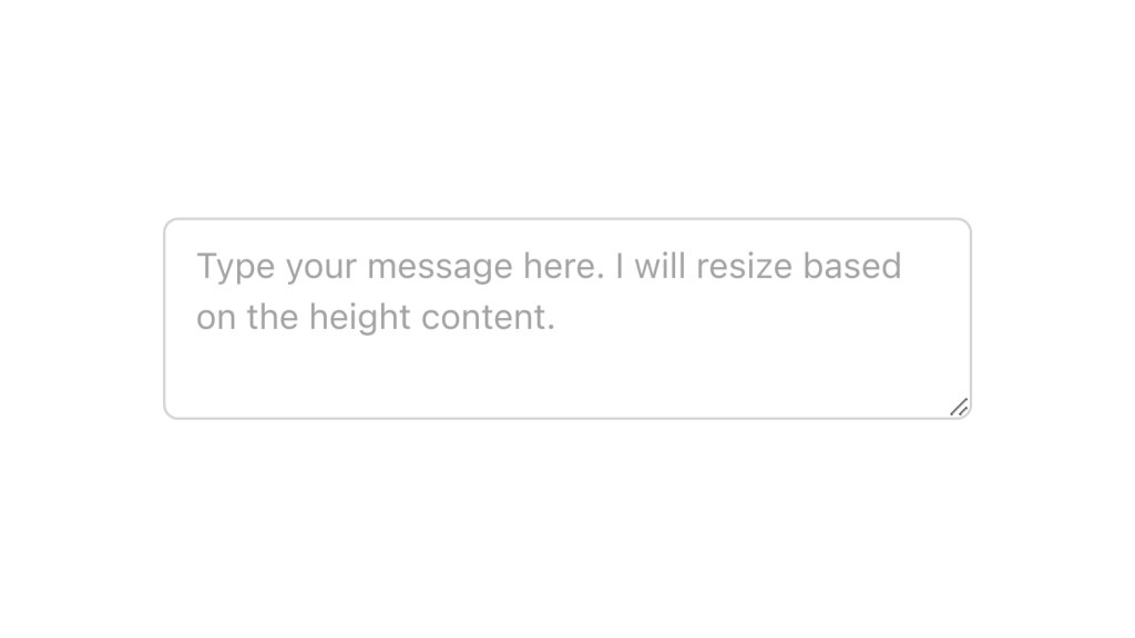
Alpine.js and Tailwind text area component by Pines UI Library.
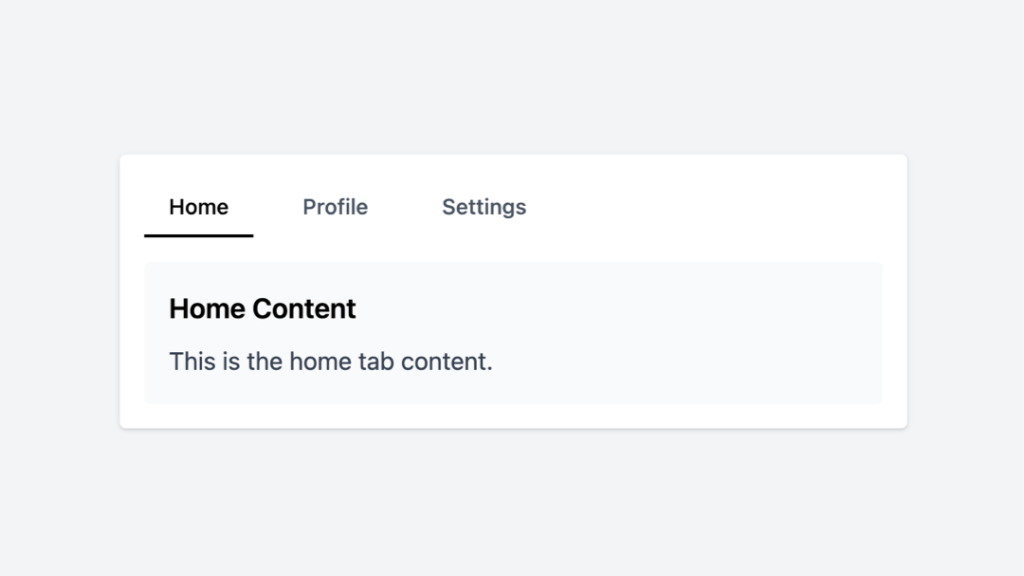
Tailwind tabs component with Alpine.js
450+ UI components for Tailwind CSS

Alpine.js and Tailwind tooltip component by Pines UI Library.
Alpine.js and Tailwind popover component by Pines UI Library.

Alpine.js and Tailwind toggle component by Pines UI Library.
Alpine.js and Tailwind image gallery component by Pines UI Library.
Alpine.js and Tailwind progress component by Pines UI Library.
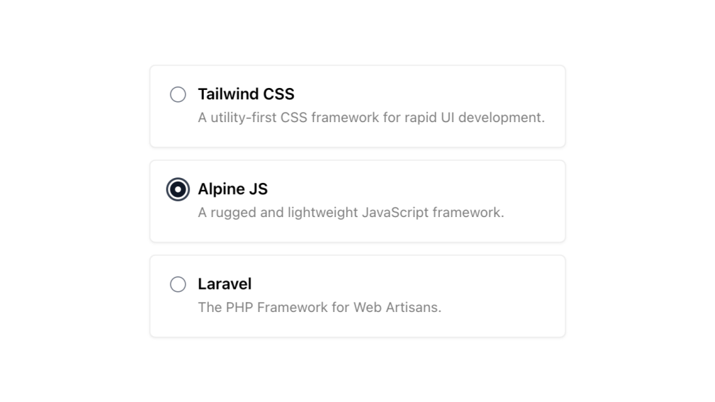
Alpine.js and Tailwind radio group component by Pines UI Library.

Alpine.js and Tailwind video component by Pines UI Library.

Alpine.js and Tailwind image gallery component by Pines UI Library.
A clean sidebar that has hover states for navigation items
Alpine.js and Tailwind menu component by Pines UI Library.
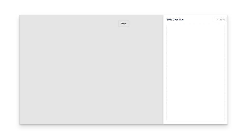
Alpine.js and Tailwind slide-over component by Pines UI Library.
Alpine.js and Tailwind animated text component by Pines UI Library.
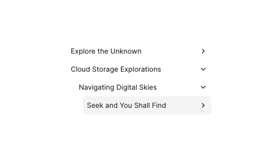
Tailwind tree view menu component

Alpine.js and Tailwind toast notification component by Pines UI Library.

Alpine.js and Tailwind hover card component by Pines UI Library.

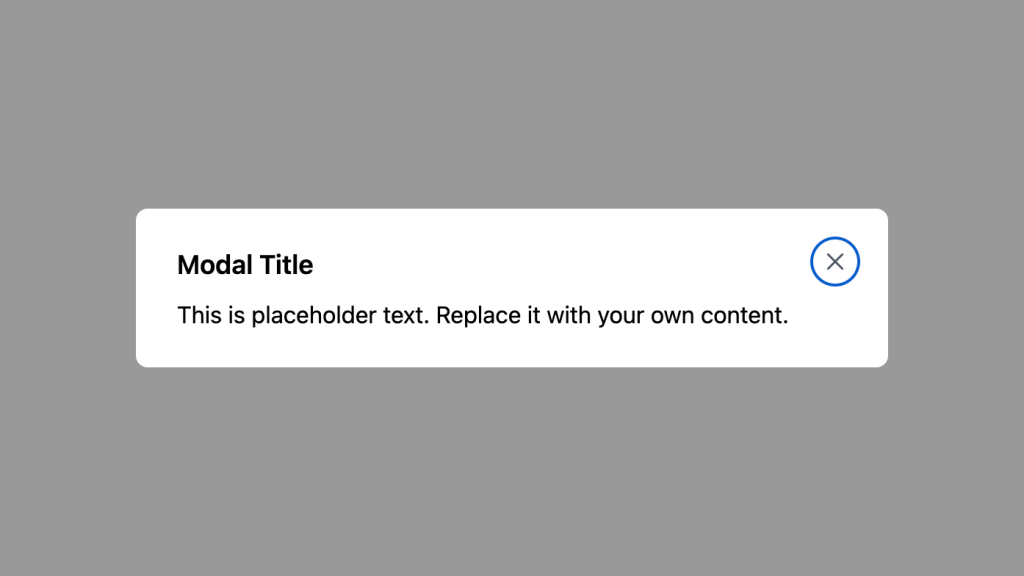
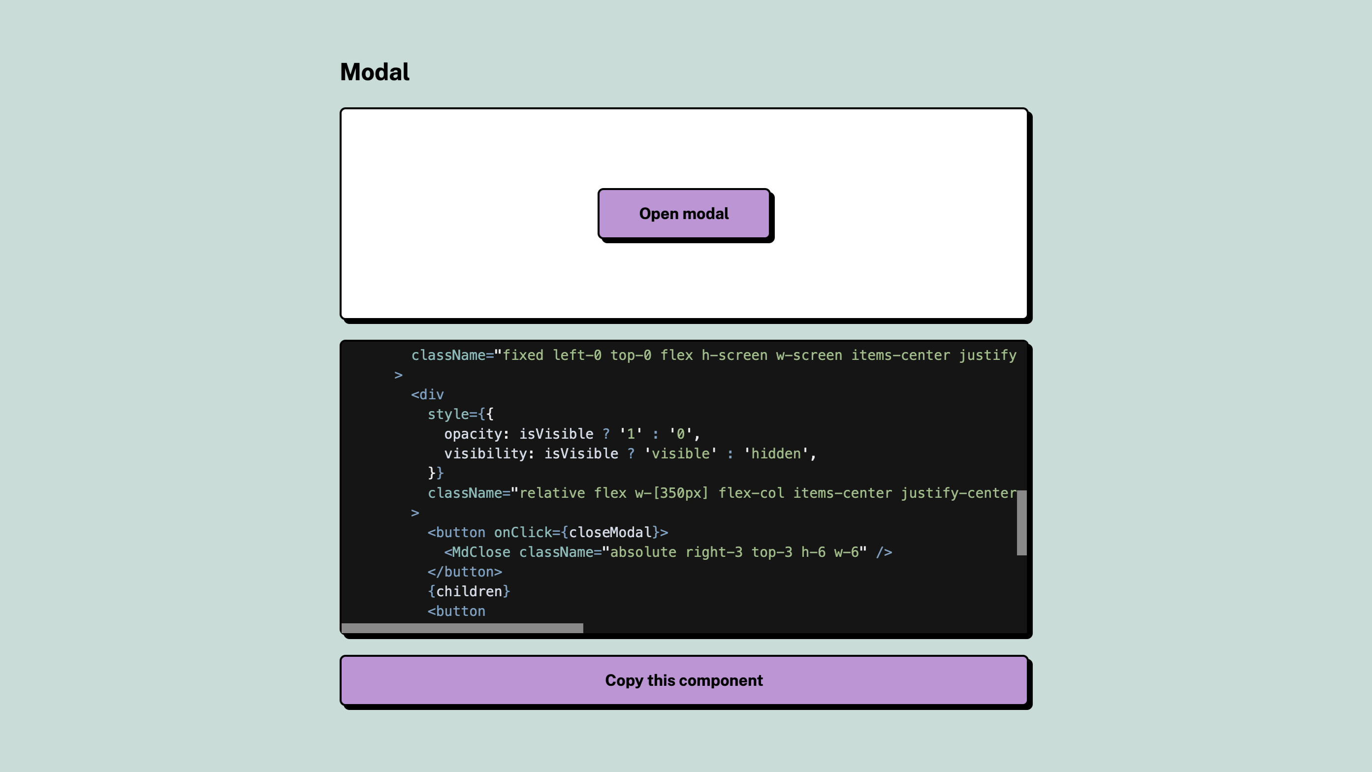
Alpine.js and Tailwind modal component by Pines UI Library.
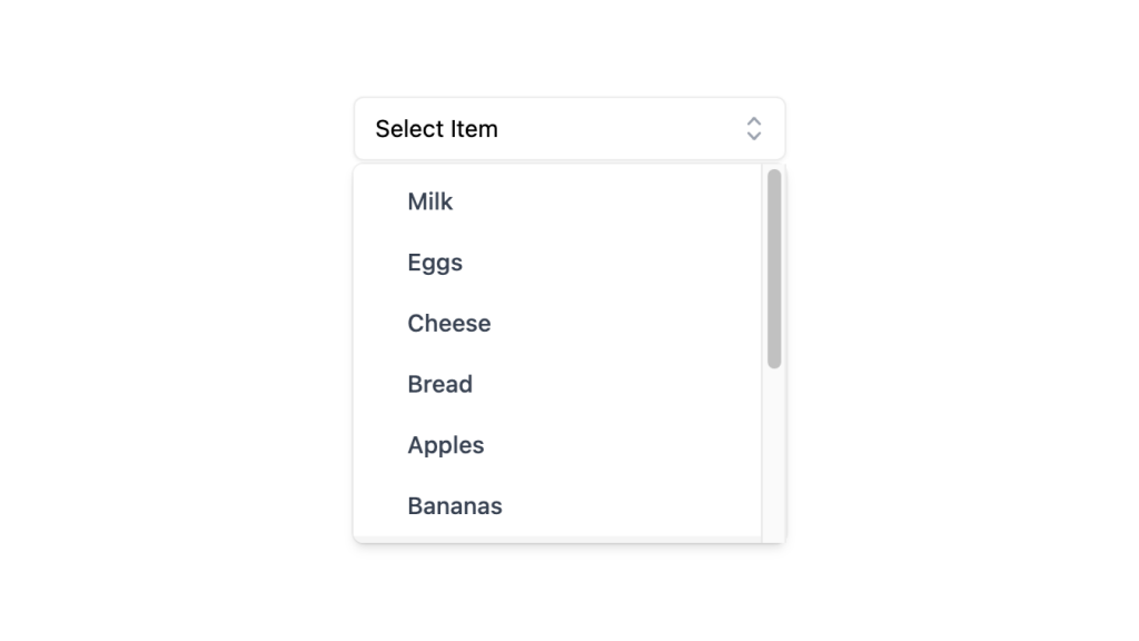
Alpine.js and Tailwind select dropdown menu component by Pines UI Library.
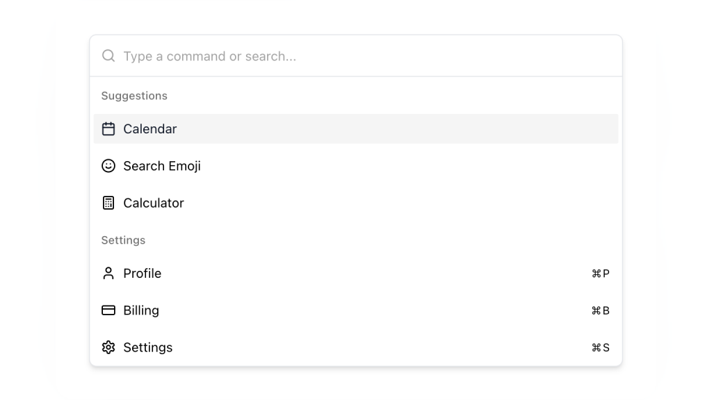
Alpine.js and Tailwind command palette component by Pines UI Library.
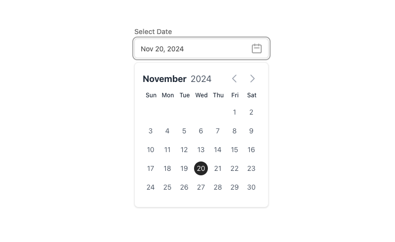
Alpine.js and Tailwind date picker component by Pines UI Library.
52 Free to use Tailwind buttons
300+ copy-paste Tailwind CSS UI components
600+ Tailwind CSS Components and blocks

16 React & Vue UI components
500+ customizable Tailwind components for React
Alpine.js Tailwind banner component to add a sticky CTA on landing pages.
Tailwind accordion component with Alpine.js

0 javascript infinite carousel-slider component with logo cloud example
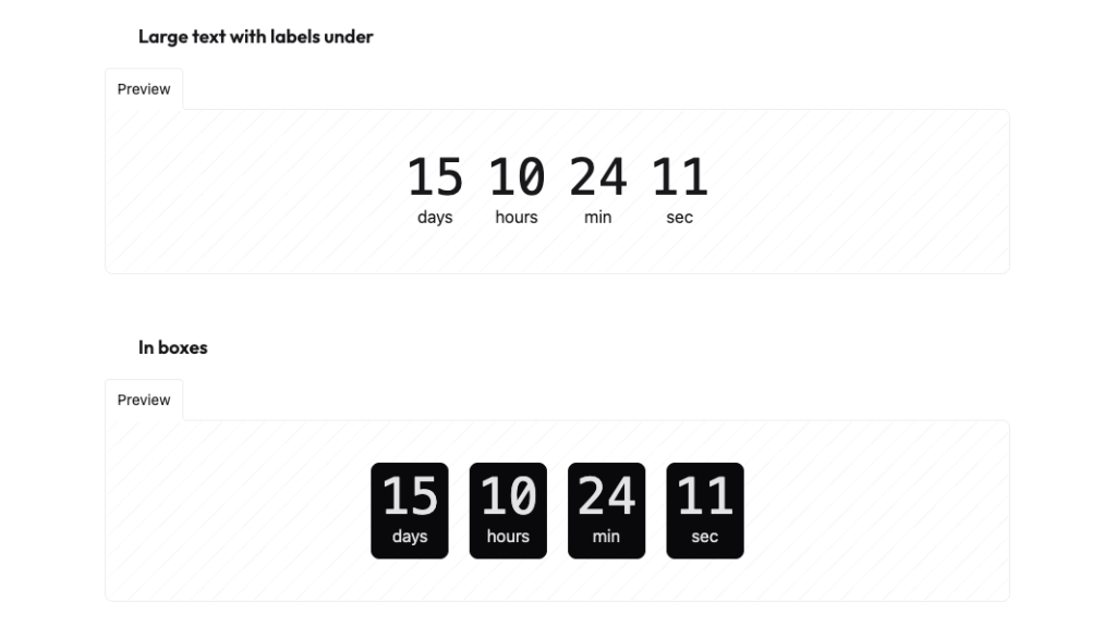
Countdown with transition effect
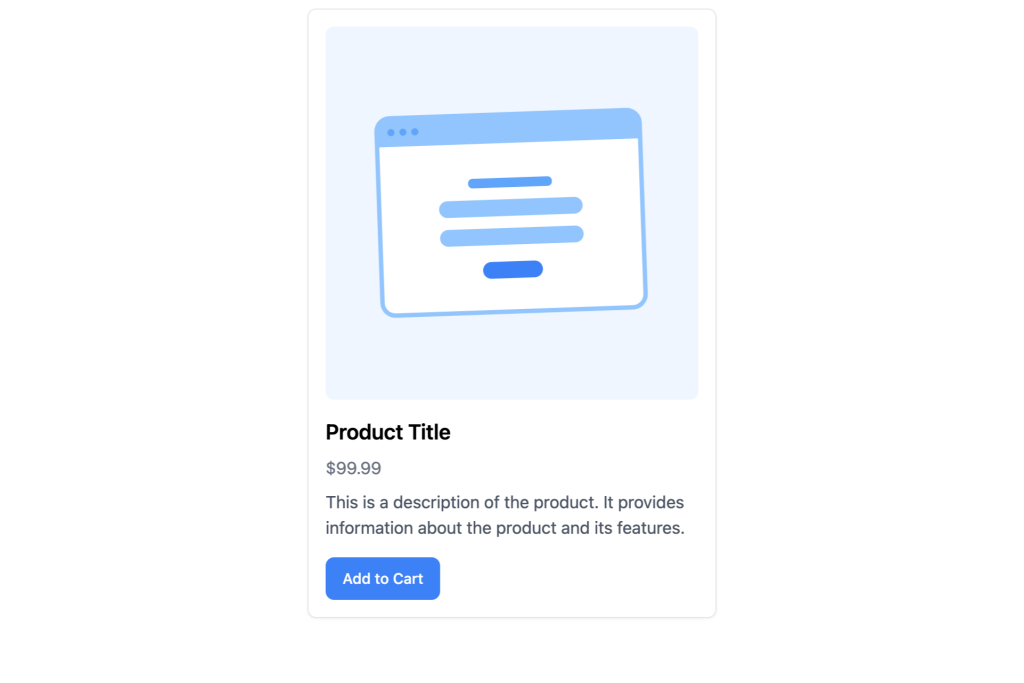
Responsive product Detail card built with Tailwind CSS

Tailwind CSS coupon code component

Open source React and Figma design system
Open-source neobrutalism Tailwind UI component library
250+ Free Application and Marketing Tailwind CSS UI Components
Free Tailwind & Alpine component library
18+ free React & Tailwind CSS UI Components

Sticky bottom button for Tailwind CSS
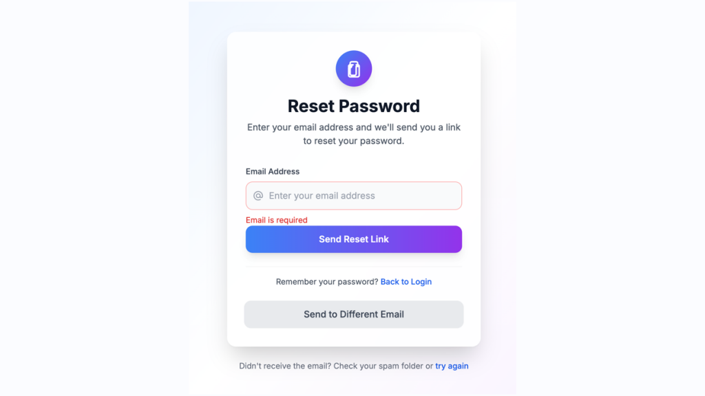
Customizable password reset form built with Tailwind CSS
Fast, accessible, and fully customizable components built for e-commerce
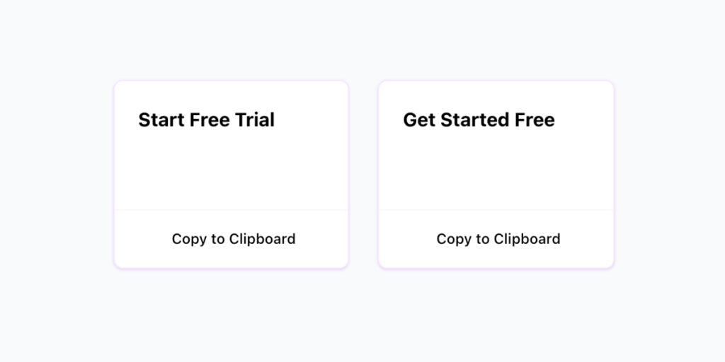
Copy to clipboard component with Alpine.js and Tailwind CSS

130+ Free Tailwind UI Sections
19 HTML & React UI components
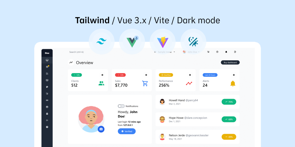
Tailwind CSS Vue 3 dashboard template with dark mode
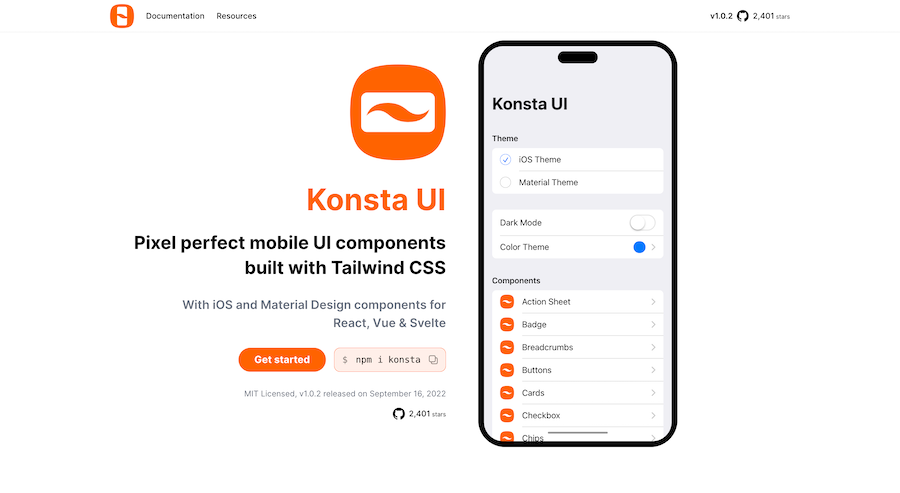
Mobile first Tailwind UI kit for React, Vue & Svelte
Accessible, responsive UI components for Tailwind projects
80+ ready-made Tailwind CSS components
60+ customizable Tailwind CSS blocks
55 themeable components for rapid web design.
226 Free & Open Source Tailwind CSS Components
Generate Tailwind CSS components using Claude 3.5 Sonnet

600+ TailGrids UI blocks for instant Tailwind designs
200+ ready-to-use Tailwind CSS components with MCP integration. Let AI generate complete pages from your prompts — one command, production-ready UI.
Explore Components
The shift from semantic CSS to utility-first frameworks has fundamentally altered web development. Tailwind CSS has emerged not merely as a tool but as a standard for building scalable, maintainable user interfaces. For modern developers, the search for "tailwind components" is rarely about finding a single button style; it is about discovering a cohesive design system that can accelerate the transition from prototype to production.
At Tailkits, we understand that modern development requires more than just HTML snippets. It requires an architecture that supports the latest standards, including React Server Components, Vue 3 Composition API, and the interactive simplicity of Alpine.js. Our library is curated to bridge the gap between design fidelity and code quality, ensuring that every component—from a simple hero section to a complex admin dashboard—is built with maintainability in mind.
This evolution is driven by the need for speed. By providing copy-paste solutions that are pre-optimized for Tailwind v4, we address the core friction point of setup and configuration. The modern component is "headless" in logic but "opinionated" in style, allowing for seamless integration into existing projects without the bloat of traditional heavy UI frameworks.
A robust component library must adapt to the developer's stack of choice. Whether you are building a static site or a complex web application, our components are designed to be framework-agnostic while offering specific optimizations for the most popular tools.
For the React ecosystem, specifically Next.js, component architecture must account for hydration lifecycles and server-side rendering. Our React-compatible components are built to be "drop-in" ready. We leverage the philosophy where components are not hidden behind an npm package but are exposed as code you own. If you are new to this workflow, read our guide on(/blog/convert-html-to-react-component/) to streamline your integration process.
Vue developers often struggle to find Tailwind resources that respect the framework's reactive principles. Our components utilize the <script setup> syntax and fully support Nuxt 3's auto-import features. By providing native Vue implementations alongside HTML, we ensure that developers looking for specific Vue Tailwind components have a dedicated resource that respects their framework's conventions.
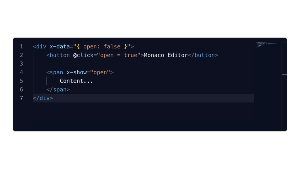
For developers adhering to the "stackless" approach—often pairing Laravel or Django with Tailwind—Alpine.js offers the perfect balance of interactivity without the build step complexity. Our library includes a dedicated subset of components pre-wired with Alpine.js logic for handling states like dropdowns, modals, and mobile menus.
Accessibility is no longer optional; it is a critical ranking factor and a legal requirement for many projects. Low-quality component libraries often neglect semantic HTML, leading to poor SEO performance and inaccessible products.
Semantic Structure: Our components abandon the "div soup" approach. We utilize semantic tags—<nav>, <header>, <main>, <article>—to ensure that search engines can parse the document structure effectively.
ARIA & Focus Management: Interactive elements in the Tailkits library come equipped with dynamic ARIA attributes. For example, our include properly associated <label> tags and aria-describedby attributes for error messages, ensuring compatibility with screen readers.
With the adoption of Tailwind CSS v4, performance optimization has taken center stage. The new engine, built on Rust, offers lightning-fast compilation, but it requires components to be structured correctly to take advantage of new features like native CSS variable configuration.
Our components are optimized for the Just-In-Time (JIT) compiler. We avoid dynamic class concatenation (e.g., bg-${color}-500), which breaks tree-shaking. Instead, we use complete utility strings and map props to classes, ensuring that the final CSS bundle remains minimal—often under 10KB even for large projects. For a deeper dive into these technical updates, check out our analysis of(/blog/tailwind-v4-component-libraries/).
Dark mode is a frequent requirement for modern web apps. Tailkits components utilize the dark: variant strategy, allowing for seamless theme switching based on system preferences or user toggles. This is implemented via CSS variables in tailwind.config.js, ensuring that color schemes are consistent and easily themable across your entire or application interface.
You can find answers for commonly asked questions about components.
Yes, the Tailkits core library is open-source and free for both personal and commercial projects. We provide a permissive license that allows you to use these components in unlimited client projects without attribution, making it an ideal choice for freelancers and agencies.
Tailkits components are fully compatible with React and Next.js. Since Tailwind is utility-first, you simply copy the HTML and convert class attributes to className. For interactive elements, we recommend using our headless adapters or integrating with libraries like Radix UI for full accessibility and state management.
Yes, all components are optimized for the Tailwind CSS v4 engine. We utilize modern CSS features and avoid deprecated utilities, ensuring that your project is future-proof. Our templates are regularly updated to leverage the latest performance improvements in the Tailwind ecosystem.
While Tailwind UI is the official paid library, Tailkits offers a robust alternative with a massive collection of free and premium components. Tailkits focuses on a broader range of design aesthetics and provides specific integrations for frameworks like Astro and Alpine.js that are often less prioritized in other libraries.
Accessibility is built-in. We use semantic HTML tags (<nav>, <main>) and include ARIA attributes (like aria-expanded for menus) by default. Our color palettes are tested for contrast ratios to meet WCAG 2.1 AA standards, ensuring your site is usable by everyone, including those relying on screen readers.
Absolutely. Alpine.js is a perfect match for Tailwind. Our HTML components are structured to easily accept Alpine x-data and x-bind directives, allowing you to add interactivity like dropdown toggles and mobile menus without the complexity of a build step.