shadcn/ui Blocks
shadcn/ui Blocks: setup, sources, tips
- Documentation
- Dark Mode
- Open Source
- Tailwind CSS v4
What are shadcn/ui Blocks?
Blocks are complete, copy-paste UI sections (dashboards, auth, pricing, etc.) built on shadcn/ui components. They save time vs. assembling primitives yourself.
They’re maintained in the shadcn ecosystem and community registries and can be pulled or copied into your React/Next.js projects.
How do I install and use Blocks quickly?
Use the shadcn CLI or copy code from a Blocks library, then paste into your project and adjust paths per your aliases.
Initialize or upgrade your project for Tailwind v4 and React 19 using the updated CLI.
For community registries and quick add flows, see the Registry Index and CLI 3.0 notes.
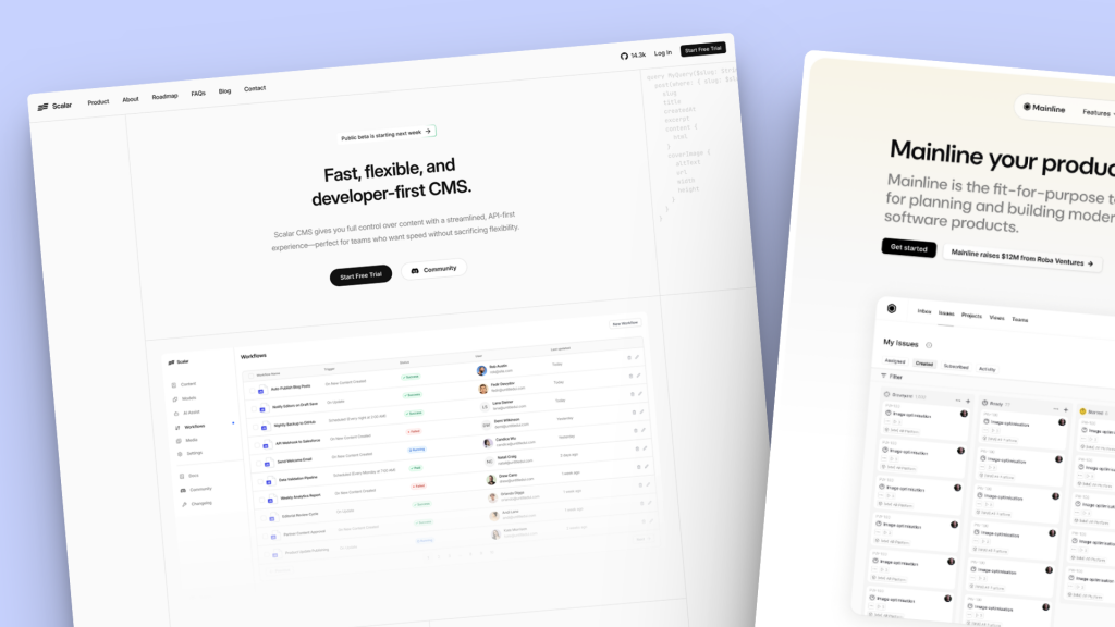
Where can I find quality shadcn/ui Blocks and templates?
Start with the official Blocks docs, then explore curated third-party registries/templates.
Official Blocks docs and contribution guide.
Curated templates, libraries on Tailkits shadcn templates & shadcn/ui components
Tip: Pair Blocks with Tailkits UI components when you need extra patterns or non-shadcn primitives. See our component library.
Shadcnblocks - Shadcnblocks shadcn/ui blocks & components (Editors Pick ⭐️⭐️⭐️⭐️⭐️)

Get 10% off Shadcnblocks! Use code
TAILKITS10at checkout 🎉
What’s new in shadcn/ui related to Blocks and Tailwind v4?
Full Tailwind v4 support, React 19 compatibility, a revamped CLI, Registry Index, and “Lift Mode” for copying sub-components.
Key highlights:
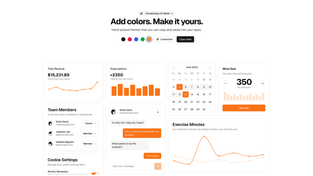
Tailwind v4 + @theme support, OKLCH colors, and simplified types
CLI 3.0 with namespaced registries and private registries.
Lift Mode lets you copy smaller parts from a block.
Which use cases do these Blocks cover?
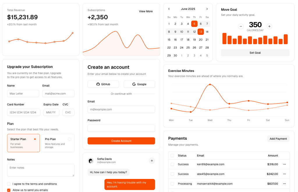
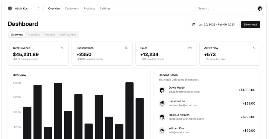
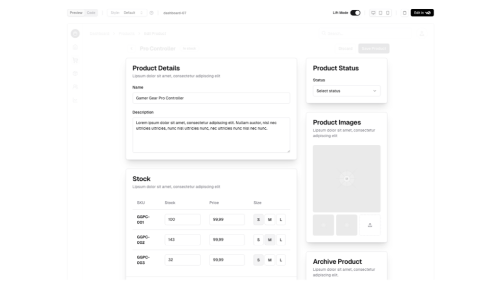
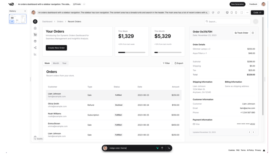
Dashboards, auth flows, pricing, feature grids, FAQs, blog, and marketing pages; ready to paste and style.
Common categories:
App UI: Dashboards, settings, product lists
Auth: Sign-in, sign-up, password reset
Marketing: Hero, features, pricing, testimonials, footers
How do I customize colors, tokens, and theming?
Short answer: Use shadcn styles (e.g., “new-york”) and Tailwind tokens; update your aliases and CSS variables, then tweak components.
Keep
components.jsonaliases in sync after adding Blocks.If a block declares registry dependencies, run the CLI to pull them and avoid broken imports.
What are common pitfalls and how do I avoid them?
Short answer: Mismatched import aliases, missing registry dependencies, and inconsistent Tailwind versions cause most issues.
Align your project to the current CLI and Tailwind v4.
When copying from third-party sites, verify license and maintenance status.
Shadcn UI Pre-Built Blocks for Tailwind Projects
Browse full-page and section templates built on shadcn/ui. Integrate effortlessly into Next.js/React, customize themes, and ship speedy UIs.
Sidebar
Login
Signup
OTP
Calendar
FAQ
What exactly is the difference between a “component” and a “block”?
Components are primitives; Blocks are complete sections assembled from those primitives.
Can I use Blocks without Next.js?
Yes. The CLI supports multiple frameworks (Vite, Remix, Laravel, etc.). Ensure routes and aliases are adapted automatically by the CLI.
Do Blocks support Tailwind v4?
Yes, the CLI and registries support v4, including @theme and OKLCH colors.
Is there a way to copy smaller parts of a Block?
Yes, Lift Mode lets you copy sub-components from within a Block.
Where can I browse open-source Block registries?
See the Registry Index (official list) and community templates on shadcn.io