HOT
HOTTailkits UI
NEWConsistent UI, zero hallucinations
Radix UI lets you build accessible React components with unstyled, customizable primitives—perfect for flexible design systems.
HOTConsistent UI, zero hallucinations
 HOT
HOT16+ Shadcn Templates
 HOT
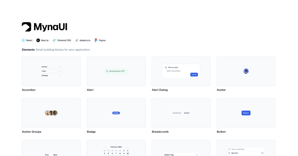
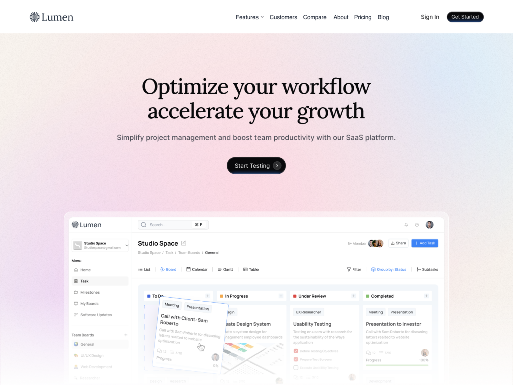
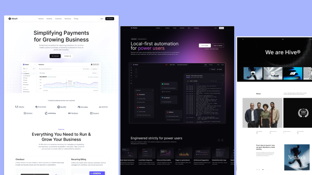
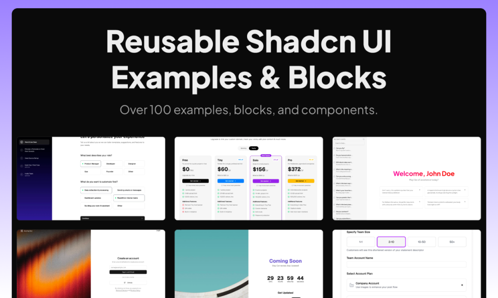
HOTReusable shadcn/ui examples, blocks, and components.

Open-source component library for React + Tailwind

Beautiful Shadcn blocks - ready-to-use & built for speed
 HOT
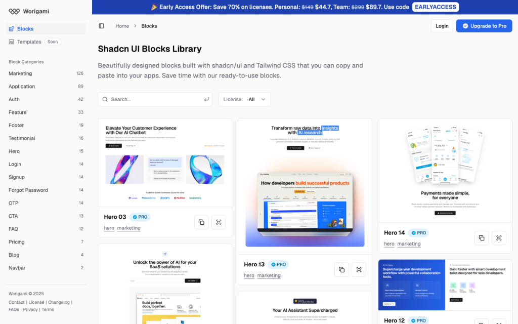
HOT1216 shadcn/ui blocks for Tailwind
Force your AI to use a professional design system. Build brand-matched, consistent UIs with 200+ vetted components.
Production-ready Tailwind components for React, Next.js, Vue & HTML. Responsive, accessible UI blocks optimized for Tailwind v4 with MCP integration.
200+ ready-to-use Tailwind CSS components with MCP integration. Let AI generate complete pages from your prompts — one command, production-ready UI.
Explore Components
Radix UI Components is a collection of unstyled, low-level UI components for building accessible and high-performance design systems and web applications. Unlike traditional UI libraries that come with predefined styles, Radix provides the underlying functionality, allowing developers to implement their own designs without being constrained by preset aesthetics.
Radix UI emphasizes primitives—basic building blocks that handle complex behaviors and accessibility concerns. By focusing on functionality over style, it gives developers the freedom to craft unique and cohesive designs tailored to their specific needs.
Choosing the right UI component library can significantly impact your development workflow and the quality of your application. Here’s why Radix UI stands out:
Accessibility is baked into every Radix component. This means that out of the box, components like modals, dropdowns, and sliders are keyboard navigable and screen reader friendly, adhering to WAI-ARIA standards. This reduces the overhead of manually ensuring accessibility in your applications.
Radix UI provides unstyled components, giving developers complete control over the look and feel. Whether you're aiming for a minimalist design or a vibrant, dynamic interface, Radix adapts to your design language without getting in the way.
Built with performance in mind, Radix minimizes unnecessary re-renders and ensures that components are lightweight. This results in faster load times and a smoother user experience, especially crucial for large-scale applications.
Radix components are designed to be composable. You can mix and match different primitives to build complex UI elements without being tied to a rigid structure. This flexibility allows for more innovative and tailored solutions.
For developers working with TypeScript, Radix UI offers robust support, ensuring type safety and better developer experience through comprehensive type definitions.
Integrating Radix UI into your project is straightforward. Here’s a quick guide to get you up and running:
Start by installing Radix UI via npm or yarn:
npm install @radix-ui/react-<component>Replace <component> with the specific Radix component you need, such as dialog, dropdown-menu, or slider.
Here’s a simple example of using Radix’s Dialog component:
import * as Dialog from '@radix-ui/react-dialog';

function MyDialog() {
  return (
    <Dialog.Root>
      <Dialog.Trigger>Open Dialog</Dialog.Trigger>
      <Dialog.Overlay />
      <Dialog.Content>
        <Dialog.Title>Dialog Title</Dialog.Title>
        <Dialog.Description>This is a Radix UI dialog.</Dialog.Description>
        <Dialog.Close>Close</Dialog.Close>
      </Dialog.Content>
    </Dialog.Root>
  );
}
In this example, Radix handles all the accessibility and behavior, while you apply your own styles to achieve the desired appearance.
Understanding the standout features of Radix UI helps in leveraging its full potential:
Every component is built with accessibility in mind. Features like focus management, keyboard navigation, and ARIA attributes are handled seamlessly, ensuring your application is usable by everyone.
Radix follows a headless approach, meaning components provide functionality without imposing any styling. This allows for maximum flexibility in design without compromising on behavior or accessibility.
Radix manages the state of components internally, simplifying the process of handling open/closed states, selected items, and other interactive behaviors. This reduces boilerplate code and potential bugs.
The design system is built on composable primitives, enabling you to create complex UI elements by combining simple, reusable components.
Radix UI components are compatible with server-side rendering frameworks like Next.js, ensuring that your application remains fast and SEO-friendly.
Radix UI Components can be applied across a wide range of scenarios in web development:
Creating accessible and customizable modal windows becomes effortless with Radix’s Dialog component, handling focus trapping and escape key functionality out of the box.
Build interactive dropdowns that are both keyboard navigable and screen reader compatible, perfect for navigation menus or action selectors.
Implement precise and responsive sliders for input ranges, enhancing forms and data visualization elements.
Organize content efficiently with Tabs and Accordion components, ensuring smooth transitions and user-friendly interactions.
Radix UI is designed to be framework-agnostic, making it compatible with popular front-end frameworks like React, Vue, and Angular. While Radix provides React components, integrating with other frameworks involves similar principles:
Given that Radix UI is built with React, it's naturally a perfect fit. Utilize hooks and component composition to seamlessly incorporate Radix into your React projects.
For applications using Next.js or Gatsby, Radix UI aligns well with server-side rendering and static site generation, ensuring fast load times and optimal SEO performance.
Radix UI plays well with CSS-in-JS libraries like Styled-Components or Emotion, as well as traditional CSS and utility-first frameworks like Tailwind CSS. This flexibility allows you to maintain consistent styling practices across your project.
Maximizing the benefits of Radix UI Components involves adhering to certain best practices:
Leverage the composable nature of Radix components to build complex UI elements from simple primitives. This promotes reusability and maintainability in your codebase.
While Radix handles much of the accessibility groundwork, always test your components with various assistive technologies to ensure a seamless user experience for all.
Take advantage of the unstyled nature of Radix to implement your design system. Ensure that custom styles align with the overall aesthetic and usability principles of your application.
Radix UI is actively maintained and frequently updated with new components and features. Keep your dependencies up to date to benefit from the latest improvements and security patches.
If you're using TypeScript, capitalize on Radix's strong type definitions to catch errors early and improve the overall reliability of your code.
Radix UI Components offer a powerful and flexible solution for building accessible and high-performance user interfaces. By providing unstyled primitives, Radix empowers developers to craft bespoke designs without sacrificing functionality or accessibility.