Myna UI
TailwindCSS and shadcn/ui UI kit
- Figma design file
- Copy & Paste
What Is MynaUI?
MynaUI is a modern, accessible UI kit designed to help designers and developers speed up the design-to-code process. With a carefully crafted collection of Figma components and React code, MynaUI is built using TailwindCSS and shadcn/ui – two of the most popular tools in the web development world.

Features

MynaUI comes packed with features designed to simplify web development and design:
Component Library:
MynaUI includes a wide variety of elements ranging from basic building blocks like buttons, alerts, and avatars to more complex elements like data tables, modals, and dashboards. This means you get a ready-to-use resource that minimizes repetitive coding.TailwindCSS & shadcn/ui Integration:
Built with the latest version of TailwindCSS, MynaUI benefits from a utility-first approach to styling, making customization fast and straightforward. Meanwhile, shadcn/ui ensures that the components have reliable interactivity and modern design standards.Figma Ready:
The kit provides Figma files that are neatly organized into a user-friendly design system. This allows designers to prototype and tweak layouts, colors, typography, and more before handing off the design to developers.Responsive and Accessible:
Every component is built with responsiveness and accessibility in mind. This means your projects not only look great on any device but are also designed to be usable by everyone.Regular Updates:
With frequent updates, MynaUI stays current with evolving web trends. New components and improvements are rolled out regularly to keep your project up-to-date without a major overhaul.Flexible Free and Pro Options:
MynaUI offers a free version with essential components, making it easy to get started. For those who need more advanced features and a broader component selection, the pro version unlocks an even larger library with additional customization options.

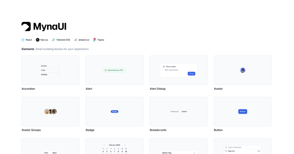
Included Components
MynaUI isn’t just about individual components; it also provides a collection of ready-to-use templates that can give your project a head start:

UI Elements
Create stunning admin panels and dashboards with pre-built components.
Accordion
Alert
Alert Dialog
Avatar
Avatar Groups
Badge
Breadcrumb
Button
Button Groups
Calendar
Combobox
Command
Context Menu
Data Table
Dialog
Drawer
Dropdown Menu
Menubar
Pagination
Popover
Progress
Rating
Sheet
Skeleton
Spinner
Table
Tabs
Toast
Toggle and Toggle Group
Tooltip
Forms
Form components for your application
Checkbox
Date Picker
Input OTP
Input
Radio
Select
Slider
Switch
Textarea
Marketing Elements
Start your marketing or product website with beautifully designed marketing site components.
Footer
Header
Hero
Statistics
Testimonial Logos
Features
404
Blog List
Blog Post
Call to Action
Cookies
FAQ
Admin Sections
Start your web application with pre-made components.
App Headers
Card Headers
Cards
Containers
Dividers
Empty States
Forgot Password
Login
Notifications
Registration
Section Headers
Pricing
MynaUI offers a flexible pricing model to suit different project requirements:
Free Version:
The free version gives you access to a core set of components and templates. It’s an excellent way to test the kit and see if it fits your workflow.Pro Version:
For a one-time fee, the pro version unlocks an extended library with advanced components, additional customization options, and priority updates. This investment can save you hours of development time and give you access to premium designs that elevate your project.
Integrations
MynaUI works seamlessly with several industry-standard tools and platforms:
TailwindCSS:
The kit is built on TailwindCSS, ensuring you have access to a powerful, utility-first framework that makes styling quick and efficient.shadcn/ui:
Leveraging shadcn/ui for its components means you get modern, interactive elements that follow best practices in UI development.Figma:
MynaUI comes with ready-to-use Figma files, allowing you to prototype and iterate on designs before diving into the code.React:
For developers, the provided React components ensure smooth integration with your projects, whether you’re building a web application from scratch or enhancing an existing one.
Pros and Cons
Pros
User-Friendly:
Both designers and developers will find MynaUI easy to navigate. The Figma files are well-organized, and the React components are modular, which reduces the learning curve significantly.High Customizability:
Every component is built with customization in mind. You can tweak colors, spacing, and typography to match your project’s unique style, making it a highly flexible solution.Modern and Responsive:
MynaUI’s components are built to be responsive and accessible, ensuring your projects are future-proof and usable across different devices and by diverse user groups.Frequent Updates:
The development team actively maintains MynaUI, releasing updates and new components regularly. This means you always have access to the latest design trends and technical improvements.
Cons
Dark Mode Inconsistencies:
While some components offer dark mode support, the experience isn’t fully consistent across the entire kit. A more comprehensive dark mode implementation would be a great addition.Premium Lock-In:
While the free version is generous, some of the more advanced features and components are locked behind the pro version. For smaller projects or tight budgets, this might be a consideration.Learning Curve for Beginners:
Even though the kit is designed to be user-friendly, complete newcomers to TailwindCSS or shadcn/ui might need some time to get accustomed to the workflow.
MynaUI stands out as a modern, flexible UI kit that bridges the gap between design and development. Its comprehensive collection of Figma and React components, built on the solid foundation of TailwindCSS and shadcn/ui, makes it a top pick for anyone looking to streamline their workflow.
FAQ
Can I customize MynaUI components?
Absolutely! All components in MynaUI are designed to be fully customizable. You can tweak colors, spacing, typography, and more to match your project’s unique requirements. The Figma files are especially useful for visual customization before you apply changes in code.
Is MynaUI suitable for both beginners and experienced developers?
Yes, it is. While beginners might need a little time to get used to TailwindCSS and shadcn/ui, the documentation and guided onboarding make it accessible. Experienced developers will appreciate the kit’s flexibility, modularity, and the speed it brings to the development process.
How often is MynaUI updated?
MynaUI is actively maintained, with regular updates that include new components, improvements to existing ones, and bug fixes. Staying current with the latest web standards is a top priority for the development team.
Can I use MynaUI for commercial projects?
Definitely. MynaUI is built for both personal and commercial use. The licensing is flexible, so whether you’re working on a startup, a personal blog, or a large-scale enterprise application, MynaUI is a reliable choice.