HOT
HOTTailkits UI
NEWConsistent UI, zero hallucinations
Discover 50+ free and premium, responsive UI elements built with Tailwind CSS. Expertly designed pre-built components to start building your projects.
HOTConsistent UI, zero hallucinations
 HOT
HOT16+ Shadcn Templates
 HOT
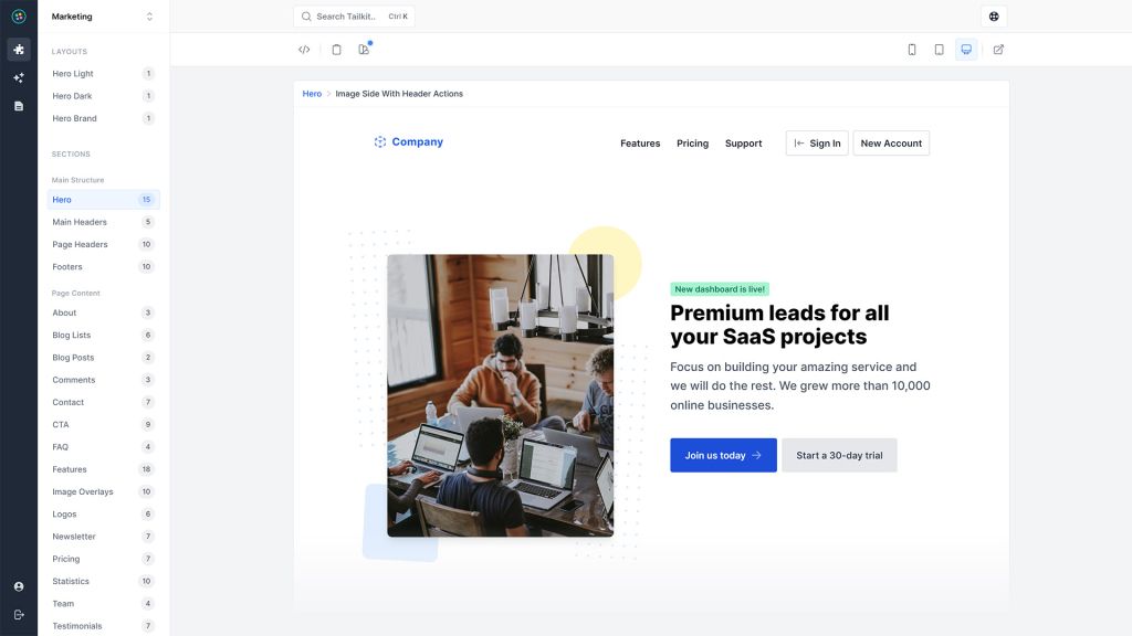
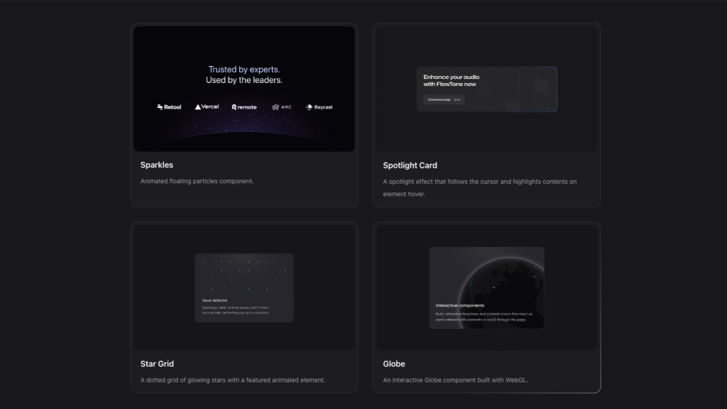
HOT1216 shadcn/ui blocks for Tailwind
Premium neo-brutalist blocks for React

shadcn/ui without React
Angular component kit with 130+ building blocks
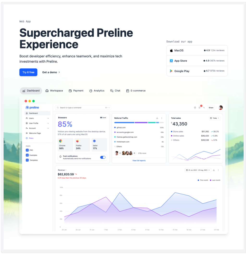
Preline: 740+ Tailwind pages & components
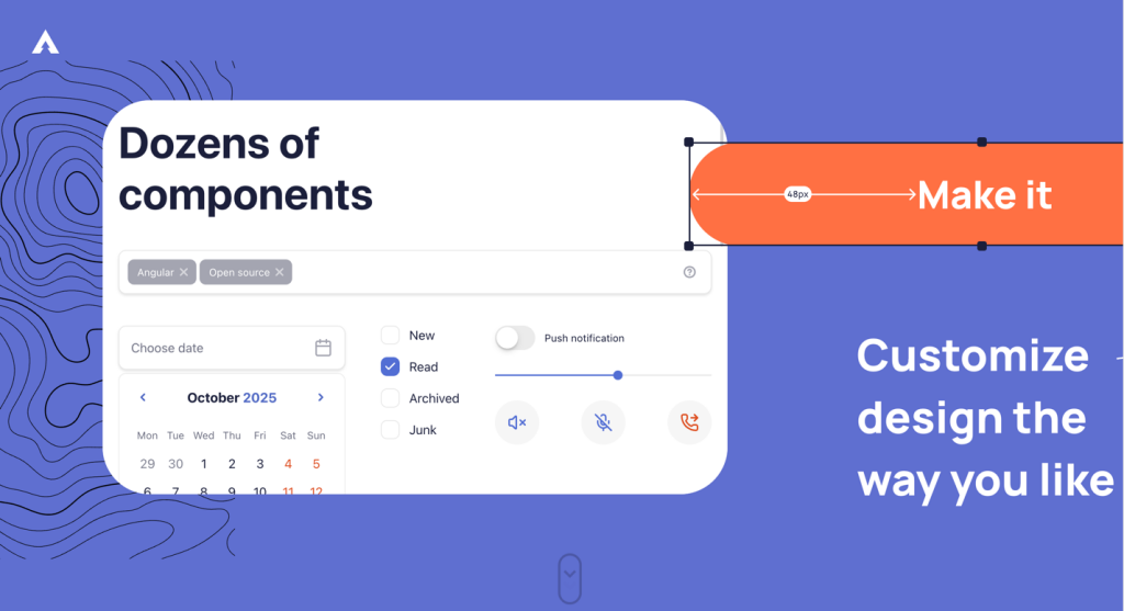
Open source Tailwind CSS & Alpine.js components

500+ Tailwind Plus UI components
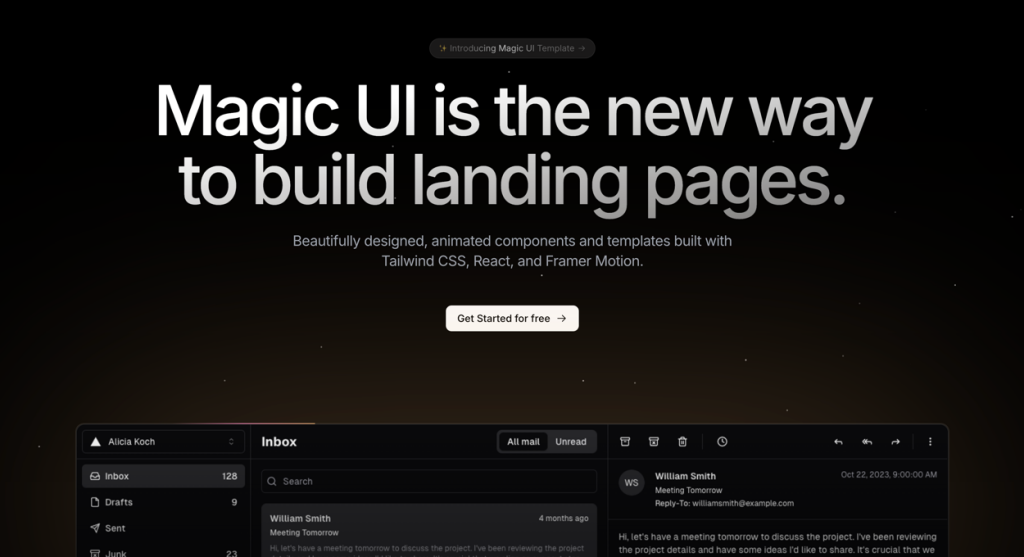
50+ animated sections and 3+ templates
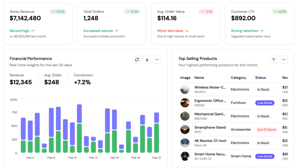
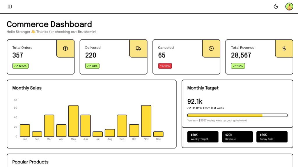
UI blocks for dashboards, built with shadcn/ui

Launch Rails apps quickly with ready Tailwind components
600+ ready-made Tailwind CSS components
TailwindCSS and shadcn/ui UI kit
Interactive Tailwind components for React and Vue.js
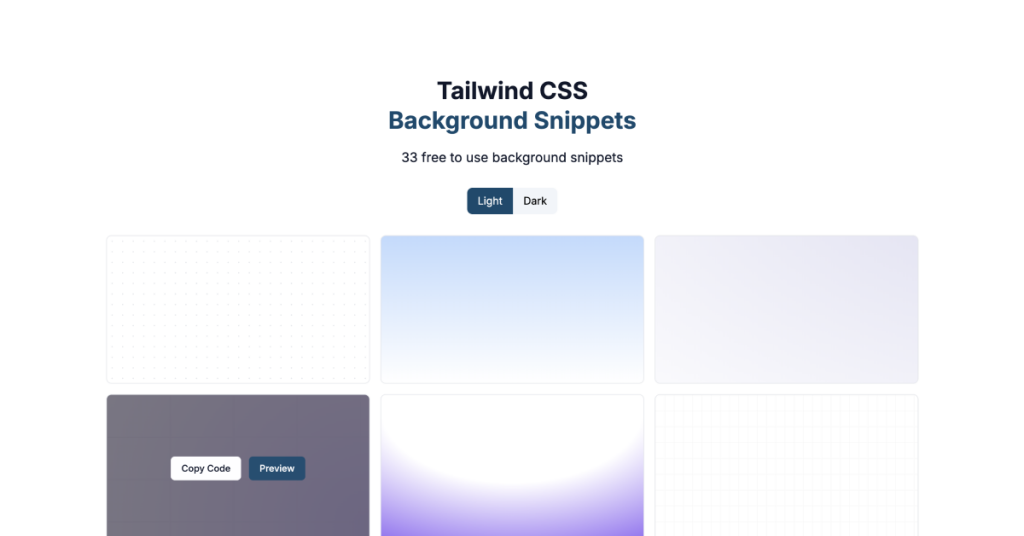
33 free to use background snippets
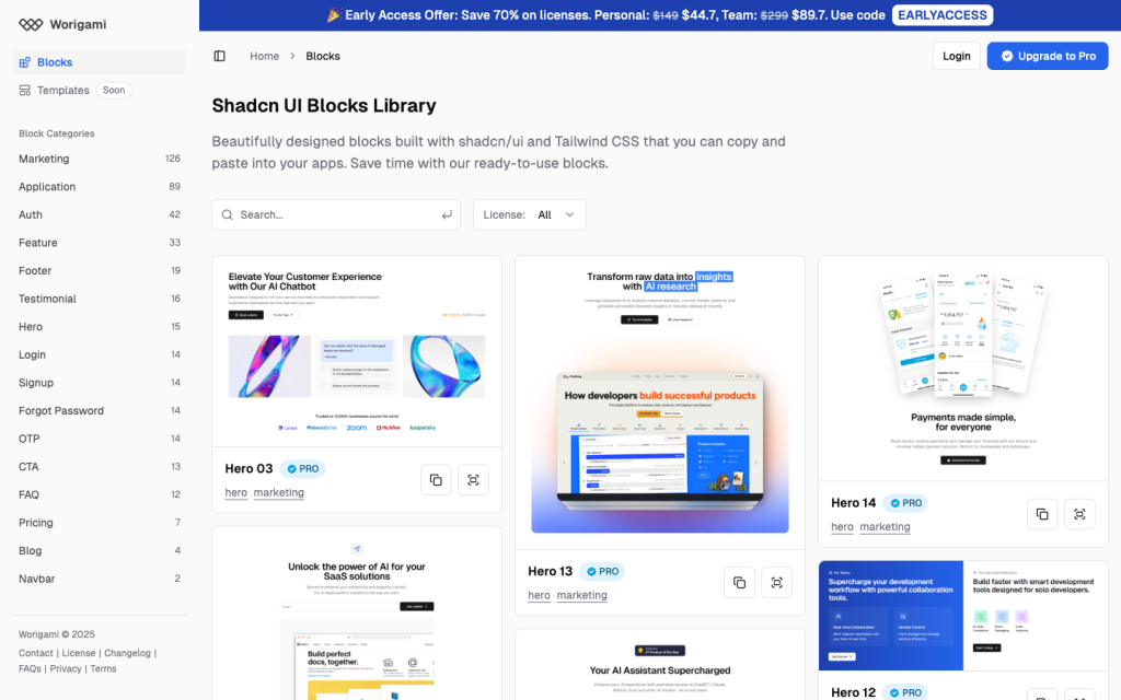
180+ shadcn/ui blocks
Animated Tailwind components using Framer Motion
Framer Motion components from ibelick
UI components built with Tailwind CSS for React and Next.js
Reusable shadcn/ui elements
Tailwind dropdown component with Alpine.js
50+ UI Components for Tailwind CSS
Responsive Tailwind grid components in HTML
Tailwind contact form component & sections
Force your AI to use a professional design system. Build brand-matched, consistent UIs with 200+ vetted components.
Responsive and minimal table component built with Tailwind CSS.
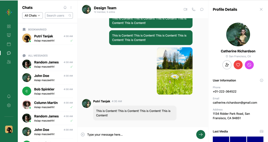
Chat UI component built with Tailwind and Next.js.
Tailwind roadmap, timeline component
Tailwind logo cloud components
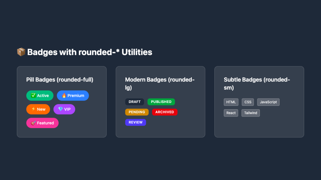
Responsive, rounded badge components
Sleek glass card UI in pure Tailwind

Tailwind integrations components
Tailwind filter components
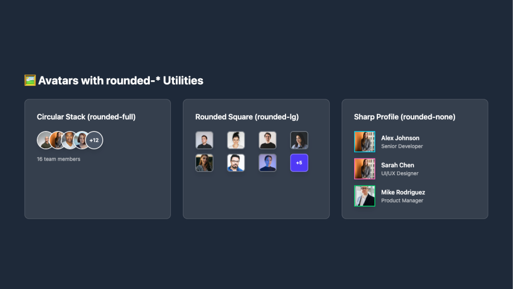
Overlapping circular avatars in a neat stack

Tailwind 404, error page components
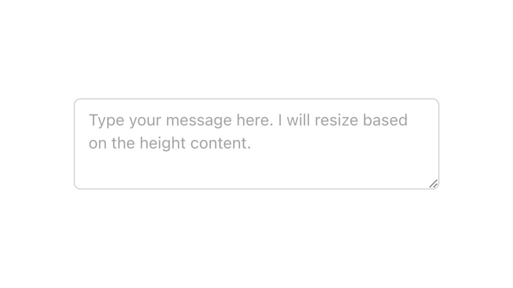
Alpine.js and Tailwind text area component by Pines UI Library.
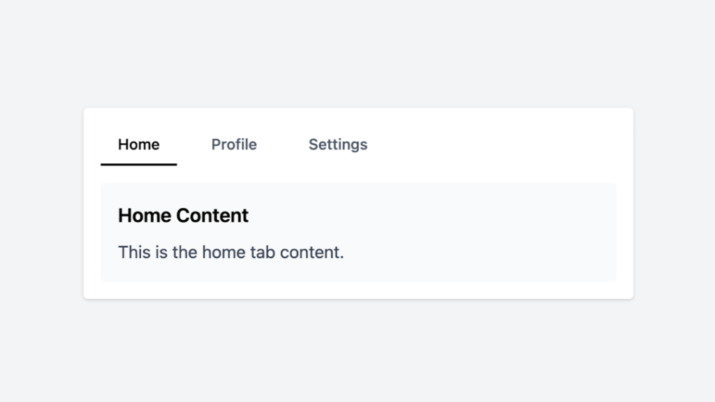
Tailwind tabs component with Alpine.js
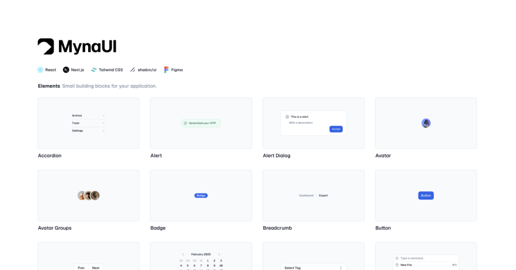
450+ UI components for Tailwind CSS
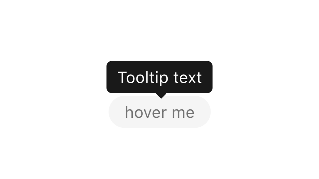
Alpine.js and Tailwind tooltip component by Pines UI Library.
Alpine.js and Tailwind popover component by Pines UI Library.
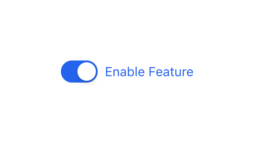
Alpine.js and Tailwind toggle component by Pines UI Library.
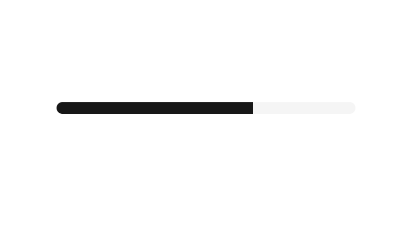
Alpine.js and Tailwind progress component by Pines UI Library.
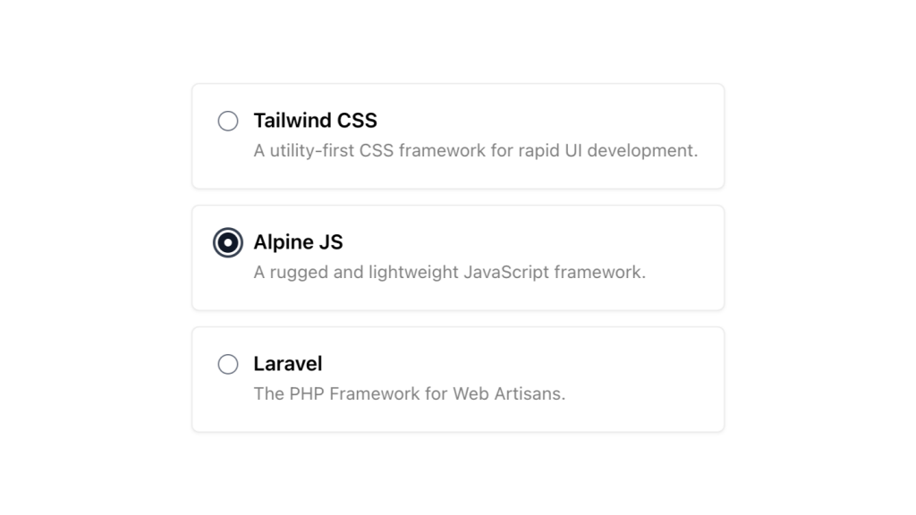
Alpine.js and Tailwind radio group component by Pines UI Library.

Alpine.js and Tailwind video component by Pines UI Library.

Alpine.js and Tailwind image gallery component by Pines UI Library.
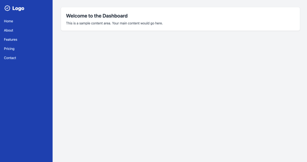
A clean sidebar that has hover states for navigation items
Alpine.js and Tailwind menu component by Pines UI Library.
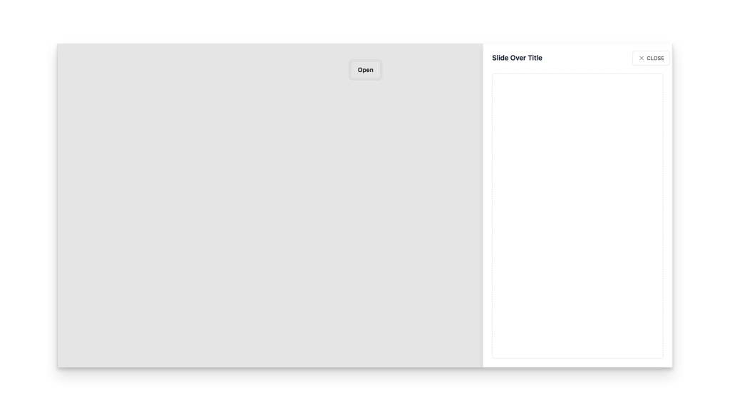
Alpine.js and Tailwind slide-over component by Pines UI Library.
Alpine.js and Tailwind animated text component by Pines UI Library.
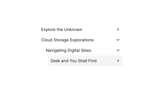
Tailwind tree view menu component
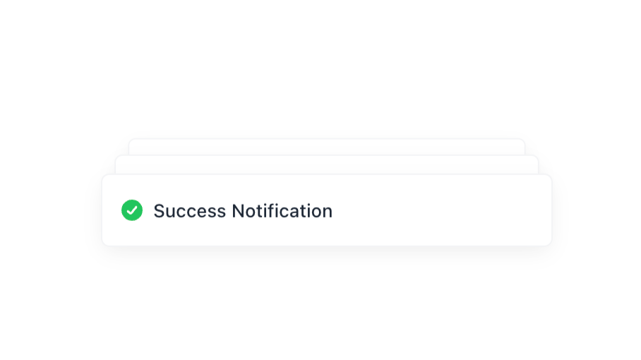
Alpine.js and Tailwind toast notification component by Pines UI Library.

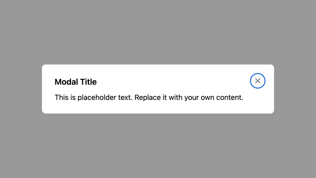
Alpine.js and Tailwind modal component by Pines UI Library.
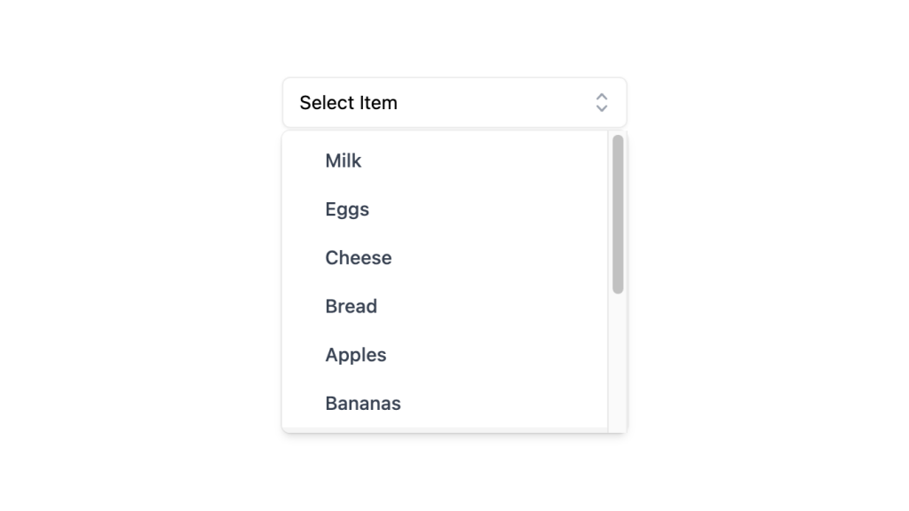
Alpine.js and Tailwind select dropdown menu component by Pines UI Library.
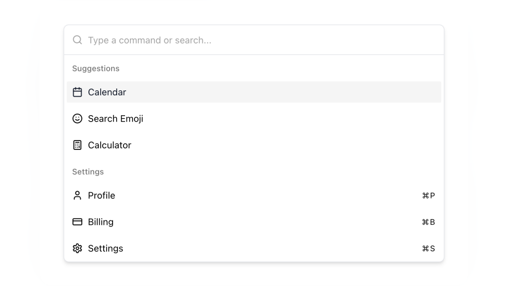
Alpine.js and Tailwind command palette component by Pines UI Library.
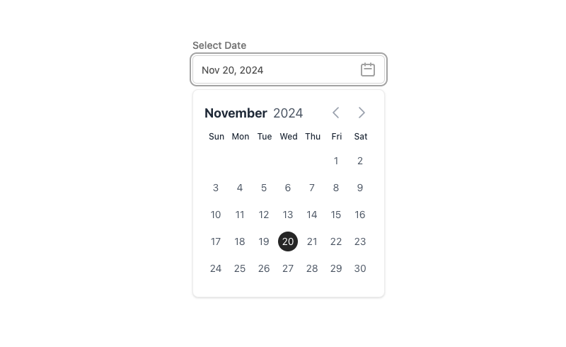
Alpine.js and Tailwind date picker component by Pines UI Library.
52 Free to use Tailwind buttons

16 React & Vue UI components
Alpine.js Tailwind banner component to add a sticky CTA on landing pages.
Tailwind accordion component with Alpine.js
0 javascript infinite carousel-slider component with logo cloud example
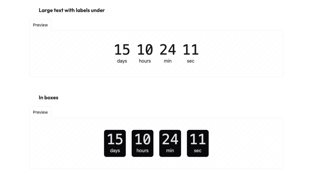
Countdown with transition effect
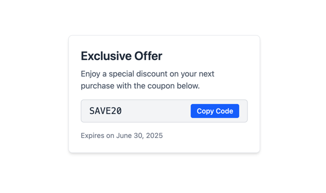
Tailwind CSS coupon code component
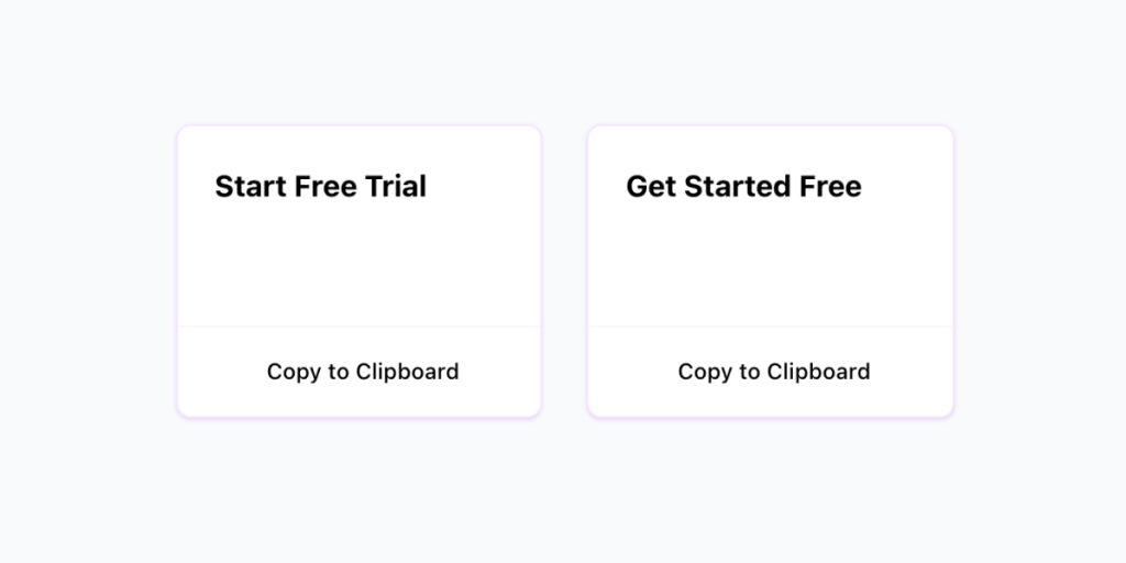
Copy to clipboard component with Alpine.js and Tailwind CSS
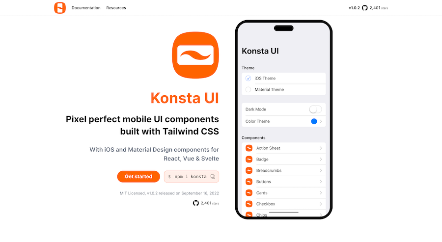
Mobile first Tailwind UI kit for React, Vue & Svelte
226 Free & Open Source Tailwind CSS Components
Generate Tailwind CSS components using Claude 3.5 Sonnet

600+ TailGrids UI blocks for instant Tailwind designs
Production-ready Tailwind components for React, Next.js, Vue & HTML. Responsive, accessible UI blocks optimized for Tailwind v4 with MCP integration.
200+ ready-to-use Tailwind CSS components with MCP integration. Let AI generate complete pages from your prompts — one command, production-ready UI.
Explore Components
Building websites takes time. Making each button, form, and menu from scratch can be tough. But here's the good news! Tailwind UI Elements can speed up your work. Think of them as ready-made pieces you can use right away.
Tailwind UI Elements are pre-made website parts. They're like building blocks that fit together perfectly. You can use them to make buttons, forms, menus, and more. Each piece works right away, but you can also change how it looks.
These elements use Tailwind CSS. This means you can change their colors, sizes, and styles easily. You don't need to write lots of new code. Just pick the pieces you need and put them together.
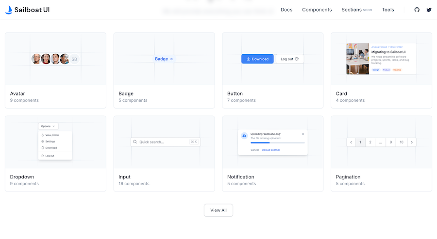
Basic UI elements are the simple parts every website needs. These include:
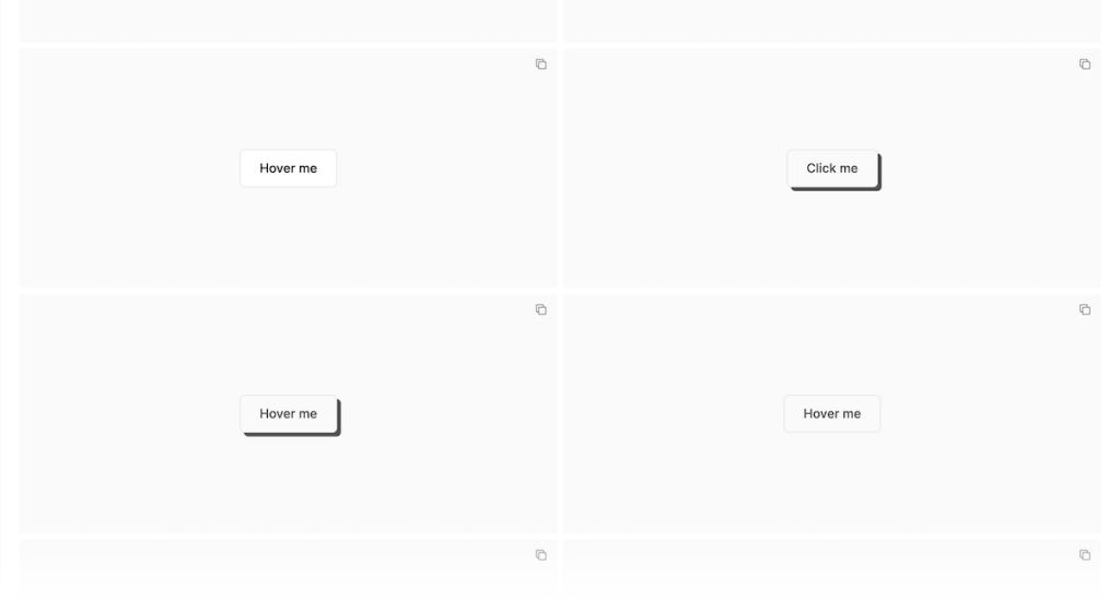
Buttons and links with various states and styles:
Different sizes and colors
Change style when clicked
Work with mouse and keyboard
Show when they're active
Text and Images:
Headers
Body text
Picture holders
Icons
All sizes work on phones and computers
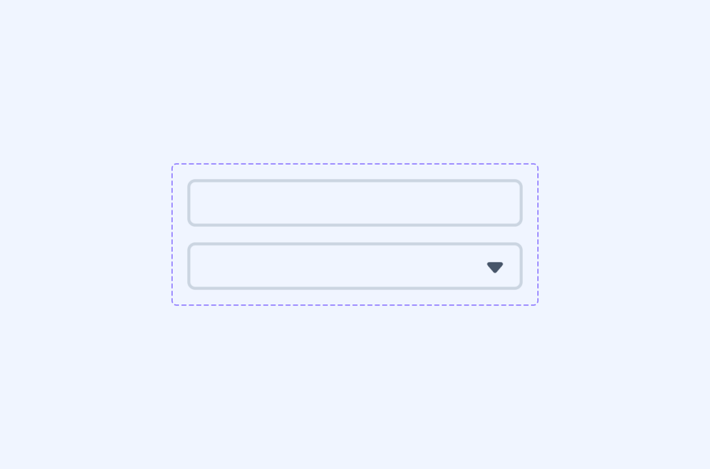
Input fields and form controls for data collection:
Text boxes
Email fields
Password inputs
Search bars
Easy to fill out
Labels and badges for categorization and status indicators
Typography components for content hierarchy
Specific parts are designed according to the website's needs.
These components mostly have built-in states for hover, focus, and active interactions, making them ready for real cases. Each element maintains accessibility standards and works across different browsers.
Interactive components add functionality and user engagement. These parts respond when users click or tap:
Menu Options:
Dropdown lists and select menus with search capabilities
Toggle switches for binary options
Radio buttons for single-choice selections
Checkboxes for multiple-choice inputs
Sliders for range selection
Progress bars for status indication
Rating systems for user feedback such as star ratings
Tooltips for showing extra info on hover
They work well on:
Computer mice
Touch screens
Keyboards
All web browsers
These elements handle user interactions and provide immediate visual feedback. They're built with keyboard navigation support and touch-friendly targets for mobile users.
Layout elements help structure your content:
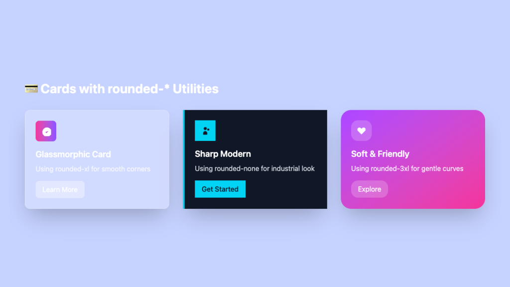
Cards and containers; are popular for content organization. They hold text and pictures, fit different screen sizes, and space things evenly. They help to keep things lined up and make lists look nice
Grid Systems are important for responsive layouts putting things in rows and columns, and changing shapes on phones. They are useful to keep everything clear,and easy to read.
Flex containers for flexible arrangements
Spacing utilities for consistent gaps
Dividers for visual separation
Columns and rows for structured layouts
Wrappers for content containment
Masonry layouts for dynamic content
These components work together to have well-structured pages that adapt to different screen sizes and content types.
Navigation elements guide users through your website:
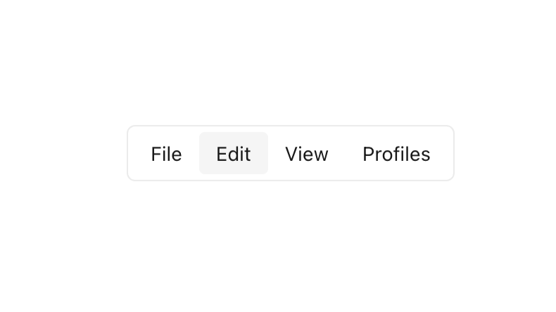
Menu bars with dropdowns
Breadcrumbs for location tracking
Pagination controls for long lists
Tabs for content organization
Sidebars for additional navigation
Search bars with autocomplete
Mega menus for complex structures
Mobile navigation drawers
Each navigation component is designed for user-friendly usage with smooth transitions between different sections of your website.
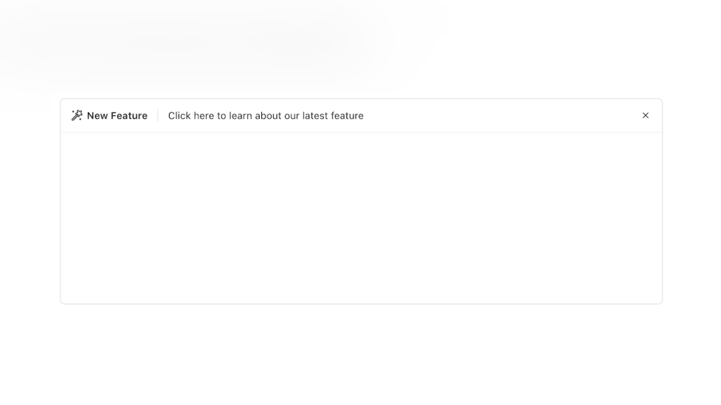
Pop-up interfaces for focused interactions:
Alert dialogs
Confirmation windows
Cookie consent notices
Feature announcements
Image lightboxes
Video players
Form wizards
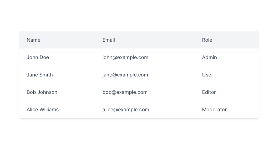
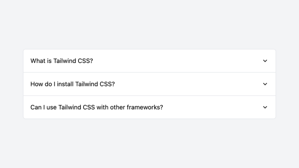
Components for showing complex information:
Tables with sorting and filtering
Charts and graphs
Statistics cards
Timeline displays
Price tables
Comparison grids
Dashboard widgets
Elements for user engagement:
Comment sections
Share buttons
Like/reaction systems
User profiles
Activity feeds
Following/follower displays
Using pre-built UI elements saves significant development time. Rather than writing CSS from scratch, you can focus on:
Customizing components to match your brand
Building unique features
Improving user experience
Testing and optimization
Creating new functionality
Refining interactions
Adding business logic
UI elements help maintain design consistency by:
Using standardized spacing
Following color schemes
Maintaining typography rules
Keeping component styles uniform
Applying consistent shadows
Using matching animations
Coordinating border styles
Modern UI elements are built with mobile-first principles:
Adapt to different screen sizes
Scale appropriately on various devices
Maintain functionality across platforms
Look great on both desktop and mobile
Support touch interactions
Handle orientation changes
Manage content reflow
Quality UI elements prioritize accessibility:
Include ARIA labels
Support keyboard navigation
Meet contrast requirements
Follow semantic HTML practices
Provide screen reader support
Handle focus management
Support reduced motion
UI elements work with popular frameworks:
React integration patterns
Vue component usage
Angular implementation
Next.js optimization
Svelte adaptation
Handle component states effectively:
Data loading states
Error conditions
Empty states
Loading animations
Success feedback
Validation messages
Optimize component usage:
Code splitting strategies
Bundle size management
Runtime performance
Memory usage
Network requests
Asset loading
Keep your website running smoothly:
Use only necessary components
Remove unused styles
Optimize for loading speed
Consider lazy loading
Minimize HTTP requests
Cache effectively
Compress assets
Create a unified look:
Stick to a consistent style
Use complementary components
Follow design patterns
Maintain visual hierarchy
Apply spacing rules
Match animations
Coordinate interactions
Plan for mobile users:
Test touch interactions
Check spacing on small screens
Verify tap target sizes
Review mobile navigation
Support gestures
Handle offline states
Optimize images
You can find answers for commonly asked questions about components.
UI elements are pre-built website components that serve as building blocks for web development. They include buttons, forms, menus, and other interface elements that are ready to use, saving development time while maintaining consistency in design.
UI elements are mostly built with mobile-first principles, automatically adapting to different screen sizes, supporting touch interactions, handling orientation changes, and managing content reflow across various devices and platforms.
UI Elements include comprehensive accessibility features such as: ARIA labels Keyboard navigation support Contrast requirement compliance Semantic HTML practices Screen reader support Focus management Reduced motion support
UI elements maintain consistency through standardized spacing, consistent color schemes, uniform typography rules, matching component styles, coordinated animations and transitions, consistent border styles and shadows.
We generally use cards and containers for organizing the content, grid systems for creating responsive layouts, flex containers for flexible adjustments, and spacing utilities for providing consistent gaps.