Pricing 1
Tailkits UISingle‑plan card with monthly/annual toggle, price and feature list

From our own library — copy-paste Tailwind components with MCP support.
Responsive and minimal table component built with Tailwind CSS.
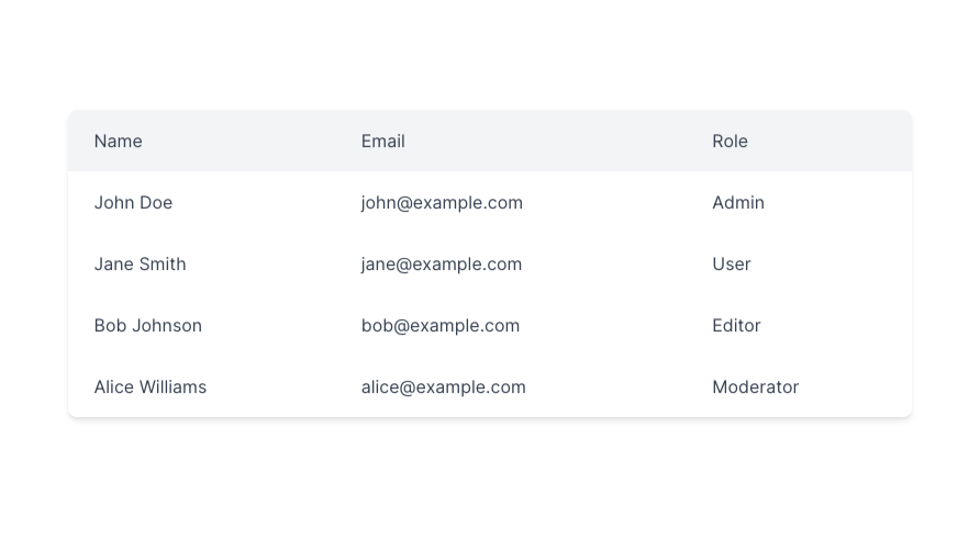
Here is the copy-to-paste code of this component:
<div class="flex justify-center">
  <table class="w-full max-w-4xl border-collapse rounded-lg overflow-hidden shadow-lg">
    <thead class="bg-gray-100 dark:bg-gray-800">
      <tr>
        <th class="px-6 py-4 text-left font-medium text-gray-900 dark:text-gray-50">Name</th>
        <th class="px-6 py-4 text-left font-medium text-gray-900 dark:text-gray-50">Email</th>
        <th class="px-6 py-4 text-left font-medium text-gray-900 dark:text-gray-50">Role</th>
        <th class="px-6 py-4 text-right font-medium text-gray-900 dark:text-gray-50">Actions</th>
      </tr>
    </thead>
    <tbody class="bg-white dark:bg-gray-950">
      <tr class="border-b border-gray-200 dark:border-gray-800">
        <td class="px-6 py-4 whitespace-nowrap">John Doe</td>
        <td class="px-6 py-4 whitespace-nowrap">[email protected]</td>
        <td class="px-6 py-4 whitespace-nowrap">Admin</td>
        <td class="px-6 py-4 text-right">
          <button
            class="inline-flex items-center justify-center whitespace-nowrap rounded-md text-sm font-medium ring-offset-background transition-colors focus-visible:outline-none focus-visible:ring-2 focus-visible:ring-ring focus-visible:ring-offset-2 disabled:pointer-events-none disabled:opacity-50 hover:bg-accent hover:text-accent-foreground h-10 w-10"
            type="button"
            id="radix-:r0:"
            aria-haspopup="menu"
            aria-expanded="false"
            data-state="closed"
          >
            <svg
              xmlns="http://www.w3.org/2000/svg"
              width="24"
              height="24"
              viewBox="0 0 24 24"
              fill="none"
              stroke="currentColor"
              stroke-width="2"
              stroke-linecap="round"
              stroke-linejoin="round"
              class="w-4 h-4"
            >
              <polyline points="18 8 22 12 18 16"></polyline>
              <polyline points="6 8 2 12 6 16"></polyline>
              <line x1="2" x2="22" y1="12" y2="12"></line>
            </svg>
            <span class="sr-only">Actions</span>
          </button>
        </td>
      </tr>
      <tr class="border-b border-gray-200 dark:border-gray-800">
        <td class="px-6 py-4 whitespace-nowrap">Jane Smith</td>
        <td class="px-6 py-4 whitespace-nowrap">[email protected]</td>
        <td class="px-6 py-4 whitespace-nowrap">Editor</td>
        <td class="px-6 py-4 text-right">
          <button
            class="inline-flex items-center justify-center whitespace-nowrap rounded-md text-sm font-medium ring-offset-background transition-colors focus-visible:outline-none focus-visible:ring-2 focus-visible:ring-ring focus-visible:ring-offset-2 disabled:pointer-events-none disabled:opacity-50 hover:bg-accent hover:text-accent-foreground h-10 w-10"
            type="button"
            id="radix-:r2:"
            aria-haspopup="menu"
            aria-expanded="false"
            data-state="closed"
          >
            <svg
              xmlns="http://www.w3.org/2000/svg"
              width="24"
              height="24"
              viewBox="0 0 24 24"
              fill="none"
              stroke="currentColor"
              stroke-width="2"
              stroke-linecap="round"
              stroke-linejoin="round"
              class="w-4 h-4"
            >
              <polyline points="18 8 22 12 18 16"></polyline>
              <polyline points="6 8 2 12 6 16"></polyline>
              <line x1="2" x2="22" y1="12" y2="12"></line>
            </svg>
            <span class="sr-only">Actions</span>
          </button>
        </td>
      </tr>
      <tr class="border-b border-gray-200 dark:border-gray-800">
        <td class="px-6 py-4 whitespace-nowrap">Bob Johnson</td>
        <td class="px-6 py-4 whitespace-nowrap">[email protected]</td>
        <td class="px-6 py-4 whitespace-nowrap">User</td>
        <td class="px-6 py-4 text-right">
          <button
            class="inline-flex items-center justify-center whitespace-nowrap rounded-md text-sm font-medium ring-offset-background transition-colors focus-visible:outline-none focus-visible:ring-2 focus-visible:ring-ring focus-visible:ring-offset-2 disabled:pointer-events-none disabled:opacity-50 hover:bg-accent hover:text-accent-foreground h-10 w-10"
            type="button"
            id="radix-:r4:"
            aria-haspopup="menu"
            aria-expanded="false"
            data-state="closed"
          >
            <svg
              xmlns="http://www.w3.org/2000/svg"
              width="24"
              height="24"
              viewBox="0 0 24 24"
              fill="none"
              stroke="currentColor"
              stroke-width="2"
              stroke-linecap="round"
              stroke-linejoin="round"
              class="w-4 h-4"
            >
              <polyline points="18 8 22 12 18 16"></polyline>
              <polyline points="6 8 2 12 6 16"></polyline>
              <line x1="2" x2="22" y1="12" y2="12"></line>
            </svg>
            <span class="sr-only">Actions</span>
          </button>
        </td>
      </tr>
      <tr class="border-b border-gray-200 dark:border-gray-800">
        <td class="px-6 py-4 whitespace-nowrap">Alice Williams</td>
        <td class="px-6 py-4 whitespace-nowrap">[email protected]</td>
        <td class="px-6 py-4 whitespace-nowrap">Viewer</td>
        <td class="px-6 py-4 text-right">
          <button
            class="inline-flex items-center justify-center whitespace-nowrap rounded-md text-sm font-medium ring-offset-background transition-colors focus-visible:outline-none focus-visible:ring-2 focus-visible:ring-ring focus-visible:ring-offset-2 disabled:pointer-events-none disabled:opacity-50 hover:bg-accent hover:text-accent-foreground h-10 w-10"
            type="button"
            id="radix-:r6:"
            aria-haspopup="menu"
            aria-expanded="false"
            data-state="closed"
          >
            <svg
              xmlns="http://www.w3.org/2000/svg"
              width="24"
              height="24"
              viewBox="0 0 24 24"
              fill="none"
              stroke="currentColor"
              stroke-width="2"
              stroke-linecap="round"
              stroke-linejoin="round"
              class="w-4 h-4"
            >
              <polyline points="18 8 22 12 18 16"></polyline>
              <polyline points="6 8 2 12 6 16"></polyline>
              <line x1="2" x2="22" y1="12" y2="12"></line>
            </svg>
            <span class="sr-only">Actions</span>
          </button>
        </td>
      </tr>
    </tbody>
  </table>
</div>Creating visually appealing and responsive tables can be a game-changer for your web projects. With Tailwind CSS, a utility-first framework, designing tables becomes both efficient and flexible.
Tailwind CSS provides many utility classes that allow you to style your tables with precision. Unlike traditional CSS frameworks with pre-styled components, Tailwind offers you the building blocks to craft your custom designs. This approach ensures that your tables align perfectly with your overall design system.
At its core, a table in HTML consists of <table>, <thead>, <tbody>, and <tfoot> elements. Tailwind enhances these elements with utilities for spacing, borders, and text styles. Here’s a simple example:
<table class="min-w-full bg-white">
  <thead>
    <tr>
      <th class="py-2 px-4 bg-gray-200">Header 1</th>
      <th class="py-2 px-4 bg-gray-200">Header 2</th>
    </tr>
  </thead>
  <tbody>
    <tr>
      <td class="py-2 px-4 border">Data 1</td>
      <td class="py-2 px-4 border">Data 2</td>
    </tr>
  </tbody>
</table>
In this example:
min-w-full ensures the table takes up the full width of its container.
bg-white sets the background color.
py-2 px-4 applies padding for better spacing.
bg-gray-200 differentiates the header from the body.
border adds borders to table cells.
Tailwind allows you to fine-tune the appearance of your tables. You can easily adjust colors, borders, spacing, and typography to match your design requirements.
Striped Rows: Add alternating background colors to rows for better readability.
<tbody>
  <tr class="bg-white">
    <td class="py-2 px-4 border">Data 1</td>
    <td class="py-2 px-4 border">Data 2</td>
  </tr>
  <tr class="bg-gray-50">
    <td class="py-2 px-4 border">Data 3</td>
    <td class="py-2 px-4 border">Data 4</td>
  </tr>
</tbody>
Hover Effects: Highlight rows on hover to improve user interaction.
<tr class="hover:bg-gray-100">
  <td class="py-2 px-4 border">Data 1</td>
  <td class="py-2 px-4 border">Data 2</td>
</tr>
Responsive Design: Ensure tables look good on all devices by making them scrollable on smaller screens.
<div class="overflow-x-auto">
  <table class="min-w-full bg-white">
    <!-- Table content -->
  </table>
</div>In today’s multi-device world, responsiveness is crucial. Tailwind simplifies creating tables that adapt seamlessly to different screen sizes.
Horizontal Scrolling: Wrap your table in a div with overflow-x-auto to allow horizontal scrolling on smaller screens.
<div class="overflow-x-auto">
  <table class="min-w-full bg-white">
    <!-- Table content -->
  </table>
</div>
Hide Columns on Mobile: Use responsive utility classes to show or hide specific columns based on screen size.
<th class="py-2 px-4 hidden md:table-cell">Optional Header</th>
<td class="py-2 px-4 hidden md:table-cell">Optional Data</td>
In this example, the <th> and <td> elements are hidden on small screens (hidden) and displayed as table cells on medium screens and above (md:table-cell).
Tailwind’s flexibility doesn’t end with basic styling. You can enhance your tables with interactive features like sorting, pagination, and more, often by integrating JavaScript or other libraries.
While Tailwind handles the styling, you can implement sorting and filtering functionalities using JavaScript frameworks or libraries. For instance, integrating with Alpine.js can provide reactive data handling without the overhead of larger frameworks.
For tables with extensive data, pagination helps in managing content without overwhelming the user. Tailwind’s utility classes can style your pagination controls to match your table’s design seamlessly.
<div class="flex justify-between items-center py-2">
  <span class="text-sm text-gray-700">Showing 1 to 10 of 50 entries</span>
  <div class="flex space-x-2">
    <button class="px-3 py-1 bg-gray-200 rounded">Previous</button>
    <button class="px-3 py-1 bg-gray-800 text-white rounded">Next</button>
  </div>
</div>Several component libraries built on Tailwind can expedite the development of complex table features. Libraries like Headless UI or TailwindUI offer pre-designed components that you can customize according to your needs.
To make the most out of Tailwind CSS when building table components, consider the following best practices:
Maintain consistent padding, margins, and typography across your table to ensure a harmonious look. Use Tailwind’s utility classes to enforce uniformity.
Ensure your tables are accessible to all users. Use semantic HTML elements, proper scope attributes for headers, and sufficient color contrast for text and backgrounds.
<th scope="col" class="py-2 px-4 bg-gray-200">Header</th>Start designing your tables for mobile devices, then enhance them for larger screens. Tailwind’s responsive utilities make it easy to adjust styles based on screen size.
Avoid excessive use of utility classes which can bloat your HTML. Leverage Tailwind’s @apply directive in your CSS to combine commonly used classes, keeping your HTML clean and maintainable.
/* Example in a CSS file */
.table-header {
  @apply py-2 px-4 bg-gray-200 text-left text-sm font-semibold;
}
<th class="table-header">Header</th>Tailwind’s utility-first approach is highly extensible. You can customize Tailwind’s configuration to add new utilities or modify existing ones to better suit your table component needs.
Tailwind allows you to define custom color palettes in your tailwind.config.js file. This is especially useful for creating a unique look for your tables that aligns with your brand.
// tailwind.config.js
module.exports = {
  theme: {
    extend: {
      colors: {
        tableHeader: '#f3f4f6',
        tableRow: '#ffffff',
        tableRowAlt: '#f9fafb',
      },
    },
  },
};To streamline your workflow, create reusable table components using Tailwind’s @apply directive or by defining component classes. This reduces repetition and ensures consistency across your project.
/* In your CSS file */
.table-cell {
  @apply py-2 px-4 border;
}

.table-header {
  @apply bg-gray-200;
}
<th class="table-header">Header</th>
<td class="table-cell">Data</td>Enhance user experience by adding interactive elements to your tables. Tailwind’s utilities combined with JavaScript can create dynamic and engaging tables.
Allow users to edit table data directly. Style input fields within table cells using Tailwind to maintain a cohesive design.
<td class="table-cell">
  <input type="text" class="w-full bg-transparent border-none focus:ring-0" value="Editable Data">
</td>Implement row selection for bulk actions. Use checkboxes styled with Tailwind to keep the design consistent.
<tr class="hover:bg-gray-100">
  <td class="py-2 px-4">
    <input type="checkbox" class="form-checkbox h-4 w-4 text-blue-600">
  </td>
  <td class="py-2 px-4 border">Data 1</td>
  <td class="py-2 px-4 border">Data 2</td>
</tr>Large tables can impact performance, especially on mobile devices. Here are some tips to keep your Tailwind tables efficient:
Load table data incrementally as the user scrolls. This reduces initial load time and improves responsiveness.
Implement virtual scrolling for tables with thousands of rows. This technique renders only the visible rows, enhancing performance.
Keep the number of DOM elements to a minimum. Avoid unnecessary wrappers and excessive use of utility classes within deeply nested tables.
To get inspired, check out these examples of how Tailwind CSS is used to create effective table components:
Dashboards: Organize KPIs, metrics, and other important data in a clean, user-friendly table layout.
E-commerce: Display product listings, inventory, and pricing information with sortable and filterable columns.
Admin Panels: Manage user data, settings, and logs efficiently with responsive and interactive tables.
When working with Tailwind table components, be mindful of the following to ensure optimal results:
While Tailwind’s utility classes are powerful, overusing them can make your HTML cluttered. Strike a balance by using component classes and the @apply directive where possible.
Ensure your tables are accessible by using proper semantic HTML and ARIA attributes. Accessible tables benefit all users, including those using assistive technologies.
Design tables with mobile users in mind. Ensure that your tables are readable and navigable on smaller screens by implementing responsive design techniques.
Tailwind CSS offers a versatile and efficient way to build beautiful, responsive tables tailored to your project’s needs. By leveraging its utility-first approach, you can create highly customizable table components that enhance both the aesthetics and functionality of your web applications.
To add hover effects, use Tailwind’s hover:bg- classes on your <tr> elements. This changes the background color when a user hovers over a row, enhancing interactivity and readability.
Yes, you can easily create striped rows by alternating background colors using Tailwind’s utility classes. Apply different bg- classes to odd and even rows or directly alternate them in your markup.
Absolutely! Tailwind’s utility classes are perfect for styling pagination controls. You can create buttons and layout containers with classes like flex, space-x-2, bg-gray-200, and rounded to match your table’s design.
To make your table responsive in Tailwind, wrap the <table> element in a div with the overflow-x-auto class. This allows horizontal scrolling on smaller screens, ensuring that your table remains accessible and readable.