 HOT
HOTTailkits UI
NEWConsistent UI, zero hallucinations
Discover Color Pickers, which enable you to select and fine-tune colors for your designs. Color Pickers provide visual tools to choose colors and generate color codes.
 HOT
HOTConsistent UI, zero hallucinations
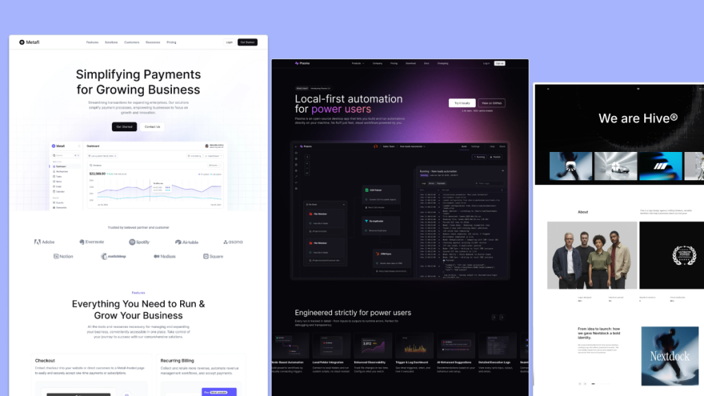 HOT
HOT12+ Shadcn Templates
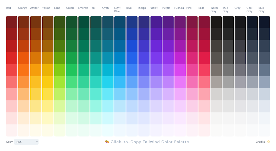
Copy from Tailwind CSS color palette in HEX
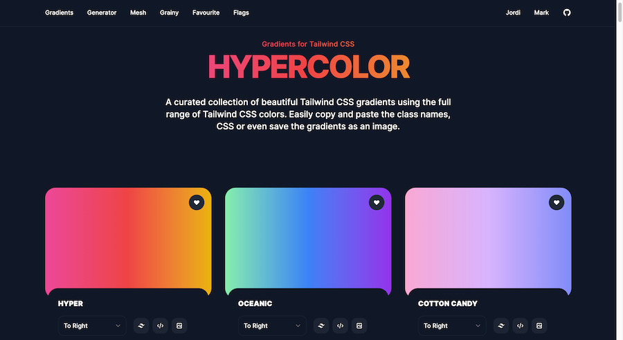
Tailwind CSS gradients collection
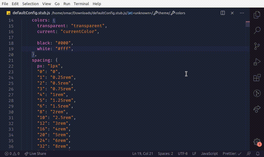
Tailwind CSS color palette generator for VS Code
Force your AI to use a professional design system. Build brand-matched, consistent UIs with 200+ vetted components.

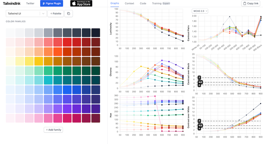
Color palette generator for Tailwind CSS
Browse 100+ Tailwind CSS developer tools—generators, color pickers, gradient makers, VS Code snippets and more.
200+ ready-to-use Tailwind CSS components with MCP integration. Let AI generate complete pages from your prompts — one command, production-ready UI.
Explore Components
At its core, a color picker is a graphical user interface (GUI) component that allows users to select colors. These tools typically present a range of colors, gradients, or palettes that users can choose from, ensuring consistency and creativity in design projects. Color pickers can be standalone applications, integrated features in design software, or embedded elements in websites and apps.
Color pickers come in various forms, each catering to different needs and preferences. Here's a look at some common types:
Standard Color Pickers: These are the most basic form, offering a palette of colors that users can choose from. They often include sliders for adjusting RGB (Red, Green, Blue) or HEX values to fine-tune selections.
Gradient Pickers: Ideal for designers looking to create smooth transitions between colors. Gradient pickers allow users to select multiple colors and define the gradient's direction and style.
Palette-Based Pickers: These pickers present pre-defined color palettes, making it easier to maintain color harmony and consistency across a project.
Eye Dropper Tools: Primarily used for extracting colors from existing images or designs. Eye dropper tools are invaluable for matching colors or creating cohesive color schemes.
Integrating a color picker into your website or application enhances user experience by providing an intuitive way to select colors. Here's how you can approach this:
Choose the Right Type: Depending on your project's needs, select a color picker type that best fits. For instance, a gradient picker is perfect for graphic design tools, while a standard picker might suffice for simpler applications.
User Interface Design: Ensure that the color picker blends seamlessly with your overall design. It should be easily accessible but not intrusive.
Functionality: Decide on the features you want to offer. Basic color selection might be enough, or you might want to include advanced options like recent colors, palette saving, and exporting capabilities.
Accessibility: Make sure your color picker is accessible to all users, including those with visual impairments. This includes providing keyboard navigation and screen reader support.
To make the most out of color pickers, consider the following best practices:
Consistency is Key: Use color pickers to maintain a consistent color scheme across your project. This helps in creating a cohesive and professional look.
Limit Your Palette: While it's tempting to use a wide range of colors, limiting your palette can prevent designs from looking chaotic. Stick to a manageable number of colors that complement each other.
Provide Presets: Offering pre-set color palettes can help users get started quickly, especially if they're unsure about color combinations.
Test for Accessibility: Ensure that the color combinations you choose are accessible to all users. Use tools to check for sufficient contrast and color blindness compatibility.
Accessibility in color selection ensures that your designs are inclusive. Here are some tips:
Contrast Ratios: Maintain adequate contrast between text and background colors to ensure readability.
Color Blindness: Use patterns or additional indicators alongside color coding to accommodate users with color vision deficiencies.
Keyboard Navigation: Ensure that color pickers can be navigated using a keyboard for users who cannot use a mouse.
Color pickers are powerful tools that bridge the gap between creativity and functionality in design and development. By understanding the different types of color pickers, implementing them thoughtfully, and adhering to best practices, you can elevate the visual appeal and user experience of your projects.
Remember, the right color can evoke emotions, convey messages, and create memorable experiences. So, take the time to explore various color picker options and find the one that best fits your creative needs!
You can find answers for commonly asked questions about tools.
Most modern color pickers support multiple color formats, including HEX, RGB, and HSL. This versatility allows developers and designers to work with their preferred formats, enhancing flexibility and integration with various design tools and frameworks.
Yes, many color picker libraries are designed to be responsive and mobile-friendly. They adapt to different screen sizes and touch interfaces, ensuring users can select colors effortlessly on smartphones and tablets. When choosing a color picker, look for those that prioritize responsive design to cater to a wider audience.
Color pickers provide an interactive and user-friendly way for users to select colors, enhancing personalization and engagement. They simplify the process of choosing colors, ensuring users can easily find and apply the exact shades they need without manual input, thereby streamlining design workflows.