 HOT
HOTTailkits UI
NEWConsistent UI, zero hallucinations
Discover shadcn/ui templates crafted to streamline your React development. Build responsive, modern web apps with our premium and free templates.
 HOT
HOTConsistent UI, zero hallucinations
 HOT
HOT12+ Shadcn Templates
 HOT
HOT12+ Shadcn Templates
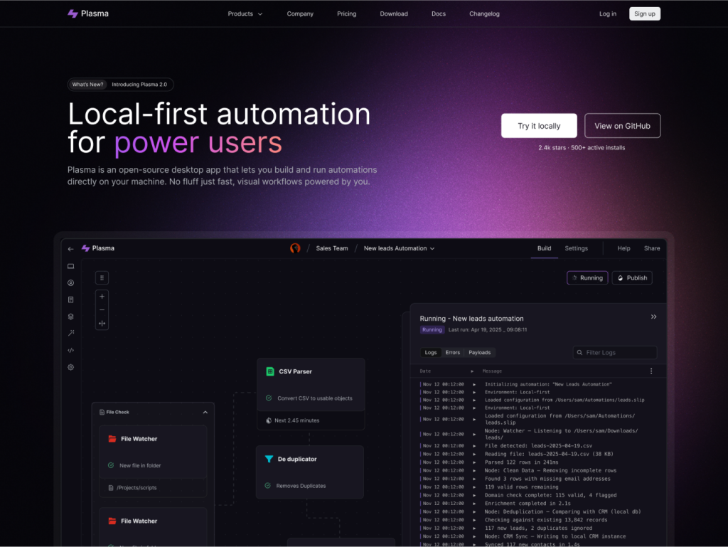
Developer SaaS template for Next.js 15 & Astro 5
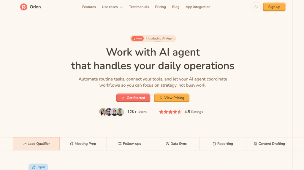
AI automation landing page built with shadcn UI

Analytics landing page built with shadcn UI, Tailwind v4
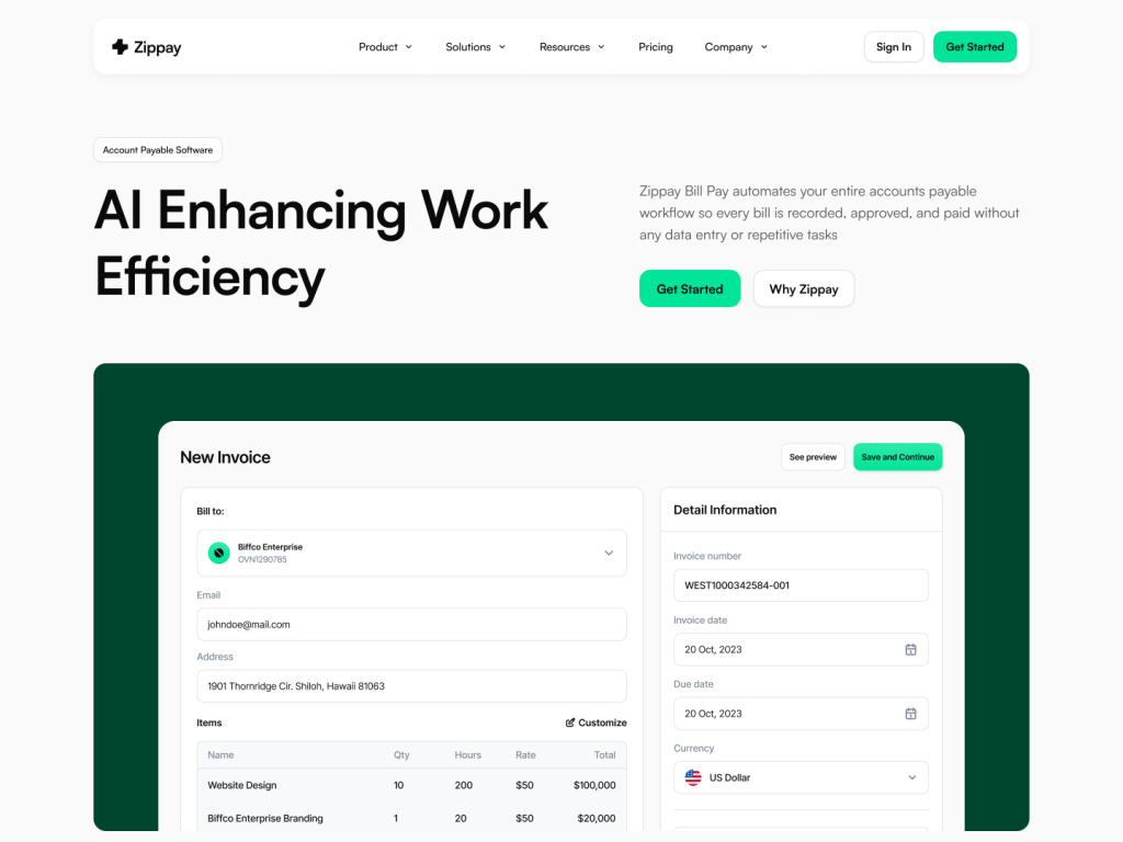
Multi-page fintech template for Next.js/Astro
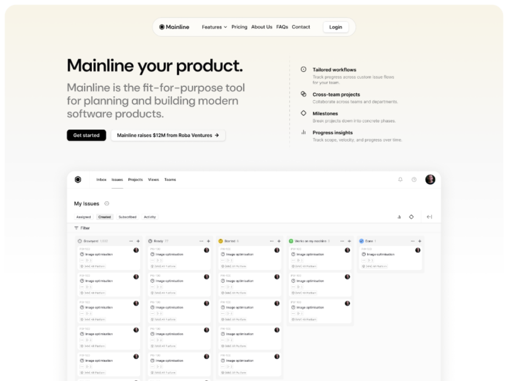
10+ page shadcn/ui template
Free & Pro Tailwind CSS Templates & Themes
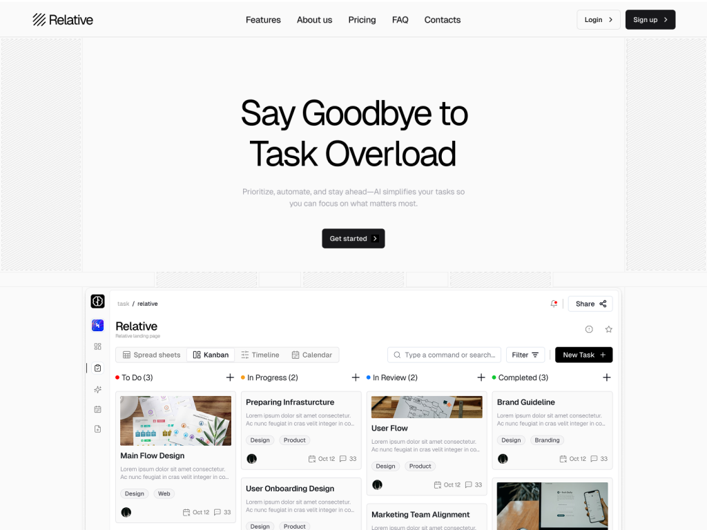
10 page modern landing page tempalte
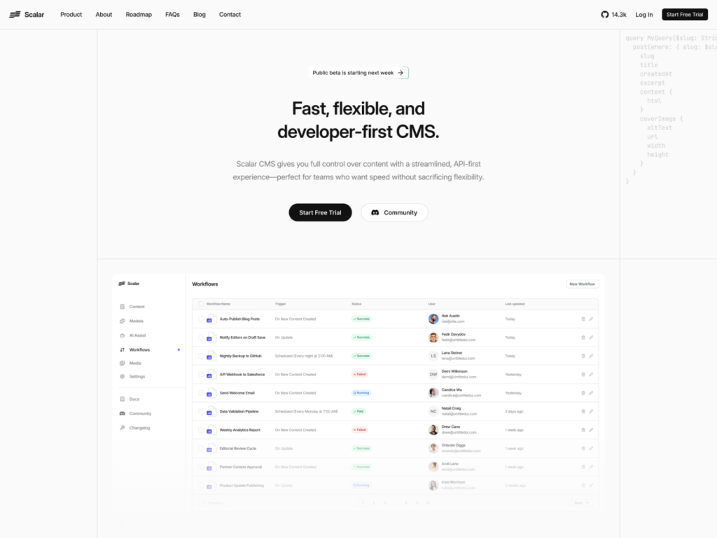
Modern SaaS template built with shadcn/ui & Tailwind
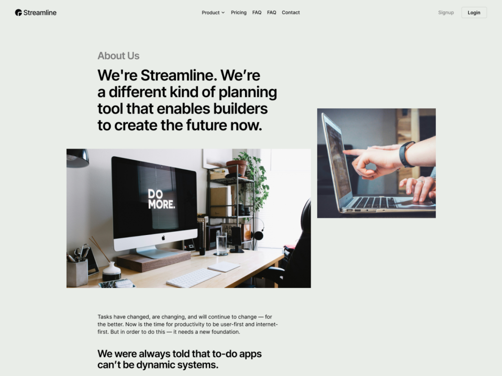
10 page Next.js & Astro template
 HOT
HOT43 Tailwind templates and 7,500+ UI components
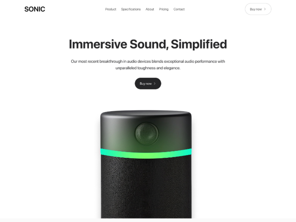
Single-product Tailwind landing template
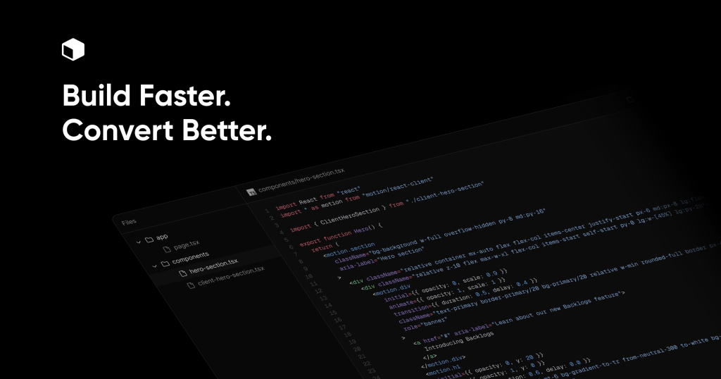
Premium blocks & templates for high conversion and SEO
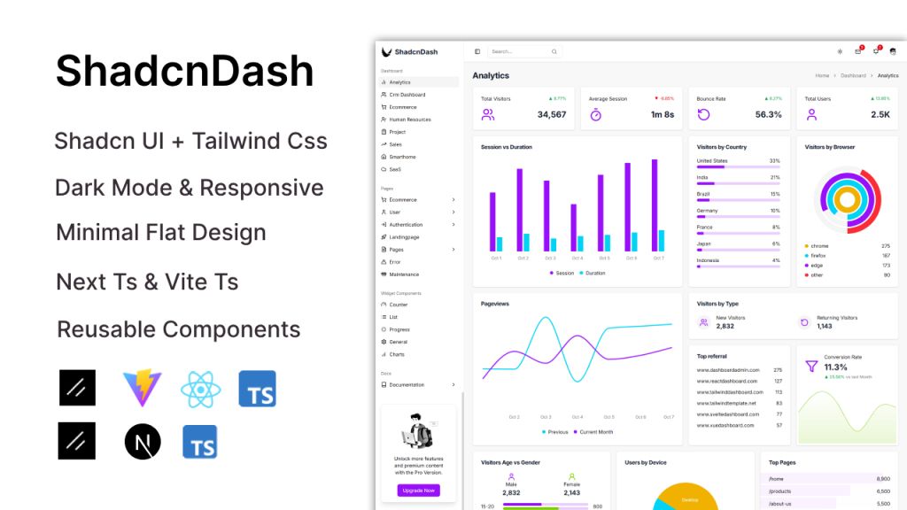
Minimal admin panel with reusable layouts
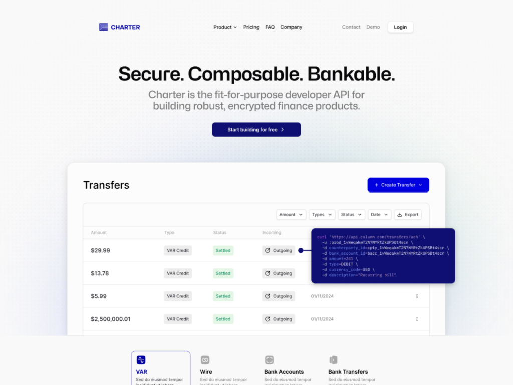
10+ page fintech template designed for modern startups.
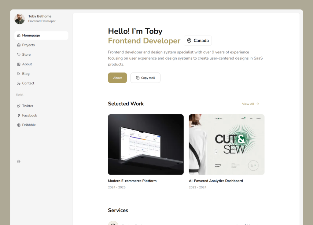
Dashboard-style shadcn/ui portfolio template
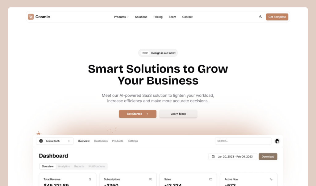
shadcn/ui SaaS landing page template
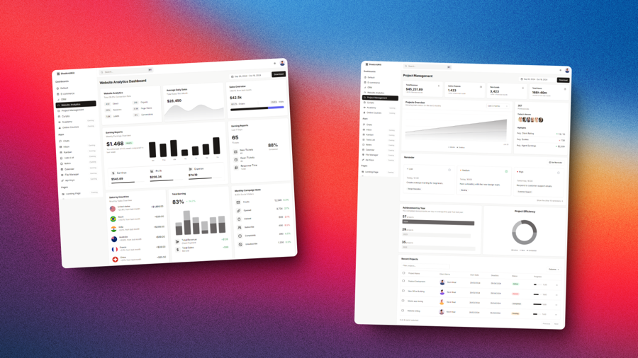
A collection of Tailwind CSS templates, dashboards, and UI components
Force your AI to use a professional design system. Build brand-matched, consistent UIs with 200+ vetted components.

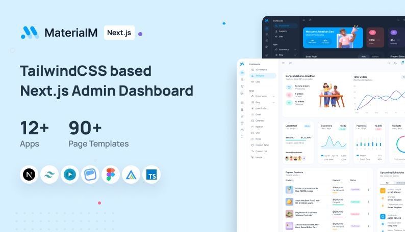
Admin template with 90+ pages 12+ apps
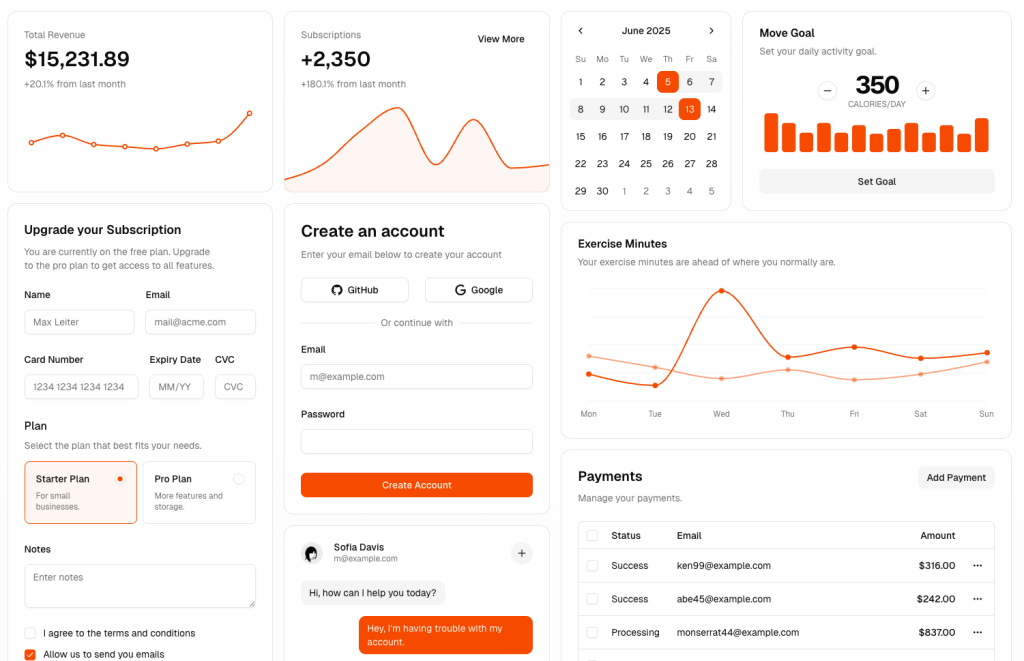 HOT
HOTshadcn/ui Blocks: setup, sources, tips
Scalable Next.js template, boilerplate, and UI kit bundle with Tailwind CSS.
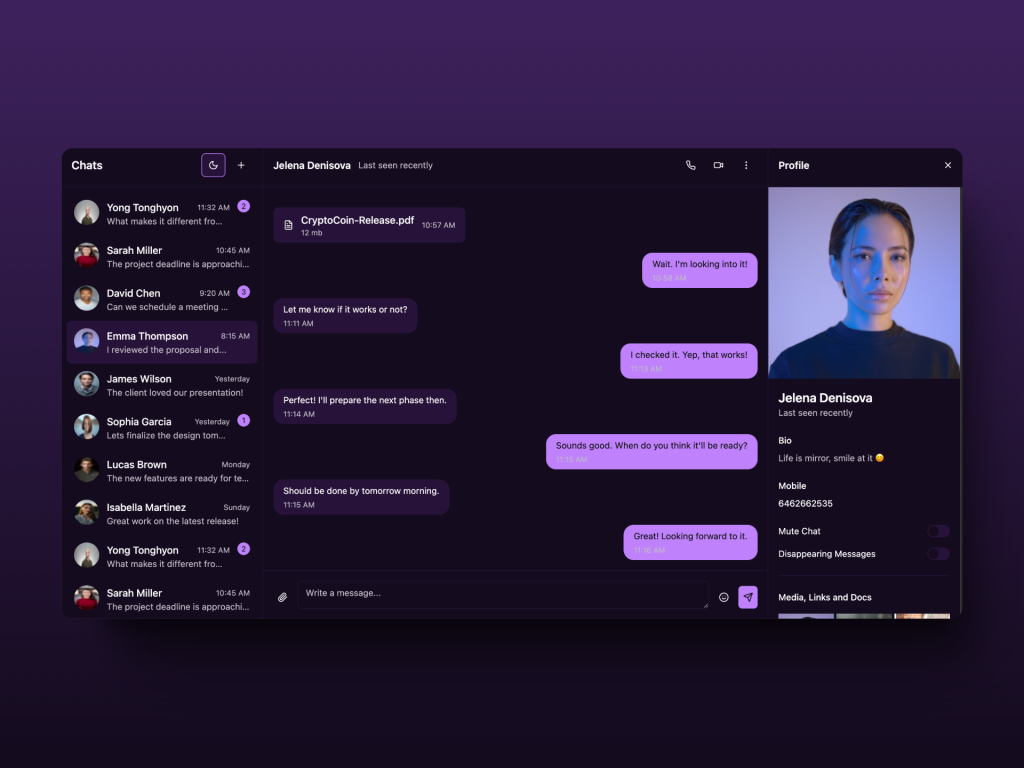 HOT
HOTReact Chat Template built with shadcn/ui and Tailwind
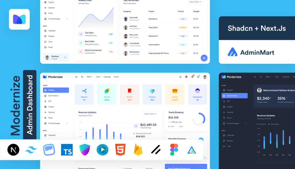
Feature rich Next.js admin template
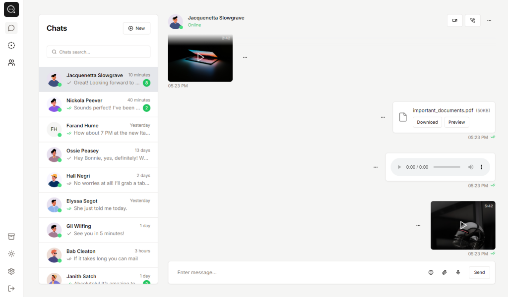
Clean shadcn/ui chat app template
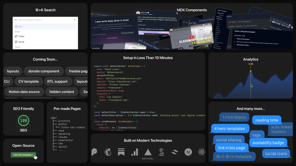
Customizable digital garden for developers
The best Tailwind templates & UI kits for landing pages & dashboards.
200+ ready-to-use Tailwind CSS components with MCP integration. Let AI generate complete pages from your prompts — one command, production-ready UI.
Explore Components
shadcn/ui stands out as a modern React component library meticulously crafted to simplify the development of user interfaces. Developed by shadcn, this library leverages the strengths of Radix UI and Tailwind CSS to offer a seamless blend of accessibility, customization, and performance.
At its core, shadcn/ui provides a set of unstyled yet accessible components through Radix UI, empowering developers to apply their unique designs using Tailwind CSS's utility-first approach. This combination ensures that applications built with shadcn/ui are not only visually consistent but also adhere to the highest accessibility standards.
Accessibility is a cornerstone of shadcn/ui. By building upon Radix UI, shadcn/ui ensures that every component is compliant with accessibility best practices. This means:
Keyboard Navigation: All components are navigable via keyboard, catering to users who rely on non-mouse inputs.
ARIA Attributes: Proper ARIA (Accessible Rich Internet Applications) attributes are integrated, enhancing the semantic meaning of components for assistive technologies.
Focus Management: Components manage focus appropriately, ensuring a seamless user experience when interacting with dynamic elements like modals or dropdowns.
Tailwind CSS's utility-first approach complements shadcn/ui's philosophy of flexibility and customization. Key aspects include:
Utility Classes: Developers can apply utility classes directly within component markup, allowing for rapid styling without leaving the JSX context.
Responsive Design: Tailwind's responsive utilities make it straightforward to create designs that adapt seamlessly across various screen sizes.
Customization: Tailwind's configuration file enables the extension and customization of the default design system, ensuring consistency across the application.
In an age where type safety enhances developer productivity and code reliability, shadcn/ui embraces TypeScript fully:
Typed Components: Every component is meticulously typed, offering IntelliSense support in IDEs like VSCode.
Enhanced Developer Experience: TypeScript integration minimizes runtime errors by catching type mismatches during the development phase.
Seamless Integration: Whether your project is entirely in TypeScript or uses JavaScript with type annotations, shadcn/ui fits right in.
shadcn/ui champions a modular approach to component design:
On-Demand Imports: Developers can import only the components they need, ensuring optimized bundle sizes and improved application performance.
Composable Components: Components are designed to work harmoniously together, allowing for the creation of complex UI structures without redundancy.
Minimal Dependencies: By keeping dependencies sparse, shadcn/ui ensures that integrating the library doesn't bloat your project.
Flexibility is at the heart of shadcn/ui:
Utility-First Styling: With Tailwind CSS, customizing components is as simple as applying different utility classes, eliminating the need for intricate CSS overrides.
Component Props: Many components expose props that allow for behavioral and stylistic adjustments, enabling developers to tailor components to specific needs.
Theming: Extend Tailwind's default theme or create custom themes to align with your brand's identity effortlessly.
Embarking on your journey with shadcn/ui is straightforward. This section guides you through the prerequisites, installation process, and basic usage to get your first component up and running.
Before diving into shadcn/ui, ensure your development environment meets the following requirements:
Node.js: A runtime environment essential for JavaScript development. Download and install it from Node.js official website.
React: shadcn/ui is tailored for React applications. Familiarity with React concepts like components and hooks is beneficial.
Tailwind CSS: As shadcn/ui relies on Tailwind for styling, setting it up is crucial. If you haven't set it up yet, refer to the official Tailwind installation guide.
Choosing the right UI library can significantly impact your development workflow and the final product's quality. Here's how shadcn/ui stacks up against some of its contemporaries:
Design Philosophy: MUI follows Material Design principles, providing a comprehensive and opinionated design system. In contrast, shadcn/ui offers unstyled components, granting developers complete design flexibility using Tailwind CSS.
Customization: While MUI allows theme customization, shadcn/ui leverages Tailwind's utility-first approach, enabling more granular and intuitive styling directly within component markup.
Bundle Size: shadcn/ui's modular design often results in smaller bundle sizes compared to MUI, which can be heavyweight due to its extensive suite of components.
Language and Community: Ant Design has a robust ecosystem with internationalization support, catering primarily to enterprise applications. shadcn/ui, being newer, is rapidly growing and aligns well with modern React and Tailwind CSS trends.
Styling Approach: Ant Design provides a predefined style, whereas shadcn/ui offers complete styling control through Tailwind, making it more adaptable to bespoke designs.
Styling Mechanism: Chakra UI uses a style props-based approach, which can sometimes lead to verbose code. shadcn/ui's Tailwind integration allows for more concise and readable styling.
Accessibility: Both libraries prioritize accessibility, but shadcn/ui's foundation on Radix UI ensures a strong emphasis on accessible behaviors.
You can find answers for commonly asked questions about templates.
shadcn/ui is a collection of beautifully designed, accessible, and customizable UI components that you can easily copy and paste into your projects. It's open-source and built to streamline your development process.
Yes, the components in shadcn/ui are designed to be highly customizable. You can easily adjust styles and functionality to fit the needs of your project.
If your project demands high customization, leverages Tailwind CSS, and requires accessible, unstyled components that blend seamlessly with custom designs, shadcn/ui is an excellent choice. Its modularity and performance optimizations make it suitable for both small and large-scale applications.