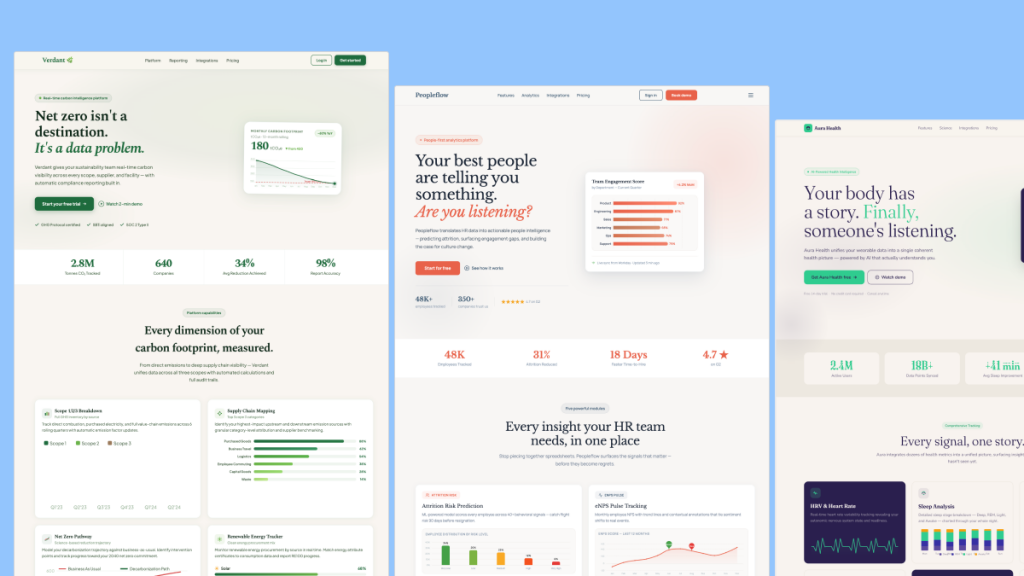
 HOT
HOTTailkits UI
NEWConsistent UI, zero hallucinations
Discover dark mode Tailwind templates. Build your dark mode landing page using pre-designed tailwind and components and UI elements.
 HOT
HOTConsistent UI, zero hallucinations
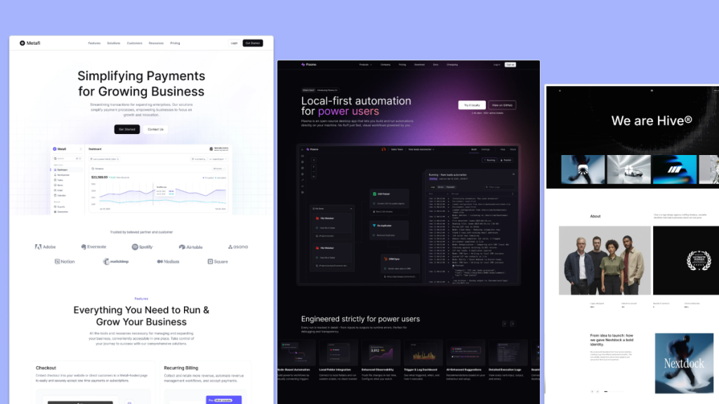 HOT
HOT12+ Shadcn Templates
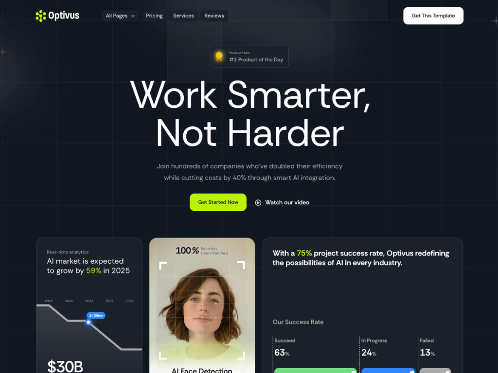
16-page Astro theme for AI SaaS and automation teams
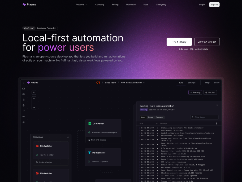
Developer SaaS template for Next.js 15 & Astro 5
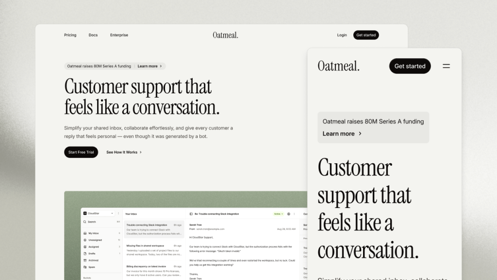
Multi-theme SaaS marketing kit for Tailwind CSS
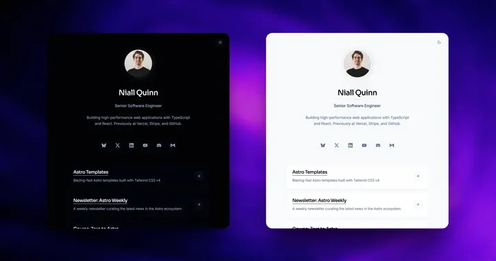
personal Link in-bio template
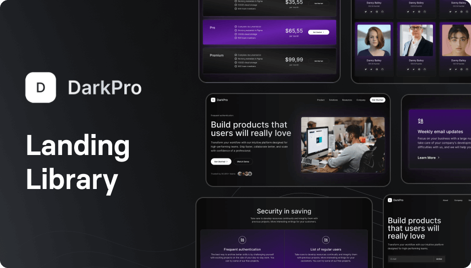
90+ dark Tailwind UI components
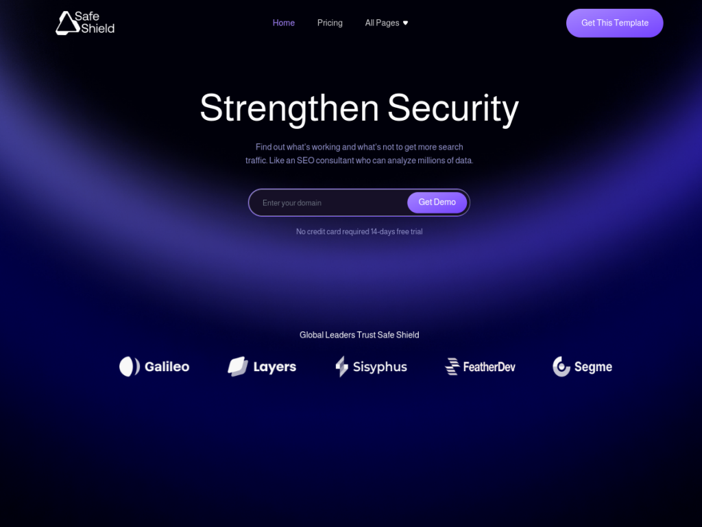
Security-ready SaaS Astro template, 13+ pages
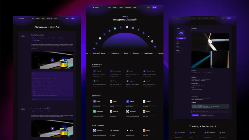
Sleek, multilingual Astro template for startups.
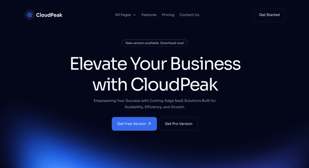
15‑page Tailwind theme to launch SaaS sites faster
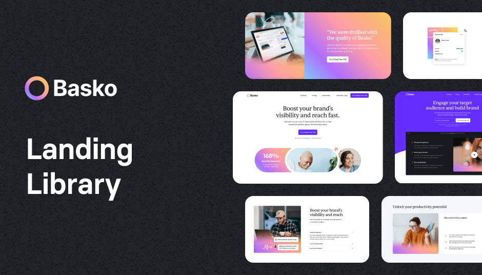
209 colorful components for vibrant design

345 Tailwind CSS components ready to use
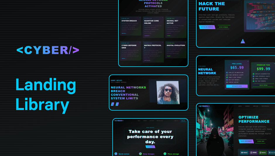
110 dark mode customizable UI components

Modern dark Astro theme
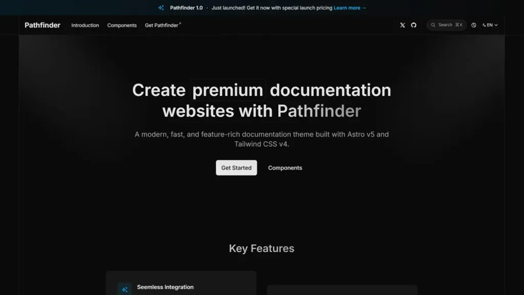
Astro, Tailwind documentation template
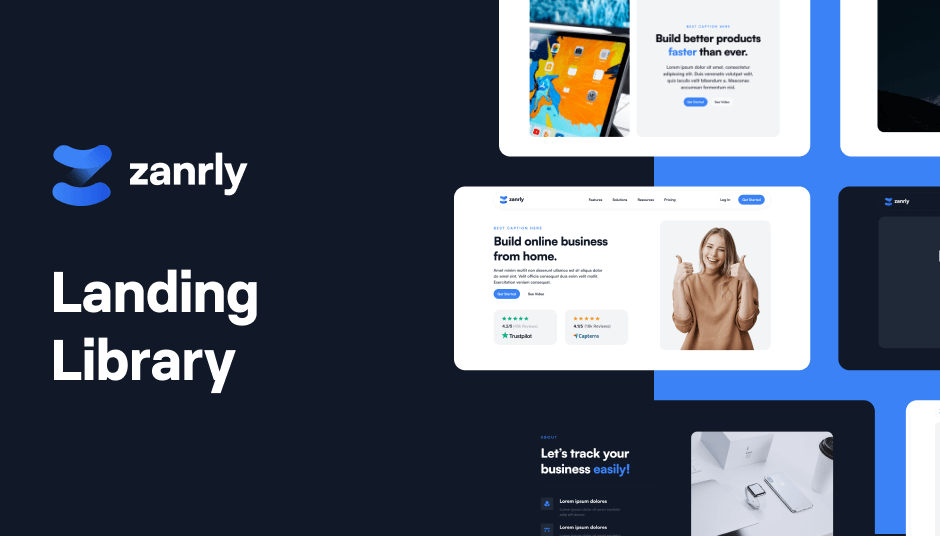
86 responsive UI components
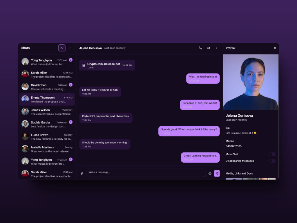 HOT
HOTReact Chat Template built with shadcn/ui and Tailwind
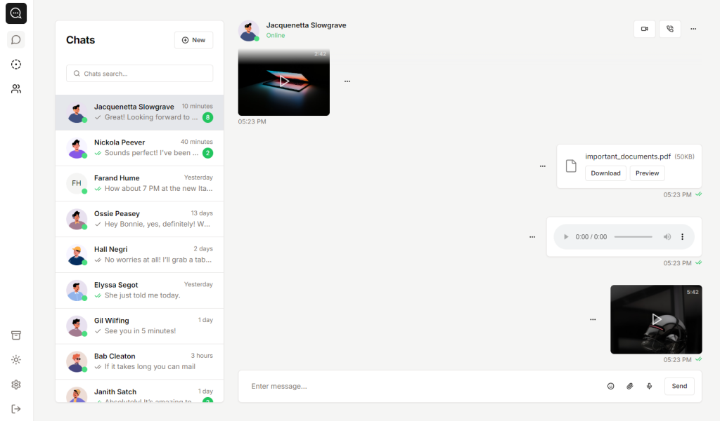
Clean shadcn/ui chat app template
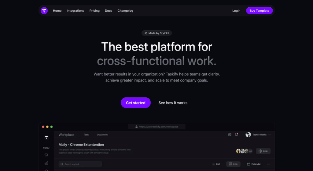
Nuxt template with 7 collections and Figma file
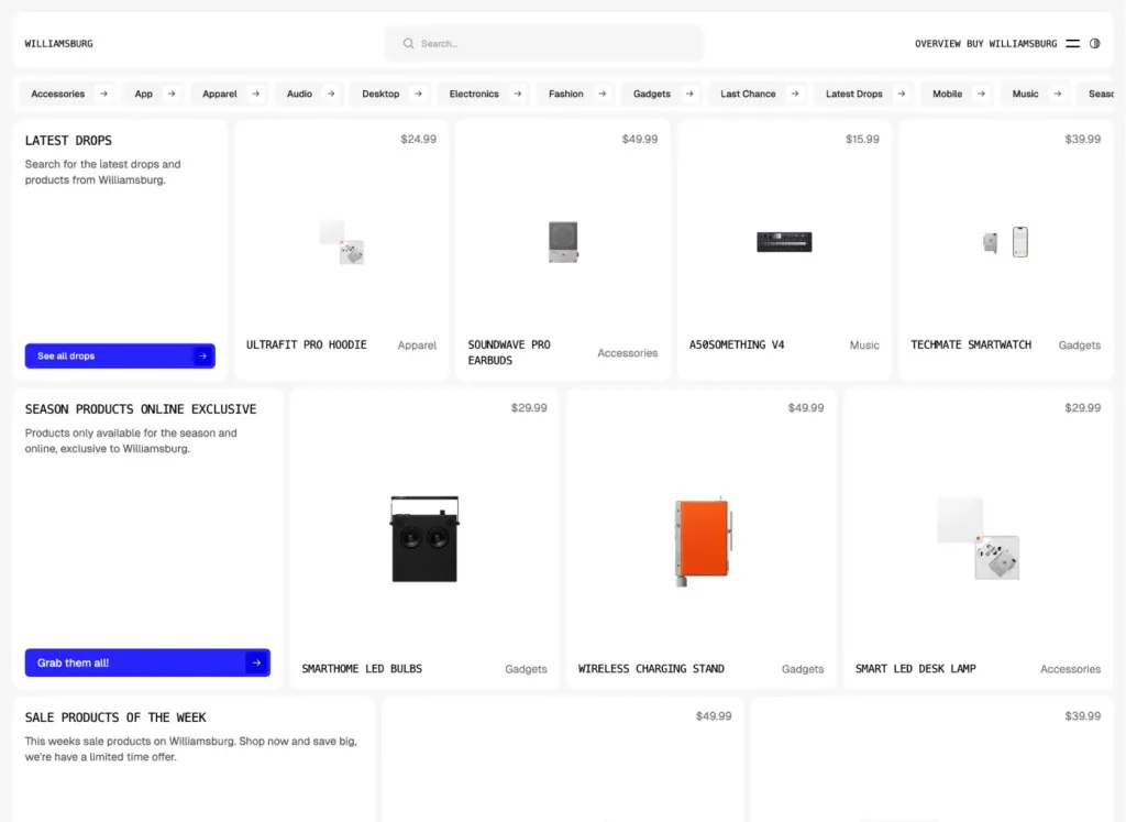
Brutalist Astro/Tailwind listing theme
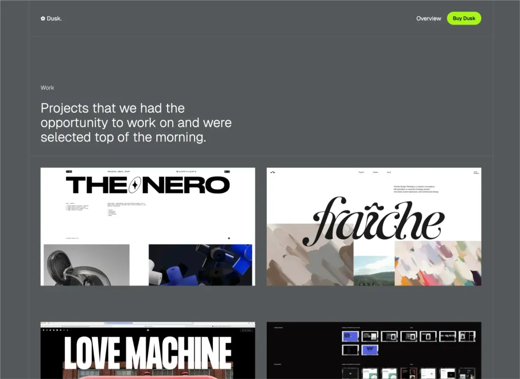
Minimal Astro & Tailwind agency theme
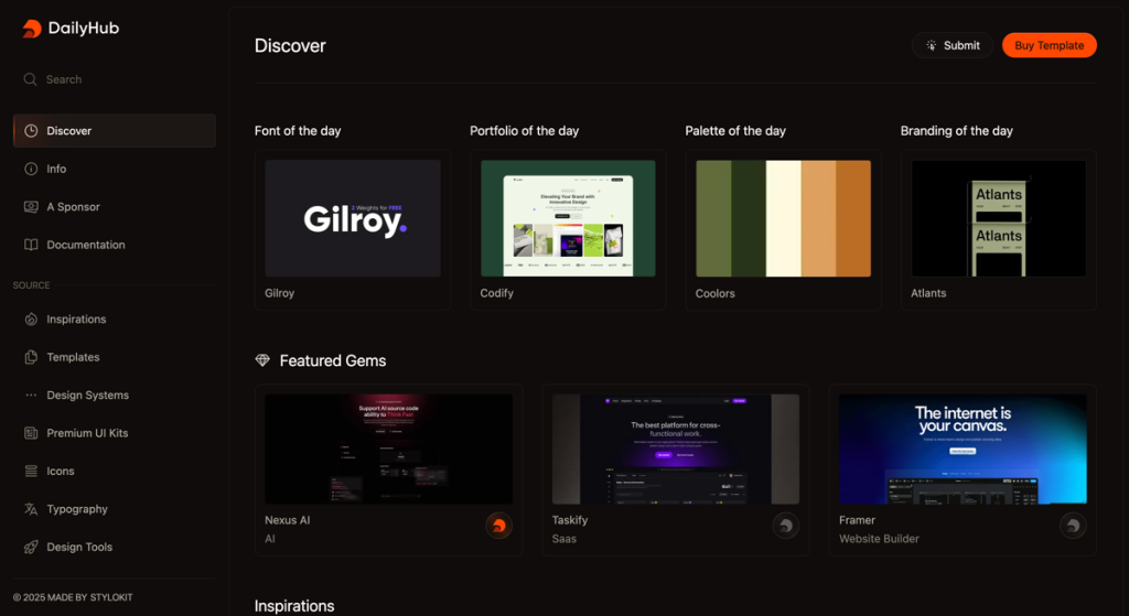
Modern directory template
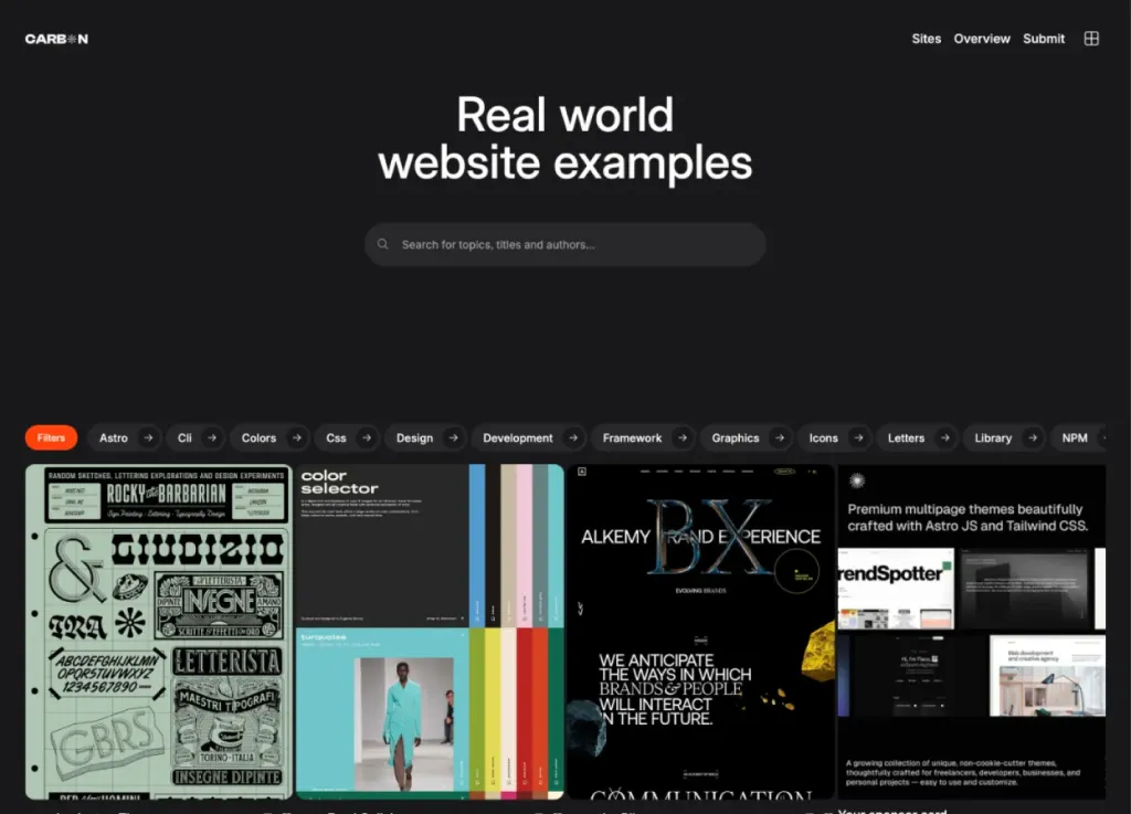
Bold dark directory theme
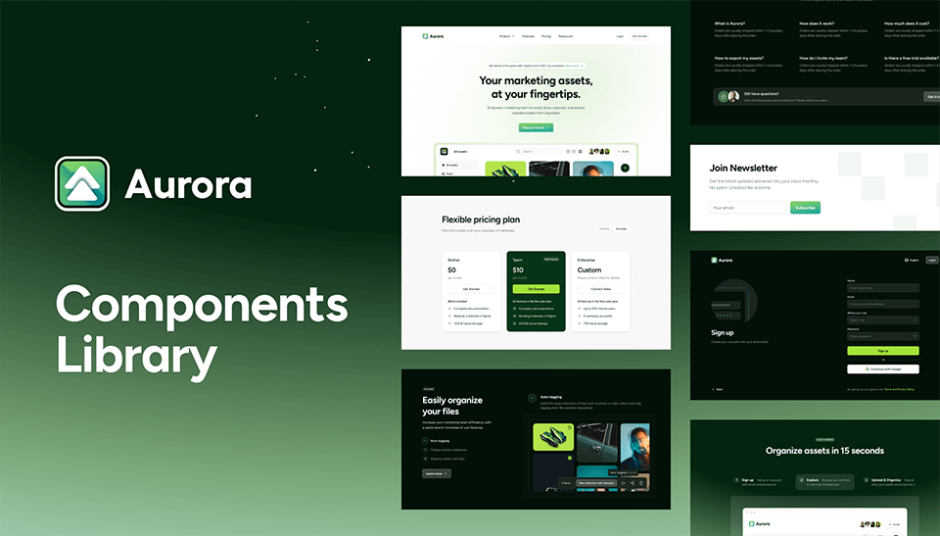
105 components for modern web design
Force your AI to use a professional design system. Build brand-matched, consistent UIs with 200+ vetted components.

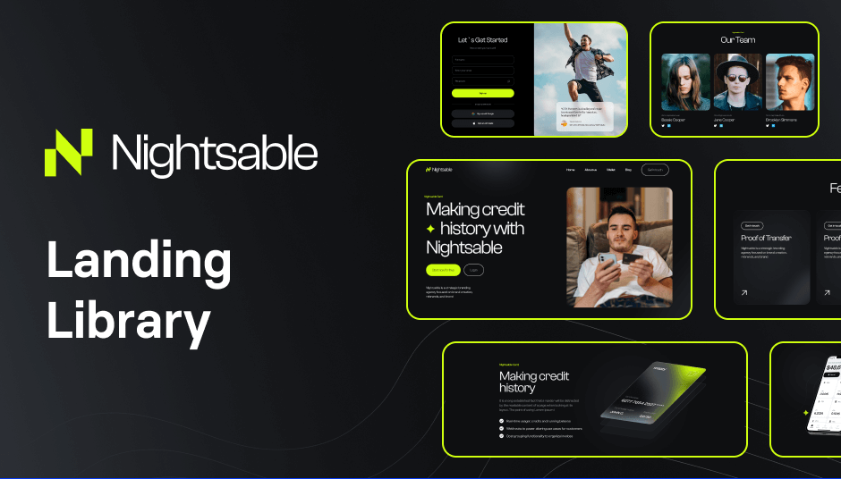
122 dark-mode components for modern, responsive sites
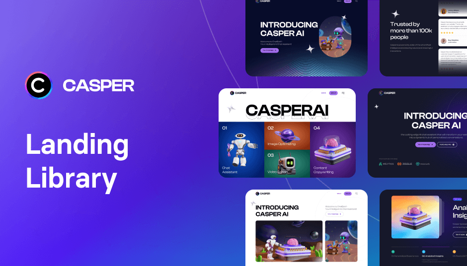
Build with 152 dark mode components
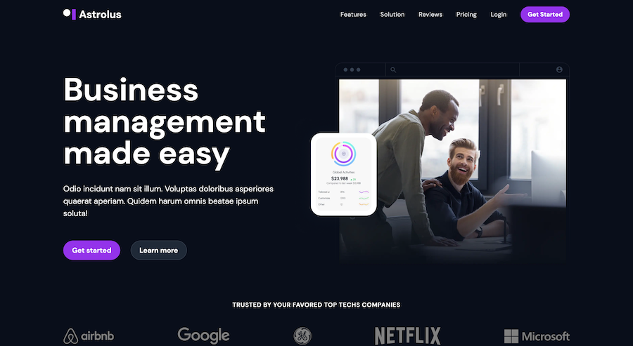
Modern Tailwind CSS landing page template

18 pre-designed pages
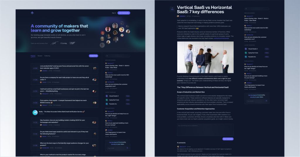
Responsive Tailwind forum template
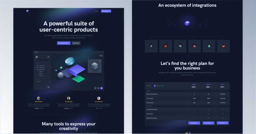
Modern Tailwind landing page template

Modern dark-themed landing page template
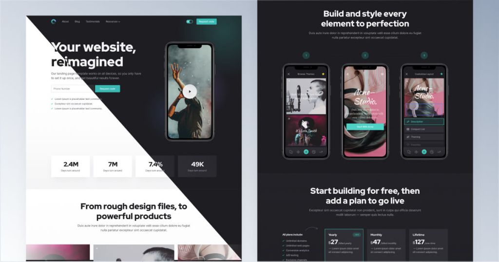
Tailwind template for mobile apps
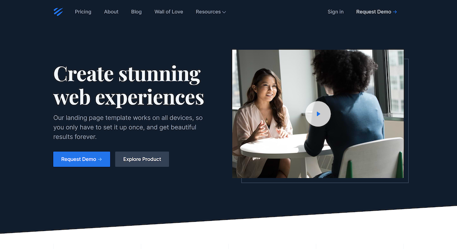
12-page corporate website template
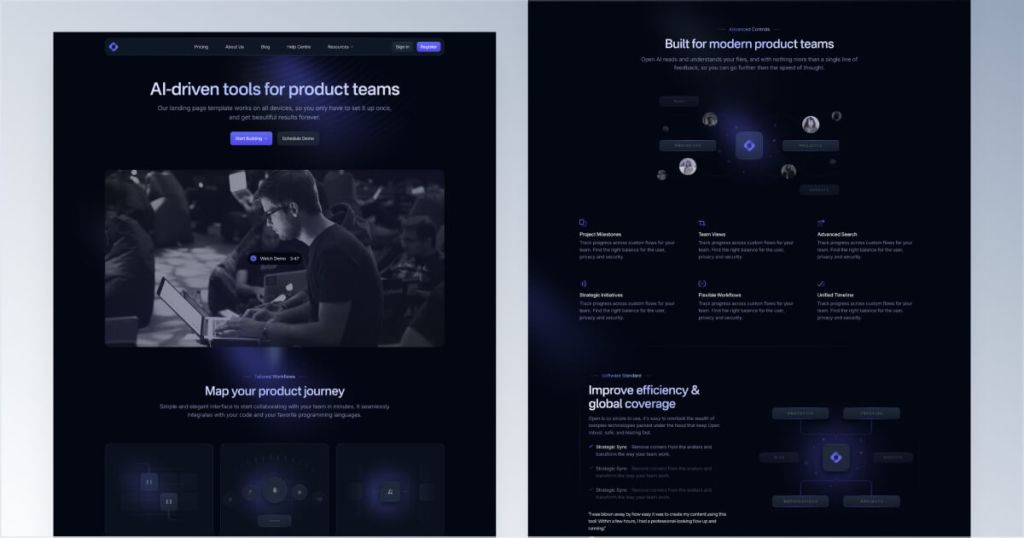
12 page Sleek SaaS template for startups
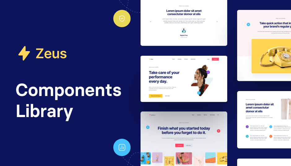
593 Tailwind components with UI editor
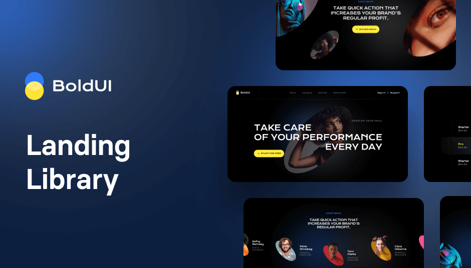
141 Tailwind components in dark mode

130 Tailwind components in Shuffle Editor
The best Tailwind templates & UI kits for landing pages & dashboards.
200+ ready-to-use Tailwind CSS components with MCP integration. Let AI generate complete pages from your prompts — one command, production-ready UI.
Explore Components
Dark mode templates aren't just a trend; they're a powerful tool for enhancing user experience. Here’s why:
Reduced Eye Strain: Dark backgrounds with light text are easier on the eyes, especially in low-light conditions.
Energy Efficiency: Dark mode can save battery life on devices with OLED screens.
Modern Aesthetic: Dark mode provides a sleek, contemporary look that can make your website stand out.
Accessibility: Improves readability for users with visual impairments.
Landing pages are crucial for capturing leads and driving conversions. Tailwind CSS offers a range of dark mode landing page templates that are not only visually appealing but also highly functional.
Conversion-Optimized: These templates come with strategically placed CTAs to drive user action.
Responsive Design: Ensure a seamless experience across all devices.
Customizable: Easily tweak the design to match your brand’s identity.
Whether you're building a blog, portfolio, or e-commerce site, Tailwind CSS dark mode website templates have you covered.
Versatility: Suitable for various types of websites.
SEO-Friendly: Built with best practices to help your site rank higher.
Fast Loading: Optimized for performance, ensuring quick load times.
Selecting the right dark mode template can be overwhelming given the plethora of options. Here are some tips to help you make the best choice:
Define Your Purpose: Understand the primary goal of your website—whether it's to inform, sell, or entertain.
Consider Your Audience: Choose a design that will appeal to your target demographic.
Check Customization Options: Ensure the template can be easily modified to fit your brand.
Test Responsiveness: Make sure the template looks great on both desktop and mobile devices.
Implementing dark mode in your Tailwind CSS project is straightforward. Here’s a quick guide:
Install Tailwind CSS: Ensure you have Tailwind CSS set up in your project.
Enable Dark Mode: Add darkMode: 'class' to your Tailwind configuration file.
Use Dark Mode Classes: Apply classes like dark:bg-gray-800 or dark:text-white to elements to style them for dark mode.
Toggle Dark Mode: Add a toggle switch to let users switch between light and dark modes.
Customizing your dark mode templates can make your website unique and aligned with your brand. Here are some tips to get you started:
Color Schemes: Stick to a limited color palette to maintain a clean and cohesive look. Use accent colors sparingly to highlight important elements.
Typography: Choose fonts that are easy to read in both dark and light modes. Sans-serif fonts often work well in dark mode.
Spacing: Use ample spacing to avoid a cluttered look. Dark mode can sometimes make elements appear closer together, so extra padding can help.
Imagery: Opt for high-contrast images that stand out against dark backgrounds. Avoid images that are too dark or too light, as they can get lost in the overall design.
While dark mode can enhance user experience, optimizing your templates for SEO is crucial for driving organic traffic. Here are some actionable tips:
Mobile Optimization: Ensure your dark mode templates are mobile-friendly. Google prioritizes mobile-first indexing, so a responsive design is a must.
Fast Load Times: Optimize images, use lazy loading, and minimize CSS and JavaScript to ensure your site loads quickly.
Clear Navigation: Make sure your site’s navigation is intuitive and easy to use. A well-structured menu helps both users and search engines understand your site’s hierarchy.
High-Quality Content: Populate your templates with informative, engaging, and keyword-rich content. This not only improves user experience but also helps your site rank better.
Meta Tags: Don’t forget to optimize your title tags, meta descriptions, and alt text for images. These elements are crucial for on-page SEO.
Even though dark mode templates are fantastic, there are some common pitfalls to watch out for:
Poor Contrast: Ensure there’s enough contrast between text and background to maintain readability.
Overuse of Colors: Stick to a limited color palette to keep the design clean and cohesive.
Neglecting Light Mode: While dark mode is popular, some users still prefer light mode. Make sure your site offers both options.
Ignoring Accessibility: Use ARIA labels and ensure your design is accessible to users with disabilities.
Dark mode templates are versatile and can be used across various industries and applications. Here are a few examples:
Dark mode can make product images pop, creating a more immersive shopping experience. It also adds a touch of sophistication and modernity to your online store.
Creative professionals can benefit from dark mode templates to showcase their work in a way that stands out. The dark background can make colors and details in artwork or photography more vibrant.
For content-heavy websites, dark mode can improve readability, especially during nighttime browsing. It also provides a unique aesthetic that can set your blog apart from others.
Dark mode can lend a modern and professional look to corporate websites, making them appear more cutting-edge and tech-savvy.
User experience is paramount in web design, and dark mode can significantly enhance it. Here’s how:
Comfortable Viewing: Dark mode reduces glare and blue light, making it more comfortable for prolonged viewing.
Focus on Content: The dark background helps users focus on the content, reducing distractions.
Modern Appeal: Dark mode gives your website a modern and stylish look that appeals to tech-savvy users.
To make sure your dark mode implementation is effective, follow these best practices:
Test Thoroughly: Ensure that every element of your website looks good in both dark and light modes.
Provide a Toggle: Give users the option to switch between dark and light modes easily.
Consistent Design: Keep the design consistent across different pages and elements.
User Feedback: Gather feedback from users to improve the dark mode experience.
Dark mode is not just a passing trend; it’s here to stay. Here are some future trends to watch out for:
Dynamic Dark Mode: Websites that automatically switch to dark mode based on the user’s system settings or time of day.
Advanced Customization: More tools and plugins that allow for advanced customization of dark mode templates.
Integration with Augmented Reality (AR): Dark mode designs that integrate seamlessly with AR experiences.
AI-Powered Design: AI tools that help create and optimize dark mode designs based on user behavior and preferences.
You can find answers for commonly asked questions about templates.
Dark mode templates reduce eye strain, save battery life on OLED screens, and provide a modern, sleek look. They also enhance readability for users with visual impairments.
To enable dark mode in Tailwind CSS, add darkMode: 'class' to your Tailwind configuration file and use dark mode classes like dark:bg-gray-800 or dark:text-white.
You can find an extensive collection of Tailwind CSS dark mode templates at Tailkits, offering both free and premium options to suit your needs.
Dark mode itself doesn’t directly impact SEO. However, a well-designed dark mode template can improve user experience, which can lead to better engagement metrics like longer session durations and lower bounce rates, indirectly benefiting your SEO.
Dark mode can be beneficial for a variety of websites, including e-commerce sites, portfolios, blogs, news sites, and corporate websites. Essentially, any site that wants to offer a modern, sleek look and improve user experience can benefit from dark mode.