Web3 Components
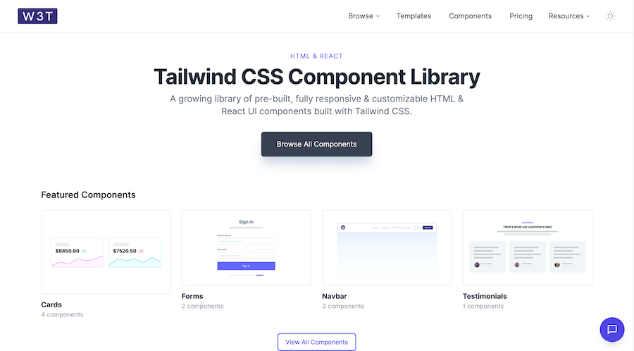
19 HTML & React UI components
What Is the Web3Templates Tailwind CSS Component Library?
The Web3Templates Component Library is a free, open, and ever-expanding set of 19 Tailwind-based UI blocks for HTML and React, designed specifically for Web3 and blockchain applications.
It aims to accelerate development with ready-to-use cards, forms, navbars, testimonials, and more, all styled using Tailwind’s utility classes.
Features ✨
Weekly Updates: New components released every week keeps the library fresh.
Dual Framework Support: Works seamlessly with plain HTML or React projects.
Responsive Design: All components are mobile-friendly and adapt to various screen sizes.
Customizable Styles: Easily overridden Tailwind classes let you match your brand’s look.
Lightweight: Minimal dependencies ensure fast page loads.
Included Components 📒
Cards: 4 variations for displaying content and previews.
Forms: 2 form layouts including inputs, selects, and buttons.
Navbar: 3 navigation bars with dropdown and mobile menu support.
Testimonials: 1 testimonial block with avatar, quote, and details.
Pros and Cons
Pros ✅
Free Access: No cost barrier for entry-level projects.
Regular Updates: Continuous stream of new components each week.
Simple Integration: Copy-paste snippets that work out of the box.
Community & Support: Active Discord and email support channels.
Cons ⚠️
Limited Catalog: Only 19 components versus 500+ in premium kits.
Basic Styles: Components are minimal and may require additional styling for complex UIs.
Documentation Scope: Lacks in-depth usage examples compared to some open-source peers.
Integration
HTML: Drop the compiled CSS link and copy the HTML snippets.
React: Install via NPM (
npm install web3templates), then import components.Next.js/Astro: Compatible modules available for SSR frameworks.
Customization: Override with Tailwind configuration or inline classes.