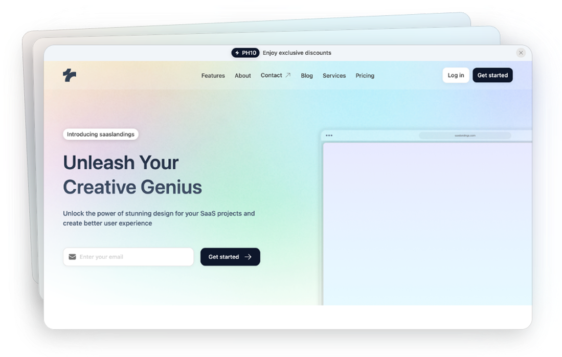
Tailwind Navbar Component
3 Tailwind navbar components in HTML and React
- Documentation
- Custom config file
- Open Source
- JavaScript Plugin
- Copy & Paste
- Tailwind CSS v3.0+
- Responsive Design
Code Examples of the Navbar Components
Logo Only
<header class="flex h-20 w-full shrink-0 items-center px-4 md:px-6">
<button
class="inline-flex items-center justify-center whitespace-nowrap rounded-md text-sm font-medium ring-offset-background transition-colors focus-visible:outline-none focus-visible:ring-2 focus-visible:ring-ring focus-visible:ring-offset-2 disabled:pointer-events-none disabled:opacity-50 border border-input bg-background hover:bg-accent hover:text-accent-foreground h-10 w-10 lg:hidden"
type="button"
aria-haspopup="dialog"
aria-expanded="false"
aria-controls="radix-:rb:"
data-state="closed"
>
<svg
xmlns="http://www.w3.org/2000/svg"
width="24"
height="24"
viewBox="0 0 24 24"
fill="none"
stroke="currentColor"
stroke-width="2"
stroke-linecap="round"
stroke-linejoin="round"
class="h-6 w-6"
>
<line x1="4" x2="20" y1="12" y2="12"></line>
<line x1="4" x2="20" y1="6" y2="6"></line>
<line x1="4" x2="20" y1="18" y2="18"></line>
</svg>
<span class="sr-only">Toggle navigation menu</span>
</button>
<div class="w-[150px]">
<a class="mr-6 hidden lg:flex" href="#">
<svg
xmlns="http://www.w3.org/2000/svg"
width="24"
height="24"
viewBox="0 0 24 24"
fill="none"
stroke="currentColor"
stroke-width="2"
stroke-linecap="round"
stroke-linejoin="round"
class="h-6 w-6"
>
<path d="m8 3 4 8 5-5 5 15H2L8 3z"></path>
</svg>
<span class="sr-only">Acme Inc</span>
</a>
</div>
<div class="flex w-full justify-center">
<nav
aria-label="Main"
data-orientation="horizontal"
dir="ltr"
class="relative z-10 max-w-max flex-1 items-center justify-center hidden lg:flex"
>
<div style="position: relative;">
<ul
data-orientation="horizontal"
class="group flex flex-1 list-none items-center justify-center space-x-1"
dir="ltr"
>
<a
class="group inline-flex h-9 w-max items-center justify-center rounded-md bg-white px-4 py-2 text-sm font-medium transition-colors hover:bg-gray-100 hover:text-gray-900 focus:bg-gray-100 focus:text-gray-900 focus:outline-none disabled:pointer-events-none disabled:opacity-50 data-[active]:bg-gray-100/50 data-[state=open]:bg-gray-100/50 dark:bg-gray-950 dark:hover:bg-gray-800 dark:hover:text-gray-50 dark:focus:bg-gray-800 dark:focus:text-gray-50 dark:data-[active]:bg-gray-800/50 dark:data-[state=open]:bg-gray-800/50"
data-radix-collection-item=""
href="#"
>
About
</a>
<li>
<button
id="radix-:re:-trigger-radix-:rf:"
data-state="closed"
aria-expanded="false"
aria-controls="radix-:re:-content-radix-:rf:"
class="group inline-flex h-9 w-max items-center justify-center rounded-md bg-background px-4 py-2 text-sm font-medium transition-colors hover:bg-accent hover:text-accent-foreground focus:bg-accent focus:text-accent-foreground focus:outline-none disabled:pointer-events-none disabled:opacity-50 data-[active]:bg-accent/50 data-[state=open]:bg-accent/50 group"
data-radix-collection-item=""
>
Features
<svg
width="15"
height="15"
viewBox="0 0 15 15"
fill="none"
xmlns="http://www.w3.org/2000/svg"
aria-hidden="true"
class="relative top-[1px] ml-1 h-3 w-3 transition duration-300 group-data-[state=open]:rotate-180"
>
<path
d="M3.13523 6.15803C3.3241 5.95657 3.64052 5.94637 3.84197 6.13523L7.5 9.56464L11.158 6.13523C11.3595 5.94637 11.6759 5.95657 11.8648 6.15803C12.0536 6.35949 12.0434 6.67591 11.842 6.86477L7.84197 10.6148C7.64964 10.7951 7.35036 10.7951 7.15803 10.6148L3.15803 6.86477C2.95657 6.67591 2.94637 6.35949 3.13523 6.15803Z"
fill="currentColor"
fill-rule="evenodd"
clip-rule="evenodd"
></path>
</svg>
</button>
</li>
<a
class="group inline-flex h-9 w-max items-center justify-center rounded-md bg-white px-4 py-2 text-sm font-medium transition-colors hover:bg-gray-100 hover:text-gray-900 focus:bg-gray-100 focus:text-gray-900 focus:outline-none disabled:pointer-events-none disabled:opacity-50 data-[active]:bg-gray-100/50 data-[state=open]:bg-gray-100/50 dark:bg-gray-950 dark:hover:bg-gray-800 dark:hover:text-gray-50 dark:focus:bg-gray-800 dark:focus:text-gray-50 dark:data-[active]:bg-gray-800/50 dark:data-[state=open]:bg-gray-800/50"
data-radix-collection-item=""
href="#"
>
Pricing
</a>
<li>
<button
id="radix-:re:-trigger-radix-:rg:"
data-state="closed"
aria-expanded="false"
aria-controls="radix-:re:-content-radix-:rg:"
class="group inline-flex h-9 w-max items-center justify-center rounded-md bg-background px-4 py-2 text-sm font-medium transition-colors hover:bg-accent hover:text-accent-foreground focus:bg-accent focus:text-accent-foreground focus:outline-none disabled:pointer-events-none disabled:opacity-50 data-[active]:bg-accent/50 data-[state=open]:bg-accent/50 group"
data-radix-collection-item=""
>
Resources
<svg
width="15"
height="15"
viewBox="0 0 15 15"
fill="none"
xmlns="http://www.w3.org/2000/svg"
aria-hidden="true"
class="relative top-[1px] ml-1 h-3 w-3 transition duration-300 group-data-[state=open]:rotate-180"
>
<path
d="M3.13523 6.15803C3.3241 5.95657 3.64052 5.94637 3.84197 6.13523L7.5 9.56464L11.158 6.13523C11.3595 5.94637 11.6759 5.95657 11.8648 6.15803C12.0536 6.35949 12.0434 6.67591 11.842 6.86477L7.84197 10.6148C7.64964 10.7951 7.35036 10.7951 7.15803 10.6148L3.15803 6.86477C2.95657 6.67591 2.94637 6.35949 3.13523 6.15803Z"
fill="currentColor"
fill-rule="evenodd"
clip-rule="evenodd"
></path>
</svg>
</button>
</li>
</ul>
</div>
<div class="absolute left-0 top-full flex justify-center"></div>
</nav>
</div>
</header>
Logo and CTA Button
<header class="bg-white dark:bg-gray-950 shadow">
<nav class="container flex h-16 items-center justify-between px-4 md:px-6">
<a class="flex items-center gap-2" href="#" rel="ugc">
<svg
xmlns="http://www.w3.org/2000/svg"
width="24"
height="24"
viewBox="0 0 24 24"
fill="none"
stroke="currentColor"
stroke-width="2"
stroke-linecap="round"
stroke-linejoin="round"
class="h-6 w-6 text-gray-900 dark:text-gray-50"
>
<path d="m8 3 4 8 5-5 5 15H2L8 3z"></path>
</svg>
<span class="text-lg font-bold text-gray-900 dark:text-gray-50">Acme Inc</span>
</a>
<div class="hidden items-center gap-6 text-sm font-medium text-gray-900 dark:text-gray-50 lg:flex">
<a class="hover:underline hover:underline-offset-4" href="#" rel="ugc">
Home
</a>
<a class="hover:underline hover:underline-offset-4" href="#" rel="ugc">
About
</a>
<a class="hover:underline hover:underline-offset-4" href="#" rel="ugc">
Services
</a>
<a class="hover:underline hover:underline-offset-4" href="#" rel="ugc">
Contact
</a>
</div>
<button class="inline-flex items-center justify-center whitespace-nowrap text-sm font-medium ring-offset-background transition-colors focus-visible:outline-none focus-visible:ring-2 focus-visible:ring-ring focus-visible:ring-offset-2 disabled:pointer-events-none disabled:opacity-50 border border-input bg-background hover:bg-accent hover:text-accent-foreground h-10 w-10 rounded-full lg:hidden">
<svg
xmlns="http://www.w3.org/2000/svg"
width="24"
height="24"
viewBox="0 0 24 24"
fill="none"
stroke="currentColor"
stroke-width="2"
stroke-linecap="round"
stroke-linejoin="round"
class="h-6 w-6 text-gray-900 dark:text-gray-50"
>
<line x1="4" x2="20" y1="12" y2="12"></line>
<line x1="4" x2="20" y1="6" y2="6"></line>
<line x1="4" x2="20" y1="18" y2="18"></line>
</svg>
<span class="sr-only">Toggle navigation menu</span>
</button>
</nav>
</header>
Navbar for React
import { Sheet, SheetTrigger, SheetContent } from "@/components/ui/sheet"
import { Button } from "@/components/ui/button"
import Link from "next/link"
import { Collapsible, CollapsibleTrigger, CollapsibleContent } from "@/components/ui/collapsible"
import { NavigationMenu, NavigationMenuList, NavigationMenuLink, NavigationMenuItem, NavigationMenuTrigger, NavigationMenuContent } from "@/components/ui/navigation-menu"
export default function Component() {
return (
<header className="flex h-20 w-full shrink-0 items-center px-4 md:px-6">
<Sheet>
<SheetTrigger asChild>
<Button variant="outline" size="icon" className="lg:hidden">
<MenuIcon className="h-6 w-6" />
<span className="sr-only">Toggle navigation menu</span>
</Button>
</SheetTrigger>
<SheetContent side="left">
<Link href="#" prefetch={false}>
<MountainIcon className="h-6 w-6" />
<span className="sr-only">Acme Inc</span>
</Link>
<div className="grid gap-2 py-6">
<Link href="#" className="flex w-full items-center py-2 text-lg font-semibold" prefetch={false}>
About
</Link>
<Collapsible className="grid gap-4">
<CollapsibleTrigger className="flex w-full items-center text-lg font-semibold [&[data-state=open]>svg]:rotate-90">
Features
<ChevronRightIcon className="ml-auto h-5 w-5 transition-all" />
</CollapsibleTrigger>
<CollapsibleContent>
<div className="-mx-6 grid gap-6 bg-gray-100 p-6 dark:bg-gray-800">
<Link href="#" className="group grid h-auto w-full justify-start gap-1" prefetch={false}>
<div className="text-sm font-medium leading-none group-hover:underline">Analytics</div>
<div className="line-clamp-2 text-sm leading-snug text-gray-500 dark:text-gray-400">
Upgrade your reporting with advanced analytics.
</div>
</Link>
<Link href="#" className="group grid h-auto w-full justify-start gap-1" prefetch={false}>
<div className="text-sm font-medium leading-none group-hover:underline">Developer Tools</div>
<div className="line-clamp-2 text-sm leading-snug text-gray-500 dark:text-gray-400">
Extend your application with our developer tools.
</div>
</Link>
<Link href="#" className="group grid h-auto w-full justify-start gap-1" prefetch={false}>
<div className="text-sm font-medium leading-none group-hover:underline">
Security & Compliance
</div>
<div className="line-clamp-2 text-sm leading-snug text-gray-500 dark:text-gray-400">
Keep your data secure with our security features.
</div>
</Link>
<Link href="#" className="group grid h-auto w-full justify-start gap-1" prefetch={false}>
<div className="text-sm font-medium leading-none group-hover:underline">Scalability</div>
<div className="line-clamp-2 text-sm leading-snug text-gray-500 dark:text-gray-400">
Scale your application with our infrastructure.
</div>
</Link>
</div>
</CollapsibleContent>
</Collapsible>
<Link href="#" className="flex w-full items-center py-2 text-lg font-semibold" prefetch={false}>
Pricing
</Link>
<Collapsible className="grid gap-4">
<CollapsibleTrigger className="flex w-full items-center text-lg font-semibold [&[data-state=open]>svg]:rotate-90">
Resources
<ChevronRightIcon className="ml-auto h-5 w-5 transition-all" />
</CollapsibleTrigger>
<CollapsibleContent>
<div className="-mx-6 grid gap-6 bg-gray-100 p-6 dark:bg-gray-800">
<Link href="#" className="group grid h-auto w-full justify-start gap-1" prefetch={false}>
<div className="text-sm font-medium leading-none group-hover:underline">Blog Posts</div>
<div className="line-clamp-2 text-sm leading-snug text-gray-500 dark:text-gray-400">
Read our latest blog posts.
</div>
</Link>
<Link href="#" className="group grid h-auto w-full justify-start gap-1" prefetch={false}>
<div className="text-sm font-medium leading-none group-hover:underline">Case Studies</div>
<div className="line-clamp-2 text-sm leading-snug text-gray-500 dark:text-gray-400">
Read our customer case studies.
</div>
</Link>
<Link href="#" className="group grid h-auto w-full justify-start gap-1" prefetch={false}>
<div className="text-sm font-medium leading-none group-hover:underline">Documentation</div>
<div className="line-clamp-2 text-sm leading-snug text-gray-500 dark:text-gray-400">
Learn how to use our product.
</div>
</Link>
<Link href="#" className="group grid h-auto w-full justify-start gap-1" prefetch={false}>
<div className="text-sm font-medium leading-none group-hover:underline">Help Center</div>
<div className="line-clamp-2 text-sm leading-snug text-gray-500 dark:text-gray-400">
Get help with our product.
</div>
</Link>
</div>
</CollapsibleContent>
</Collapsible>
<Link href="#" className="flex w-full items-center py-2 text-lg font-semibold" prefetch={false}>
Contact
</Link>
</div>
</SheetContent>
</Sheet>
<div className="w-[150px]">
<Link href="#" className="mr-6 hidden lg:flex" prefetch={false}>
<MountainIcon className="h-6 w-6" />
<span className="sr-only">Acme Inc</span>
</Link>
</div>
<div className="flex w-full justify-center">
<NavigationMenu className="hidden lg:flex">
<NavigationMenuList>
<NavigationMenuLink asChild>
<Link
href="#"
className="group inline-flex h-9 w-max items-center justify-center rounded-md bg-white px-4 py-2 text-sm font-medium transition-colors hover:bg-gray-100 hover:text-gray-900 focus:bg-gray-100 focus:text-gray-900 focus:outline-none disabled:pointer-events-none disabled:opacity-50 data-[active]:bg-gray-100/50 data-[state=open]:bg-gray-100/50 dark:bg-gray-950 dark:hover:bg-gray-800 dark:hover:text-gray-50 dark:focus:bg-gray-800 dark:focus:text-gray-50 dark:data-[active]:bg-gray-800/50 dark:data-[state=open]:bg-gray-800/50"
prefetch={false}
>
About
</Link>
</NavigationMenuLink>
<NavigationMenuItem>
<NavigationMenuTrigger>Features</NavigationMenuTrigger>
<NavigationMenuContent>
<div className="grid w-[400px] p-2">
<NavigationMenuLink asChild>
<Link
href="#"
className="group grid h-auto w-full items-center justify-start gap-1 rounded-md bg-white p-4 text-sm font-medium transition-colors hover:bg-gray-100 hover:text-gray-900 focus:bg-gray-100 focus:text-gray-900 focus:outline-none disabled:pointer-events-none disabled:opacity-50 data-[active]:bg-gray-100/50 data-[state=open]:bg-gray-100/50 dark:bg-gray-950 dark:hover:bg-gray-800 dark:hover:text-gray-50 dark:focus:bg-gray-800 dark:focus:text-gray-50 dark:data-[active]:bg-gray-800/50 dark:data-[state=open]:bg-gray-800/50"
prefetch={false}
>
<div className="text-sm font-medium leading-none group-hover:underline">Analytics</div>
<div className="line-clamp-2 text-sm leading-snug text-gray-500 dark:text-gray-400">
Upgrade your reporting with advanced analytics.
</div>
</Link>
</NavigationMenuLink>
<NavigationMenuLink asChild>
<Link
href="#"
className="group grid h-auto w-full items-center justify-start gap-1 rounded-md bg-white p-4 text-sm font-medium transition-colors hover:bg-gray-100 hover:text-gray-900 focus:bg-gray-100 focus:text-gray-900 focus:outline-none disabled:pointer-events-none disabled:opacity-50 data-[active]:bg-gray-100/50 data-[state=open]:bg-gray-100/50 dark:bg-gray-950 dark:hover:bg-gray-800 dark:hover:text-gray-50 dark:focus:bg-gray-800 dark:focus:text-gray-50 dark:data-[active]:bg-gray-800/50 dark:data-[state=open]:bg-gray-800/50"
prefetch={false}
>
<div className="text-sm font-medium leading-none group-hover:underline">Developer Tools</div>
<div className="line-clamp-2 text-sm leading-snug text-gray-500 dark:text-gray-400">
Extend your application with our developer tools.
</div>
</Link>
</NavigationMenuLink>
<NavigationMenuLink asChild>
<Link
href="#"
className="group grid h-auto w-full items-center justify-start gap-1 rounded-md bg-white p-4 text-sm font-medium transition-colors hover:bg-gray-100 hover:text-gray-900 focus:bg-gray-100 focus:text-gray-900 focus:outline-none disabled:pointer-events-none disabled:opacity-50 data-[active]:bg-gray-100/50 data-[state=open]:bg-gray-100/50 dark:bg-gray-950 dark:hover:bg-gray-800 dark:hover:text-gray-50 dark:focus:bg-gray-800 dark:focus:text-gray-50 dark:data-[active]:bg-gray-800/50 dark:data-[state=open]:bg-gray-800/50"
prefetch={false}
>
<div className="text-sm font-medium leading-none group-hover:underline">
Security & Compliance
</div>
<div className="line-clamp-2 text-sm leading-snug text-gray-500 dark:text-gray-400">
Keep your data secure with our security features.
</div>
</Link>
</NavigationMenuLink>
<NavigationMenuLink asChild>
<Link
href="#"
className="group grid h-auto w-full items-center justify-start gap-1 rounded-md bg-white p-4 text-sm font-medium transition-colors hover:bg-gray-100 hover:text-gray-900 focus:bg-gray-100 focus:text-gray-900 focus:outline-none disabled:pointer-events-none disabled:opacity-50 data-[active]:bg-gray-100/50 data-[state=open]:bg-gray-100/50 dark:bg-gray-950 dark:hover:bg-gray-800 dark:hover:text-gray-50 dark:focus:bg-gray-800 dark:focus:text-gray-50 dark:data-[active]:bg-gray-800/50 dark:data-[state=open]:bg-gray-800/50"
prefetch={false}
>
<div className="text-sm font-medium leading-none group-hover:underline">Scalability</div>
<div className="line-clamp-2 text-sm leading-snug text-gray-500 dark:text-gray-400">
Scale your application with our infrastructure.
</div>
</Link>
</NavigationMenuLink>
</div>
</NavigationMenuContent>
</NavigationMenuItem>
<NavigationMenuLink asChild>
<Link
href="#"
className="group inline-flex h-9 w-max items-center justify-center rounded-md bg-white px-4 py-2 text-sm font-medium transition-colors hover:bg-gray-100 hover:text-gray-900 focus:bg-gray-100 focus:text-gray-900 focus:outline-none disabled:pointer-events-none disabled:opacity-50 data-[active]:bg-gray-100/50 data-[state=open]:bg-gray-100/50 dark:bg-gray-950 dark:hover:bg-gray-800 dark:hover:text-gray-50 dark:focus:bg-gray-800 dark:focus:text-gray-50 dark:data-[active]:bg-gray-800/50 dark:data-[state=open]:bg-gray-800/50"
prefetch={false}
>
Pricing
</Link>
</NavigationMenuLink>
<NavigationMenuItem>
<NavigationMenuTrigger>Resources</NavigationMenuTrigger>
<NavigationMenuContent>
<div className="grid w-[550px] grid-cols-2 p-2">
<NavigationMenuLink asChild>
<Link
href="#"
className="group grid h-auto w-full items-center justify-start gap-1 rounded-md bg-white p-4 text-sm font-medium transition-colors hover:bg-gray-100 hover:text-gray-900 focus:bg-gray-100 focus:text-gray-900 focus:outline-none disabled:pointer-events-none disabled:opacity-50 data-[active]:bg-gray-100/50 data-[state=open]:bg-gray-100/50 dark:bg-gray-950 dark:hover:bg-gray-800 dark:hover:text-gray-50 dark:focus:bg-gray-800 dark:focus:text-gray-50 dark:data-[active]:bg-gray-800/50 dark:data-[state=open]:bg-gray-800/50"
prefetch={false}
>
<div className="text-sm font-medium leading-none group-hover:underline">Blog Posts</div>
<div className="line-clamp-2 text-sm leading-snug text-gray-500 dark:text-gray-400">
Read our latest blog posts.
</div>
</Link>
</NavigationMenuLink>
<NavigationMenuLink asChild>
<Link
href="#"
className="group grid h-auto w-full items-center justify-start gap-1 rounded-md bg-white p-4 text-sm font-medium transition-colors hover:bg-gray-100 hover:text-gray-900 focus:bg-gray-100 focus:text"
prefetch={false}
/>
</NavigationMenuLink>
</div>
</NavigationMenuContent>
</NavigationMenuItem>
</NavigationMenuList>
</NavigationMenu>
</div>
</header>
)
}
function ChevronRightIcon(props) {
return (
<svg
{...props}
xmlns="http://www.w3.org/2000/svg"
width="24"
height="24"
viewBox="0 0 24 24"
fill="none"
stroke="currentColor"
strokeWidth="2"
strokeLinecap="round"
strokeLinejoin="round"
>
<path d="m9 18 6-6-6-6" />
</svg>
)
}
function MenuIcon(props) {
return (
<svg
{...props}
xmlns="http://www.w3.org/2000/svg"
width="24"
height="24"
viewBox="0 0 24 24"
fill="none"
stroke="currentColor"
strokeWidth="2"
strokeLinecap="round"
strokeLinejoin="round"
>
<line x1="4" x2="20" y1="12" y2="12" />
<line x1="4" x2="20" y1="6" y2="6" />
<line x1="4" x2="20" y1="18" y2="18" />
</svg>
)
}
function MountainIcon(props) {
return (
<svg
{...props}
xmlns="http://www.w3.org/2000/svg"
width="24"
height="24"
viewBox="0 0 24 24"
fill="none"
stroke="currentColor"
strokeWidth="2"
strokeLinecap="round"
strokeLinejoin="round"
>
<path d="m8 3 4 8 5-5 5 15H2L8 3z" />
</svg>
)
}
Creating an effective and visually appealing navigation bar is crucial for any website, and Tailwind CSS makes this task both straightforward and highly customizable.
Why Choose Tailwind for Your Navbar?
Tailwind CSS stands out with its utility-first philosophy, enabling rapid UI development without the overhead of unused styles. When it comes to navigation bars, this means:
Flexibility: Easily adjust layout, spacing, colors, and typography directly in your HTML.
Responsiveness: Tailwind’s responsive utilities ensure your navbar looks great on all devices.
Consistency: Maintain a cohesive design system across your website with predefined utility classes.
Customization: Tailwind can be configured to match your design requirements precisely, ensuring your navbar aligns with your brand identity.
Key Elements of a Tailwind Navbar
A typical navigation bar includes several core components. Understanding these elements will help you structure your navbar effectively.
1. Container
The container holds all navbar elements and defines the overall layout. With Tailwind, you can use utilities like flex
, justify-between
, and items-center
to align items horizontally and vertically.
2. Logo or Brand Name
Positioned usually on the left side, the logo or brand name serves as an anchor point for your brand. Tailwind’s spacing and sizing utilities allow you to control its appearance precisely.
3. Navigation Links
These are the links that guide users to different sections of your website. Tailwind’s typography utilities help style these links for optimal readability and interactivity.
4. Hamburger Menu Icon
For mobile responsiveness, a hamburger menu icon toggles the visibility of navigation links on smaller screens. Tailwind’s responsive utilities make it easy to show or hide elements based on screen size.
5. Call-to-Action (CTA) Button
Often placed on the right side, a CTA button encourages user engagement, such as signing up or contacting you. Tailwind offers various button styles through its utility classes.
Building a Responsive Navbar with Tailwind
Responsiveness is a cornerstone of modern web design. Tailwind simplifies creating navbars that adapt seamlessly to different screen sizes.
Desktop Layout
On larger screens, navbars typically display all navigation links horizontally. Using Tailwind’s flex
and responsive classes like md:flex
, you can ensure that links are visible and appropriately spaced.
Mobile Layout
On smaller screens, navbars often collapse into a hamburger menu to save space. Tailwind’s hidden
, block
, and md:hidden
classes allow you to control the visibility of navigation links and the hamburger icon based on screen width.
Toggle Functionality
While Tailwind provides the styling, adding interactivity (like toggling the menu) requires a bit of JavaScript. However, Tailwind’s utility classes make it easy to define the styles for both states.
Customizing Your Navbar with Tailwind Utilities
Tailwind’s extensive suite of utility classes empowers you to tailor your navbar to fit your specific needs.
Color Customization
Utilize Tailwind’s color palette to set background colors, text colors, and hover states. Classes like bg-blue-500
, text-white
, and hover:bg-blue-700
offer fine-grained control over your navbar’s color scheme.
Spacing and Sizing
Control padding, margins, and element sizes with utilities such as p-4
, m-2
, and h-16
. This flexibility ensures that your navbar elements are well-spaced and proportionate.
Typography
Tailwind’s typography utilities allow you to set font sizes, weights, and styles. Classes like text-lg
, font-semibold
, and uppercase
help create a visually appealing and readable navbar.
Animations and Transitions
Enhance user experience with smooth transitions. Utilities like transition
, duration-300
, and ease-in-out
can animate hover effects and menu toggles, making interactions more engaging.
Best Practices for Tailwind Navbars
Creating a functional and aesthetically pleasing navbar involves adhering to several best practices.
Keep It Simple
Avoid clutter by limiting the number of navigation links. A clean and straightforward navbar enhances user experience and reduces cognitive load.
Consistent Styling
Maintain consistency in styling across different navbar elements. Use Tailwind’s utility classes to ensure uniform padding, margins, and font styles.
Responsive Design
Always prioritize mobile-first design. Ensure that your navbar is fully functional and visually appealing on all device sizes.
Optimize Performance
Tailwind is designed to be efficient, but it's essential to purge unused styles in production to keep your CSS lightweight and performant.
Test for Accessibility
Regularly test your navbar with accessibility tools and real users to ensure it meets all necessary standards and provides an inclusive experience.
Practical Tips for Tailwind Navbars
Utilize Flexbox: Tailwind’s flexbox utilities (
flex
,flex-row
,flex-col
, etc.) are perfect for arranging navbar items horizontally or vertically.Leverage Grid for Complex Layouts: If your navbar has a more intricate structure, Tailwind’s grid utilities can help create sophisticated layouts.
Use Utilities for State Management: Apply different utility classes for hover, focus, and active states to enhance interactivity and user feedback.
Maintain Readability: Ensure that fonts are legible and the text size is appropriate across devices by using responsive typography classes.
Tailwind CSS provides a powerful and flexible way to build navigation bars that are both functional and aesthetically pleasing.
FAQ
How do I make my navbar responsive for mobile devices?
The navbar can be made responsive using Tailwind's responsive utilities. Use the md: prefix for desktop styles and implement a hamburger menu for mobile using the block/hidden classes.
Can I customize the navbar's background color?
Yes, you can use Tailwind's background color utilities like bg-blue-500 or create custom colors in your tailwind.config.js file using the extend property.
How do I add a dropdown menu to my navbar?
Implement dropdowns using group and group-hover utilities combined with absolute positioning. You'll need JavaScript for more complex interactions.
How do I animate the mobile menu transition?
Use Tailwind's transition utilities like transition-all duration-300 combined with height or opacity changes. For more complex animations, consider using Tailwind's plugins.
What's the best way to handle active states for nav links?
Use conditional classes to apply text-primary or border-b-2 styles. With frameworks like React, you can use the current route to determine the active state.
Can I create multi-level dropdown menus with Tailwind?
Yes, you can create multi-level dropdown menus using Tailwind CSS by combining its utility classes with a bit of JavaScript to handle the toggle functionality. Additionally, using plugins like Headless UI can simplify the process.
How do I handle sticky or fixed navbars with Tailwind?
Tailwind provides utilities like fixed, sticky, and positioning classes (top-0, left-0, etc.) to create sticky or fixed navbars. Combine these with appropriate z-index classes to ensure your navbar stays in place as users scroll.