BadtzUI Pro
PaidPremium blocks & templates for high conversion and SEO
Find Tailwind mega menu components. Mega menus organize complex navigation structures, improving usability and accessibility.

Premium blocks & templates for high conversion and SEO
 HOT
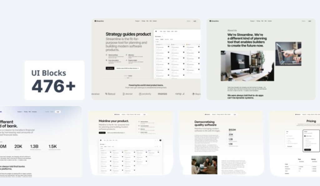
HOT476+ UI blocks + 4+ templates
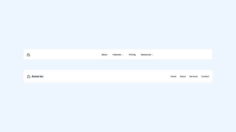
3 Tailwind navbar components in HTML and React
Best Tailwind components and elements to use on your web projects.
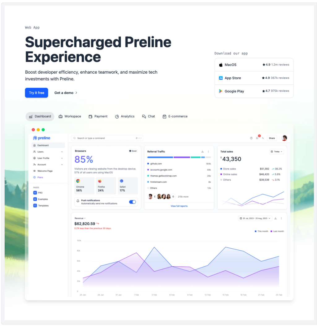
Preline: 740+ Tailwind pages & components
 HOT
HOTHundreds of premium components & blocks built for Tailwind & Shadcn UI
Creating intuitive and visually appealing navigation is crucial for any website, and mega menus are a powerful tool to enhance user experience.
A mega menu is an expansive dropdown menu that displays multiple options at once, often organized into categories. Unlike traditional dropdowns, mega menus can showcase various links, images, and even interactive elements, providing users with a comprehensive view of the site’s offerings without overwhelming them.
Tailwind CSS is a utility-first CSS framework that allows developers to build custom designs without leaving their HTML. Its flexibility and ease of use make it an excellent choice for creating complex components like mega menus. Here’s why Tailwind stands out:
Utility-First Approach: Tailwind’s utility classes enable rapid styling without writing custom CSS.
Responsive Design: Tailwind makes it straightforward to create responsive menus that look great on all devices.
Customization: Easily tailor your mega menus to match your brand’s aesthetics with Tailwind’s extensive customization options.
Creating a mega menu involves several key components. Let’s break them down and see how Tailwind can help.
The container holds the entire mega menu. It should be positioned correctly and styled to match your website’s layout.
<div class="relative">
  <!-- Trigger and Mega Menu will go here -->
</div>This is typically a navigation link that, when hovered or clicked, reveals the mega menu.
<button class="flex items-center px-3 py-2 text-gray-700 hover:text-blue-500">
  Products
</button>The panel contains the mega menu content. Using Tailwind’s utility classes, you can control its appearance and behavior.
<div class="absolute left-0 w-full bg-white shadow-lg hidden group-hover:block">
  <!-- Mega menu content goes here -->
</div>Organize your mega menu content using grids or flexbox for a structured and visually appealing layout.
<div class="grid grid-cols-4 gap-6 p-6">
  <!-- Columns with links and images -->
</div>Let’s walk through a basic example of creating a mega menu with Tailwind CSS.
Start by creating a relative container to position the mega menu correctly.
<nav class="bg-gray-100 p-4">
  <div class="relative group">
    <button class="px-4 py-2">Services</button>
    <!-- Mega Menu -->
    <div class="absolute left-0 w-full bg-white shadow-lg hidden group-hover:block">
      <div class="grid grid-cols-3 gap-4 p-6">
        <div>
          <h3 class="text-lg font-bold">Design</h3>
          <ul>
            <li><a href="#" class="block py-1">Web Design</a></li>
            <li><a href="#" class="block py-1">Graphic Design</a></li>
          </ul>
        </div>
        <div>
          <h3 class="text-lg font-bold">Development</h3>
          <ul>
            <li><a href="#" class="block py-1">Frontend</a></li>
            <li><a href="#" class="block py-1">Backend</a></li>
          </ul>
        </div>
        <div>
          <h3 class="text-lg font-bold">Marketing</h3>
          <ul>
            <li><a href="#" class="block py-1">SEO</a></li>
            <li><a href="#" class="block py-1">Social Media</a></li>
          </ul>
        </div>
      </div>
    </div>
  </div>
</nav>Use Tailwind’s utility classes to handle hover states, transitions, and responsive behavior. The group class on the container and group-hover on the mega menu ensure the menu appears when the user hovers over the trigger.
Ensure your mega menu looks great on all devices by utilizing Tailwind’s responsive design utilities.
<div class="absolute left-0 w-full bg-white shadow-lg hidden group-hover:block md:grid md:grid-cols-3">
  <!-- Responsive content layout -->
</div>Creating an effective mega menu involves more than just adding links. Here are some best practices to consider:
Group related items together and use clear headings to help users find what they’re looking for quickly.
Ensure the styling of your mega menu aligns with the rest of your website. Use consistent colors, fonts, and spacing.
Since a significant amount of traffic comes from mobile devices, make sure your mega menu is responsive and easy to navigate on smaller screens. Consider implementing a hamburger menu or accordion-style dropdowns for mobile users.
Avoid overly complex designs that can slow down your website. Use Tailwind’s utility classes efficiently and minimize unnecessary markup.
Ensure your mega menu is accessible to all users by using semantic HTML, proper ARIA attributes, and keyboard navigation support.
Tailwind’s flexibility allows you to customize your mega menu to fit your specific needs. Here are some customization tips:
Leverage Tailwind’s design system to apply custom colors, fonts, and spacing. Modify the tailwind.config.js file to define your theme.
// tailwind.config.js
module.exports = {
  theme: {
    extend: {
      colors: {
        primary: '#1E40AF',
        secondary: '#FBBF24',
      },
    },
  },
};Enhance user experience with smooth animations and transitions.
<div class="absolute left-0 w-full bg-white shadow-lg hidden group-hover:block transition duration-300 ease-in-out">
  <!-- Content -->
</div>Incorporate icons or images to make your mega menu more engaging.
<a href="#" class="flex items-center py-1">
  <img src="icon.png" alt="" class="w-5 h-5 mr-2">
  Link Text
</a>Add interactive elements like search bars or call-to-action buttons within your mega menu.
<div class="p-4">
  <input type="text" placeholder="Search..." class="w-full px-3 py-2 border rounded">
  <button class="mt-2 w-full bg-blue-500 text-white py-2 rounded">Search</button>
</div>While Tailwind handles the styling, integrating JavaScript can add more interactivity to your mega menu. Consider using Alpine.js or vanilla JavaScript to manage the open and close states, especially for accessibility and mobile interactions.
<div x-data="{ open: false }" class="relative">
  <button @click="open = !open" class="px-4 py-2">Dropdown</button>
  <div x-show="open" class="absolute left-0 w-full bg-white shadow-lg">
    <!-- Mega menu content -->
  </div>
</div>Designing mega menus can come with challenges. Here are some common issues and how to address them with Tailwind:
Creating multi-column layouts can be tricky. Use Tailwind’s grid system to simplify the process.
<div class="grid grid-cols-4 gap-6">
  <!-- Columns -->
</div>Ensuring your mega menu works seamlessly on all devices requires careful planning. Utilize Tailwind’s responsive classes to adjust the layout based on screen size.
<div class="hidden md:block">
  <!-- Desktop Mega Menu -->
</div>
<div class="block md:hidden">
  <!-- Mobile Menu -->
</div>
Tailwind CSS offers a versatile and efficient way to create stunning mega menus that enhance your website’s navigation and user experience.
You can find answers for commonly asked questions about components.
Use Tailwind’s transition and animation utility classes. For example, apply transition, duration-300, and ease-in-out to the mega menu container to create smooth transitions when it appears and disappears.
Popular patterns include multi-column layouts, categorized sections, inclusion of images or icons, and integration of call-to-action buttons. Choose a pattern that aligns with your website’s content and user needs.
Use nested containers and Tailwind’s positioning utilities to create submenus. Managing visibility with JavaScript or frameworks like Alpine.js can help control the display of each submenu.
Yes, you can embed forms, search bars, buttons, and other interactive components within your mega menu. Tailwind’s utility classes make it easy to style these elements consistently with the rest of your menu.