 HOT
HOTTailkits UI
MCPBuild landing pages with AI
Discover how Astro Components. Astro's island architecture allows for static site generation with interactive features, enhancing speed and SEO.
 HOT
HOTBuild landing pages with AI
 HOT
HOT959 Shadcn blocks & 10+ templates

shadcn/ui without React
 HOT
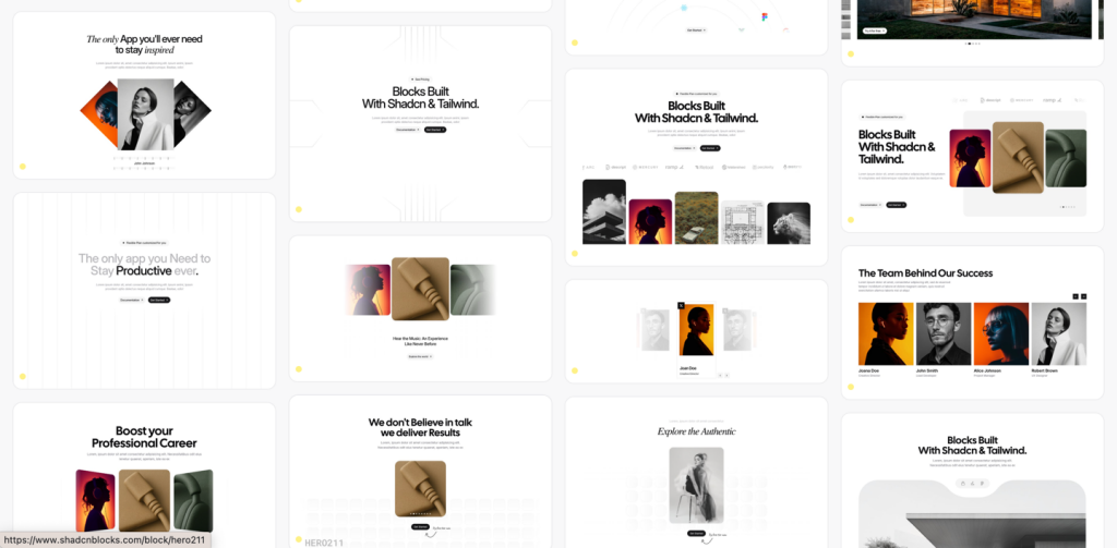
HOT959 shadcn/ui blocks for Tailwind
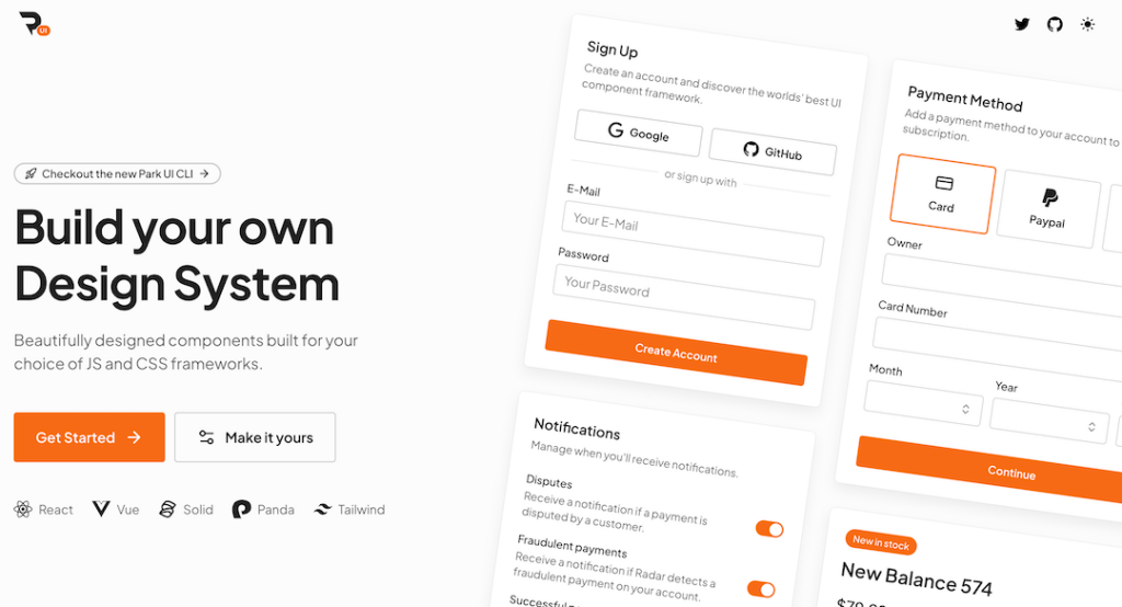
Tailwind-powered UI kit for React, Vue & Solid
Best Tailwind components and elements to use on your web projects.
 HOT
HOT959 shadcn/ui blocks for Tailwind

Free and premium Shadcn blocks

220+ Free & Premium Tailwind, Alpine.js components
Astro Components are the building blocks of Astro projects, allowing you to encapsulate HTML, CSS, and JavaScript into reusable units. Unlike traditional components tied to a specific framework, Astro Components are framework-agnostic, meaning you can use components from React, Vue, Svelte, and more within the same project. This flexibility makes Astro an excellent choice for developers who want to leverage multiple technologies without being confined to one.
An Astro Component typically resides in a .astro file and consists of three main sections:
Frontmatter (<script setup>): Contains JavaScript or TypeScript code that handles the component’s logic, data fetching, and props.
Template (<template>): Defines the HTML structure that the component will render.
Styles (<style>): Includes CSS scoped to the component, ensuring styles do not leak into other parts of the application.
---
const { title } = Astro.props;
---
<div class="card">
  <h2>{title}</h2>
  <slot />
</div>
<style>
  .card {
    border: 1px solid #eaeaea;
    padding: 20px;
    border-radius: 8px;
  }
</style>
In this example, the component accepts a title prop and uses a <slot /> to allow content projection, promoting reusability and flexibility.
One of Astro’s standout features is its ability to integrate components from various front-end frameworks like React, Vue, Svelte, and others. This allows developers to choose the best tool for each part of their project without being locked into a single ecosystem.
Astro employs a technique called partial hydration, where only the interactive components are hydrated on the client side. This approach reduces the amount of JavaScript sent to the browser, enhancing performance and load times.
Astro Components promote reusability and encapsulation. By isolating HTML, CSS, and JavaScript within a single component, you can maintain a clean and organized codebase, making it easier to manage and scale your projects.
Styles defined within an Astro Component are scoped to that component by default. This means you don’t have to worry about CSS conflicts, as styles are automatically isolated, ensuring consistency and predictability in your designs.
Passing data to Astro Components is straightforward using props, and slots allow for flexible content projection. This makes it easy to create dynamic and highly customizable components that can adapt to various contexts within your application.
Creating and using Astro Components is intuitive, thanks to Astro’s straightforward syntax and powerful features. Let’s walk through the process of building a simple Button component and integrating it into a page.
Start by creating a new file named Button.astro in the src/components directory:
---
const { label, onClick } = Astro.props;
---
<button onClick={onClick} class="btn">
  {label}
</button>
<style>
  .btn {
    background-color: #0070f3;
    color: white;
    padding: 10px 20px;
    border: none;
    border-radius: 5px;
    cursor: pointer;
  }
  .btn:hover {
    background-color: #005bb5;
  }
</style>
This Button component accepts label and onClick props, making it reusable with different labels and click behaviors.
Next, integrate the Button component into a page, such as index.astro in the src/pages directory:
---
import Button from '../components/Button.astro';
let count = 0;

const handleClick = () => {
  count += 1;
};
---
<main>
  <h1>Welcome to Astro!</h1>
  <Button label="Click Me" onClick={handleClick} />
  <p>You have clicked the button {count} {count === 1 ? 'time' : 'times'}.</p>
</main>
<style>
  main {
    text-align: center;
    padding: 50px;
  }
</style>
In this setup, the Button component is imported and used within the index.astro page. Each click on the button increments the count, demonstrating effective component interaction and state management.
Props are fundamental for creating dynamic and reusable Astro Components. They allow parent components to pass data down to child components, enabling customization and flexibility.
In your Astro Component, define props in the frontmatter:
---
const { title } = Astro.props;
---
<h2>{title}</h2>When using the component, pass the prop values as attributes:
<Card title="Astro Component">
  <p>This is a reusable card component.</p>
</Card>
Props can accept various data types, including strings, numbers, arrays, objects, and functions, making them versatile for different use cases.
Communication between components is essential for interactive applications. Astro facilitates this through custom events and props.
In a child component, you can emit events by passing functions as props:
---
const { onClick } = Astro.props;
---
<button onClick={() => onClick('Button clicked!')}>Click Me</button>In the parent component or page, listen for the emitted events and handle them accordingly:
---
import Button from '../components/Button.astro';
let message = '';

const handleButtonClick = (msg) => {
  message = msg;
};
---
<main>
  <Button label="Press Me" onClick={handleButtonClick} />
  <p>{message}</p>
</main>
This mechanism ensures a clean and decoupled way for child components to communicate actions and data back to their parents.
Styling components effectively is crucial for maintaining a consistent and conflict-free design. Astro supports scoped styles within components, ensuring that CSS rules apply only to their respective components.
Use the <style> tag within your .astro file to define scoped styles:
<style>
  .card {
    border: 1px solid #eaeaea;
    padding: 20px;
    border-radius: 8px;
  }
</style>
These styles are automatically scoped to the component, preventing them from affecting other parts of the application.
For more complex styling needs, Astro supports CSS Modules, allowing for locally scoped class names:
---
import styles from './Card.module.css';
---
<div class={styles.card}>
  <h2>{title}</h2>
  <slot />
</div>
/* Card.module.css */
.card {
background-color: #f9f9f9;
padding: 20px;
border-radius: 8px;
}CSS Modules enhance the maintainability and scalability of your styles, especially in large projects.
Slots provide a way to pass content from a parent component into a child component, offering greater flexibility in rendering dynamic content.
Default slots allow any content to be inserted into a child component:
<!-- Parent Component -->
<Card title="My Card">
  <p>This content is passed into the card component.</p>
</Card>
<!-- Card.astro -->
---
const { title } = Astro.props;
---
<div class="card">
<h2>{title}</h2>
<slot />
</div>Named slots enable multiple insertion points within a component:
<!-- ButtonGroup.astro -->
<div class="button-group">
  <slot name="primary" />
  <slot name="secondary" />
</div>
<!-- Parent Component -->
<ButtonGroup>
<button slot="primary">Primary</button>
<button slot="secondary">Secondary</button>
</ButtonGroup>Astro allows you to render components dynamically based on application state or user interaction. This enhances the interactivity and modularity of your application.
---
import Button from '../components/Button.astro';
import Link from '../components/Link.astro';
const [currentComponent, setCurrentComponent] = Astro.useState('button');
---
<select @change="setCurrentComponent($event.target.value)">
  <option value="button">Button</option>
  <option value="link">Link</option>
</select>

{currentComponent === 'button' && <Button label="Dynamic Button" onClick={() => alert('Button clicked!')} />}
{currentComponent === 'link' && <Link href="/about" label="Go to About" />}One of Astro’s strengths is its ability to integrate components from various front-end frameworks. This means you can use React, Vue, Svelte, or even vanilla JavaScript components within your Astro project, allowing for maximum flexibility and leveraging the best tools for each task.
Astro Components can be pre-rendered on the server or at build time, enhancing performance and SEO. This dual capability ensures that your components deliver fast load times and are optimized for search engines without additional configuration.
---
const data = await fetch(`https://api.example.com/data`).then(res => res.json());
---
<template>
  <div>
    <h1>Data from API</h1>
    <pre>{JSON.stringify(data, null, 2)}</pre>
  </div>
</template>Adhering to best practices ensures that your Astro Components are efficient, maintainable, and scalable. Here are some recommended practices:
Keep Components Small and Focused: Design each component to handle a single responsibility. This enhances readability, maintainability, and reusability.
Use Descriptive Names: Clearly name your components and their props to improve code readability and make it easier to navigate the codebase.
Leverage Scoped Styling: Utilize scoped styles or CSS Modules to prevent style leakage and ensure that styles apply only to intended components.
Optimize Data Fetching: Use Astro’s data fetching capabilities judiciously to ensure optimal performance. Prefetch data when needed and avoid unnecessary requests.
Avoid Overcomplicating Templates: Keep your templates clean and simple. Delegate complex logic to the script section or external utilities to maintain clarity.
Document Components: Provide clear documentation for your components, outlining their props, events, and usage scenarios. This facilitates collaboration and future maintenance.
Use TypeScript for Type Safety: Incorporate TypeScript to catch errors early, improve code quality, and enhance developer productivity.
Implement Lazy Loading: For large components or those not immediately required, implement lazy loading to optimize performance and reduce initial load times.
Ensuring that your Astro Components are efficient and performant is vital for delivering a smooth user experience. Here are some optimization techniques:
Each DOM manipulation can impact performance, especially in large applications. Use Astro’s built-in directives and reactivity system to handle state changes efficiently, reducing the need for manual DOM updates.
Astro’s partial hydration ensures that only interactive components are hydrated on the client side. This reduces the amount of JavaScript sent to the browser, enhancing load times and overall performance.
For components that are not immediately visible or essential for the initial render, consider lazy loading them. This approach reduces the initial load time and improves the performance of your application by loading components only when they are needed.
Choose appropriate data fetching strategies based on the component’s requirements. Use server-side rendering (SSR) or static site generation (SSG) for pre-rendering data when applicable, and avoid fetching data unnecessarily on the client side.
Keep your CSS minimal and avoid overly complex selectors. Utilize utility-first CSS frameworks like Tailwind CSS in combination with scoped styles or CSS Modules to maintain efficient and scalable styles.
Incorporating TypeScript can help catch errors early, enforce type safety, and improve code quality. This leads to more reliable and maintainable components, especially in larger projects.
Testing is crucial to ensure that your Astro Components function as intended and maintain high-quality standards. Here are some strategies for effective testing:
Unit tests focus on testing individual components in isolation. They verify that components render correctly, handle props and state changes appropriately, and respond to events as expected. Tools like Jest and Testing Library can be integrated with Astro to facilitate unit testing.
Integration tests assess how multiple components work together within the application. They ensure that data flows correctly between components and that interactions behave as intended, maintaining the integrity of your application's functionality.
End-to-end (E2E) tests simulate real user interactions to verify that the entire application behaves correctly from the user’s perspective. Tools like Cypress or Playwright can be used to perform comprehensive E2E tests, ensuring that user workflows function seamlessly from start to finish.
Transitioning from another framework or vanilla JavaScript to Astro involves several steps to ensure a smooth migration:
Analyze Existing Components: Understand the structure, functionality, and dependencies of your current components to determine how they can be translated into Astro syntax and directives.
Set Up the Astro Project: Initialize a new Astro project using the Astro CLI, which provides a structured environment and necessary configurations.
Recreate Component Structure: Rewrite your components using Astro’s declarative syntax, leveraging x-data, x-bind, and other directives to manage state and behavior within the HTML.
Transfer Styles and Templates: Move your existing styles into the Astro Components, using scoped styles or CSS Modules to maintain encapsulation and prevent conflicts.
Adapt State Management: Ensure that state management aligns with Astro’s reactive system. Use x-data for component-specific state and consider global state management solutions for shared state.
Handle Events and Interactions: Translate event handling from your existing framework to Astro’s syntax using x-on or aliases like @.
Test Thoroughly: Validate that each migrated component behaves as expected within the Astro context, addressing any issues related to state, interactivity, or styling.
A systematic approach to migration preserves functionality while leveraging Astro’s strengths, resulting in an optimized and maintainable application.
Astro Components make it easy to build fast, dynamic web apps with simple syntax and powerful features like framework integrations and partial hydration. With its vibrant ecosystem, you can create reusable, scalable UI components for anything from static sites to complex apps. Master Astro's tools and best practices to deliver responsive, efficient, and modern web experiences.
You can find answers for commonly asked questions about components.
Sharing state between Astro Components can be achieved using global state management solutions like Zustand or Redux, leveraging browser storage APIs like localStorage, or utilizing context providers if integrating with frameworks that support it. Alternatively, you can pass state and handlers through props to facilitate communication between parent and child components.
Yes, Astro fully supports TypeScript. You can write your Astro Components using TypeScript by configuring your project accordingly. This provides strong typing, improved tooling, and better maintainability, enhancing the development experience and reducing potential errors.