Glassmorphic Card
Sleek glass card UI in pure Tailwind
Details About Glassmorphic Card
Key points:
- Copy & Paste
- Tailwind CSS v4
- Responsive
Contents
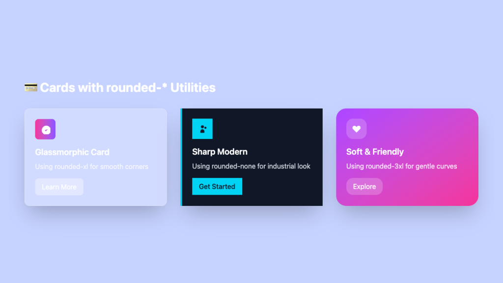
Glassmorphic Card
Uses rounded-xl for smooth, modern corners
                <!-- Glassmorphic Card - rounded-xl -->
                <div class="bg-white/20 backdrop-blur-lg rounded-xl p-6 border border-white/30 shadow-2xl hover:shadow-3xl transition-all duration-300 hover:scale-105">
                    <div class="text-white">
                        <div class="w-12 h-12 bg-gradient-to-r from-pink-500 to-violet-500 rounded-lg mb-4 flex items-center justify-center">
                            <svg class="w-6 h-6" fill="currentColor" viewBox="0 0 20 20">
                                <path d="M9 12l2 2 4-4m6 2a9 9 0 11-18 0 9 9 0 0118 0z"/>
                            </svg>
                        </div>
                        <h3 class="text-xl font-semibold mb-2">Glassmorphic Card</h3>
                        <p class="text-white/80 mb-4">Using rounded-xl for smooth corners</p>
                        <button class="bg-white/20 hover:bg-white/30 px-4 py-2 rounded-lg backdrop-blur-sm transition-colors">
                            Learn More
                        </button>
                    </div>
                </div>
Sharp Modern Card
Uses rounded-none for industrial, clean look
                <div class="bg-gray-900 rounded-none p-6 shadow-2xl hover:shadow-3xl transition-all duration-300 hover:scale-105 border-l-4 border-cyan-400">
                    <div class="text-white">
                        <div class="w-12 h-12 bg-cyan-400 rounded-none mb-4 flex items-center justify-center">
                            <svg class="w-6 h-6 text-gray-900" fill="currentColor" viewBox="0 0 20 20">
                                <path d="M13 6a3 3 0 11-6 0 3 3 0 016 0zM18 8a2 2 0 11-4 0 2 2 0 014 0zM14 15a4 4 0 00-8 0v3h8v-3z"/>
                            </svg>
                        </div>
                        <h3 class="text-xl font-semibold mb-2">Sharp Modern</h3>
                        <p class="text-gray-300 mb-4">Using rounded-none for industrial look</p>
                        <button class="bg-cyan-400 hover:bg-cyan-300 text-gray-900 px-4 py-2 rounded-none transition-colors font-medium">
                            Get Started
                        </button>
                    </div>
                </div>
Soft & Friendly Card
Uses rounded-3xl for gentle, welcoming curves
                <!-- Soft Rounded Card - rounded-3xl -->
                <div class="bg-gradient-to-br from-purple-500 to-pink-500 rounded-3xl p-6 shadow-2xl hover:shadow-3xl transition-all duration-300 hover:scale-105">
                    <div class="text-white">
                        <div class="w-12 h-12 bg-white/20 rounded-2xl mb-4 flex items-center justify-center">
                            <svg class="w-6 h-6" fill="currentColor" viewBox="0 0 20 20">
                                <path d="M3.172 5.172a4 4 0 015.656 0L10 6.343l1.172-1.171a4 4 0 115.656 5.656L10 17.657l-6.828-6.829a4 4 0 010-5.656z"/>
                            </svg>
                        </div>
                        <h3 class="text-xl font-semibold mb-2">Soft & Friendly</h3>
                        <p class="text-white/90 mb-4">Using rounded-3xl for gentle curves</p>
                        <button class="bg-white/20 hover:bg-white/30 px-4 py-2 rounded-2xl backdrop-blur-sm transition-colors">
                            Explore
                        </button>
                    </div>
                </div>
Features ✨
Real glassmorphism via
backdrop-blurand alpha backgroundsResponsive width & height out-of-the-box
Smooth hover lift + shadow for depth
Dark-mode friendly contrast
Fully customisable with plain Tailwind classes
Integration
Ensure Tailwind CSS v2.1+ (or v3/v4) is loaded
Copy the markup from Tailkits and paste inside your layout
For Tailwind v2.x add the official
@tailwindcss/filtersplugin for backdrop utilitiesDrop the card into React/Next by pasting the JSX version
Provide a solid-colour fallback class for Firefox users