 HOT
HOTTailkits UI
NEWConsistent UI, zero hallucinations
Find Tailwind card components to create interactive content displays. Card components encapsulate information like text, images, and links in a container.
 HOT
HOTConsistent UI, zero hallucinations
 HOT
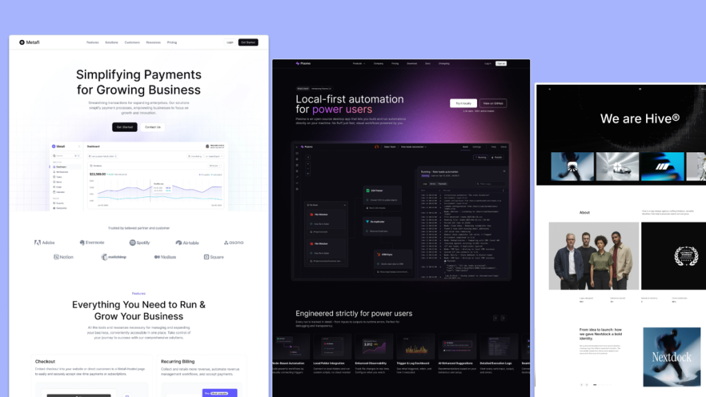
HOT12+ Shadcn Templates
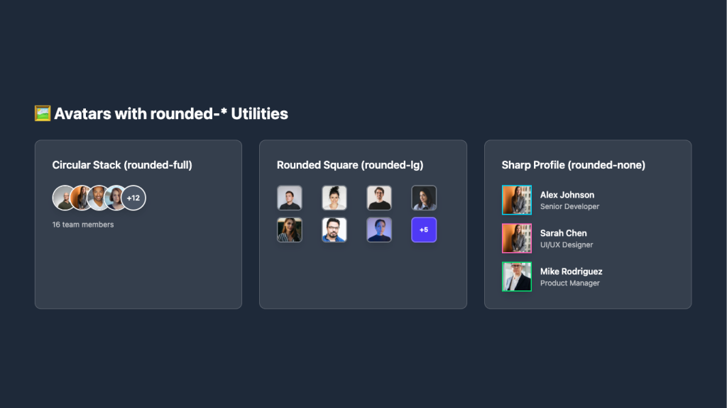
Overlapping circular avatars in a neat stack
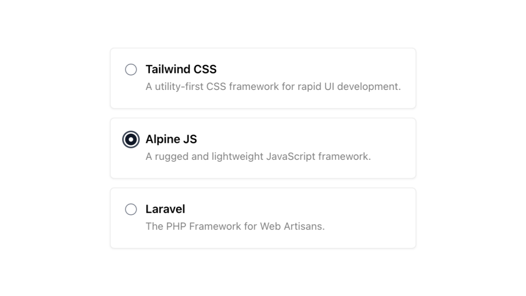
Alpine.js and Tailwind radio group component by Pines UI Library.
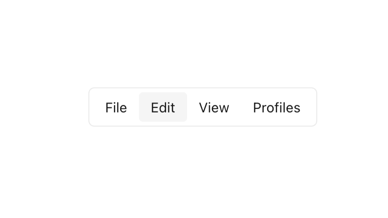
Alpine.js and Tailwind menu component by Pines UI Library.
Force your AI to use a professional design system. Build brand-matched, consistent UIs with 200+ vetted components.


Alpine.js and Tailwind hover card component by Pines UI Library.

Tailwind CSS coupon code component
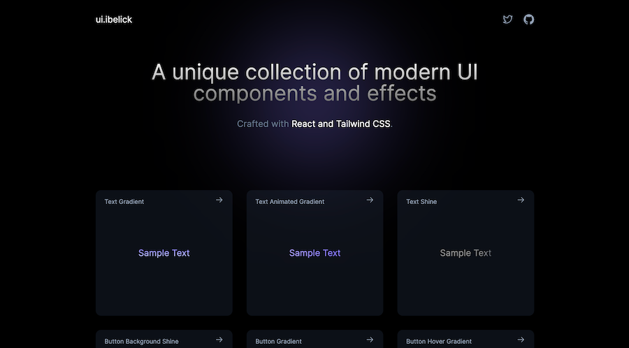
18+ free React & Tailwind CSS UI Components
Production-ready Tailwind components for React, Next.js, Vue & HTML. Responsive, accessible UI blocks optimized for Tailwind v4 with MCP integration.
200+ ready-to-use Tailwind CSS components with MCP integration. Let AI generate complete pages from your prompts — one command, production-ready UI.
Explore Components
Card components stand out for their versatility and effectiveness in displaying content succinctly.
Card components are versatile UI elements used to encapsulate and display content such as images, text, links, and other interactive elements in a structured and aesthetically pleasing manner. They are ubiquitous in modern web design, appearing on blogs, e-commerce sites, portfolios, and more. Cards help organize information, making it digestible and engaging for users.
Tailwind CSS differentiates itself with its utility-first approach, allowing developers to style components directly within HTML using predefined classes. This methodology offers several advantages:
Rapid Development: Speed up the design process without writing custom CSS.
Consistency: Ensure uniform styling across components.
Customization: Easily tweak designs by adjusting utility classes.
Responsiveness: Simplify creating responsive designs with built-in classes.
Tailwind's flexibility makes it an excellent choice for building card components that are both functional and stylish.
Creating a basic card with Tailwind CSS is straightforward. Here's a simple example to get you started:
<div class="max-w-sm rounded overflow-hidden shadow-lg">
  <img class="w-full" src="image.jpg" alt="Card Image">
  <div class="px-6 py-4">
    <div class="font-bold text-xl mb-2">Card Title</div>
    <p class="text-gray-700 text-base">
      Some descriptive text about the content of the card.
    </p>
  </div>
  <div class="px-6 pt-4 pb-2">
    <span class="inline-block bg-gray-200 rounded-full px-3 py-1 text-sm font-semibold text-gray-700 mr-2">#tag1</span>
    <span class="inline-block bg-gray-200 rounded-full px-3 py-1 text-sm font-semibold text-gray-700 mr-2">#tag2</span>
  </div>
</div>
Note: This example is concise, showcasing the essential Tailwind classes to create a clean card layout.
Tailwind CSS's utility classes enable the creation of various card styles tailored to different needs. Here are a few popular variations:
These cards emphasize visual content, making them ideal for portfolios or product showcases.
<div class="max-w-sm rounded overflow-hidden shadow-lg">
  <img class="w-full" src="image.jpg" alt="Card Image">
  <div class="px-6 py-4">
    <div class="font-bold text-xl mb-2">Image Card Title</div>
    <p class="text-gray-700 text-base">Brief description or caption.</p>
  </div>
</div>Incorporate hover effects and clickable areas to enhance user interaction.
<div class="max-w-sm rounded overflow-hidden shadow-lg hover:shadow-2xl transition-shadow duration-300">
  <img class="w-full" src="image.jpg" alt="Card Image">
  <div class="px-6 py-4">
    <div class="font-bold text-xl mb-2">Interactive Card</div>
    <p class="text-gray-700 text-base">Click to learn more.</p>
  </div>
</div>Perfect for displaying user information, such as profiles or team members.
<div class="max-w-sm rounded overflow-hidden shadow-lg">
  <img class="w-full h-48 object-cover" src="profile.jpg" alt="Profile Image">
  <div class="px-6 py-4">
    <div class="font-bold text-xl mb-2">John Doe</div>
    <p class="text-gray-700 text-base">Web Developer at XYZ Company</p>
  </div>
</div>Tailwind CSS excels in creating responsive designs. By leveraging its responsive utility classes, you can ensure that your card components look great on all devices.
<div class="grid grid-cols-1 sm:grid-cols-2 md:grid-cols-3 gap-4">
  <!-- Card 1 -->
  <div class="max-w-sm rounded overflow-hidden shadow-lg">
    <!-- Card Content -->
  </div>
  <!-- Repeat for additional cards -->
</div>
In this setup, the grid adjusts the number of columns based on the screen size, ensuring optimal display across devices.
Tailwind's utility classes offer extensive customization options:
Colors: Utilize classes like bg-white, text-gray-700, or bg-blue-500 to change backgrounds and text colors.
Borders: Add borders with border, border-gray-200, or remove them with border-none.
Shadows: Enhance depth using shadow, shadow-lg, or shadow-2xl.
Spacing: Control padding and margins with p-4, m-2, px-6, py-4, etc.
Typography: Tailor text with classes like font-bold, text-xl, text-center, etc.
Rounded Corners: Soften edges using rounded, rounded-lg, or rounded-full.
By combining these utilities, you can craft unique card designs that align with your project's aesthetic.
Keep It Simple: Avoid overcomplicating your cards. A clean design often offers better usability.
Consistent Sizing: Ensure uniformity in card dimensions for a harmonious layout.
Use Flex and Grid: Leverage Tailwind's flexbox and grid utilities to organize content within cards.
Optimize Images: Use appropriately sized images to maintain performance and appearance.
Accessibility Matters: Incorporate alt texts for images and ensure sufficient color contrast.
Adding hover effects enhances interactivity. Tailwind provides straightforward classes for this purpose. For instance, to change the shadow on hover, you can use:
<div class="shadow-lg hover:shadow-2xl transition-shadow duration-300">
  <!-- Card Content -->
</div>
This snippet ensures that when a user hovers over the card, the shadow intensifies smoothly, providing a visual cue.
Absolutely! Tailwind CSS is framework-agnostic, meaning you can seamlessly integrate its card components with popular JavaScript frameworks like React, Vue, or Angular. Here's a brief example using React:
function Card() {
  return (
    <div className="max-w-sm rounded overflow-hidden shadow-lg">
      <img className="w-full" src="image.jpg" alt="Card Image" />
      <div className="px-6 py-4">
        <div className="font-bold text-xl mb-2">Card Title</div>
        <p className="text-gray-700 text-base">Card description goes here.</p>
      </div>
    </div>
  );
}
You maintain a streamlined styling process by incorporating Tailwind classes directly into your component's JSX.
Accessibility is crucial for inclusive design. To make your Tailwind cards accessible:
Use Semantic HTML: Utilize appropriate tags like <article> or <section>.
Alt Text for Images: Always include descriptive alt attributes for images.
Keyboard Navigation: Ensure interactive elements within cards are navigable via keyboard.
Contrast Ratios: Choose colors that offer sufficient contrast between text and backgrounds.
ARIA Attributes: Implement ARIA roles and labels where necessary to enhance screen reader compatibility.
By adhering to these practices, your cards will be more accessible to all users.
Dynamic generation of card components is common in data-driven applications. Using templating engines or frontend frameworks, you can iterate over data sets to create cards. For example, in Vue.js:
<template>
  <div class="grid grid-cols-1 sm:grid-cols-2 md:grid-cols-3 gap-4">
    <div v-for="item in items" :key="item.id" class="max-w-sm rounded overflow-hidden shadow-lg">
      <img :src="item.image" alt="Card Image" class="w-full">
      <div class="px-6 py-4">
        <div class="font-bold text-xl mb-2">{{ item.title }}</div>
        <p class="text-gray-700 text-base">{{ item.description }}</p>
      </div>
    </div>
  </div>
</template>

<script>
export default {
  data() {
    return {
      items: [
        { id: 1, image: 'image1.jpg', title: 'Card 1', description: 'Description 1' },
        // Additional items
      ],
    };
  },
};
</script>
This approach allows for scalable and maintainable card generation based on your data structures.
Tailwind CSS empowers developers to craft elegant and responsive card components with minimal effort. Its utility-first paradigm simplifies styling, ensuring that your cards are not only visually appealing but also highly customizable and maintainable.
You can find answers for commonly asked questions about components.
While Tailwind is optimized for use with build tools to purge unused styles and optimize performance, you can include it via CDN for simpler projects. However, this approach may include the entire Tailwind library, potentially impacting load times.
Yes, Tailwind offers various utility classes to adjust transition durations. For example, duration-500 sets the transition duration to 500ms.