Coupon Code Card
Tailwind CSS coupon code component
Details About Coupon Code Card
Key points:
- Copy & Paste
- Tailwind CSS v4
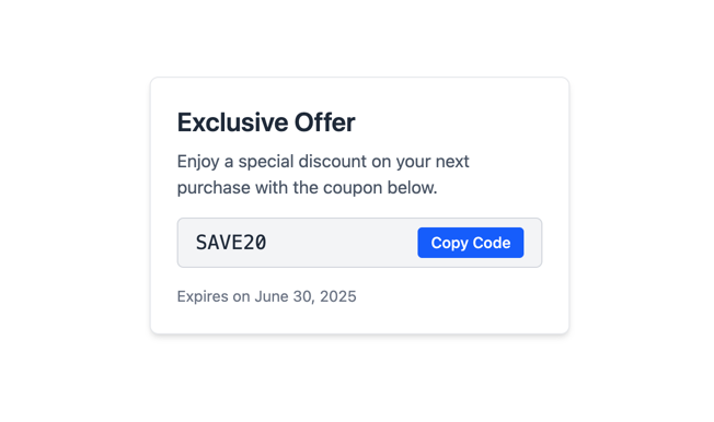
<!-- Tailwind CSS v4 Coupon Code Card -->
<div class="max-w-sm mx-auto bg-white border border-gray-200 rounded-lg shadow-md p-6">
  <h2 class="text-2xl font-semibold text-gray-800 mb-2">Exclusive Offer</h2>
  <p class="text-gray-600 mb-4">Enjoy a special discount on your next purchase with the coupon below.</p>

  <div class="flex items-center justify-between bg-gray-100 border border-gray-300 rounded-md px-4 py-2 mb-4">
    <code class="font-mono text-lg text-gray-800">SAVE20</code>
    <button
      class="inline-flex items-center px-3 py-1 bg-blue-600 text-white text-sm font-medium rounded hover:bg-blue-700 focus:outline-none focus:ring-2 focus:ring-blue-500"
      onclick="navigator.clipboard.writeText('SAVE20')"
    >
      Copy Code
    </button>
  </div>

  <p class="text-sm text-gray-500">Expires on <time datetime="2025-06-30">June 30, 2025</time></p>
</div>
Customizable Coupon Code Card styled with Tailwind CSS v4.
It includes:
Header & description
Coupon badge with a copy-to-clipboard button
Expiration date
You can tweak colors, padding, or text to fit your design.