HOT
HOTTailkits UI
NEWConsistent UI, zero hallucinations
Discover headless (unstyled) component libraries like Base UI, Radix Primitives, React Aria, and Headless UI—accessible building blocks you can style with Tailwind.
HOTConsistent UI, zero hallucinations
 HOT
HOT12+ Shadcn Templates
Unstyled, accessible React components
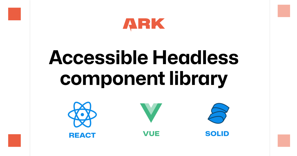
Unstyled components for React, Vue, Solid, Svelte
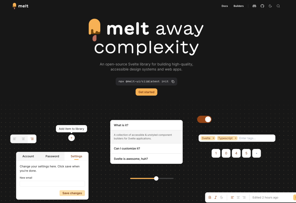
Unstyled Svelte components with WAI-ARIA support
Accessible, unstyled React UI primitives with examples

Accessible Angular UI primitives, Tailwind ready

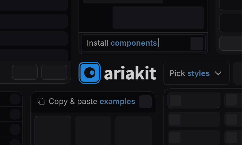
Accessible, unstyled React components and hooks
16 React & Vue UI components
Production-ready Tailwind components for React, Next.js, Vue & HTML. Responsive, accessible UI blocks optimized for Tailwind v4 with MCP integration.
200+ ready-to-use Tailwind CSS components with MCP integration. Let AI generate complete pages from your prompts — one command, production-ready UI.
Explore Components
Headless UI libraries; often called “unstyled primitives” - give you the hard parts of UI components without prescribing how they look.
You get the behavior and accessibility foundations (semantics, ARIA wiring, focus management, keyboard interactions, layering/portals), and you style everything yourself - usually with Tailwind or a design system.
An unstyled component library provides the structural foundation and functionality of UI components without imposing any visual design. Unlike traditional component libraries that come with pre-defined styles, unstyled components give developers complete control over appearance while handling complex logic like accessibility, keyboard navigation, and state management.
This category is for teams who want full control over visuals without re-implementing complex UI patterns.
Many modern libraries position themselves exactly this way: Radix Primitives as “unstyled, accessible…primitives,” Base UI as “unstyled UI components for building accessible user interfaces,” and Headless UI as “completely unstyled, fully accessible UI components.
Design-system friendly: build a consistent visual language on top of shared behavior.
Accessibility out of the box: focus traps, keyboard maps, ARIA patterns—handled for you.
Composable building blocks: primitives are meant to be wrapped and reused as your app grows.
Complete Design Freedom: Your brand guidelines, design system, or creative vision can be implemented exactly as intended without compromise. There's no need to strip away existing styles before adding your own.
Smaller Bundle Sizes: Without shipping CSS for styles you'll never use, your application stays lean. You only include the styling code you actually write.
Framework Agnostic Styling: Use any CSS methodology you prefer. Unstyled components work seamlessly with utility-first frameworks like Tailwind, CSS-in-JS solutions, CSS modules, or traditional stylesheets.
Built-in Accessibility: The most valuable aspect of unstyled component libraries is their handling of complex accessibility requirements. Developers get proper ARIA attributes, keyboard navigation, screen reader support, and focus management without manual implementation.
Teams building custom design systems rely on unstyled component libraries as their foundation. Instead of building complex components like dropdowns, modals, or date pickers from scratch, they start with accessible, functional components and apply their unique visual identity.
Agencies serving multiple clients benefit from the flexibility to implement different brand guidelines using the same component foundation. One unstyled component library can power dozens of visually distinct websites.
Product teams working with designers who have specific visions can implement exact specifications without negotiating with framework limitations.
These libraries typically provide headless UI components—they handle state, logic, and behavior while exposing hooks or render props that give you full control over markup and styling. You compose these primitives to create the exact component structure your design requires.
The library manages the complex interactions: which element should receive focus, when to close a dropdown, how to handle keyboard navigation in a menu, or managing the relationship between a combobox input and its options list.
The ecosystem includes several mature options. Radix UI provides a comprehensive set of React primitives with exceptional accessibility. Headless UI from the Tailwind team offers essential components optimized for utility-first styling. Ariakit focuses on flexibility and composability. React Aria from Adobe delivers a complete system of hooks for building accessible components.
Each library brings its own approach to the problem, but they share the core philosophy: handle the hard parts of component behavior while giving developers complete styling control.
Unstyled component libraries integrate naturally with modern development workflows. They work alongside design tokens, style systems, and CSS frameworks without friction. Many teams combine them with Tailwind CSS for rapid development that doesn't sacrifice accessibility or custom branding.
The approach also supports design system evolution. As your brand guidelines change, you update styling without touching component logic. The separation of concerns makes maintenance cleaner and updates less risky.
You can find answers for commonly asked questions about components.
Unstyled components (also called headless or primitive components) provide the logic, accessibility, and behavior for UI elements without any default styling. You apply Tailwind CSS classes to control appearance while the library handles keyboard navigation, ARIA attributes, and screen reader support. This gives you complete design freedom with production-ready accessibility.
Traditional libraries like Bootstrap ship with predefined styles you must override. Headless UI libraries like Radix UI and Headless UI provide only the behavioral logic and accessibility features, leaving all styling to you. This makes them ideal for custom design systems and Tailwind CSS projects where you want full control over appearance.
Most popular unstyled libraries are free and open-source. Headless UI, Radix UI, React Aria, Base UI, and Ark UI all use permissive licenses (MIT or Apache) allowing commercial use without fees. Premium options exist for pre-styled component collections built on these foundations, but the core headless libraries remain free.
Not necessarily. While most unstyled libraries target React (Radix UI, React Aria, Base UI), Headless UI supports React, Vue, and Alpine.js. Some libraries offer framework-agnostic versions using Web Components. Check each library's documentation for framework compatibility. The concepts work across frameworks, though implementation details vary.