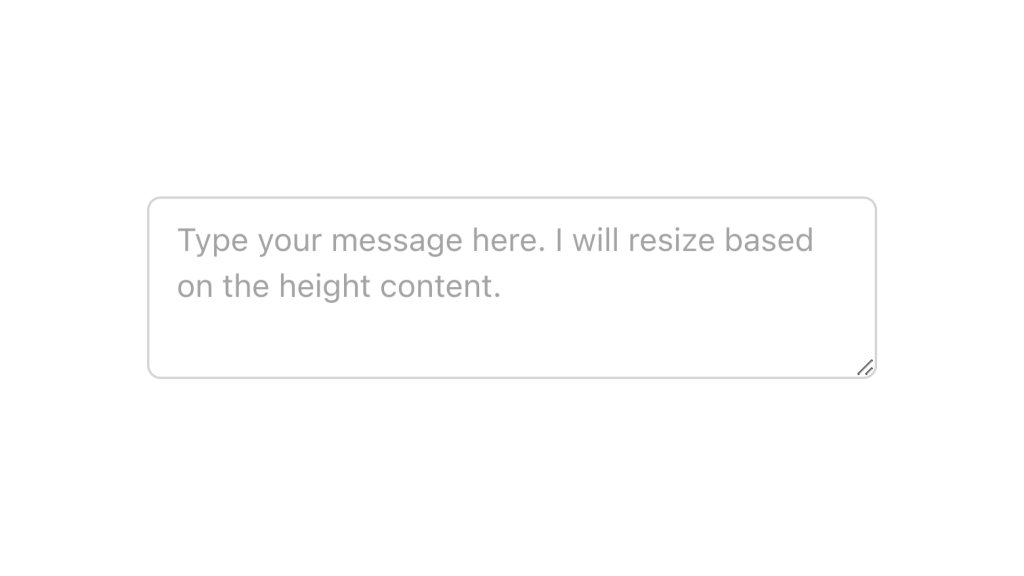
Text Area
Alpine.js and Tailwind text area component by Pines UI Library.
- Documentation
- Custom config file
- Open Source
- JavaScript Plugin
- Copy & Paste
- Tailwind CSS v3
- Responsive
Tailwind CSS has revolutionized the way developers approach styling by offering a utility-first framework that emphasizes flexibility and efficiency. When it comes to creating text areas, Tailwind simplifies the process, allowing you to build responsive, accessible, and aesthetically pleasing components without drowning in custom CSS.
Getting Started with Tailwind Text Areas
At its core, a text area in HTML is a versatile element used for multi-line text input. Tailwind enhances this element by providing a plethora of utility classes that can be combined to achieve the desired look and functionality. Let’s dive deeper into how you can leverage Tailwind to create robust text area components.
Basic Text Area Styling
Creating a basic text area with Tailwind is straightforward. By applying utility classes, you can control the width, height, padding, borders, and more.
<textarea class="w-full h-32 p-4 border border-gray-300 rounded-lg focus:outline-none focus:ring-2 focus:ring-blue-500"></textarea>Key Classes Explained:
w-full: Ensures the text area spans the full width of its container, making it responsive to different screen sizes.h-32: Sets a fixed height, which can be adjusted based on your design requirements.p-4: Adds padding inside the text area, enhancing readability by preventing text from clinging to the borders.border border-gray-300: Applies a subtle gray border, providing a clear boundary without being too overpowering.rounded-lg: Gives the text area large rounded corners for a modern look.focus:outline-none focus:ring-2 focus:ring-blue-500: Enhances focus states for better accessibility and user experience by removing the default outline and adding a blue ring upon interaction.
Text Areas with Customizations
Tailwind’s utility classes allow for extensive customization. Whether you need larger input areas, different border colors, or specific interactivity features, Tailwind has the tools to make it happen.
<textarea class="w-full h-48 p-5 border border-indigo-500 rounded-xl resize-none focus:ring-green-400"></textarea>
Additional Customizations:
h-48: Increases the height for scenarios where more text input is expected.p-5: Adds extra padding for better content spacing.border-indigo-500: Changes the border color to indigo, aligning with your color scheme.rounded-xl: Applies even larger rounded corners for a more pronounced effect.resize-none: Disables the user’s ability to resize the text area, maintaining design consistency.focus:ring-green-400: Alters the focus ring color to green, providing visual feedback tailored to your design palette.
Advanced Styling Techniques
Beyond basic styling, Tailwind allows you to implement advanced features such as disabled states, read-only modes, and dynamic feedback based on user interactions.
Disabled and Read-Only States
Sometimes, you might need a text area that users cannot interact with. Tailwind makes it easy to style these states to indicate their status clearly.
<textarea class="w-full p-4 border border-gray-300 rounded-lg bg-gray-100 cursor-not-allowed" disabled></textarea>bg-gray-100: Sets a light gray background to signify that the text area is inactive.cursor-not-allowed: Changes the cursor to indicate that interaction is not permitted.
Error and Success States
Providing real-time feedback is crucial for user experience. Tailwind allows you to highlight text areas based on validation states.
<textarea class="w-full p-4 border border-red-500 rounded-lg focus:ring-red-500"></textarea>border-red-500andfocus:ring-red-500: Use red hues to indicate errors, drawing user attention to necessary corrections.
Conversely, for successful input:
<textarea class="w-full p-4 border border-green-500 rounded-lg focus:ring-green-500"></textarea>border-green-500andfocus:ring-green-500: Green accents can signify successful input or confirmation.
Responsiveness and Adaptability
In today’s multi-device landscape, ensuring that your text areas adapt seamlessly across various screen sizes is paramount. Tailwind’s responsive utilities make this effortless.
<textarea class="w-full sm:w-3/4 md:w-1/2 lg:w-1/3 p-4 border rounded"></textarea>Responsive Classes:
sm:w-3/4: On small screens and above, the width adjusts to three-quarters of the container.md:w-1/2: On medium screens and above, it adapts to half the container’s width.lg:w-1/3: On large screens and above, the width becomes one-third of the container.
This approach ensures that your text area maintains optimal usability and aesthetics across devices, from mobile phones to desktops.
Accessibility Considerations
Accessibility is a cornerstone of modern web design, ensuring that all users, including those with disabilities, can interact with your applications effectively. Tailwind provides several classes and strategies to enhance the accessibility of text areas.
Focus Management
Proper focus management helps users navigate forms using keyboards or assistive technologies.
<textarea class="w-full p-4 border rounded focus:outline-none focus:ring-2 focus:ring-blue-500" aria-label="Your message"></textarea>aria-label: Provides an accessible name for the text area, especially useful when a visible label isn’t present.
High Contrast Modes
Ensuring sufficient contrast between text and background is vital for readability.
<textarea class="w-full p-4 border border-gray-300 bg-white text-black rounded-lg"></textarea>bg-whiteandtext-black: Guarantee high contrast, making the content easily readable.
Integrating with JavaScript for Enhanced Functionality
While Tailwind handles the styling excellently, integrating JavaScript can elevate your text areas with dynamic behaviors like auto-resizing, character counting, or live validations.
Auto-Resizing Text Areas
Creating text areas that adjust their height based on user input can improve user experience.
<textarea class="w-full p-4 border rounded-lg resize-none overflow-hidden" oninput="this.style.height = ''; this.style.height = this.scrollHeight + 'px'"></textarea>resize-noneandoverflow-hidden: Prevent manual resizing and hide overflow, allowing JavaScript to manage the height.oninputevent: Dynamically adjusts the height as the user types, ensuring all content is visible without requiring scrolls.
Theming and Dark Mode Support
Tailwind excels in theming, allowing you to create text areas that adapt to light and dark modes seamlessly.
<textarea class="w-full p-4 border border-gray-300 bg-white text-black dark:bg-gray-800 dark:border-gray-600 dark:text-white rounded-lg"></textarea>dark:bg-gray-800,dark:border-gray-600,dark:text-white: These classes adjust the background, border, and text colors when dark mode is active, ensuring consistency and readability.
Utilizing Plugins for Extended Functionality
Tailwind’s plugin ecosystem offers additional utilities that can further enhance your text areas. For instance, using the Typography Plugin can help style placeholder text more effectively or manage responsive font sizes within the text area.
Best Practices for Tailwind Text Areas
To make the most out of Tailwind CSS for your text areas, consider the following best practices:
Consistent Sizing: Maintain consistent padding and border sizes across different text areas to ensure a uniform look.
Clear Labels: Always associate text areas with clear labels, either visually or through ARIA attributes, to enhance accessibility.
Responsive Design: Utilize Tailwind’s responsive classes to ensure your text areas look great on all devices.
Feedback Mechanisms: Incorporate visual feedback for user interactions, such as focus states and validation messages, to guide user behavior.
Avoid Overcomplicating: While Tailwind offers numerous utilities, aim for simplicity to maintain clean and maintainable code.
FAQ
How can I make the text area responsive using Tailwind CSS?
Tailwind’s responsive design utilities are a breeze to implement. By using breakpoint prefixes like sm:, md:, lg:, and xl:, you can adjust various properties of the text area at different screen widths.
How do I add placeholder text with customized styling in Tailwind?
Tailwind allows you to style placeholder text using the placeholder- prefix classes. This enables you to match the placeholder's appearance with your design language.
Can I integrate validation styles with Tailwind text areas?
Absolutely. Tailwind’s utility classes make it simple to reflect validation states visually. For example, by applying border-red-500 and focus:ring-red-500, the text area clearly signals an error state to the user. Similarly, you can use green classes for success states.
How do I disable resizing of the text area in Tailwind?
Disabling the user’s ability to resize the text area can help maintain your design’s integrity. Tailwind provides utility classes to control this behavior: "resize-none": Disables both horizontal and vertical resizing. "resize-y": Allows only vertical resizing. "resize-x": Allows only horizontal resizing. "resize": Enables both horizontal and vertical resizing (default behavior). Using "resize-none" ensures that the text area remains fixed in size, preventing users from altering its dimensions and maintaining a consistent layout across your application.