Toast
Alpine.js and Tailwind toast notification component by Pines UI Library.
- Documentation
- Custom config file
- JavaScript Plugin
- Copy & Paste
- Responsive
Creating Toast notifications with Tailwind CSS is a fantastic way to enhance user experience by providing timely, unobtrusive feedback. Tailwind’s utility-first approach allows for rapid customization and seamless integration into your projects.
Basic Toast Structure
At its core, a Toast notification is a simple, self-contained component. It typically consists of:
Container: Positioned fixed, holds the toast messages.
Content Area: Contains the message and optional elements like icons or buttons.
Close Button: Allows users to manually dismiss the toast.
HTML Skeleton:
<div id="toast" class="hidden fixed top-5 right-5 flex items-center p-4 mb-4 text-white bg-blue-500 rounded-lg shadow-lg" role="alert">
  <div class="inline-flex items-center justify-center flex-shrink-0 w-8 h-8 bg-blue-700 rounded-lg">
    <!-- Icon SVG -->
    <svg aria-hidden="true" class="w-5 h-5" fill="currentColor" viewBox="0 0 20 20">
      <!-- SVG Path -->
    </svg>
    <span class="sr-only">Info</span>
  </div>
  <div class="ml-3 text-sm font-medium">This is a Toast message.</div>
  <button type="button" class="ml-auto bg-transparent text-white hover:text-gray-200 rounded-lg focus:ring-2 focus:ring-white p-1.5">
    <span class="sr-only">Close</span>
    <svg aria-hidden="true" class="w-5 h-5" fill="none" stroke="currentColor" viewBox="0 0 24 24">
      <!-- Close Icon Path -->
    </svg>
  </button>
</div>
Styling the Toast with Tailwind CSS
Tailwind’s utility classes offer immense flexibility to style your Toasts for various scenarios like success, error, warning, or information.
Example Variants:
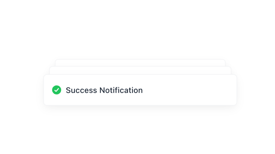
Success Toast
<div id="toast-success" class="hidden fixed top-5 right-5 flex items-center p-4 mb-4 text-green-700 bg-green-100 rounded-lg shadow-lg" role="alert">
  <div class="inline-flex items-center justify-center flex-shrink-0 w-8 h-8 bg-green-200 rounded-lg">
    <!-- Success Icon -->
    <svg aria-hidden="true" class="w-5 h-5" fill="currentColor" viewBox="0 0 20 20">
      <path d="M16.707 5.293a1 1 0 010 1.414L8.414 15H7v-1.414l8.293-8.293a1 1 0 011.414 0z" />
    </svg>
    <span class="sr-only">Success</span>
  </div>
  <div class="ml-3 text-sm font-medium">Your action was successful!</div>
  <button type="button" class="ml-auto bg-transparent text-green-700 hover:text-green-900 rounded-lg focus:ring-2 focus:ring-green-500 p-1.5">
    <span class="sr-only">Close</span>
    <!-- Close Icon SVG -->
  </button>
</div>
Error Toast
<div id="toast-error" class="hidden fixed top-5 right-5 flex items-center p-4 mb-4 text-red-700 bg-red-100 rounded-lg shadow-lg" role="alert">
  <div class="inline-flex items-center justify-center flex-shrink-0 w-8 h-8 bg-red-200 rounded-lg">
    <!-- Error Icon -->
    <svg aria-hidden="true" class="w-5 h-5" fill="currentColor" viewBox="0 0 20 20">
      <path d="M10 18a8 8 0 100-16 8 8 0 000 16zm1-11a1 1 0 10-2 0v4a1 1 0 102 0V7zm-1 8a1.5 1.5 0 110-3 1.5 1.5 0 010 3z" />
    </svg>
    <span class="sr-only">Error</span>
  </div>
  <div class="ml-3 text-sm font-medium">Something went wrong!</div>
  <button type="button" class="ml-auto bg-transparent text-red-700 hover:text-red-900 rounded-lg focus:ring-2 focus:ring-red-500 p-1.5">
    <span class="sr-only">Close</span>
    <!-- Close Icon SVG -->
  </button>
</div>
Customization Tips:
Colors: Tailor
bg-,text-, andborder-classes to match your design language.Icons: Select meaningful SVGs that represent the toast’s purpose.
Placement: Adjust
fixed top-5 right-5to position the toast elsewhere, such asbottom-5 left-5for different screen corners.
Adding Animations and Transitions
Animations breathe life into your Toasts, making their appearance and disappearance smooth and visually appealing.
Transition Classes:
<div id="toast" class="hidden fixed top-5 right-5 flex items-center p-4 mb-4 text-white bg-blue-500 rounded-lg shadow-lg transition-opacity duration-300 ease-in-out" role="alert">
  <!-- Toast Content -->
</div>
JavaScript Toggle with Fade In/Out:
function showToast() {
  const toast = document.getElementById('toast');
  toast.classList.remove('hidden');
  toast.classList.add('opacity-0', 'animate-fadeIn');

  // Auto-hide after 3 seconds
  setTimeout(() => {
    toast.classList.remove('animate-fadeIn');
    toast.classList.add('animate-fadeOut');

    // Hide after fade out animation
    toast.addEventListener('animationend', () => {
      toast.classList.add('hidden');
      toast.classList.remove('opacity-0', 'animate-fadeOut');
    }, { once: true });
  }, 3000);
}
Tailwind CSS Custom Animations:
Extend Tailwind’s configuration to include custom animations.
// tailwind.config.js
module.exports = {
  theme: {
    extend: {
      keyframes: {
        fadeIn: {
          '0%': { opacity: '0', transform: 'translateY(-10px)' },
          '100%': { opacity: '1', transform: 'translateY(0)' },
        },
        fadeOut: {
          '0%': { opacity: '1', transform: 'translateY(0)' },
          '100%': { opacity: '0', transform: 'translateY(-10px)' },
        },
      },
      animation: {
        fadeIn: 'fadeIn 0.3s forwards',
        fadeOut: 'fadeOut 0.3s forwards',
      },
    },
  },
};Note: Remember to rebuild your Tailwind CSS after modifying the configuration.
Advanced Features
Enhancing basic Toasts with advanced features can significantly improve their functionality and user experience.
Stacking Multiple Toasts
Sometimes, multiple Toasts need to appear simultaneously. Implementing a stacking mechanism ensures they display neatly without overlapping.
HTML Structure:
<div id="toast-container" class="fixed top-5 right-5 flex flex-col space-y-4">
  <!-- Multiple Toasts will be appended here -->
</div>
JavaScript to Append Toasts:
function showToast(message, type = 'info') {
  const container = document.getElementById('toast-container');

  const toast = document.createElement('div');
  toast.className = `flex items-center p-4 text-white rounded-lg shadow-lg bg-${type}-500 transition-opacity duration-300 ease-in-out`;

  toast.innerHTML = `
    <div class="inline-flex items-center justify-center flex-shrink-0 w-8 h-8 bg-${type}-700 rounded-lg">
      ${getIcon(type)}
      <span class="sr-only">${capitalize(type)}</span>
    </div>
    <div class="ml-3 text-sm font-medium">${message}</div>
    <button type="button" class="ml-auto bg-transparent text-white hover:text-gray-200 rounded-lg focus:ring-2 focus:ring-white p-1.5">
      <span class="sr-only">Close</span>
      <!-- Close Icon SVG -->
    </button>
  `;

  container.appendChild(toast);

  // Auto-remove after 4 seconds
  setTimeout(() => {
    toast.classList.add('opacity-0');
    toast.addEventListener('transitionend', () => toast.remove(), { once: true });
  }, 4000);

  // Manual close
  toast.querySelector('button').addEventListener('click', () => {
    toast.remove();
  });
}

function getIcon(type) {
  switch(type) {
    case 'success':
      return `<svg class="w-5 h-5" fill="currentColor" viewBox="0 0 20 20">
                <path d="M16.707 5.293a1 1 0 010 1.414L8.414 15H7v-1.414l8.293-8.293a1 1 0 011.414 0z" />
             </svg>`;
    case 'error':
      return `<svg class="w-5 h-5" fill="currentColor" viewBox="0 0 20 20">
                <path d="M10 18a8 8 0 100-16 8 8 0 000 16zm1-11a1 1 0 10-2 0v4a1 1 0 102 0V7zm-1 8a1.5 1.5 0 110-3 1.5 1.5 0 010 3z" />
             </svg>`;
    case 'warning':
      return `<svg class="w-5 h-5" fill="currentColor" viewBox="0 0 20 20">
                <path d="M8.257 3.099c.765-1.36 2.702-1.36 3.468 0l6.518 11.591c.75 1.335-.213 2.981-1.742 2.981H2.48c-1.53 0-2.492-1.646-1.742-2.981L8.257 3.1zM11 14a1 1 0 11-2 0 1 1 0 012 0zm-1-7a1 1 0 00-1 1v3a1 1 0 002 0V8a1 1 0 00-1-1z" />
             </svg>`;
    default:
      return `<svg class="w-5 h-5" fill="currentColor" viewBox="0 0 20 20">
                <path d="M18 10C18 5.58 14.42 2 10 2S2 5.58 2 10s3.58 8 8 8 8-3.58 8-8zm-8 4a1 1 0 100-2 1 1 0 000 2zm1-6a1 1 0 00-2 0v4a1 1 0 002 0V8z" />
             </svg>`;
  }
}

function capitalize(word) {
  return word.charAt(0).toUpperCase() + word.slice(1);
}
Usage Example:
showToast('Data saved successfully!', 'success');
showToast('Failed to load data.', 'error');
showToast('Please check your input.', 'warning');
Responsive Design
Ensure your Toasts look great on all devices by making them responsive.
Responsive Classes:
Use responsive utility classes like
sm:,md:,lg:, etc., to adjust padding, font sizes, or positioning based on screen size.
Example:
<div id="toast" class="hidden fixed top-5 right-5 sm:right-8 md:right-10 lg:right-16 flex items-center p-4 mb-4 text-white bg-blue-500 rounded-lg shadow-lg md:p-6" role="alert">
  <!-- Toast Content -->
</div>
Custom Icons and Images
Beyond SVGs, you can incorporate custom images or icons to enhance the visual appeal.
Example with Image:
<div class="inline-flex items-center justify-center flex-shrink-0 w-8 h-8 rounded-lg">
  <img src="path/to/custom-icon.png" alt="Custom Icon" class="w-6 h-6">
</div>
Considerations:
Ensure images are optimized for web to prevent slow loading.
Maintain consistent sizing for visual harmony.
Dynamic Content and User Interaction
Toasts can be more interactive by including action buttons or dynamically updating content.
Example with Action Button:
<div id="toast" class="hidden fixed top-5 right-5 flex items-center p-4 mb-4 text-white bg-blue-500 rounded-lg shadow-lg" role="alert">
  <!-- Icon and Message -->
  <div class="ml-3 text-sm font-medium">Download complete.</div>
  <button type="button" class="ml-auto bg-transparent text-white hover:text-gray-200 rounded-lg focus:ring-2 focus:ring-white p-1.5">
    Download Again
  </button>
  <button type="button" class="ml-2 bg-transparent text-white hover:text-gray-200 rounded-lg focus:ring-2 focus:ring-white p-1.5">
    Close
  </button>
</div>
JavaScript Handling:
document.querySelector('#toast .download-again').addEventListener('click', () => {
  // Trigger download action
});

document.querySelector('#toast .close-toast').addEventListener('click', hideToast);
Accessibility Considerations
Ensuring your Toasts are accessible makes your application inclusive for all users, including those using assistive technologies.
Key Practices:
Roles and ARIA Attributes:
Use
role="alert"to notify assistive technologies immediately.Consider
aria-live="assertive"oraria-live="polite"for managing announcement behavior.
Focusable Elements:
Ensure buttons within Toasts are keyboard navigable.
Maintain a logical tab order.
Color Contrast:
Ensure text and background colors meet WCAG contrast standards for readability.
Screen Reader Text:
Utilize
sr-onlyclasses to provide context for icons without cluttering the UI.
Benefits of Using Component Libraries
Speed: Quickly implement Toasts without building from scratch.
Consistency: Maintain a uniform design across components.
Enhanced Features: Access advanced functionalities like animations, stacking, and theming out of the box.
Best Practices for Toast Notifications
To maximize the effectiveness of Toasts while minimizing potential annoyances, adhere to the following best practices:
1. Keep It Brief
Short Messages: Toasts should convey their message succinctly, typically one to two sentences.
Avoid Clutter: Don’t overload Toasts with excessive information or multiple actions.
2. Timely Display
Immediate Feedback: Trigger Toasts in response to user actions (e.g., form submissions, data saves).
Auto-Dismiss: Automatically hide Toasts after a reasonable time (3-5 seconds). Allow users to manually close them as well.
3. Non-Intrusive Design
Positioning: Place Toasts in corners where they don’t obstruct primary content, commonly top-right or bottom-right.
Size and Spacing: Ensure Toasts are neither too large nor too small, with adequate spacing to prevent overlap.
4. Consistent Styling
Color Coding: Use consistent color schemes for different Toast types (e.g., green for success, red for error).
Typography: Maintain uniform font sizes and weights across Toasts for readability.
5. Accessibility
Screen Readers: Utilize ARIA roles and properties to ensure Toasts are announced to users relying on assistive technologies.
Keyboard Navigation: Ensure all interactive elements within Toasts are accessible via keyboard.
6. Avoid Repetition
Limit Frequency: Don’t bombard users with multiple Toasts in quick succession. If needed, prioritize the most important messages.
Smart Stacking: Group similar messages or update existing Toasts instead of creating new ones for the same action.
7. Actionable Elements
Clear Actions: If including buttons (e.g., “Undo”), ensure actions are clearly defined and perform as expected.
Feedback on Actions: Provide immediate feedback when users interact with Toast elements.
Tailwind CSS offers a robust and flexible framework for creating Toast notifications that are both visually appealing and functional. By leveraging Tailwind’s utility classes, custom animations, and minimal JavaScript, you can build Toast components tailored to your application’s specific needs.
Frequently Asked Questions
How can I customize the duration a toast stays visible using Tailwind CSS?
Tailwind CSS handles the styling of the toast, but controlling the duration requires JavaScript. You can use
setTimeoutto automatically remove or hide the toast after a specified time. For example:setTimeout(() => { // Code to hide or remove the toast }, 3000); // 3 seconds
Can I add different types of toasts (e.g., success, error, warning) with Tailwind?
Yes! You can create different styles for each toast type by changing the background colors, text colors, and icons. For example:
Success Toast: Use green colors (
bg-green-100,text-green-700)Error Toast: Use red colors (
bg-red-100,text-red-700)Warning Toast: Use yellow colors (
bg-yellow-100,text-yellow-700)
Adjust the Tailwind classes accordingly to reflect the desired type.
How do I make the toast responsive for different screen sizes?
Tailwind CSS is inherently mobile-first and responsive. You can use responsive utility classes to adjust the toast's positioning, sizing, and padding based on screen size. For example:
<div class="fixed bottom-5 right-5 md:bottom-10 md:right-10 bg-white ...">
  <!-- Toast content -->
</div>
In this example, the toast has different
bottomandrightpositions on medium (md) screens and above.
Remember to prioritize accessibility and user experience by ensuring your Toasts are informative without being intrusive. Additionally, utilizing component libraries can speed up development, while integrating with JavaScript frameworks like React or Vue can further enhance functionality.
Feel free to experiment with the examples provided, tweak the styles, and expand upon the functionalities to create Toast notifications that seamlessly integrate into your projects. Happy coding!
FAQ
Is it possible to animate toast entrances and exits with Tailwind CSS?
Absolutely. Tailwind CSS provides utility classes for transitions and animations. You can add classes like transition, ease-in-out, and duration-300 to animate the toast when it appears or disappears. For more complex animations, consider using Tailwind's @keyframes feature or integrating with a JavaScript animation library.
What's the recommended display duration for toast notifications?
The optimal display time ranges from 3 to 5 seconds for simple messages, and 5 to 8 seconds for more complex information. Adjust based on your message length and importance.
Can toast notifications be interactive?
Yes! Toast components can include buttons, links, and other interactive elements. Just make sure they remain visible long enough for users to interact with them.
How many toast notifications should be shown at once?
Display no more than 3-4 notifications simultaneously to avoid overwhelming users. Stack them neatly and remove older ones as new ones appear.
Should toast notifications be used for critical errors?
No, critical errors should use more prominent UI elements like modal dialogs. Toast notifications work best for non-critical updates and success messages.
What's the best position for toast notifications?
Top-right or bottom-right corners are common positions, but consider your app's layout and user interaction patterns. Stay consistent with your chosen position.