BuouUI
Retro Tailwind components ready to copy‑paste
- Documentation
- Copy & Paste
- Theming
BuouUI offers a variety of Tailwind CSS components such as buttons, cards, and navigation sections, all with smooth animations. It's ideal for developers looking for quick, polished UI elements to speed up their web projects.
What is it?

BuouUI is a collection of Tailwind CSS-based UI components and sections, featuring sleek animations and clean designs. It is designed for developers who want ready-to-use, visually appealing elements that enhance user experience.
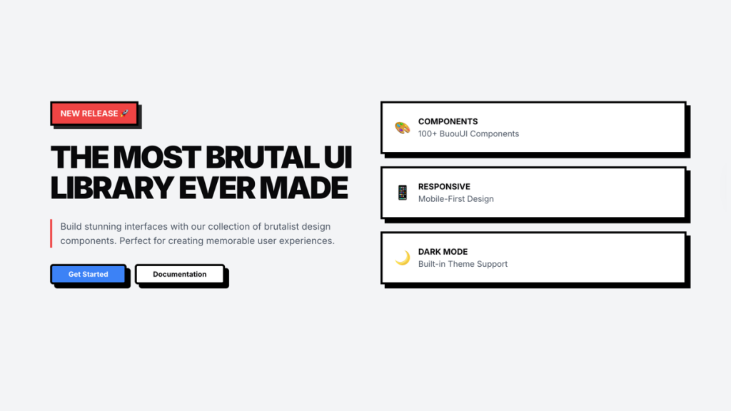
Brutal Retro UI Kit


BuouUI’s Brutal Retro bundle is a hand‑picked set of neo‑brutalist components, sections and landing pages—all built with React, TypeScript and Tailwind CSS, and animated via Framer Motion. Just copy the snippet and you’re live—no NPM install needed.
Included Components
Build eye‑catching sites fast with BuouUI’s rich component library.


Brutal Components
Accordion
Alert
Alert Dialog
Avatar
Button
Badge
Breadcrumb
Card
Checkbox
Combobox
Radio Group
Command
Dialog
Drawer
Dropdown Menu
Form
Hover Card
Input
Label
Menubar
Navigation Menu
Pagination
Popover
Progress
Resizable
Scroll Area
Select
Separator
Skeleton
Slider
Switch
Table
Tabs
Toast
Tooltip


Animations
Countdown Timer
Animated Tabs
3D Logo Particles
Firework
Particle Clock
Screen Scrolling
Nintendo Switch
3D Event Badge
Avatar List
Scroll Island
Bill Calendar
Workflow Animation
Nintendo NES Controller
Clock
Dark Mode
Ads Banner
Logo Bling Bling

Backgrounds
Beams (New)
Particle Bubbles (New)
Hacker (New)
Pixel (New)
Rain Letters (New)
Floating Pixel (New)
Meteor Shower (Pro)
Floating Bubbles
Floating Color
Waves
Dot
Animated Grid
Grid
Components
Buttons
Button
Animated Button (Pro)
Button with Link (Pro)
AI Prompt Button
Button with Trail
GitHub Button
Confetti Button
Sprinkle Flowers Button
Forms
Multi-Step Form (Pro)
Password Input
Stepper
Card Input
Text
Matrix Text (New)
Wave Revel Text (New)
Particle Text (New)
Generate Text (Pro)
Smooth Flipping Number (Pro)
Smooth Flipping Text (New)
Flipping Text (Pro)
Smooth Typing Text (Pro)
Smooth View Text (Pro)
Typing Text
Window Typing Text
Fade In Out
No Lib Typing Text
Text Drop
Scaling
Cards
Glowing Card (New)
Card Hover Effect (New)
Gallery Card (Pro)
Counter Card (Pro)
Kanban Board Card (Pro)
Marquee Card (Pro)
Animotion LED Card (Pro)
Bento Grid (Pro)
Hover Card
Folder Card
PageView Card
Animations Card
Bill Card
Join Us Card
Retro Style Card
Weather Card
Flipping Card
Animated Music
Music Card
Thanks Card
Twitter Display
Profile Card
Frosted Glass Card
Wallet Card
Border Trail Card
BuouNext Features
Color Card
Features
High-quality, responsive Tailwind CSS components
Built-in animations using Framer Motion
Pre-built sections like headers, footers, and modals
Supports Next.js 13 and React 18
Components styled with Radix UI
Pros and Cons
Pros
Includes a wide range of components and sections
Easy integration with Tailwind CSS and React
Affordable pricing
Cons
Does not include design files (like Figma)
Subscription-based
Included Components/Templates
Accordion
Aspect Ratio
Avatar
Badge
Breadcrumb
Breadcrumb Dropdown
Breadcrumb Ellipsis
Button
Navigation Menu
Pagination
Popover
Progress
Radio Group
Radio Group Form
Resizable
Scroll Area
Alert
Button Styles
Calendar
Card
Card Form
Carousel
Carousel Styles
Checkbox
Checkbox Form
Select
Select Form
Separator
Sheet
Sheet Side
Skeleton
Slider
Alert Destructive
Collapsible
Combobox
Combobox Form
Command
Command Dialog
Context Menu
Date Picker
Date Picker Form
Dialog
Switch Form
Table
Tabs
Textarea
Textarea Form
Toast
Alert Dialog
Drawer
Dropdown Menu
Form
Hover Card
Input
Input Form
Input OTP
Label
Menubar
Toggle
Toggle Group
Tooltip
Switch
Sonner
Integrations
Tailwind CSS 3.x
Next.js 13
React 18
FAQ
What is BuouUI?
BuouUI is a Tailwind CSS component library with built-in animations and UI elements for modern web development.
Can I customize BuouUI components?
Yes, all components are customizable using Tailwind CSS and React.