The Best Tailwind Component Libraries with MCP Integration
MCP-ready Tailwind component libraries to try
 MCP (Model Context Protocol) turns your UI library into a tool your AI editor can actually consult. Instead of guessing Tailwind classes, your assistant can pull the right components, docs, and patterns from the source.
Below is a list of Tailwind UI libraries and registries that support MCP, starting with Tailkits UI.
1. Tailkits UI
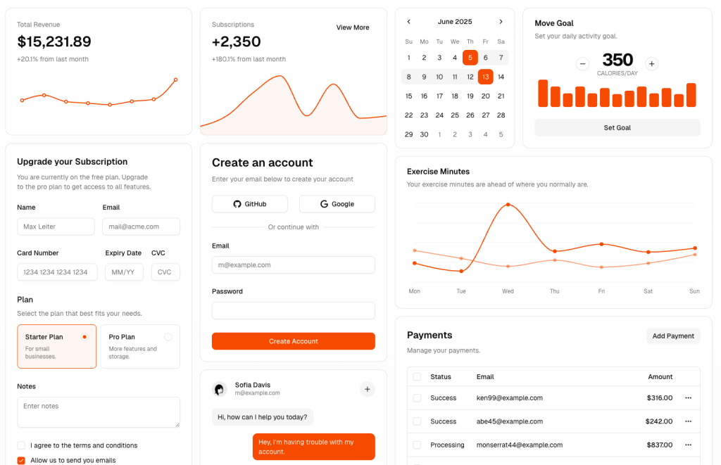
 Tailkits UI is an AI-first Tailwind component library with native MCP support, so your assistant can fetch real sections and generate full pages from the catalog.
Core components:
Landing page sections (hero, features, pricing, FAQ, testimonials)
App UI patterns (navigation, forms, cards, layouts)
Copy paste HTML + Tailwind sections for broad framework compatibility
Why it’s MCP-friendly:
Designed to “describe, don’t code” and have the AI assemble multiple sections into a page using the library’s component IDs and patterns.

2. Flowbite

Flowbite ships an official MCP server so AI assistants can access Flowbite’s Tailwind components and optionally generate themes and design-to-code outputs.
Core components:
UI components (buttons, navbars, modals, tables, alerts)
Forms and typography building blocks
Plugins and interactive UI patterns
Why it’s MCP-friendly:
MCP tools expose Flowbite components to your editor so the assistant can generate UI using the library’s actual component structure, not generic Tailwind guesses.
3. daisyUI Blueprint
 Blueprint is daisyUI’s MCP workflow for generating daisyUI + Tailwind code from inputs like screenshots or existing markup, using daisyUI components as the target output.
Core components:
daisyUI component system (navbars, drawers, modals, dropdowns, toggles)
Prompt-driven conversion flows (screenshot to code, Tailwind to daisyUI)
Why it’s MCP-friendly:
The assistant can request the right daisyUI components via the Blueprint MCP server, then assemble them into clean daisyUI-based UI with fewer utility classes.
4. FlyonUI
 FlyonUI MCP positions itself as a Tailwind AI Builder that integrates into your IDE to generate blocks and full pages inspired by the FlyonUI library.
Core components:
UI components (common UI atoms and molecules)
Page blocks and landing sections
Themes and reusable patterns
Why it’s MCP-friendly:
MCP acts as the bridge between your editor and FlyonUI’s component knowledge, so generation stays consistent with FlyonUI’s library and conventions.
5. shadcn/ui
This is the MCP layer for the shadcn ecosystem. It lets your assistant browse, search, and install components from registries directly into your project.
Core components:
Registry-driven components (shadcn/ui plus third-party registries)
Installation workflows (add items into your codebase)
Multi-registry support for teams and private catalogs
Why it’s MCP-friendly:
Perfect if your “component library” is actually a registry. Your AI can discover components by intent, then install the exact matching implementation.
6. Shadcn Admin Kit

Shadcn Admin Kit is an admin-focused component kit built on shadcn/ui patterns, and it can be exposed via registry workflows that play well with MCP-enabled IDEs.
Core components:
Admin app layouts and screens
Data-heavy UI patterns (tables, filters, forms, sidebars)
Reusable admin primitives for B2B apps
Why it’s MCP-friendly:
Admin kits benefit massively from MCP because assistants can pull consistent scaffolding for complex screens instead of inventing UI from scratch.
7. TailGrids MCP Server
(coming soon)
 TailGrids has a dedicated MCP server project that gives assistants structured access to TailGrids components and documentation.
Core components:
Hundreds of prebuilt Tailwind sections and UI blocks
Component usage instructions and implementation notes
Searchable docs style workflow for faster discovery
Why it’s MCP-friendly:
Great for “find the right section fast” prompts, where the assistant needs library context to pick correct sections and integrate them cleanly.
Quick picks
Want native MCP + Tailwind sections: Tailkits UI
Want official MCP + classic Tailwind components: Flowbite
Want conversion workflows and theming: daisyUI Blueprint
Want IDE-first AI building: FlyonUI MCP
Want registry installs and multi-source catalogs: shadcn/ui MCP Server
Getting Started with MCP
To use any of these libraries with your AI coding assistant, you'll typically need to:
Install the MCP server (usually via NPX)
Add the server configuration to your AI coding tool's settings
Restart your coding environment
Start prompting your AI with natural language requests
The beauty of MCP integration is that once it's set up, it works transparently in the background. You simply describe what you want to build, and your AI assistant fetches the appropriate components and documentation to generate accurate, production-ready code.
FAQ
Which one is best for landing pages?
Tailkits UI and TailGrids are strongest when you want complete sections like hero, features, and pricing that can be assembled quickly.
Which one is best for design-system teams with private components?
shadcn/ui MCP Server is the most flexible because it supports multiple registries, including private ones.
What’s the main benefit of MCP for UI libraries?
It lets your AI pull verified component code and docs, not guess.

Yucel is a digital product creator and content writer with a knack for full-stack development. He loves blending technical know-how with engaging storytelling to build practical, user-friendly solutions. When he's not coding or writing, you'll likely find him exploring new tech trends or getting inspired by nature.