Shadow UI Kit
Dark Tailwind UI Kit with 100+ components
- Custom .config
- JavaScript Plugin
- Documentation
- Tailwind v3
- Responsive Design
What Is the Shadow UI Kit?
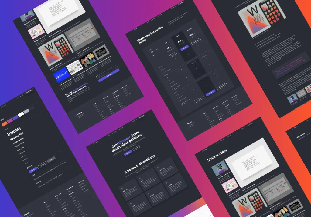
The Shadow UI Kit is a premium design system built with Tailwind CSS 3, offering a dark, modern aesthetic ideal for SaaS platforms, startups, and tech-focused websites. It provides developers with a comprehensive set of pre-designed components and pages to accelerate the web development process.
Features ✨
40+ pre-built pages
60+ customizable sections
100+ reusable components
Tailwind CSS 3 and PostCSS 8 integration
Includes custom
tailwind.config.jsAlpine.js and minimal vanilla JavaScript support
Fully responsive design
Webpack build pipeline with
npm run build&npm run startNeatly organized folder structure with over 150 HTML files.
Included Components, Pages 📒
Landing pages
Dashboard interfaces
Authentication pages (Sign In, Sign Up, Forgot Password)
Pricing tables
Blog layouts and posts
Help center and FAQ sections
Forms and input elements
Utility pages (404, Terms, Privacy Policy)
Style guide and documentation
Pros and Cons
Pros ✅
Comprehensive collection of components and pages
Modern, dark-themed design suitable for tech products
Easy to customize and integrate into projects
Responsive and mobile-friendly layouts
Includes both source files and compiled HTML
Cons ⚠️
May require familiarity with Tailwind CSS and Webpack for advanced customization
Dark theme may not suit all branding requirements
Integration
Tailwind CSS 3: Utilizes the latest version for utility-first styling.
PostCSS 8: For processing CSS with JavaScript plugins.
Alpine.js: Lightweight JavaScript framework for interactivity.
Webpack: Module bundler for compiling source files.
npm: Package manager for installing dependencies and running build scripts.