Untitled UI
5 000+ Tailwind React components
- Figma design file
- Tailwind CSS v4
What Is Untitled UI React?
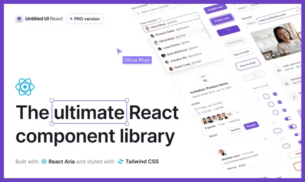
Untitled UI React is positioned as “the world’s largest collection of open-source React components” built with Tailwind CSS v4.1, React Aria, TypeScript 5.8 and React 19.1.

Instead of a compiled npm package, you copy raw, accessible code straight into your project, eliminating vendor lock-in and letting you tweak every pixel.
Features ✨
5 000+ production-ready components covering base UI, marketing sections, application dashboards and more.
250+ full-page templates (dashboards, settings, landing pages, blogs, auth flows).
Dark-mode and theming out-of-the-box via CSS variables.
Figma design system parity—design tokens match every React component.
MIT-licensed core; free for unlimited commercial projects with optional PRO upgrade.
Built-in CLI scaffolding plus starter kits for Next.js, Vite, Bolt and more.

Included Components 📒
Base UI: buttons, inputs, selects, badges, toggles, avatars, tooltips, sliders.
Marketing blocks: hero headers, feature grids, pricing tables, testimonials, CTAs, footers.
Application UI: modals, data tables, charts, sidebars, paginations, notifications.
Full pages: dashboards, settings, blog posts, login/signup, 404s, email templates.
Icon set: 4 600+ neutral SVG icons delivered as React components.
Pros and Cons
Pros ✅
Huge catalogue saves months of design/development time.
Copy-paste code = zero runtime dependency bloat.
Modern stack (React 19, Tailwind 4.1, TS 5.8) and WAI-ARIA accessibility baked in.
Free tier is generous and MIT-licensed.
Active updates and lifetime free upgrades.
Cons ⚠️
Copy-paste workflow can scatter duplicated code across large projects.
PRO licence price tag may feel steep for solo hobbyists.
Tailwind-only styling; teams on CSS-in-JS frameworks must adapt tokens manually.
React-centric—Vue, Svelte users can only reuse design tokens, not components.
Integration 🔌
Next.js, Vite, Bolt official starter kits via
npx untitledui@latest.Figma → Code: one-to-one token mapping keeps designers & devs in sync.
Tailwind CSS config and plugin for design tokens and reset layers.
React Aria primitives ensure accessible keyboard navigation out-of-the-box.
Icon npm package delivers 4 600+ SVG icons as React components.
FAQ
Does it work with older React versions?
The codebase targets React 19+. You can back-port with minor tweaks, but you’ll lose some React Aria capabilities.
Can I tree-shake unused components?
Because you copy only what you need into your repo, unused components never enter your bundle—nothing to tree-shake.
How do I enable dark mode?
Add a dark-mode class at any container level; color tokens swap automatically via CSS variables.