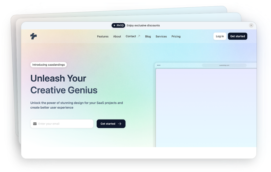
Tailwind Team Components
10 Tailwind team components by Tailspark
- Dark mode
- Figma design file
- Copy & Paste
- Tailwind CSS v3.0+
- Responsive Design
Tailwind Team Components are pre-designed, reusable components empower teams to build cohesive and visually appealing interfaces swiftly.
What Are Tailwind Team Components?
Tailwind Team Components are a collection of pre-built, modular UI elements designed using Tailwind CSS utility classes. They serve as foundational building blocks for creating consistent and responsive user interfaces. By leveraging these components, development teams can maintain design uniformity across projects, reduce repetitive coding tasks, and accelerate the development process.
Benefits of Using Team Components
Consistency Across Projects: With a shared set of components, teams ensure that all applications have a unified look and feel, enhancing brand recognition and user experience.
Increased Productivity: Instead of building common elements from scratch, developers can focus on unique functionalities, saving valuable time.
Ease of Maintenance: Centralized components mean that updates or changes need to be made only once, automatically reflecting across all instances where the component is used.
Enhanced Collaboration: A standardized component library fosters better collaboration among team members, as everyone works with the same set of tools and guidelines.
Common Team Section Components
While the exact components can vary based on team needs, some universally essential components include:
Buttons: From primary actions to secondary options, having a variety of button styles ensures flexibility in design.
Forms: Input fields, checkboxes, radio buttons, and dropdowns designed for accessibility and responsiveness.
Navigation Bars: Sticky headers, sidebars, and dropdown menus that adapt seamlessly to different screen sizes.
Cards: Versatile containers for displaying content like images, text, and actions in a structured manner.
Modals: Overlay dialogs for user interactions without navigating away from the current page.
Alerts and Notifications: Timely messages to inform users about important actions or updates.
Customizing Team Components with Tailwind
One of the strengths of Tailwind CSS is its flexibility. Tailwind Team Components are no exception. While they come pre-designed, teams can easily customize them to fit specific project requirements or branding guidelines. This customization can be achieved by adjusting utility classes, extending component variants, or integrating with Tailwind’s theming capabilities.
For instance, if your brand has a unique color palette, you can modify the button component to match your primary and secondary colors by tweaking the utility classes related to background and text colors. Similarly, spacing, typography, and responsive behaviors can be tailored to align with your design standards.
Best Practices for Managing Team Components
To maximize the effectiveness of Tailwind Team Components, consider the following best practices:
Document Your Components: Maintain clear documentation outlining the purpose, usage guidelines, and customization options for each component. This ensures that all team members understand how to implement them correctly.
Version Control: Use version control systems to track changes to your component library. This makes it easier to manage updates and revert to previous versions if necessary.
Regular Reviews and Updates: Periodically review your component library to incorporate new design trends, address any inconsistencies, and ensure compatibility with the latest Tailwind CSS versions.
Encourage Team Feedback: Foster an environment where team members can suggest improvements or report issues with components. This collaborative approach leads to a more robust and versatile component library.
FAQ
How do I create smooth hover effects for team member cards?
Layer social links with opacity-0 and group-hover:opacity-100. Use scale transforms for subtle card expansion. Add transition-all with proper duration. Ensure hover states don't disrupt layout.
How do I create an effective team member filter system?
Use data attributes for categories (department, role, location). Implement smooth transitions for filtering. Add proper empty states. Consider mobile-friendly filter dropdowns.
What's the proper way to display social media links?
Use consistent icon sizing. Implement hover states with color transitions. Add proper aria-labels. Consider delayed appearance on hover for cleaner design.
What's the best approach for team member detail modals?
Use dialog element with proper transitions. Ensure mobile-friendly design. Implement keyboard navigation. Add proper focus management.