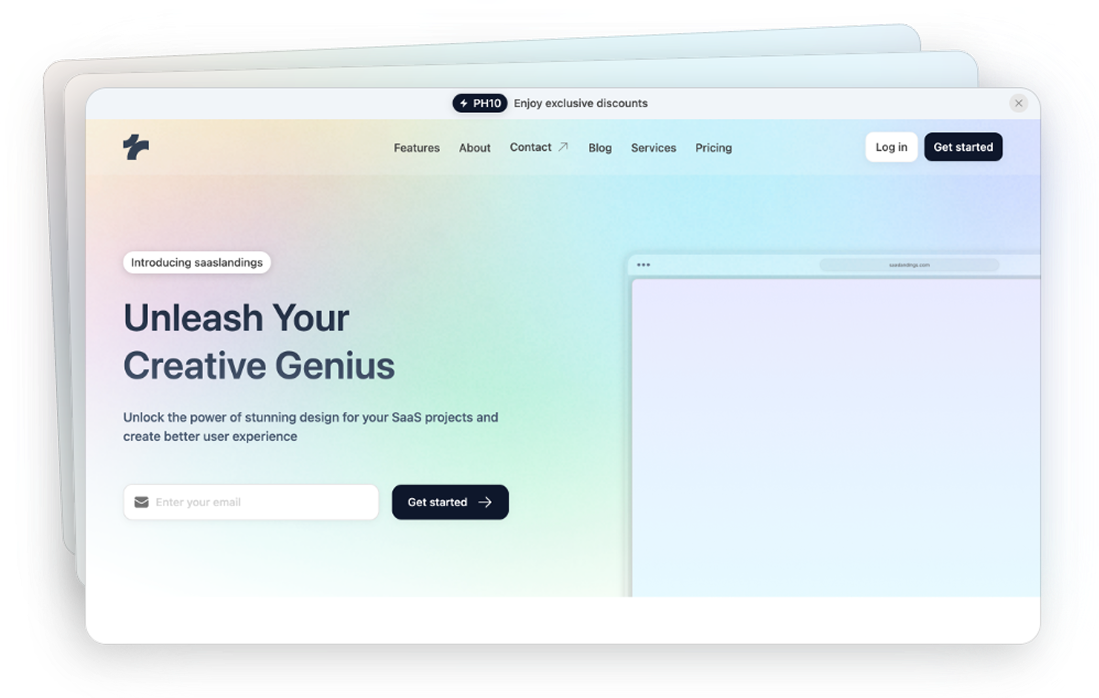
Tailwind Features Components
40 Tailwind feature components by Tailspark
- Dark mode
- Figma design file
- Copy & Paste
- Tailwind CSS v3.0+
- Responsive Design
What are Tailwind Features Components?
Tailwind Features Components are pre-built UI elements crafted using Tailwind CSS utility classes. They're designed to highlight the standout features or benefits of a product, service, or application. From simple feature lists to interactive sections with animations, these components provide a visually appealing way to present information.
Imagine you're launching a new app and need to showcase its key features—like seamless integration, real-time analytics, or user-friendly design. Instead of building these sections from scratch, you can leverage Tailwind Features Components to quickly assemble professional-looking feature highlights.
Popular Tailwind Features Components in Tailkits
Feature Cards
Ideal for highlighting individual features with an icon or image and a brief description.
Feature Grids
Display multiple features in a grid layout, perfect for showcasing several benefits side by side.
Interactive Features
Components with hover effects or animations that engage users and draw attention to key areas.
Media-Rich Features
Combine text with images or videos to provide a more immersive explanation of features.
Tips for Clear Feature Sections
Use Concise Headlines: Grab attention with short, impactful headings.
Incorporate Icons: Visual elements like icons help convey messages faster than text alone.
Break Up Text: Use bullet points or short paragraphs to make information digestible.
Contrast Colors: Ensure text stands out against the background for better readability.
Boosting Conversions Through Effective Feature Presentation
An engaging feature section can significantly impact your conversion rates. By showcasing features compellingly, you build trust and encourage users to take the desired action.
Strategies to Maximize Conversions
Highlight Unique Selling Points: Focus on what sets your product apart.
Include Social Proof: Testimonials or user statistics can reinforce credibility.
Clear Call-to-Action (CTA): Guide users on the next steps with prominent CTAs.
Optimize for Speed: Fast-loading components prevent user drop-off.
Building Feature Components
While we won't delve into extensive code, it's helpful to understand the general approach to creating feature components with Tailwind CSS.
Structuring Your Feature Section
Container: Start with a responsive container to hold your content.
Grid Layout: Utilize Tailwind's grid utilities to arrange features in columns or rows.
Typography: Apply text classes for headings and descriptions to enhance readability.
Spacing: Use margin and padding utilities to create visual separation.
Visual Elements: Add images or icons using Tailwind's object-fit and sizing utilities.
Example Overview
Imagine a feature section with three key features side by side:
Intuitive Design: A description of how user-friendly your product is.
Advanced Security: Highlighting robust security measures.
Outstanding Support: Emphasizing customer service excellence.
With Tailwind CSS, you can quickly set up a responsive grid and apply appropriate styling to each feature without writing custom CSS.
Best Practices
Creating effective feature components goes beyond just placing content on a page. Here are some best practices to consider:
1. Maintain Visual Hierarchy
Headings First: Use larger font sizes for headings to draw attention.
Emphasize Key Points: Utilize font weights and colors to highlight important information.
Logical Flow: Arrange content in a way that guides the user's eye naturally.
2. Utilize Compelling Imagery
Icons and Illustrations: Support textual information with relevant visuals.
Consistency: Use a consistent style for all images and icons.
Accessibility: Include alt text for screen readers.
3. Focus on Responsiveness
Test Across Devices: Ensure your feature components look great on desktops, tablets, and mobile phones.
Responsive Utilities: Leverage Tailwind's responsive classes to adjust layouts at different breakpoints.
Touch-Friendly Elements: Make interactive elements large enough for users to tap comfortably on touch devices.
4. Keep Branding Consistent
Color Schemes: Apply your brand colors using Tailwind's customization options.
Typography: Use fonts that align with your brand identity.
Voice and Tone: Write copy that reflects your brand's personality.
Examples of Effective Feature Components
Looking at real-world examples can inspire your designs.
Case Study: SaaS Product Features
A software-as-a-service (SaaS) company showcases its features using:
Three-Column Layout: Each column represents a feature with an icon, headline, and brief description.
Hover Effects: Subtle changes when users hover over a feature to indicate interactivity.
CTA Buttons: Direct links beneath each feature for users to learn more or sign up.
Case Study: E-commerce Product Highlights
An online store highlights product features by:
Image Carousels: Displaying multiple product images.
Feature Lists: Bullet points outlining key benefits.
Customer Reviews: Including star ratings and snippets of feedback.
FAQ
Can I modify the layout of feature components?
Yes! All feature components are built with Tailwind CSS classes, making them highly customizable. You can adjust layouts, spacing, colors, and other properties using Tailwind's utility classes.
Do these components work well on mobile devices?
Absolutely! All feature components are built with a mobile-first approach, ensuring they look and function perfectly across all screen sizes and devices.
How do I maintain consistent branding across feature components?
You can customize colors, typography, and spacing using your project's Tailwind configuration file, ensuring all components match your brand guidelines perfectly.
Can I combine multiple feature components in one section?
Yes, you can combine and nest different feature components to create unique layouts. Just make sure to maintain proper spacing and hierarchy for the best visual results.