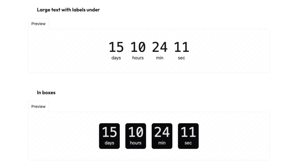
Countdown
Countdown with transition effect

Code of the sample above
Want to know something cool? Adding countdown timers to your website can increase sales! These timers make websites more fun and get people to take action. Let's look at how you can use Tailwind CSS countdown timers in your projects.
What Are Countdown Timer Components?
Think of countdown timers as digital clocks that count backwards. They show how much time is left until something happens. With Tailwind CSS, you can make these timers look great and work well on any screen size.
These timers do more than just count down - they get people excited and motivated to act. They turn website visitors into active users by creating a sense of "don't miss out!" From product launches to flash sales, countdown timers add that extra push users need to take action.
Types of Countdown Timers
You'll find different types of countdown timers for different needs. Event timers help build excitement for launches, webinars, and special occasions. They count down days, hours, minutes, and seconds until the big moment.
Deal timers work great for online stores. They show how long a special price will last, making people more likely to buy. Session timers keep track of important time limits, like shopping cart holds or quiz durations.
Some timers use cool circular designs that look like clock faces. These work really well for things like workout timers or presentation slides. The circular shape gives users a quick visual way to see how much time is left.
Making Your Timer Look Good
Colors play a big role in timer design. Pick colors that pop but still match your website. Make sure the numbers stand out and are easy to read. Think about using red for urgent countdowns and green for more relaxed timing.
Text needs to be crystal clear. Choose fonts that are easy to read at any size. Numbers should line up nicely, which is why many designers pick fonts where all numbers take up the same width. This keeps your timer looking neat and professional.
Your timer should look good on phones, tablets, and computers. Make buttons big enough to tap on phones. Change how things are arranged based on screen size. Test your timer on different devices to make sure it works well everywhere.
Smart Timer Features
Great timers keep perfect time by checking with the server. This stops any confusion about time zones or slow internet connections. They update smoothly, so users don't see any jumping or flickering numbers.
Save computer power by updating just what needs to change. Don't refresh the whole timer every second if only one number needs to change. Clean up any timers that aren't being used anymore to keep your website running fast.
Make your timer work for everyone. Add labels that screen readers can understand. Make sure keyboard users can control any interactive parts. Think about people who might need more time to read or understand the countdown.
Extra Timer Tricks
Some timers can sync up with real-time events. This helps when you're counting down to something happening live, like a game start or auction end. The timer stays accurate even if someone closes their browser and comes back later.
Let users pick how they want to see the time. Some prefer seeing "2 days" while others like "48 hours." Support different languages and number styles for users around the world. Remember that some languages read right-to-left!
Add simple controls when needed. Let users pause, restart, or reset the timer. Save their progress if they need to come back later. These little touches make your timer more useful and user-friendly.
Making Timers Phone-Friendly
Phones need special attention for timers. Make sure buttons are easy to tap with thumbs. Keep the display clean and simple - show only what users really need to see on small screens.
Think about battery life too. Phone users don't want their battery drained by a timer. Update less often for longer countdowns, and keep animations simple. This helps the timer run smoothly without using too much power.
Wrapping Up
Countdown timers make websites better by adding excitement and urgency. Pick the right type of timer for your needs, make it look good, and keep it running smoothly. With these tips, you can create timers that help your website succeed!
FAQ
What's the best update interval for a countdown timer?
For most applications, updating every second provides a good balance between smoothness and performance. For longer countdowns (days/weeks), longer intervals might be more appropriate.
Can countdown timers work without JavaScript?
While basic visual representations are possible with CSS alone, full countdown functionality requires JavaScript for accurate time calculations and updates.
How do I handle different time zones in countdown timers?
Use UTC timestamps for consistency and convert to local time on the client side. This prevents confusion and ensures accurate countdowns for all users.
Should countdown timers auto-refresh when they reach zero?
It depends on your use case. For recurring events, auto-refresh might make sense. For one-time events, displaying a completion message or redirecting users is often better.
How can I make countdown timers accessible in Framer?
Use ARIA labels, provide text alternatives, and ensure timer information is announced appropriately by screen readers. Consider users who might need more time to process information.