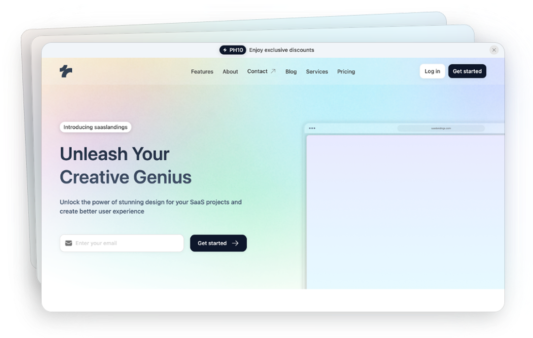
Tailwind Blog Components
19 Tailwind blog components by Tailspark
- Figma design file
- Copy & Paste
- Tailwind CSS v3.0+
- Responsive Design
Want to start a blog? Or maybe give your current one a fresh look? Tailwind CSS blog components are here to help. They're like building blocks that snap together to create awesome blogs in no time!
What Makes Blog Components Special?
Blog components are the foundation of any great blog design. Think of them as LEGO pieces - each one serves a specific purpose, but when combined thoughtfully, they create something amazing. From post cards that showcase your latest articles to comment sections that spark discussions, these components work together to create an engaging reading experience.
The real magic happens when you mix and match these components to create unique layouts that match your vision. You might want a minimalist design that puts your writing front and center, or perhaps a media-rich layout that showcases your photography. Whatever your style, Tailwind blog components give you the flexibility to bring it to life.
Must-Have Blog Components
Post Cards and Grid Layouts
Post cards are like digital magazine covers for your articles. They grab attention and give readers a taste of what's inside. With Tailwind blog components, you can create cards that adapt to any screen size, showcase featured images, and highlight key information like read time and category tags.
Overall, each card can show:
A catchy title
A cool image
Reading time
Tags or topics
A short preview
Author info
The way you arrange these cards matters too. Grid layouts help you present your content in an organized, visually appealing way. You might choose:
A classic two-column layout for a traditional blog feel
A Pinterest-style masonry grid for visual-heavy content
A single-column layout for long-form articles
A mixed layout that combines different card sizes for visual interest
Headers and Navigation
Your blog's header is the first thing readers see. It needs to look good and work well. Blog components offer navigation bars that collapse into mobile-friendly menus, search functionality, and category filters - all the tools readers need to find what interests them.
Modern headers often include:
Smart search with auto-suggestions
Easy-to-click buttons
Dropdown menus for categories
Social media links
Call-to-action buttons
User account access
Reading progress indicators
Your logo
A menu that works on phones
Content Sections
The heart of any blog is its content area. Blog components should provide clean, readable layouts with proper spacing, typography, and image handling. They include features like:
Dynamic text sizing that adapts to different screens
Image galleries with lazy loading
Pull quotes and blockquotes
Code snippets with syntax highlighting
Table of contents for long articles
Reading time estimates
Social sharing options
Related post suggestions
Sidebar Widgets
Sidebars help readers discover more content. Popular Tailwind blog components for sidebars include:
Author profiles with bio and social links
Popular posts lists with thumbnails
Category clouds with post counts
Newsletter signup forms
Recent comments section
Social media feeds
Advertisement spaces
Archive calendars
Comments and Interaction
Comments turn a monologue into a conversation. Blog components built with Tailwind CSS offer:
Threaded comment systems
User avatars and profiles
Voting and reaction systems
Social sharing buttons
Comment moderation tools
Rich text editing
Mention functionality
Reply notifications
Make Your Blog Better
Mobile-First Design
They're built with responsive design principles, help your blog look and work great on phones, tablets, and desktops.
Key mobile considerations include:
Touch-friendly navigation
Readable font sizes
Optimized images
Quick-loading pages
Easy-to-tap buttons
Collapsible menus
Gesture support
Performance Optimization
Speed matters for both readers and search engines. These components are lightweight by design, using utility classes that get purged in production for minimal CSS file sizes.
Performance features include:
Lazy loading for images and comments
Infinite scroll options
Progressive loading
Image optimization
Minimal CSS output
Caching support
Resource prioritization
Accessibility Features
Good blogs welcome all readers. Most blog components come with built-in accessibility features like:
ARIA labels
Keyboard navigation
High contrast options
Screen reader compatibility
Focus indicators
Skip navigation links
Alt text support
Semantic HTML
Dark Mode Support
Dark mode isn't just trendy - it's easier on the eyes. Many blog components have dark mode variants, letting readers choose their preferred viewing experience.
Dark mode features often include:
System preference detection
Manual toggle options
Smooth transitions
Color palette adjustments
Image handling
Code block themes
Custom accent colors
Customization Options
Color Schemes
Your blog should match your brand. Blog elements make it easy to customize colors while maintaining consistency across your site. You can:
Define primary and secondary colors
Create color variations
Set up dark mode palettes
Handle hover states
Manage focus rings
Style form elements
Update icon colors
Typography
From headlines to body text, typography sets the tone. Tailwind's typography plugin works seamlessly with blog components to create beautiful, readable content. Key typography features:
Custom font integration
Responsive font sizing
Line height control
Letter spacing
Font weight options
Text decoration
Drop caps
Multi-column text
Best Practices for Blog Components
Content Organization
Well-organized content helps readers find what they want. Use components that support:
Clear hierarchies
Logical navigation
Related content suggestions
Search functionality
Category systems
Tag management
Archive access
Visual Hierarchy
Guide readers through your content with smart design choices:
Consistent heading styles
Clear content sections
Strategic use of white space
Visual cues for interaction
Content grouping
Emphasis techniques
Navigation breadcrumbs
Let's transform your blog into something special! With Tailwind blog components, you're not just building a blog - you're creating an experience readers will love coming back to.
FAQ
What's the best way to start using Tailwind blog components if I'm new to web development?
Start with the basic components like post cards and headers. Most components come with copy-paste code and clear instructions. You can build up your blog piece by piece as you get more comfortable.
How do blog components handle different screen sizes?
They automatically adjust to fit phones, tablets, and computers. Text sizes change, menus collapse, and images resize - all without you having to write extra code for each device.
Do blog components affect my site's loading speed?
They're built to be fast. They load images only when needed, use minimal code, and compress automatically. This means your blog stays quick even with lots of content.
How do I keep my blog accessible to all readers?
The components come with built-in features for accessibility. They work with screen readers, support keyboard navigation, and include high-contrast options. You don't need to add these features yourself.
Can I mix different types of content in my blog layout?
Absolutely! The components work like building blocks. You can combine text posts, photo galleries, videos, and more. The grid layouts help you arrange everything neatly.