 HOT
HOTTailkits UI
NEWConsistent UI, zero hallucinations
Explore premium and free Svelte UI components to simplify your development. Svelte components allow you to create responsive and high-performance applications.
 HOT
HOTConsistent UI, zero hallucinations
 HOT
HOT12+ Shadcn Templates
Headless Svelte components with accessibility built in
Unstyled components for React, Vue, Solid, Svelte
Unstyled Svelte components with WAI-ARIA support
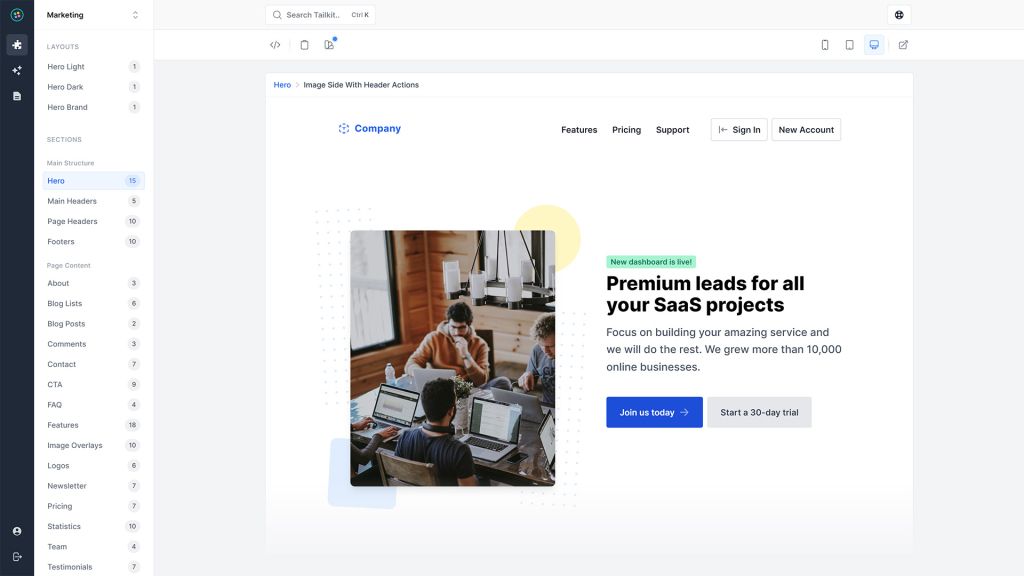
600+ ready-made Tailwind CSS components

Free Tailwind CSS components
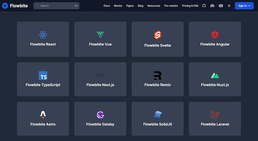
450+ UI components for Tailwind CSS
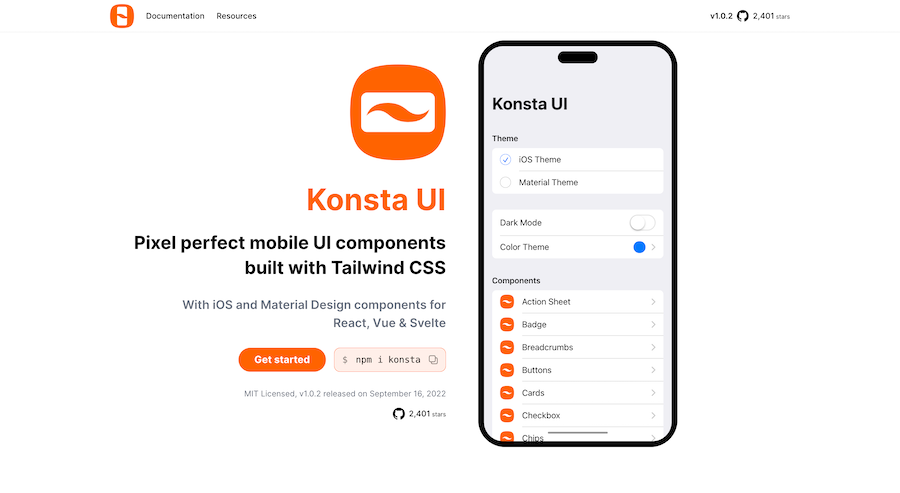
Mobile first Tailwind UI kit for React, Vue & Svelte
Production-ready Tailwind components for React, Next.js, Vue & HTML. Responsive, accessible UI blocks optimized for Tailwind v4 with MCP integration.
200+ ready-to-use Tailwind CSS components with MCP integration. Let AI generate complete pages from your prompts — one command, production-ready UI.
Explore Components
Svelte has rapidly gained popularity among modern web developers for its unique approach to building user interfaces. Unlike traditional frameworks that perform much of their work in the browser, Svelte shifts the burden to compile time, resulting in highly efficient and lightweight applications. Central to Svelte’s architecture are Svelte Components, which are the building blocks of any Svelte application.
At its core, a Svelte Component is a reusable piece of UI that encapsulates both markup (HTML), styles (CSS), and behavior (JavaScript). This encapsulation promotes modularity and reusability, making it easier to manage complex applications by breaking them down into manageable parts.
A typical Svelte Component file has a .svelte extension and is divided into three main sections:
Script Block (<script>): Contains the JavaScript logic, including variables, functions, and component lifecycle hooks.
Markup (<markup>): Defines the HTML structure that the component will render.
Style Block (<style>): Includes scoped CSS that styles the component. Styles are scoped by default, ensuring they don't leak out to other components.
Here's a simple example of a Svelte Component:
<script>
  let count = 0;
  function increment() {
    count += 1;
  }
</script>

<button on:click={increment}>
  Clicked {count} {count === 1 ? 'time' : 'times'}
</button>

<style>
  button {
    padding: 10px 20px;
    font-size: 16px;
  }
</style>
In this example, the component displays a button that, when clicked, increments a counter. The styles applied to the button are scoped to this component alone.
Svelte introduces a straightforward reactivity model. By prefixing a statement with $:, you tell Svelte to re-run that line whenever its dependencies change.
<script>
  let a = 1;
  let b = 2;

  $: sum = a + b;
</script>

<p>The sum of {a} and {b} is {sum}.</p>
Here, whenever a or b changes, sum is automatically recalculated.
Components can be reused across different parts of an application, promoting DRY (Don't Repeat Yourself) principles. You can pass data to components using props and handle events to communicate between components.
Styles defined within a component are scoped to that component by default. This means you don't have to worry about CSS conflicts across different parts of your application.
Svelte provides lifecycle hooks like onMount, beforeUpdate, afterUpdate, and onDestroy to manage component behavior at different stages of its existence.
<script>
  import { onMount, onDestroy } from 'svelte';

  onMount(() => {
    console.log('Component mounted');
    return () => {
      console.log('Component destroyed');
    };
  });
</script>
Creating a Svelte Component is straightforward. Let's walk through building a simple Button component and using it within another component.
Create a file named Button.svelte:
<script>
  export let label = 'Click me';
  export let onClick = () => {};
</script>

<button on:click={onClick}>
  {label}
</button>

<style>
  button {
    background-color: #6200ee;
    color: white;
    border: none;
    padding: 10px 15px;
    border-radius: 4px;
    cursor: pointer;
  }

  button:hover {
    background-color: #3700b3;
  }
</style>In another component, say App.svelte, you can import and use the Button component:
<script>
  import Button from './Button.svelte';

  let clickCount = 0;

  function handleClick() {
    clickCount += 1;
  }
</script>

<main>
  <h1>Welcome to Svelte!</h1>
  <Button label="Press me" onClick={handleClick} />
  <p>You have clicked the button {clickCount} {clickCount === 1 ? 'time' : 'times'}.</p>
</main>

<style>
  main {
    text-align: center;
    padding: 50px;
  }
</style>
In this setup, the App.svelte component includes the Button component, passing down the label and onClick handler as props. Each click updates the clickCount, demonstrating inter-component communication.
Props are the primary way to pass data from a parent component to a child component. They allow for dynamic and reusable components.
In the child component, you define props using the export keyword:
<script>
  export let title = 'Default Title';
</script>

<h2>{title}</h2>In the parent component, pass the prop values when using the child component:
<ChildComponent title="Custom Title" />Props can be any valid JavaScript data type, including strings, numbers, arrays, objects, or even functions.
Svelte components can emit and handle events, facilitating communication between components.
To emit events from a child component, use the createEventDispatcher utility:
<script>
  import { createEventDispatcher } from 'svelte';
  const dispatch = createEventDispatcher();

  function notify() {
    dispatch('notify', { message: 'Button clicked!' });
  }
</script>

<button on:click={notify}>Notify Parent</button>In the parent component, listen to the emitted event:
<ChildComponent on:notify={handleNotification} />

<script>
  function handleNotification(event) {
    console.log(event.detail.message);
  }
</script>
This mechanism allows for a robust way to handle interactions between components.
Slots allow you to pass markup/content into child components, providing greater flexibility.
<!-- ParentComponent.svelte -->
<ChildComponent>
  <p>This is child content passed from the parent.</p>
</ChildComponent>
<!-- ChildComponent.svelte -->
<slot></slot>
<style>
:global(p) {
color: blue;
}
</style>The <slot> element serves as a placeholder for the content passed from the parent.
For more complex applications, Svelte offers a Context API, enabling components to share data without prop drilling.
<!-- Provider.svelte -->
<script>
  import { setContext } from 'svelte';
  setContext('key', 'shared data');
</script>
<!-- Consumer.svelte -->
<script>
import { getContext } from 'svelte';
const data = getContext('key');
</script>
<p>{data}</p>This approach is useful for sharing data like themes, locales, or user information across multiple components.
Svelte's store system provides a reactive way to manage state outside of components, facilitating state management across your application.
<!-- store.js -->
import { writable } from 'svelte/store';
export const count = writable(0);
<!-- AnyComponent.svelte -->
<script>
import { count } from './store.js';
</script>
<button on:click={() => $count += 1}>
Count is {$count}
</button>Stores are particularly beneficial for managing global state in larger applications.
Keep Components Small and Focused: Each component should ideally handle a single responsibility. This modularity enhances readability and maintainability.
Use Descriptive Names: Naming your components clearly reflects their purpose, making your codebase easier to navigate.
Leverage Scoped Styles: Utilize Svelte's scoped styling to prevent CSS conflicts and keep styles organized within their respective components.
Embrace Reactivity: Take advantage of Svelte’s reactive declarations and stores to manage state efficiently without unnecessary boilerplate.
Document Components: Clearly document your components' props, events, and usage patterns to facilitate collaboration and future maintenance.
UI Elements: Buttons, modals, forms, and other interactive elements.
Layout Components: Headers, footers, navigation bars, and sidebars.
Data Display: Tables, lists, cards, and other components that present data.
Interactive Widgets: Sliders, date pickers, and other input controls.
Composite Components: Combining multiple components to form more complex UI structures.
By thoughtfully designing components, you can create a cohesive and scalable user interface.
Answer: You can use {#if} blocks to conditionally render elements. For example:
{#if condition}
  <p>Condition is true</p>
{/if}Answer: Simply include multiple attributes when using the component:
<ChildComponent propOne="value1" propTwo={value2} />To ensure your Svelte Components perform efficiently, consider the following optimization techniques:
Avoid Unnecessary Re-renders
Svelte intelligently updates the DOM based on reactive changes. However, unnecessary computations can still impact performance. Use reactive statements judiciously and avoid complex logic within them.
Use Stores for Shared State
For global state management, use Svelte stores instead of prop drilling, which can lead to cleaner and more efficient state handling.
Lazy Load Components
For large applications, consider lazy loading components to reduce the initial load time. This can be achieved using dynamic imports or routing techniques that load components on demand.
Minimize CSS Overhead
While scoped styles are beneficial, excessive use of complex selectors can increase the compiled CSS size. Keep styles simple and leverage reusable CSS classes where possible.
Ensuring your components work as intended is crucial. Svelte integrates well with testing libraries like Jest and Testing Library.
Unit Testing
Write unit tests to verify individual components’ functionality. Focus on input handling, state changes, and output rendering.
Integration Testing
Test how components interact with each other, ensuring that prop passing, event handling, and shared state work seamlessly.
End-to-End Testing
Use tools like Cypress or Playwright to perform end-to-end testing, simulating user interactions and verifying the application's overall behavior.
The Svelte ecosystem boasts a variety of tools and libraries that enhance component development:
SvelteKit: A framework for building optimized Svelte applications with features like routing, server-side rendering, and more.
Sapper: The predecessor to SvelteKit, offering similar capabilities for building web applications.
Svelte Material UI: A library of pre-built components following the Material Design guidelines.
Svelte Bootstrap: Integrates Bootstrap components into Svelte projects.
Storybook: Supports Svelte, allowing you to develop and test components in isolation.
Leveraging these tools can streamline development and provide additional functionality to your components.
If you’re transitioning from another framework, migrating components to Svelte involves:
Rewriting Markup: Convert your existing HTML or JSX into Svelte’s markup syntax.
Transferring Logic: Adapt your component’s JavaScript to fit Svelte’s reactivity model, utilizing reactive declarations and lifecycle hooks.
Styling: Move your CSS into the <style> block of the .svelte file, ensuring styles are scoped appropriately.
Handling State and Props: Adjust state management and prop passing mechanisms to align with Svelte’s approach.
Migration may require a thorough understanding of both the source framework and Svelte to ensure a smooth transition.
Svelte Components offer a powerful and efficient way to build modern web applications. Their seamless integration of markup, styles, and logic, combined with Svelte’s unique compile-time optimizations, results in performant and maintainable codebases.
By understanding the core concepts, leveraging best practices, and utilizing the rich ecosystem of tools and libraries, you can harness the full potential of Svelte Components to create dynamic and engaging user interfaces.
You can find answers for commonly asked questions about components.
Yes, Svelte allows components to be nested, enabling you to build complex UIs by composing simpler components.
Unlike frameworks like React or Vue, which handle reactivity in the browser, Svelte’s components are compiled at build time. This results in faster performance and smaller bundle sizes since there's no virtual DOM or runtime overhead.
How do Svelte Components differ from components in other frameworks like React or Vue?
Yes, Svelte has excellent support for TypeScript. You can set up your project to use TypeScript by configuring the appropriate settings and using the <script lang="ts"> tag in your .svelte files.