HOT
HOTTailkits UI
NEWConsistent UI, zero hallucinations
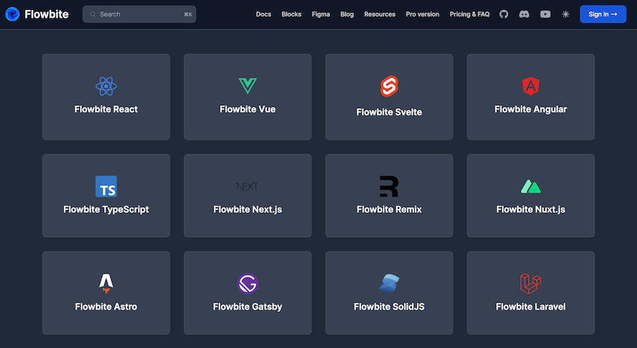
Learn about Nuxt Components offers a modular approach to building Vue.js applications with server-side rendering, code splitting, and auto-generated routes.
HOTConsistent UI, zero hallucinations
 HOT
HOT12+ Shadcn Templates
300+ drop-in Tailwind UI blocks for rapid design
450+ UI components for Tailwind CSS
Fast, accessible, and fully customizable components built for e-commerce
Tailwind CSS Vue 3 dashboard template with dark mode
Production-ready Tailwind components for React, Next.js, Vue & HTML. Responsive, accessible UI blocks optimized for Tailwind v4 with MCP integration.
200+ ready-to-use Tailwind CSS components with MCP integration. Let AI generate complete pages from your prompts — one command, production-ready UI.
Explore Components
In the ever-evolving landscape of web development, building scalable, maintainable, and performant applications is paramount. Nuxt Components play a pivotal role in achieving these goals by providing a structured and efficient way to create reusable UI elements within Nuxt.js applications
a Nuxt Component is a reusable Vue.js component enhanced by Nuxt.js's powerful features. Nuxt.js is a framework built on top of Vue.js that simplifies the development of universal (isomorphic) applications by providing out-of-the-box support for server-side rendering (SSR), static site generation (SSG), and a robust module system. Nuxt Components embody these capabilities, allowing developers to create dynamic, efficient, and scalable user interfaces with ease.
Nuxt Components are typically Single File Components (SFCs) with a .vue extension. These components encapsulate template, script, and style sections within a single file, promoting modularity and maintainability.
A typical .vue file in Nuxt looks like this:
<template>
  <div>
    <h1>{{ title }}</h1>
    <button @click="increment">Clicked {{ count }} times</button>
  </div>
</template>

<script>
export default {
  props: {
    title: {
      type: String,
      default: 'Hello, Nuxt!'
    }
  },
  data() {
    return {
      count: 0
    };
  },
  methods: {
    increment() {
      this.count += 1;
    }
  }
};
</script>

<style scoped>
h1 {
  color: #3490dc;
}
button {
  padding: 10px 20px;
  background-color: #ffed4a;
  border: none;
  cursor: pointer;
}
button:hover {
  background-color: #ffe066;
}
</style>
In this example, the component displays a title and a button that increments a counter each time it's clicked. The styles are scoped to ensure they don't interfere with other parts of the application.
Nuxt Components inherently support SSR and SSG, which means your components can be pre-rendered on the server or at build time. This leads to faster load times, improved SEO, and a better overall user experience.
SSR: Ideal for dynamic content that changes frequently or requires personalization.
SSG: Perfect for static content that doesn't change often, enabling blazing-fast page loads.
Nuxt.js uses a file-based routing system where each .vue file in the pages directory automatically becomes a routable page. Nuxt Components can be easily integrated into these pages, streamlining the navigation and structure of your application.
Styles defined within a Nuxt Component using the <style scoped> tag are automatically scoped to that component. This prevents CSS conflicts and ensures that styles remain specific to their respective components.
Nuxt.js encourages a modular approach to building applications. By breaking down the UI into small, reusable components, developers can manage complex projects more efficiently, enhance code reusability, and simplify maintenance.
During development, Nuxt.js supports Hot Module Replacement, allowing you to see changes in your components in real-time without a full page reload. This feature significantly speeds up the development process and enhances productivity.
Creating and using Nuxt Components is both straightforward and intuitive. Let's walk through the process of building a simple Button component and integrating it into a Nuxt page.
Start by creating a new file named Button.vue in the components directory:
<template>
  <button @click="handleClick">{{ label }}</button>
</template>

<script>
export default {
  props: {
    label: {
      type: String,
      default: 'Click Me'
    }
  },
  methods: {
    handleClick() {
      this.$emit('click');
    }
  }
};
</script>

<style scoped>
button {
  background-color: #42b983;
  color: white;
  border: none;
  padding: 10px 15px;
  border-radius: 4px;
  cursor: pointer;
}
button:hover {
  background-color: #2c8c6c;
}
</style>
This Button component accepts a label prop and emits a click event when the button is pressed, making it highly reusable across different parts of your application.
Next, integrate the Button component into a Nuxt page, such as index.vue in the pages directory:
<template>
  <div>
    <h1>Welcome to Nuxt.js!</h1>
    <Button label="Press Me" @click="incrementCounter" />
    <p>You have clicked the button {{ count }} times.</p>
  </div>
</template>

<script>
import Button from '~/components/Button.vue';

export default {
  components: {
    Button
  },
  data() {
    return {
      count: 0
    };
  },
  methods: {
    incrementCounter() {
      this.count += 1;
    }
  }
};
</script>

<style scoped>
div {
  text-align: center;
  margin-top: 50px;
}
</style>
In this setup, the Button component is imported and used within the index.vue page. Each click on the button increments the count, demonstrating effective component interaction and state management.
Props are fundamental for creating dynamic and reusable components in Nuxt.js. They allow parent components to pass data down to child components, enabling customization and flexibility.
In your child component, define the expected props using the props option:
<script>
export default {
  props: {
    title: {
      type: String,
      required: true
    }
  }
};
</script>In the parent component or page, pass the prop values when using the child component:
<ChildComponent title="Custom Title" />This approach allows components to be highly flexible, as different data can be provided based on the context in which the component is used.
Communication between components is essential for interactive applications. Nuxt.js, leveraging Vue.js's capabilities, facilitates this through custom events.
In the child component, emit events using the $emit method:
<script>
export default {
  methods: {
    notifyParent() {
      this.$emit('notification', 'Button was clicked!');
    }
  }
};
</script>In the parent component or page, listen for the emitted events and handle them accordingly:
<ChildComponent @notification="handleNotification" />

<script>
export default {
  methods: {
    handleNotification(message) {
      alert(message);
    }
  }
};
</script>
This mechanism ensures a clean and decoupled way for child components to communicate actions and data back to their parents.
Styling components effectively is crucial for maintaining a consistent and conflict-free design. Nuxt.js supports scoped styles, ensuring that CSS rules apply only to their respective components.
Use the scoped attribute in the <style> tag within your .vue file:
<style scoped>
h1 {
  color: #42b983;
}
</style>
This ensures that the styles defined here won't leak into other components, maintaining encapsulation and preventing unintended side effects.
For more complex styling needs, Nuxt.js supports CSS Modules, allowing for locally scoped class names:
<style module>
.title {
  color: #3490dc;
}
</style>
<template>
<h1 :class="$style.title">Scoped Title</h1>
</template>CSS Modules enhance the maintainability and scalability of your styles, especially in large projects.
Slots provide a way to pass content from a parent component into a child component, offering greater flexibility in rendering dynamic content.
Default slots allow any content to be inserted into a child component:
<template>
  <div class="card">
    <slot></slot>
  </div>
</template>
Named slots enable multiple insertion points within a component:
<template>
  <div class="modal">
    <header><slot name="header"></slot></header>
    <main><slot></slot></main>
    <footer><slot name="footer"></slot></footer>
  </div>
</template>
This feature is particularly useful for creating versatile components like modals, layouts, and panels.
Dynamic components allow you to switch between different components dynamically based on application state or user interaction.
<component :is="currentComponent"></component>By managing the currentComponent state, you can render different components seamlessly, enhancing the interactivity and modularity of your application.
Asynchronous components are loaded only when needed, reducing the initial load time and improving performance. Nuxt.js handles async components efficiently, ensuring that your application remains responsive.
<script>
export default {
  components: {
    AsyncComponent: () => import('~/components/AsyncComponent.vue')
  }
};
</script>Nuxt.js supports the Composition API, allowing for better code organization and reusability in complex components. The Composition API facilitates managing state and side effects more efficiently compared to the traditional Options API.
<script>
import { ref } from '@nuxtjs/composition-api';

export default {
  setup() {
    const count = ref(0);
    const increment = () => {
      count.value++;
    };
    return { count, increment };
  }
};
</script>Adhering to best practices ensures that your Nuxt Components are efficient, maintainable, and scalable. Here are some recommended practices:
Keep Components Small and Focused: Each component should handle a single responsibility. This enhances readability, maintainability, and reusability.
Use Descriptive Names: Clear and descriptive names for components and their props improve code readability and make it easier to navigate the codebase.
Leverage Scoped Styling: Use scoped styles or CSS Modules to prevent style leakage and ensure that styles apply only to intended components.
Optimize Data Fetching: Utilize Nuxt's data fetching methods like asyncData and fetch appropriately based on whether the page requires server-side rendering or static generation.
Avoid Overcomplicating Templates: Keep your templates clean and simple. Delegate complex logic to computed properties or methods within the script section.
Document Components: Provide clear documentation for your components, outlining their props, events, and usage scenarios, which facilitates collaboration and future maintenance.
Use TypeScript for Type Safety: Incorporate TypeScript to catch errors early, improve code quality, and enhance developer productivity.
Implement Lazy Loading: For large components or those not immediately required, implement lazy loading to optimize performance and reduce initial load times.
Nuxt Components are versatile and can be applied across various scenarios to build robust and dynamic user interfaces. Here are some common use cases:
UI Elements: Buttons, inputs, modals, dropdowns, and other interactive elements that enhance user interaction.
Layout Components: Headers, footers, navigation bars, and sidebars that provide consistent structure across pages.
Forms: Components that handle user input, validation, and submission, promoting reuse and consistency.
Data Display: Tables, lists, cards, and other components designed to present data in organized formats.
Dynamic Content: Components that load and display content based on user interactions or fetched data, such as tabs, accordions, and carousels.
Composite Components: Building complex interfaces by combining smaller, reusable components, ensuring a modular and maintainable architecture.
By effectively utilizing Nuxt Components in these scenarios, developers can create engaging and user-friendly applications with ease and efficiency.
Nuxt.js boasts a rich ecosystem of tools and libraries that enhance component development:
Vuex: Integrated state management library that provides a centralized store for managing application state across components.
Nuxt CLI: A command-line tool that streamlines the creation, development, and testing of Nuxt applications, offering features like scaffolding and automated configurations.
Nuxt Modules: Extend the functionality of Nuxt.js through various modules, such as @nuxtjs/axios for HTTP requests or @nuxtjs/pwa for progressive web app features.
UI Libraries: Libraries like Vuetify, Tailwind CSS, and Bootstrap Vue offer pre-built, customizable components that can be easily integrated into your Nuxt Components.
Storybook for Nuxt: A tool for developing and testing UI components in isolation, enhancing the design and collaboration workflow.
Nuxt Content Module: Enables the creation of content-driven applications by providing a versatile content management system within Nuxt.js.
Leveraging these tools can significantly streamline your development process, provide robust solutions for common challenges, and enhance the functionality and performance of your Nuxt Components.
Transitioning from another framework or vanilla Vue.js to Nuxt.js involves several steps to ensure a smooth migration:
Analyze Existing Components: Understand the structure, functionality, and dependencies of your current components to determine how they fit into the Nuxt.js ecosystem.
Set Up the Nuxt Project: Initialize a new Nuxt project using the Nuxt CLI, which sets up the necessary configurations and directory structure.
Recreate Component Structure: Transfer your existing components into the components directory of your Nuxt project, adjusting the syntax and structure as needed to align with Nuxt.js conventions.
Integrate Routing: Move your page-specific components into the pages directory, enabling Nuxt's automatic routing based on the file structure.
Adapt Data Fetching Methods: Replace existing data fetching methods with Nuxt-specific functions like asyncData or fetch to leverage SSR and SSG capabilities.
Transfer Styles and Assets: Move your CSS or SCSS styles into the respective components, using scoped styles or CSS Modules to maintain encapsulation.
Incorporate State Management: If your application uses a state management library, integrate Vuex into your Nuxt project and migrate your state logic accordingly.
Test Thoroughly: Ensure that all migrated components function correctly within the Nuxt.js environment, addressing any issues related to routing, data fetching, or rendering.
A systematic approach to migration helps preserve functionality while leveraging Nuxt.js’s strengths, resulting in an optimized and maintainable application.
Nuxt Components are key to building efficient and scalable apps. They make your code reusable, modular, and easy to manage. Mastering them helps you create fast, user-friendly applications while taking full advantage of Nuxt's powerful features and ecosystem. Keep exploring, and build great web experiences!
You can find answers for commonly asked questions about components.
Nuxt Components are enhanced Vue components that benefit from Nuxt.js's framework capabilities, such as automatic routing, server-side rendering, and module integration. While they maintain the same core structure as Vue components, Nuxt Components are optimized for building larger, more complex applications with additional out-of-the-box features.
Yes, Nuxt.js supports both class-based and functional components. However, the majority of Nuxt projects utilize the Options API or the Composition API with functional components due to their simplicity and enhanced reactivity.
Global state in Nuxt Components can be managed using Vuex, which is fully integrated into Nuxt.js. Vuex provides a centralized store for managing state across your application, facilitating better state management and predictability.
The Composition API offers a more flexible and organized way to manage state and side effects within Nuxt Components. It allows for better code reuse, easier testing, and improved readability, especially in complex components, compared to the traditional Options API