 HOT
HOTTailkits UI
NEWConsistent UI, zero hallucinations
Alpine.js lets you build interactive UIs with lightweight, reusable components and simple HTML-based syntax—perfect for dynamic pages with minimal code.
 HOT
HOTConsistent UI, zero hallucinations
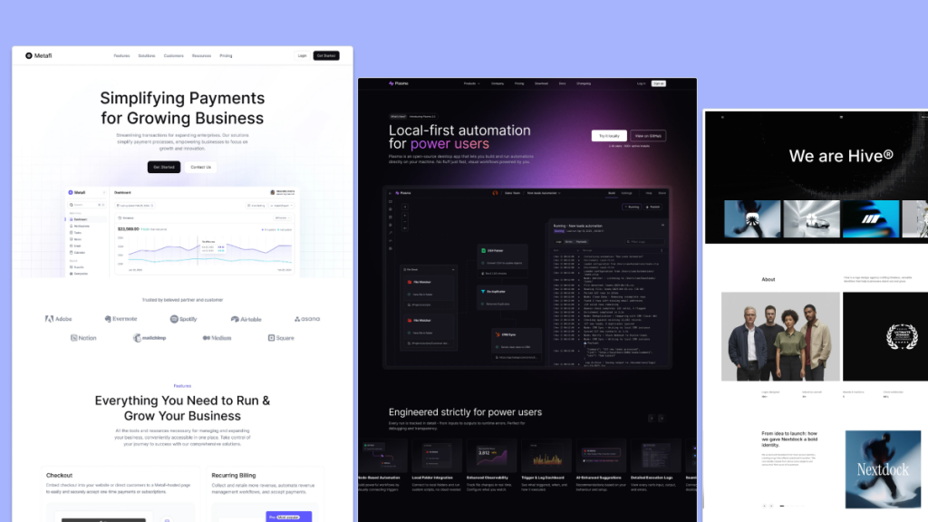 HOT
HOT12+ Shadcn Templates
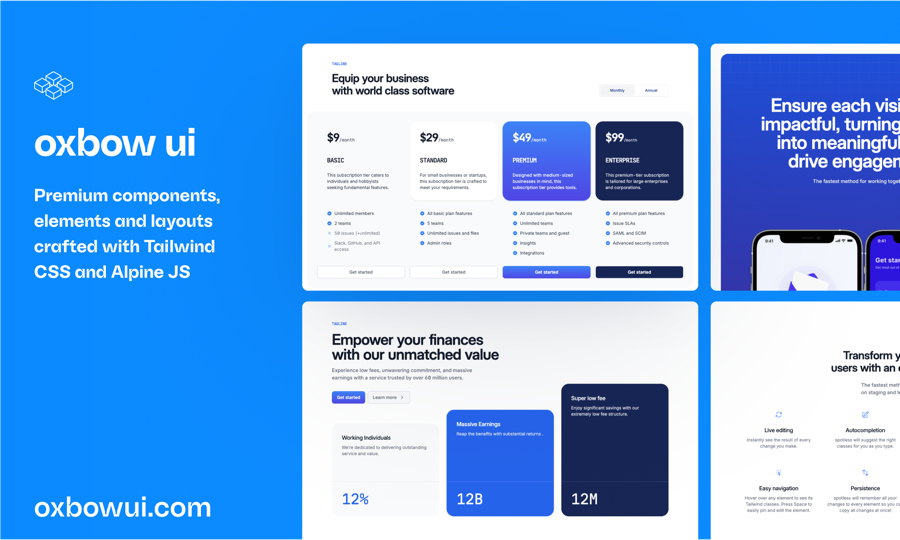
Open source Tailwind CSS & Alpine.js components
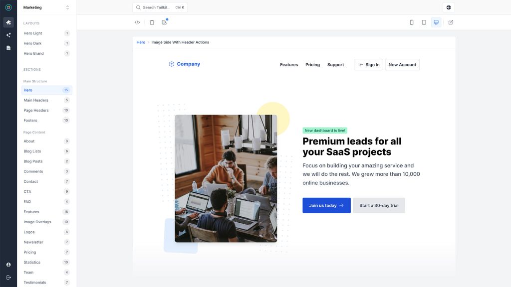
600+ ready-made Tailwind CSS components

Free Tailwind CSS components
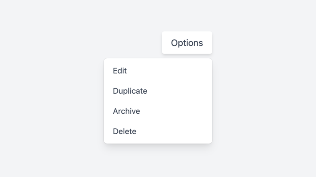
Tailwind dropdown component with Alpine.js
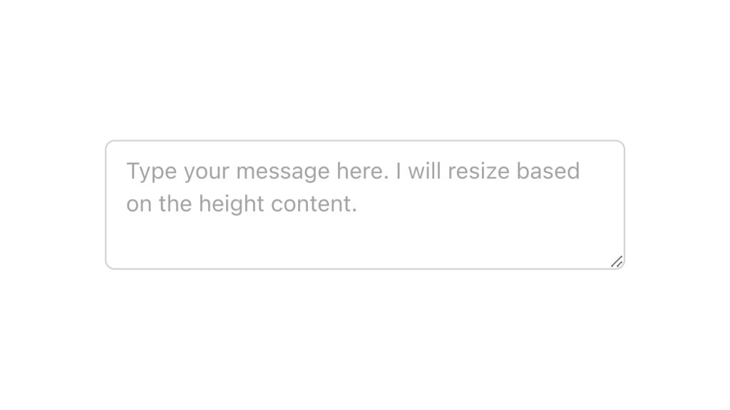
Alpine.js and Tailwind text area component by Pines UI Library.
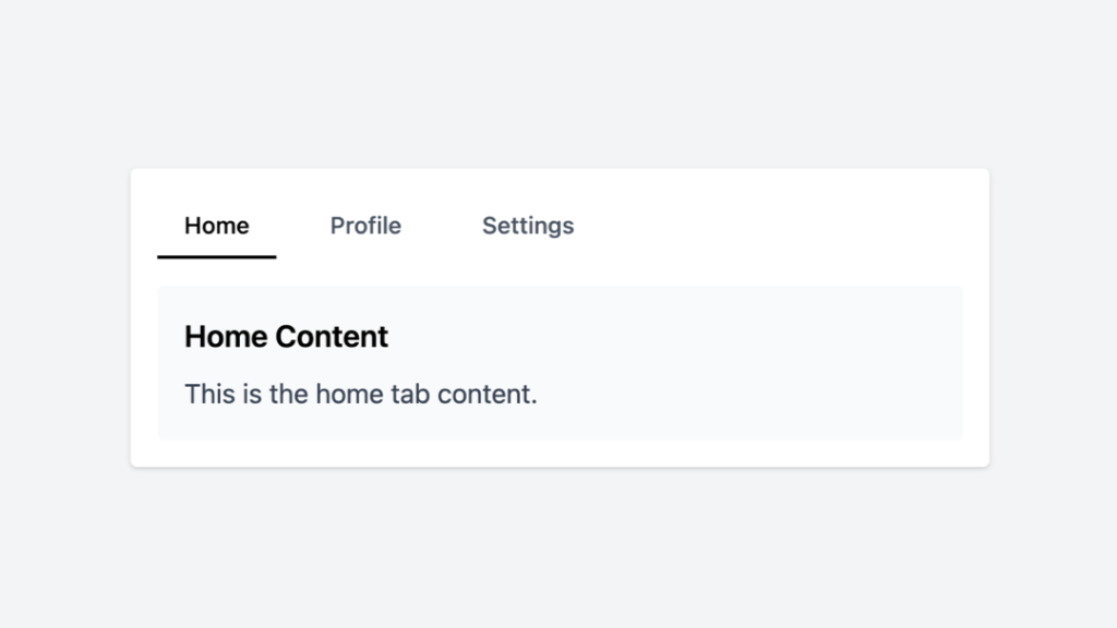
Tailwind tabs component with Alpine.js

Alpine.js and Tailwind tooltip component by Pines UI Library.
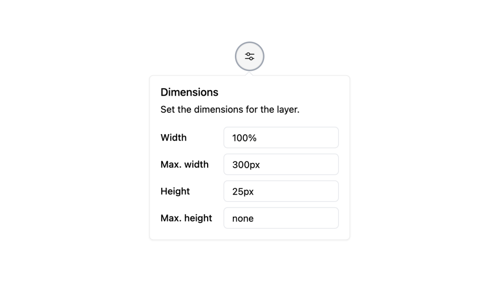
Alpine.js and Tailwind popover component by Pines UI Library.
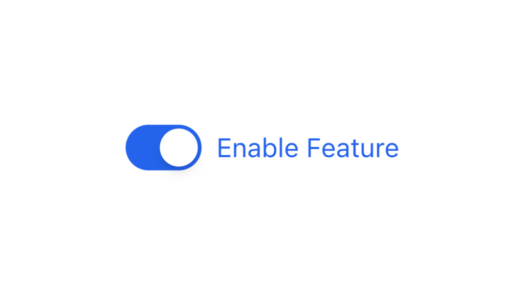
Alpine.js and Tailwind toggle component by Pines UI Library.
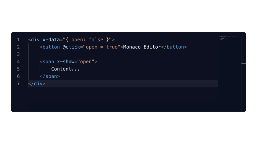
Alpine.js and Tailwind image gallery component by Pines UI Library.

Alpine.js and Tailwind progress component by Pines UI Library.
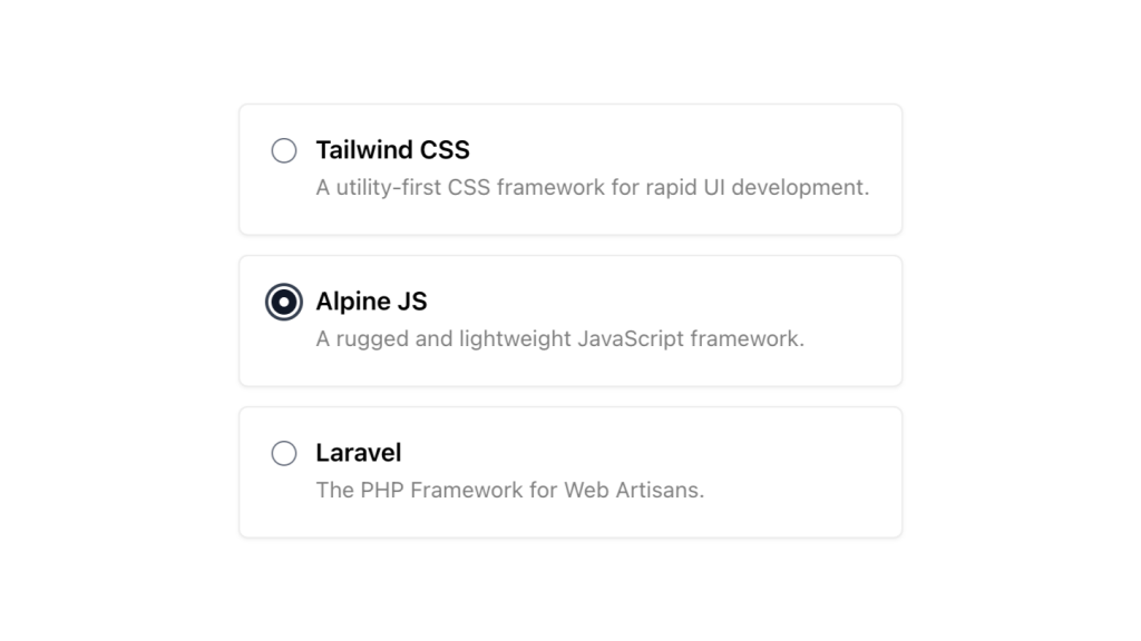
Alpine.js and Tailwind radio group component by Pines UI Library.

Alpine.js and Tailwind video component by Pines UI Library.

Alpine.js and Tailwind image gallery component by Pines UI Library.

Alpine.js and Tailwind menu component by Pines UI Library.
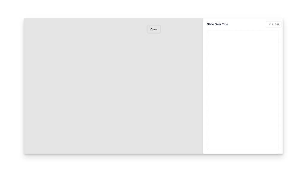
Alpine.js and Tailwind slide-over component by Pines UI Library.
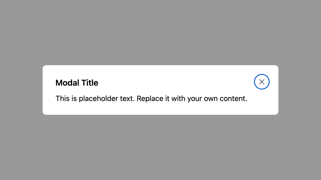
Alpine.js and Tailwind animated text component by Pines UI Library.
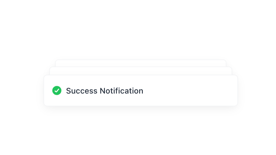
Alpine.js and Tailwind toast notification component by Pines UI Library.
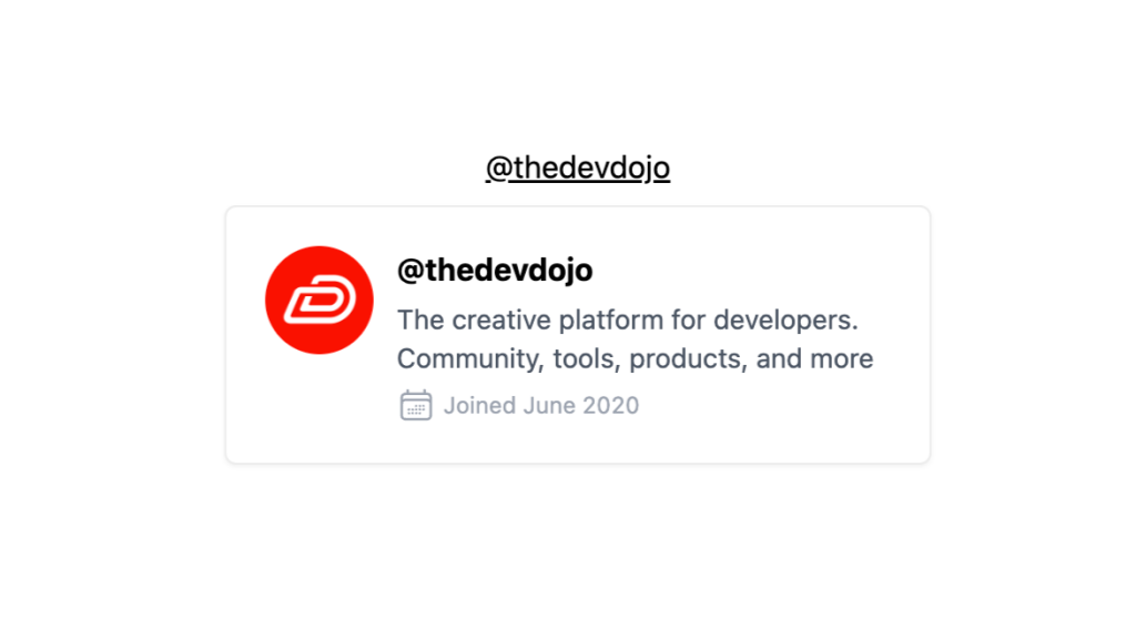
Alpine.js and Tailwind hover card component by Pines UI Library.

Alpine.js and Tailwind modal component by Pines UI Library.
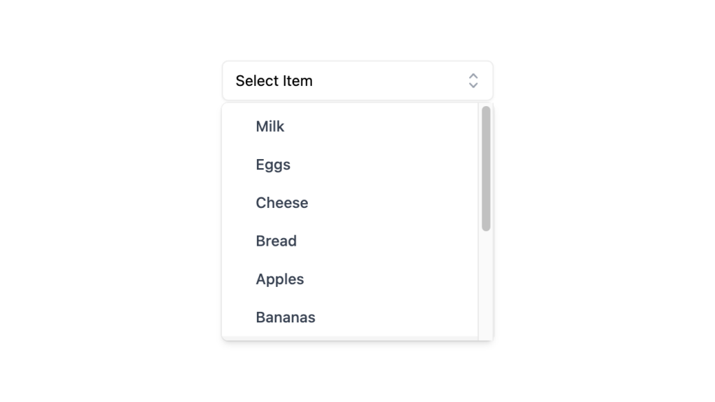
Alpine.js and Tailwind select dropdown menu component by Pines UI Library.
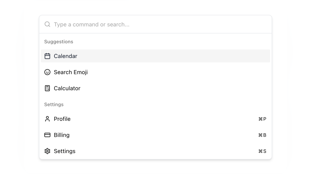
Alpine.js and Tailwind command palette component by Pines UI Library.
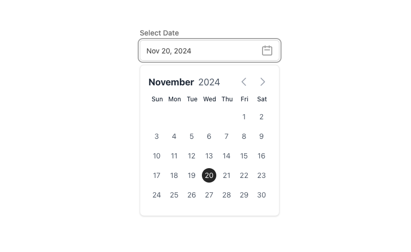
Alpine.js and Tailwind date picker component by Pines UI Library.
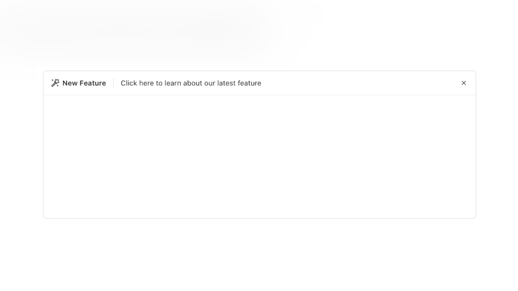
Alpine.js Tailwind banner component to add a sticky CTA on landing pages.
Force your AI to use a professional design system. Build brand-matched, consistent UIs with 200+ vetted components.

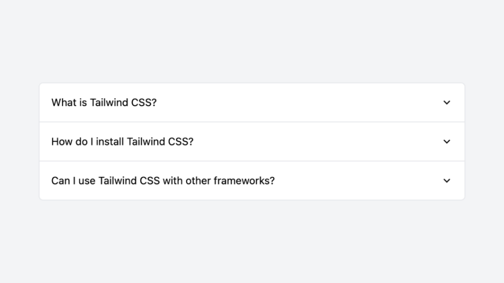
Tailwind accordion component with Alpine.js
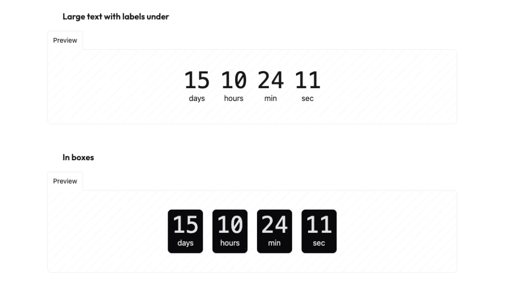
Countdown with transition effect
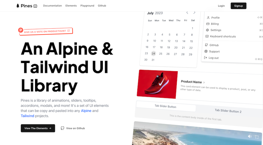
Free Tailwind & Alpine component library

Customizable password reset form built with Tailwind CSS
Generate Tailwind CSS components using Claude 3.5 Sonnet
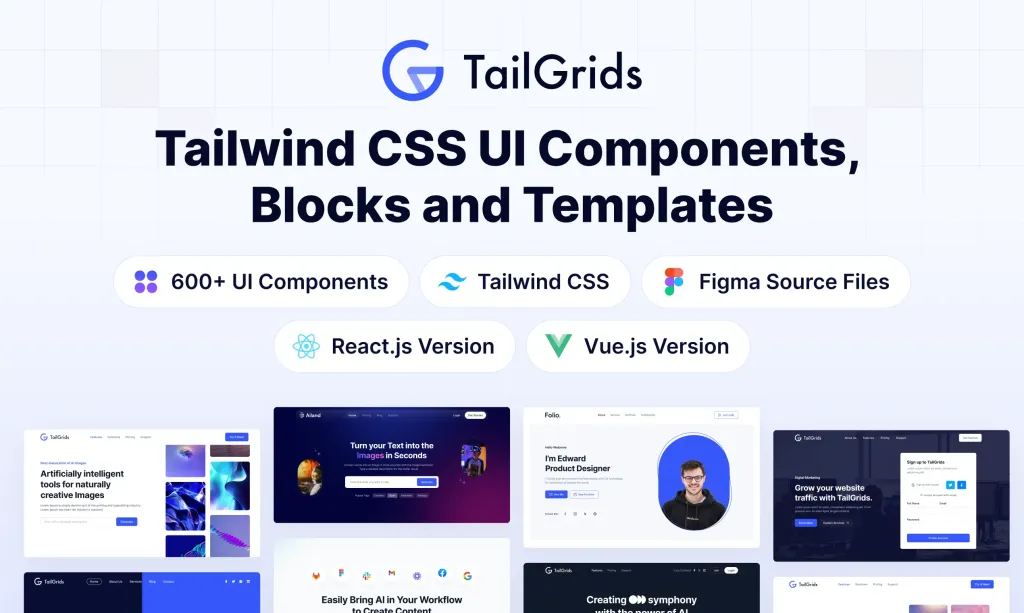
600+ TailGrids UI blocks for instant Tailwind designs
Production-ready Tailwind components for React, Next.js, Vue & HTML. Responsive, accessible UI blocks optimized for Tailwind v4 with MCP integration.
200+ ready-to-use Tailwind CSS components with MCP integration. Let AI generate complete pages from your prompts — one command, production-ready UI.
Explore Components
Alpine.js is a lightweight and powerful JavaScript framework that makes it easy to add interactive behavior to your HTML. One of its best features is Alpine.js Components, which help developers create reusable and easy-to-manage UI elements. Whether you're adding small enhancements to a static page or working on a bigger app, learning how Alpine.js Components work is super useful.
At its core, an Alpine.js Component is a self-contained unit of functionality that combines HTML markup with declarative JavaScript behavior. Alpine.js Components enable developers to add interactivity directly within HTML, reducing the need for heavy JavaScript frameworks while still providing powerful capabilities for dynamic UI manipulation.
Alpine.js adopts a declarative syntax reminiscent of Vue.js or React but with a much smaller footprint, making it an excellent choice for projects where simplicity and performance are paramount.
An Alpine.js Component typically resides directly within your HTML, utilizing x-data for its state and x-bind, x-on, or other Alpine directives to manage behavior. Here’s a simple example:
<div x-data="{ count: 0 }">
  <button @click="count++">Click Me</button>
  <span x-text="count"></span>
</div>
In this example, the <div> serves as the Alpine.js Component, managing its own state (count) and handling user interactions (@click).
Alpine.js excels at reactive data binding, allowing the UI to automatically update when the underlying data changes. This reactivity is achieved through a simple and intuitive syntax that keeps your HTML clean and readable.
Alpine.js provides a set of powerful directives that enable developers to add interactivity without writing verbose JavaScript:
x-data: Initializes component state.
x-bind: Dynamically binds attributes to data.
x-on or @: Attaches event listeners.
x-show and x-if: Control element visibility.
x-for: Handles list rendering.
One of Alpine.js’s standout features is its minimal footprint. At under 10KB (minified and gzipped), Alpine.js is lightweight, ensuring fast load times and minimal impact on performance.
Alpine.js’s syntax is straightforward, making it easy for developers familiar with HTML and JavaScript to quickly adopt and implement components without a steep learning curve.
Each Alpine.js Component maintains its own state, preventing data conflicts and making components truly reusable across different parts of your application.
Creating and using Alpine.js Components is seamless and requires minimal setup. Let’s walk through the process of building a simple Modal component and integrating it into a webpage.
Embed the component directly within your HTML using the x-data directive to initialize its state:
<div x-data="{ open: false }">
  <button @click="open = true">Open Modal</button>

  <div
    x-show="open"
    @click.away="open = false"
    class="modal">
    <p>This is a modal!</p>
    <button @click="open = false">Close</button>
  </div>
</div>Add necessary styles to ensure the component looks and behaves as expected. Scoped styles can be applied using traditional CSS or Tailwind CSS for utility-first styling.
<style>
  .modal {
    /* Modal styling */
    position: fixed;
    top: 50%;
    left: 50%;
    transform: translate(-50%, -50%);
    background: white;
    padding: 2rem;
    box-shadow: 0 2px 10px rgba(0,0,0,0.1);
    display: none;
  }
  [x-show="open"] {
    display: block;
  }
</style>Integrate the component into your page by embedding the defined HTML structure wherever needed, ensuring that the component's state and behavior are encapsulated.
While Alpine.js doesn't have a built-in props system like Vue or React, data can be passed into components through HTML attributes and x-init. This approach allows components to receive dynamic data from their parent context.
<div x-data="{ message: $el.getAttribute('data-message') }" data-message="Hello, Alpine!">
  <span x-text="message"></span>
</div>
In this example, the component initializes its state (message) using a data-message attribute, demonstrating a simple way to pass data into Alpine.js Components.
Event handling in Alpine.js is intuitive, leveraging the x-on directive or its shorthand @ to attach event listeners directly within HTML.
Components can emit events by updating their state, and parent components can listen for these changes to react accordingly.
<!-- Child Component -->
<div x-data="{ count: 0 }">
  <button @click="count++">Increment</button>
  <span x-text="count"></span>
</div>

<!-- Parent Component -->
<div>
  <child-component @count-changed="handleCountChange"></child-component>
</div>
While Alpine.js doesn’t have a direct event emitting system like Vue’s $emit, custom events can be dispatched using JavaScript, allowing for parent-child communication.
<!-- Child Component -->
<div x-data="{ count: 0 }">
  <button @click="count++ $dispatch('count-changed', count)">Increment</button>
  <span x-text="count"></span>
</div>

<!-- Parent Component -->
<div x-data>
  <child-component @count-changed="handleCountChange($event.detail)"></child-component>
  <p>Count from child: <span x-text="childCount"></span></p>
</div>

<script>
  function handleCountChange(count) {
    this.childCount = count;
  }
</script>Alpine.js supports nesting components, allowing for complex UI structures built from smaller, reusable units. Each nested component maintains its own state, ensuring isolation and reusability.
<div x-data="{ open: false }">
  <button @click="open = !open">Toggle Details</button>

  <div x-show="open">
    <nested-component></nested-component>
  </div>
</div>Alpine.js’s functionality can be extended through plugins, providing additional capabilities such as modal management, tooltips, or data visualization. Plugins integrate seamlessly, enhancing component features without complicating the core setup.
Alpine.js includes built-in support for transition effects, enabling smooth animations when components enter or leave the DOM.
<div x-data="{ open: false }">
  <button @click="open = true">Show</button>

  <div
    x-show="open"
    x-transition
    @click.away="open = false"
    class="popup">
    <p>Popup Content</p>
    <button @click="open = false">Close</button>
  </div>
</div>Keep Components Small and Focused: Design each component to handle a single responsibility. This makes them easier to manage, test, and reuse across different parts of your application.
Use Descriptive Names: Clearly name your components and their associated states and methods. This enhances readability and maintainability, especially in larger projects.
Leverage Scoped State: Ensure that each component manages its own state without relying on external variables. This promotes encapsulation and prevents unintended side effects.
Optimize for Performance: Use Alpine.js’s reactive system efficiently by minimizing unnecessary state changes and DOM manipulations. Utilize x-show and x-if judiciously to control element rendering.
Consistent Styling: Apply consistent styling practices, whether using traditional CSS, SCSS, or utility-first frameworks like Tailwind CSS. Scoped styles help maintain a clean and conflict-free design.
Document Components: Provide clear documentation for your components, outlining their purpose, expected props, emitted events, and any other relevant details. This facilitates collaboration and future maintenance.
Combine with Other Tools: Integrate Alpine.js with other libraries and tools where necessary, such as Tailwind CSS for styling or Axios for HTTP requests, to enhance component functionality without overcomplicating the setup.
Interactive Forms: Managing form state, validation, and submission without the overhead of larger frameworks.
Modals and Dialogs: Creating reusable modal components for various scenarios like user confirmations or information display.
Dropdowns and Menus: Building accessible and interactive dropdown menus that enhance navigation.
Tabs and Accordions: Implementing UI elements that allow users to navigate between different sections of content seamlessly.
Tooltips and Popovers: Adding contextual tooltips or popovers for better user guidance and information display.
Dynamic Content Loading: Loading and displaying content based on user interactions, such as infinite scrolling or lazy loading images.
By effectively utilizing Alpine.js Components in these scenarios, developers can build rich, interactive, and user-friendly interfaces with minimal effort and maximum efficiency.
To ensure your Alpine.js components are efficient and performant, consider the following optimization techniques:
Each DOM manipulation can impact performance, especially in large applications. Use Alpine.js directives like x-show and x-if to control element visibility instead of manually adding or removing elements, ensuring Angular manages these changes efficiently.
Leverage Alpine.js’s reactivity by keeping data dependencies minimal and well-organized. Avoid complex data structures that require frequent updates, and use computed properties to derive data when necessary, reducing unnecessary re-renders.
For components that are not immediately visible or essential for the initial load, consider lazy loading them. This approach reduces the initial load time and enhances the overall performance of your application by loading components only when they are needed.
Efficiently manage event listeners by ensuring they are only attached when necessary and removed when not in use. Avoid attaching multiple listeners for the same event that perform similar actions, as this can lead to performance bottlenecks.
Plugins can extend Alpine.js’s functionality, but using too many or poorly optimized plugins can degrade performance. Choose reputable plugins that are actively maintained and designed with performance in mind.
Transitioning from another framework or vanilla JavaScript to Alpine.js involves several steps to ensure a smooth migration:
Analyze Existing Components: Understand the structure, functionality, and dependencies of your current components to identify how they can be translated into Alpine.js syntax and directives.
Set Up Alpine.js in Your Project: Integrate Alpine.js into your project by including it via CDN or installing it through a package manager like npm, depending on your project setup.
Recreate Component Structure: Rewrite your components using Alpine.js’s declarative syntax, leveraging x-data, x-bind, and other directives to manage state and behavior within the HTML.
Transfer Styles and Templates: Move your existing styles into the Alpine.js Components, using scoped styles to maintain encapsulation. Simplify templates to use Alpine.js’s reactive directives effectively.
Adapt State Management: Ensure that state management aligns with Alpine.js’s reactive system. Use Alpine’s x-data for component-specific state and consider global state management solutions or browser APIs for shared state.
Handle Events and Interactions: Translate event handling from your existing framework to Alpine.js’s syntax using x-on or aliases like @.
Test Thoroughly: Validate that each migrated component behaves as expected within the Alpine.js context, addressing any issues related to state, interactivity, or styling.
A systematic approach to migration preserves functionality while leveraging Alpine.js’s strengths, resulting in an optimized and maintainable application.
Alpine.js Components offer a powerful yet lightweight solution for adding interactivity and dynamic behavior to your web applications. By combining simple, declarative syntax with robust features like reactive data binding, event handling, and scoped styles, Alpine.js enables developers to build reusable and maintainable UI components with ease.
You can find answers for commonly asked questions about components.
Sharing state between Alpine.js Components can be achieved using Alpine’s global state management plugins or by leveraging browser APIs like localStorage or SessionStorage. Alternatively, you can use custom events to communicate between parent and child components, ensuring that state changes propagate appropriately across the component hierarchy.
You can optimize Alpine.js Components by minimizing state changes, efficiently using directives like x-show and x-if to control DOM rendering, and avoiding unnecessary DOM manipulations. Additionally, delegating heavy computations to external scripts or services can help maintain smooth UI interactions.
Yes, you can integrate TypeScript with Alpine.js by configuring your build setup to transpile TypeScript and leveraging tools like Babel or TypeScript-aware bundlers. However, Alpine.js itself is designed to work seamlessly with plain JavaScript, and integrating TypeScript may require additional configuration based on your project setup.
Alpine.js Components are more lightweight and simpler compared to Vue or React components. While Alpine.js provides declarative behavior directly within HTML using attributes, Vue and React offer more comprehensive component systems with advanced features like virtual DOM, extensive lifecycle hooks, and robust state management. Alpine.js is ideal for enhancing static pages or adding interactivity without the overhead of larger frameworks.