SmoothUI
Animated React components for Tailwind projects
- Copy & Paste
- Tailwind CSS v4
- Theming
SmoothUI is a set of React components and UI blocks built with Tailwind CSS and Motion, designed to help you ship interfaces that feel polished fast. It’s especially handy if you already use shadcn/ui patterns and want motion-ready components without rebuilding everything yourself.
Key stats (quick scan):
Tech stack: React + Tailwind CSS v4 + Motion (Framer Motion) + TypeScript
Component count: “40+” components listed in docs
License: MIT (permissive, commercial-friendly with attribution)
Repo snapshot: 626 stars, 31 forks shown on GitHub
Docs freshness: pages show updates as of Dec 14, 2025
What Is the SmoothUI?
SmoothUI is a component library that combines React, Tailwind CSS, and Motion to deliver modern UI with smooth animations. The goal is simple: reusable pieces you can drop into an app to get great interaction and visuals quickly.
Definition: A “component library” is a collection of prebuilt UI parts (buttons, inputs, modals, sections) that you reuse across screens so design and behavior stay consistent.
What features does SmoothUI include? ✨
You get animation-forward components, shadcn-friendly install flows, and customization via Tailwind classes. It’s built to be developer-friendly (TypeScript-first) and practical for real projects (responsive + dark mode support).
Feature highlights:
Smooth animations powered by Motion
shadcn CLI compatibility for installing components
TypeScript-first components
Dark mode support out of the box
Accessibility-focused defaults
MCP support so AI assistants can discover/install components
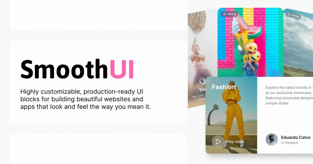
Which components and blocks are included? 📒
SmoothUI includes a broad set of UI components (docs call out 40+), plus prebuilt page blocks (hero, pricing, testimonial, FAQ, footer, logo clouds, stats, team sections). If you’re building marketing pages or dashboards, it covers a lot of the “common layout” work.
Examples you’ll see in the component catalog:
Basics: Accordion, inputs, modals, toasts
Interactive/fun: Dynamic Island, Power Off Slide, Siri Orb
“Showy hero” bits: GitHub Stars Animation (animated counter + avatars)
Note: The homepage also highlights “premium blocks”, so expect some blocks to be gated or priced depending on the section you’re browsing.
Pros and Cons
If you want modern UI that feels alive, SmoothUI saves time and looks great quickly. The tradeoff is that animation-heavy UI can add complexity (and you’ll want to be mindful of performance and consistency across your app).
Pros ✅
Quick installs via shadcn-style workflow and registry approach
Strong “polish” factor from Motion animations
Tailwind-based customization (fits typical frontend workflows)
Good coverage: 40+ components plus blocks for common sections
MIT licensed, so it’s flexible for commercial projects (keep the license notice)
Cons ⚠️
Animation-heavy components can increase bundle size or require extra performance care
Tailwind CSS v4 is referenced, so older Tailwind setups may need tweaks
Some blocks appear positioned as premium on the homepage
You’ll still need to align visuals with your design system (spacing, motion feel, brand tokens)
FAQ
How to integrate SmoothUI into a project?
You typically add the SmoothUI registry, install components using the shadcn CLI flow, then customize with Tailwind classes like you would in any Tailwind app. It’s designed to fit nicely in React and Next.js projects.