Sileo
Animated toast alerts, beautiful by default
Sileo is a free, open-source React toast notification library that delivers smooth, animated alerts using spring physics and gooey SVG morphing. It's tiny, opinionated, and works beautifully out of the box with a single npm install.
Best suited for developers who want polished notifications without spending time on configuration.
Features ✨
Spring physics animations - Every toast enters, idles, and exits with realistic motion using the Motion library under the hood
Gooey SVG morphing - The signature visual effect that makes Sileo stand out from every other toast library
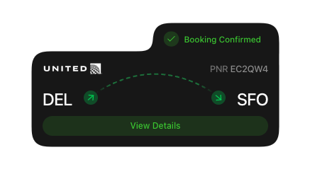
5 toast types - Success, error, warning, info, and action - each with color-coded badges
Promise support - Chain loading, success, and error states from a single
sileo.promise()call6 position options - Top or bottom, combined with left, center, or right
Custom icons - Swap out default state icons for any React node
Auto-dismiss control - Set a custom duration per toast, or pass
nullto keep it on screen until dismissedAction buttons - Attach interactive buttons directly to any toast
Style overrides - Customize individual toast elements (title, description, badge, button) via a
stylespropDark mode support - Automatically adapts background and text colors based on system preference
Swipe to dismiss - Users can swipe toasts away on touch devices
Included Components 📒
Sileo ships with two main exports you drop into your project:
Toaster - The container component you place once in your app's root layout. It manages all active toast instances and accepts global defaults like position, offset, and shared options for fill colors or style overrides.
sileo - The function you call from anywhere in your app to trigger a toast. It exposes named methods for each toast type: sileo.success(), sileo.error(), sileo.warning(), sileo.info(), sileo.action(), sileo.promise(), and the generic sileo.show() if you want to set the state dynamically at runtime.
There are also exported TypeScript types - SileoOptions, SileoPosition, SileoState, SileoStyles, and SileoButton - for teams working in typed codebases.
Pros and Cons
Pros ✅
Drop-dead gorgeous out of the box - the SVG morphing effect genuinely looks unlike any other toast library
Minimal API means you're up and running in under 5 minutes
Promise integration is really well thought out - loading, success, and error states handled in a single call
MIT license - completely free for personal and commercial projects
TypeScript support built in, no separate type package needed
Very lightweight with only one dependency (Motion)
Active development - reached 1,000+ GitHub stars within days of launch
Cons ⚠️
React-only - if you're on Vue, Svelte, or vanilla JS, you'll need the unofficial community port
Being "opinionated" means limited customization compared to more flexible libraries like react-toastify
Very new library (launched February 2026) - not battle-tested in large production environments yet
No built-in accessibility options documented (ARIA roles, screen reader support)
Requires React 18 or higher - older projects can't use it without upgrading
Integration
React 18+ - Peer dependency, required for installation
Motion (
motionnpm package) - The only runtime dependency, handles all animation primitivesNext.js - Works out of the box by placing
Toasterin your root layout fileRemix - Compatible, place
Toasterin your app's root componentVite + React - Standard setup, no extra configuration needed
TypeScript - Native types included, no
@types/sileopackage requiredTailwind CSS - The
stylesprop accepts Tailwind class strings directly for custom stylingAny Promise-based workflow - Works with
fetch,axios, or any async function viasileo.promise()