Reshaped
Open source React and Figma design system
- Dark mode
- Figma design file
- Responsive
Open source React and Figma component library for product teams.
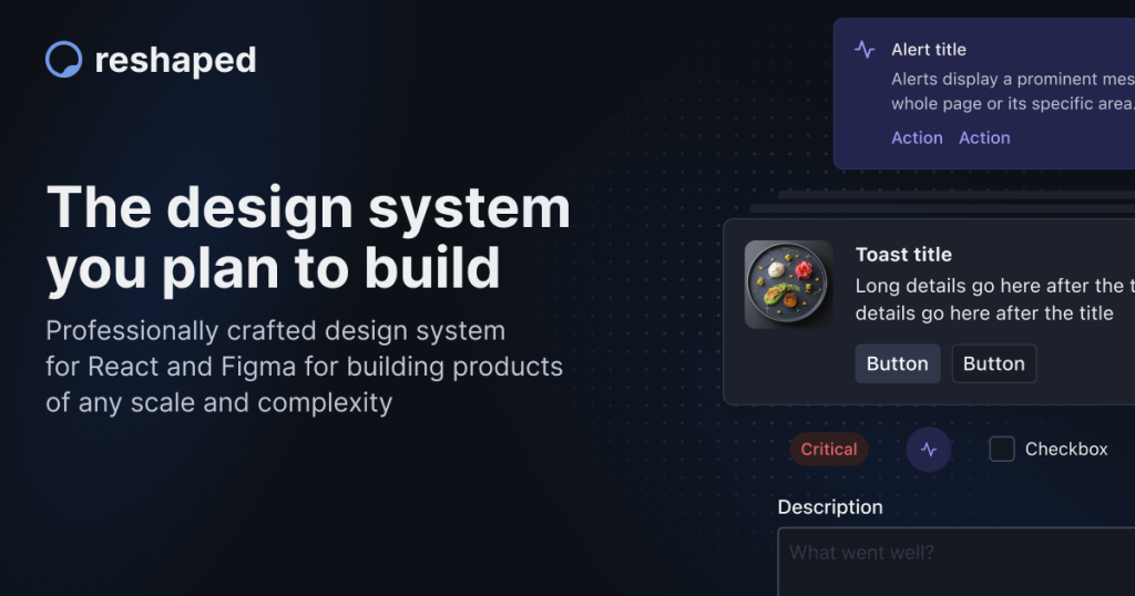
Reshaped is a fully open source design system that ships React components, Figma libraries, and theming tools in one package.
Stack: React, TypeScript, Tailwind tokens, Figma.
License: MIT, free for commercial projects.
Scope: 40+ production ready components with design and code kept in sync.
If you want React components that match your Figma files out of the box and stay accessible, Reshaped is one of the easiest ways to get there.
What Is Reshaped UI?
Reshaped is a design system and component library that bridges React and Figma so designers and developers can work from the same source of truth.
It gives you a curated set of UI primitives, layout pieces, and tokens so you do not have to design every button, card, or form control from scratch.
Under the hood, Reshaped ships:
A React library with flexible, composable components.
A matching Figma library that mirrors the React API.
A Figma plugin and theming tools to sync tokens between code and design.
Because everything is MIT licensed and public on GitHub, you can use it in side projects, client work, or full scale products without worrying about per seat pricing.
Key Features of Reshaped UI? ✨
Reshaped focuses on solving common design system headaches: theming, dark mode, accessibility, and keeping Figma and React aligned.
In practice, that means less time wiring infrastructure and more time shipping features.
Key features in plain language:
Open source and MIT licensed
React first components
Design and code in sync
Automatic dark mode
Responsive styling syntax
Accessibility baked in
Full TypeScript support
Theming CLI and design tokens
Tailwind CSS integration
Pros and Cons
Reshaped sits in a nice middle ground: more polished than low level headless libraries, lighter and more opinionated than huge enterprise kits.
Here is how it usually feels once you start building with it.
Pros ✅
Free and open source with MIT license that allows commercial use.
Tight design to code alignment between Figma and React, which reduces hand off friction.
Accessible by default, so you start from a better baseline for keyboard and screen reader users.
React only runtime dependency, easier to reason about and upgrade than stacks glued to a styling framework.
Good documentation and examples, including playgrounds and best practice notes for each component.
Tailwind token support, handy if your project already uses Tailwind for utility classes.
Cons ⚠️
React only right now, so there is no official Vue, Svelte, or Angular port.
Smaller ecosystem than long running libraries like Material UI or Chakra, so you will find fewer third party tutorials and snippets.
Opinionated visual style, which is clean and product focused but may need extra work if you want a very playful or heavily branded look.
Design system mindset required. To get the most value you should embrace tokens and theming instead of quick one off overrides.