React Bits
Premium animated React components, blocks, templates
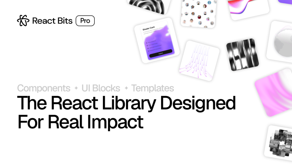
React Bits Pro is a paid React UI toolkit with 65+ animated components, 100+ UI blocks, and 5 full-page templates. It's a one-time purchase starting at $74 (launch price), designed to help developers ship polished, stand-out products without building everything from scratch.
What Is React Bits Pro?

React Bits Pro is the premium tier of the popular open-source React Bits library. While the free version gives you a solid set of animated components, the Pro version takes it further with production-ready UI blocks and full page templates, all designed specifically for marketing pages, SaaS products, and launch-ready sites.
It's made by David (DavidHDev), the same developer behind the open-source React Bits repo that racked up 35,000+ GitHub stars. The Pro version is not a subscription. You pay once and own it — updates included, forever.
It's especially aimed at developers who want their products to look memorable and polished, without spending months on UI work or hiring a designer. If you've ever seen a landing page that just looks different from every other shadcn clone out there, this is the toolkit that can get you there.
Features ✨
65+ animated, production-ready components — text effects, backgrounds, cards, buttons, and more
100+ UI blocks (Pro and Ultimate plans) — pre-assembled sections like heroes, testimonials, pricing grids, and CTAs
5 full-page templates (Ultimate plan) — complete page layouts ready to customize and deploy
TypeScript support out of the box — no extra setup needed
Tailwind CSS and vanilla CSS variants for every component
Extensive customization props — adjust colors, speeds, sizes, and behaviors without hacking source code
Commercial license — use on unlimited client projects
Lifetime access — new components, blocks, and templates added monthly at no extra cost
Mobile-responsive by default — everything looks solid from mobile to ultra-wide monitors
Priority support on the Ultimate tier
Included Components 📒
React Bits Pro covers all the major UI categories you'd need for a product or marketing site:
Text & Typography — animated headlines, gradient text, typewriter effects, split text animations
Backgrounds — particle fields, aurora effects, mesh gradients, noise textures, interactive grid overlays
Cards & UI Elements — tilt cards, glowing borders, spotlight effects, animated badges
Buttons & CTAs — shimmer buttons, magnetic hover effects, animated icon buttons
Hero Sections — multiple pre-built hero block layouts ready to drop into your app
Testimonials, Pricing, Feature Grids — as part of the 100+ blocks in the Pro and Ultimate plans
Full-Page Templates — complete landing page layouts at the Ultimate tier, covering everything from a product hero down to the footer
Pros and Cons
Pros ✅
One-time payment with no recurring fees — genuine lifetime deal
Components are genuinely different from what you'd find in shadcn or Radix-based libraries — they prioritize visual wow factor
TypeScript-ready and works with the tools you already use (Tailwind, Framer Motion, GSAP)
The free open-source version exists, so you can evaluate the quality before buying
Commercial license covers unlimited projects, which is great value for freelancers and agencies
Monthly additions mean the library keeps growing after you buy
Documentation is clean and easy to follow — copy-paste or CLI install, your choice
shadcn himself endorsed it — that's a strong signal in the React ecosystem
Cons ⚠️
The Ultimate tier ($224 after discount) might feel steep for solo devs or hobby projects
Templates are limited to 5 at launch — more are coming, but it's a small set today
Not a full design system — if you need form validation, data tables, or accessibility-first components, you'll still need another library alongside it
Heavily geared toward marketing and landing pages — it's less useful if you're building a dashboard or data-heavy app
No Vue, Svelte, or other framework support — React only
Integration
Tailwind CSS — all components come with Tailwind class variants as standard
Framer Motion — used in many animations, already set up inside components
GSAP — supported for components that need timeline-based animations
TypeScript — full type definitions included across the library
Next.js — works seamlessly, most demos are built with Next in mind
Vite + React — fully compatible for non-Next setups
CSS Modules / vanilla CSS — CSS variants available as an alternative to Tailwind for every component
CLI install — components can be dropped in via a command, similar to the shadcn CLI pattern
FAQ
Is React Bits Pro different from the free React Bits library?
Yes. The free version at reactbits.dev gives you individual animated components. The Pro version adds UI blocks (pre-assembled sections) and full-page templates, plus TypeScript and Tailwind variants — it's a bigger, more complete toolkit built for production use.
Can I use it for client work without paying extra?
Yes. All plans include a commercial license for unlimited projects. You pay once and can use the components on as many client sites as you want.
Do I need to know Framer Motion or GSAP to use it?
No. The animations are already built into the components. You just drop them in and tweak the props. You don't need to write any animation logic yourself.
What happens after I buy, do I get new stuff automatically?
Yes. New components, blocks, and templates are added monthly, and your lifetime access includes all future additions. You don't pay again for updates.