React Aria
Accessible, unstyled React components and hooks

React Aria is a style-free set of React components and hooks that helps you build accessible user interfaces while keeping full control over design. It includes more than 50 components with built-in keyboard, screen reader, and touch behavior, making it ideal for custom design systems.

Key stats
Components: 50+
Accessibility: Keyboard and screen reader support built in
License: Apache-2.0
Definition
Style-free (headless): Logic and accessibility are provided, but visuals are fully up to you.
What is React Aria?
React Aria is a collection of unstyled React components and hooks designed to solve accessibility and interaction challenges for modern web apps. It focuses on behavior, state management, and input handling, while leaving all visual styling to your own design system.
What features does React Aria offer? ✨
React Aria handles complex interaction patterns so you don’t have to reinvent them. It gives you consistent behavior across devices while staying flexible for custom UI work.
Features
Style-free components for complete design control
Built-in accessibility patterns and ARIA behavior
Keyboard, mouse, touch, and screen reader support
Helpful state indicators for styling (hovered, pressed, selected)
Advanced interactions like selection, drag and drop, and validation
Internationalization support for global applications
What components come with React Aria? 📒
React Aria includes over 50 components that cover common UI needs across forms, overlays, navigation, and data display.
Included components (examples)
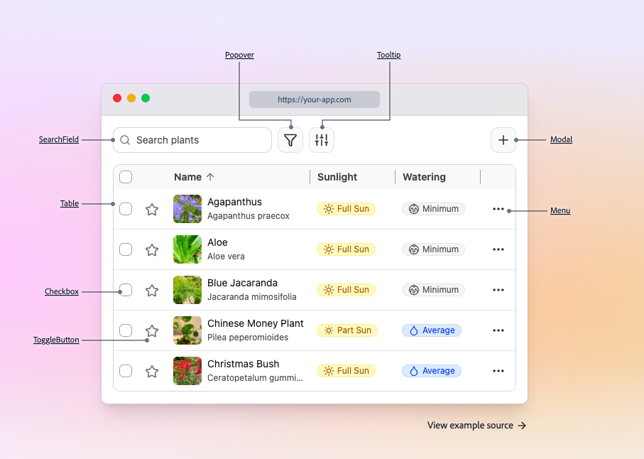
Popover, Tooltip, Modal
SearchField, ComboBox
Checkbox, ToggleButton
Menu and MenuItem
Table and Grid
DatePicker and Calendar
What are the pros and cons of React Aria?
React Aria is a strong choice if accessibility and customization matter most. The main tradeoff is that it doesn’t provide a finished visual design.
Pros ✅
Accessibility behavior is handled out of the box
Ideal for building custom design systems
Flexible styling via class names and state attributes
Consistent interactions across devices
Cons ⚠️
No default styles or themes included
Requires more setup than fully styled UI libraries
Advanced patterns still require thoughtful layout and testing
How do you integrate React Aria into a project?
Integration is flexible and works with modern React setups. You choose how much abstraction you want and layer your styling on top.
Integration
Use full components or lower-level hooks
Apply your own CSS, Tailwind, or CSS-in-JS styles
Follow framework-specific setup for routing and localization
Style interaction states using provided state attributes
Test keyboard navigation and focus behavior early
FAQ
Is React Aria a styled component library?
No - it’s style-free by default, so you bring the design and it brings behavior and accessibility.
Do I need a separate UI framework to use React Aria?
No. It can be used on its own or as the foundation for a custom design system.
Is React Aria suitable for large applications?
Yes. It is designed for complex, scalable apps with advanced interaction needs.
How are hover and active states handled?
React Aria exposes clear state indicators that you can target with your own styles.