PaceUI
GSAP-driven React components & interactive design blocks

- Copy & Paste
What Is the Pace UI?
PaceUI is a growing React component library that combines Tailwind CSS with GSAP animations for fluid, eye-catching interfaces. Built to follow the simple, copy-paste ethos of shadcn/ui (but with motion baked in), it delivers ready-to-use UI pieces—from text effects to full-page blocks—that slot seamlessly into React or Next.js projects.
Features ✨
GSAP-powered animations for high-performance transitions and effects.
Tailwind CSS utility classes ensure styling consistency and easy customization.
Copy-paste usage—no extra setup if you’re already using shadcn’s CLI.
CLI integration for one-command installs and updates.
Future-ready blocks roadmap with marketing, e-commerce, and custom layouts coming soon.
Included Components 📒
A diverse set of animated elements you can drop in directly:
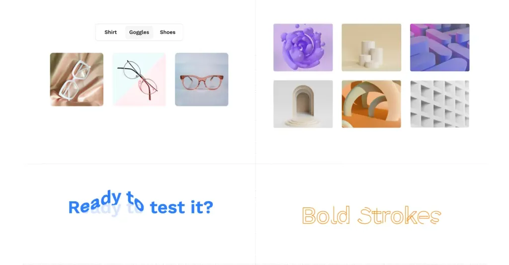
Text-based: Reveal Text, Scramble Text, Distort Text, Squash Text, Bouncing Text.
Scroll-based: Mouse Wave Text, Reveal on Scroll, Stagger on Scroll.
Buttons: Text Fall Button, Spring Button.
Other: Draw Line Text, Tilt Card, Profile Peek, Reveal Liquid Cursor.
Blocks (Beta): Hero sections, pricing panels, testimonials, product filters, and more.
Pros and Cons
Pros ✅
Plug-and-play: Drop components in with minimal setup.
Built-in animation: No need to wire GSAP yourself.
Wide variety: From tiny text effects to full sections.
CLI support: Streamlines installation and updates.
Cons ⚠️
Beta state: Some blocks and docs are still in progress.
Learning curve: Requires familiarity with Tailwind + React patterns.
Limited ecosystem: Fewer integrations compared to mature libraries (e.g., Framer Motion).
Integration
Install:
npm install @paceui/clior usenpx paceui init.Import:
import { RevealText, TiltCard } from 'paceui'.Use: Copy example code from the docs and paste into your JSX.
Customize: Override Tailwind classes or GSAP props via component props.