PaceKit
UI blocks for dashboards, built with shadcn/ui
- Copy & Paste
PaceKit UI is a collection of practical, production-ready UI blocks and app templates built with shadcn/ui, Tailwind CSS, and GSAP. It's designed for developers who want to ship real apps and dashboards fast, without reinventing common layout patterns from scratch.
Features ✨
shadcn/ui compatible - blocks follow shadcn/ui conventions so they slot into your project with zero friction
Tailwind CSS powered - utility-first styling means every block is fully customizable without fighting a separate CSS layer
GSAP animations included - smooth, production-grade transitions built in, no manual animation setup required
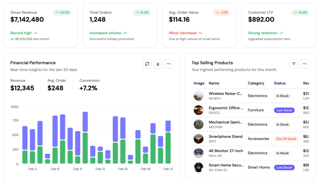
Dashboard-first design - blocks are purpose-built for data-heavy screens, admin panels, and app interfaces
Production-ready structure - solid patterns that hold up in live apps, not just side projects
Drop-in integration - designed for fast setup, minimal configuration, and immediate use in real projects
Included Components 📒
PaceKit UI ships content across two main areas:
App Templates - Full app layouts including dashboard screens ready for data-heavy use cases. These are complete, structured starting points built to handle real product needs.
UI Blocks - Modular sections covering common app patterns. Blocks are production-tested, responsive, and built to compose nicely within existing codebases.
GSAP Animations - A dedicated set of animated elements powered by GreenSock, covering scroll-triggered reveals, transitions, and interaction feedback built specifically for React and Next.js.
Pros and Cons
Pros ✅
Built on shadcn/ui so it speaks the same language as your existing stack
Dashboard and admin layouts are first-class citizens, not afterthoughts
GSAP integration means you get real animation quality without doing the wiring yourself
Tailwind CSS utilities keep customization fast and predictable
Quick setup means you can drop a block in and be shipping the same day
Made by an active solo developer with a clear product direction and roadmap
Cons ⚠️
Library is still growing - not as large as established players like ShadcnBlocks or ShadcnStudio
Best suited for React and Next.js - not a fit for Vue, Angular, or non-Tailwind stacks
Limited public documentation at early stage, which adds a small onboarding curve
GSAP dependency adds weight compared to lighter motion libraries if you only need basic transitions
Integration
Framework - Works with React and Next.js projects using the App Router or Pages Router
Styling - Requires Tailwind CSS; blocks inherit your existing Tailwind config and custom tokens
Component system - Built on top of shadcn/ui, so you can extend or override any block using your local shadcn setup
Animations - GSAP is required for animated blocks; the library provides ready-to-use
useGSAP()powered componentsInstallation - Blocks are designed for copy-paste use directly into your codebase, keeping full code ownership