Melt UI
Unstyled Svelte components with WAI-ARIA support
 Melt UI is an open-source, headless set of Svelte builders that handles accessibility and behavior, while you fully control markup and styling. It’s a strong pick if you want Radix-style primitives for Svelte without being locked into a design system.
Key stats and definitions
License: MIT
What “headless” means: logic and accessibility included, no default styling
Accessibility baseline: follows WAI-ARIA design patterns with focus management and keyboard navigation
Quick setup: optional CLI initializer available
What Is the Melt UI?
Melt UI is a collection of accessible, unstyled component builders for Svelte apps. You use its builders to get the correct keyboard interactions, roles, and focus handling, then layer your own styles on top.
It’s especially useful when you want a consistent accessibility foundation across menus, dialogs, selects, and date inputs without adopting a full UI framework.
What features does Melt UI offer? ✨
Melt UI focuses on solving complex interaction and accessibility problems once, while staying visually unopinionated.
Features
Headless, unstyled builders
Strong keyboard navigation and focus management
Designed for Svelte and SvelteKit with TypeScript support
Advanced menu behavior including submenus and typeahead
Date utilities like calendars, date fields, and pickers
Optional preprocessor to reduce repetitive markup
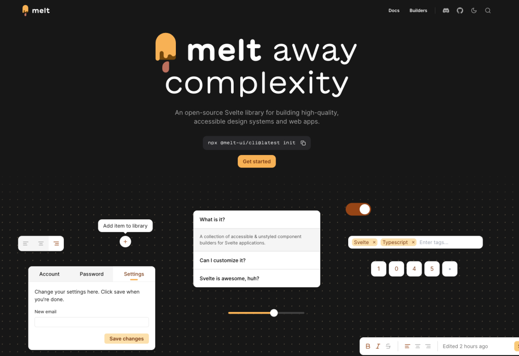
What components are included in Melt UI? 📒
Melt UI includes a wide range of builders covering forms, navigation, overlays, and complex widgets.
Included builders
Overlays: Dialog, Popover, Tooltip, Link Preview
Menus: Dropdown Menu, Menubar, Context Menu
Form controls: Checkbox, Radio Group, Switch, Select, Combobox, Tags Input
Navigation and layout: Tabs, Scroll Area, Separator, Pagination, Tree View, Table of Contents
Date and time: Calendar, Range Calendar, Date Field, Date Range Field, Date Picker, Date Range Picker
Feedback: Progress, Toast
Utilities: Toggle, Toggle Group, Toolbar, Collapsible, PIN Input
What are the pros and cons of Melt UI?
Pros ✅
Full control over styling with no design lock-in
Strong accessibility defaults out of the box
Broad coverage of both simple and advanced UI patterns
Open-source with a permissive license
Developer experience tools to reduce boilerplate
Cons ⚠️
Requires extra work to style and wrap components
More complex builders involve multiple composed parts
Toast handling is global, requiring a small app-level setup
How do you integrate Melt UI with your stack?
Install the library and start with individual builders
Works well with SvelteKit and TypeScript projects
Compatible with any styling solution, including Tailwind or plain CSS
Optional preprocessor can simplify markup
Toasts are typically rendered once at the app root
FAQ
Is Melt UI styled by default?
No. It provides behavior and accessibility only, leaving all styling to you.
Does Melt UI support complex menus?
Yes. Menu builders include features like submenus and typeahead navigation.
How are toasts handled?
Toasts are global and usually rendered through a single top-level component.
Are date pickers included?
Yes. Melt UI includes calendars, date fields, and composed date picker builders.