Mantine UI
120+ responsive UI blocks for React.

- Dark mode
What Is the Mantine UI?
Mantine UI is a collection of prebuilt, responsive React components and page sections built on the Mantine library—free, MIT-licensed, and themeable out of the box.

Features ✨
120+ components and 70+ hooks via Mantine core + extras
Built-in theming with easy color, font, and spacing control
Native light/dark modes across most components
Accessible patterns and strong developer experience
Free and open source (MIT) for personal and commercial use
Included Components 📒
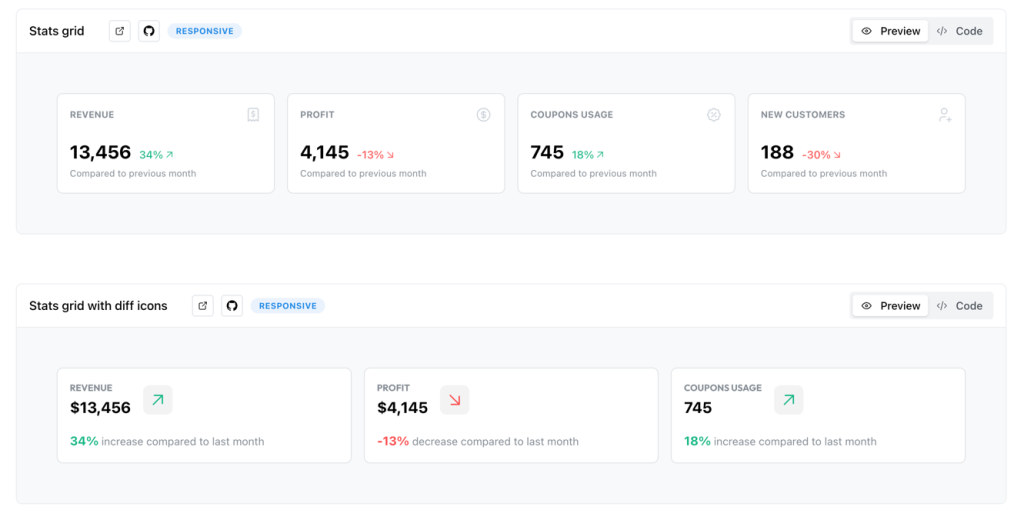
Application UI: navbars, headers, footers, inputs, buttons, sliders, tables, stats, cards, carousels, drag-and-drop
Page sections: hero, features, auth, FAQ, contact, error pages, banners
Blog UI: article cards, TOC, comments
Pros and Cons
Pros ✅
Huge set of ready-to-use sections and widgets
Fast theming; dark/light works with no extra setup
Great docs and examples; strong DX
MIT license—safe for commercial use
Cons ⚠️
Visual style is opinionated; heavy customization may take time
Ecosystem is smaller than MUI/Ant for certain niche components (charts, enterprise tables) (inferred vs. larger ecosystems in roundups).
Integration
React + Next.js/Remix compatible; SSR supported
Theme provider for global styling and dark mode toggles
Works with common libs (forms, data fetching, tables) per community guides and roundups
GitHub repo for examples and quick copy-paste usage
FAQ
Is Mantine UI free for commercial projects?
Yes. MIT license covers commercial use.
Does it support dark mode automatically?
Most components ship with dark/light variants enabled.
How many components are available?
Expect 120+ customizable components plus 70+ hooks via Mantine core.
Can I use it with Next.js and SSR?
Yes, Mantine supports modern frameworks and server-side rendering.