coss ui
Open-source Tailwind and Next.js components

- Dark mode
- Copy & Paste
The component library once known as Origin UI has now been re-branded as coss ui, available at coss.com/ui/
coss ui is a modern React + Tailwind CSS component system built on top of the Base UI primitives. It continues the copy-&-paste ethos of the original library, but with a stronger accessibility foundation, broader component coverage, and ongoing active development.

What’s new (vs Origin UI)
Built on Base UI primitives rather than Radix/shadcn (Origin UI) to improve accessibility and composability.
Styled with Tailwind CSS, and designed for full code ownership — you copy the source code into your project, giving you maximal control.
Offers three abstraction layers: Primitives (unstyled accessible building blocks), Particles (pre-assembled patterns), and Atoms (API-connected smart components).
Maintains the original library’s “free & open source” philosophy, but under the new umbrella of the company behind it.
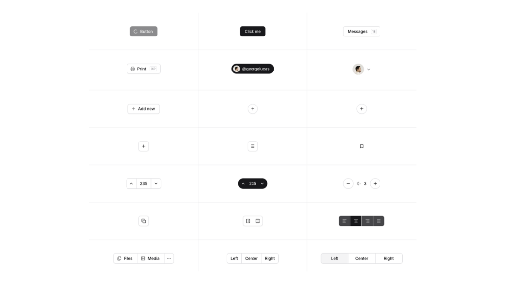
Components


coss ui (ex Origin UI) provides a range of UI components:
Input fields
Buttons
Checkboxes, radios, and switches
Select menus
Slider (coming soon ✨)
Features
Built on top of Base UI primitives and styled with Tailwind CSS for full control.
Three-layer architecture: Primitives (unstyled accessible blocks) → Particles (pre-built patterns) → Atoms (API-connected components)
Copy-&-paste ownership model: you drop full source files into your project rather than using opaque packages.
Wide component coverage: includes buttons, cards, inputs, dialogs, tables, etc.
Open-source, developer-friendly approach focused on accessibility and modern UI stacks.
Pros
✅ Full code ownership and customization possible, ideal for teams wanting to tweak deeply.
✅ Built with modern technologies (React + Tailwind + Base UI), giving a robust foundation.
✅ Strong accessibility and composability thanks to Base UI beneath the surface.
✅ Good for new projects or migrating from simpler kits (and for developers who prefer copy-paste rather than black-box libs).
Cons
⚠️ Still relatively new (in early phases) — may undergo breaking changes as it matures.
⚠️ Because you copy the source, managing updates and custom modifications is more your responsibility vs a packaged library.
⚠️ If you’re coming from an older version of Origin UI (Radix/shadcn style), there may be migration effort.
Pricing
Origin UI is completely free to use, offering open-source components without any associated costs.
Integrations
Tailwind CSS
Next.js
React
Use Cases
New projects built with React + Tailwind that need a modern, accessible UI kit
Teams migrating from libraries like shadcn/ui or Radix who want more control over styling and code
Projects where you want full ownership of UI component source code and behaviour
Summary
If you’re looking for a modern, accessible, Tailwind-style component library with full code ownership, coss ui is a strong option