 HOT
HOTTailkits UI
MCPBuild landing pages with AI
Discover Tailwind pricing components to create pricing tables. Pricing components display your product or service pricing options organized and appealingly.
 HOT
HOTBuild landing pages with AI
 HOT
HOT959 Shadcn blocks & 10+ templates
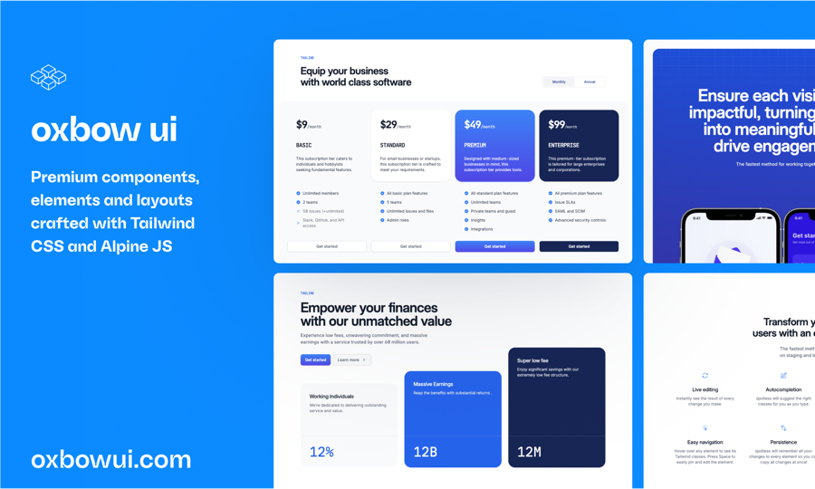
220+ Free & Premium Tailwind, Alpine.js components
120 Free Tailwind CSS blocks & components
Best Tailwind components and elements to use on your web projects.
 HOT
HOT959 shadcn/ui blocks for Tailwind

Free and premium Shadcn blocks

220+ Free & Premium Tailwind, Alpine.js components
In the competitive landscape of web design, presenting your product or service pricing in an appealing and clear manner can significantly influence user decisions.
Creating a pricing component involves several key elements, each contributing to the overall user experience and effectiveness of the section. Let's break down these components and explore how Tailwind CSS can help enhance each aspect.
The foundation of any pricing component is its layout. Tailwind provides a plethora of utility classes to define spacing, alignment, and grid structures.
Flexbox and Grid: Utilize Tailwind’s flex and grid utilities to arrange pricing cards side by side or stack them for mobile views.
Spacing: Control padding and margin with classes like p-4, m-2, ensuring adequate whitespace around elements for better readability.
Alignment: Center or align items using justify-center, items-start, etc., to achieve the desired layout.
Each pricing option typically resides within a card that highlights key features and pricing details.
Background and Borders: Apply background colors with classes like bg-white or bg-gray-50, and use border utilities (border, border-gray-200) to define the card boundaries.
Shadow and Hover Effects: Elevate the design with shadows (shadow-lg) and interactive hover effects (hover:shadow-xl) to make cards more engaging.
Rounded Corners: Soften the card edges using rounded-lg or rounded-full for a modern look.
Clear and concise text is crucial for conveying pricing details effectively.
Font Sizes and Weights: Tailwind offers classes like text-xl, font-semibold to emphasize key information such as pricing amounts.
Text Alignment: Ensure content is well-aligned using text-center, text-left, or text-right as needed.
Color Contrast: Maintain readability with appropriate text colors (text-gray-700, text-blue-500), ensuring sufficient contrast against backgrounds.
Highlighting the benefits of each pricing tier helps users make informed decisions.
List Styling: Use Tailwind’s list utilities (list-disc, list-inside) to neatly present features.
Icons and Indicators: Integrate icons with classes like inline-block and mr-2 to add visual cues next to features.
Spacing and Sizing: Control the layout with padding and margin classes to keep the feature list organized and scannable.
Encourage conversions with strategically placed buttons that stand out.
Button Styling: Make use of Tailwind’s button classes (bg-blue-500, text-white, py-2, px-4, rounded) to create eye-catching buttons.
Interactive States: Enhance user experience with hover and focus states (hover:bg-blue-600, focus:outline-none) to provide feedback.
Alignment and Spacing: Position buttons effectively using flex utilities or spacing classes to ensure they are easily accessible.
One of Tailwind CSS's standout features is its mobile-first approach to responsive design. When building pricing components, it's essential to ensure they look impeccable across all device sizes. Tailwind simplifies this with its breakpoint system:
Breakpoints: Utilize responsive prefixes like sm:, md:, lg:, and xl: to adjust styles based on screen size. For example, md:grid-cols-2 can be used to change the layout to two columns on medium screens.
Visibility: Control which elements are visible on different devices using classes like hidden, block, md:hidden, ensuring a clean and optimized layout.
Flexibility: Tailwind’s utilities allow for dynamic adjustments of padding, margins, and text sizes, ensuring that your pricing component adapts seamlessly as the viewport changes.
While Tailwind provides a solid foundation with its utility classes, customizing your pricing components to match your brand identity is straightforward:
Configuration File: Tailwind’s tailwind.config.js allows you to define custom colors, spacing, fonts, and more, ensuring that your pricing component aligns with your overall design system.
Extending Utilities: Add new utility classes or extend existing ones to cater to specific design requirements, providing flexibility beyond the default offerings.
Plugins: Leverage Tailwind’s plugin system to incorporate additional functionalities or components that enhance your pricing tables without reinventing the wheel.
Designing an impactful pricing component goes beyond aesthetics. Here are some best practices to ensure your pricing tables are both attractive and effective:
Clarity Over Clutter: Present information succinctly. Avoid overwhelming users with too many options or excessive details.
Highlight Popular Choices: Use visual cues like badges (Most Popular) or different background colors to guide users towards preferred or recommended plans.
Consistent Styling: Maintain uniformity in font styles, button designs, and spacing across all pricing options to create a cohesive look.
Easy Comparison: Arrange pricing tiers side by side with consistent layouts, making it simple for users to compare features and prices at a glance.
Clear Call-to-Action: Ensure that each pricing card has a prominent and easily accessible call-to-action button, encouraging users to take the next step.
To illustrate the power of Tailwind CSS in creating pricing components, let's explore a couple of real-world scenarios where Tailwind can make a significant impact.
Imagine you're designing a pricing section for a Software as a Service (SaaS) product. Tailwind allows you to create distinct cards for different subscription tiers, each highlighting unique features and benefits. With responsive utilities, these cards can adjust from a multi-column layout on desktops to a single-column layout on mobile devices, ensuring accessibility and readability across all platforms.
For an e-commerce platform offering various package deals, Tailwind's utility classes can help design a visually appealing grid of product bundles. Each bundle can feature product images, pricing details, and a call-to-action button, all styled consistently yet distinctively to highlight the differences between packages.
Yes, Tailwind's flexibility allows you to tailor pricing components to fit the unique needs and aesthetics of any industry, be it tech, retail, services, or others.
Tailwind CSS empowers developers and designers to craft elegant, responsive, and highly customizable pricing components with minimal hassle.
You can find answers for commonly asked questions about components.
You can emphasize a specific pricing tier by applying distinct styles such as a different background color (bg-blue-500), adding a badge (Most Popular), or increasing the shadow (shadow-2xl). These visual cues draw attention and guide users towards recommended plans.
Absolutely! Tailwind allows you to define custom fonts in the configuration file. Once set up, you can apply these fonts using Tailwind's typography utilities to ensure your pricing components reflect your brand's unique style.