 HOT
HOTTailkits UI
MCPBuild landing pages with AI
Get Tailwind header components. Header components are crucial UI elements at the top of websites—containing navigation menus, logos, and key information.
 HOT
HOTBuild landing pages with AI
 HOT
HOT959 Shadcn blocks & 10+ templates
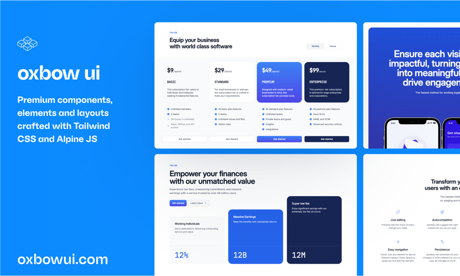
Open source Tailwind CSS & Alpine.js components
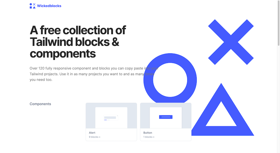
120 Free Tailwind CSS blocks & components
Production-ready Tailwind components for React, Next.js, Vue & HTML. Responsive, accessible UI blocks optimized for Tailwind v4 with MCP integration.
 HOT
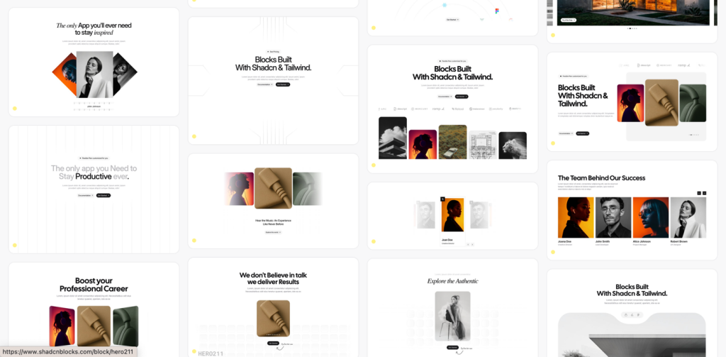
HOT959 shadcn/ui blocks for Tailwind

Free and premium Shadcn blocks
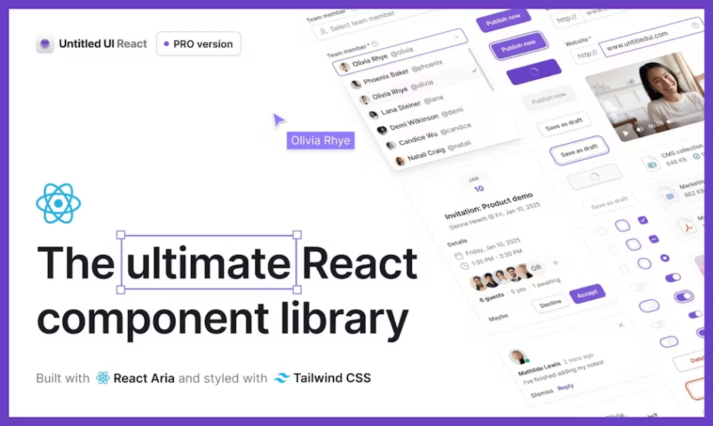
5 000+ Tailwind React components
Creating a standout website starts with a captivating header, and Tailwind CSS makes building these components both efficient and stylish.
Tailwind CSS is a utility-first framework that provides low-level classes, giving you complete control over your design without writing custom CSS. This approach is perfect for creating headers because:
Rapid Development: Quickly assemble complex layouts without leaving your HTML.
Consistency: Maintain a consistent design system across your site.
Responsive Design: Easily adapt your headers for various screen sizes using Tailwind’s responsive utilities.
Customization: Tailor components precisely to your needs with Tailwind’s extensive configuration options.
A typical header comprises a logo, navigation links, and sometimes additional elements like search bars or buttons. Tailwind’s flexbox utilities make it straightforward to align these elements.
<header class="bg-white shadow-md">
  <div class="container mx-auto flex justify-between items-center p-4">
    <div class="text-xl font-bold">Logo</div>
    <nav class="space-x-4">
      <a href="#" class="text-gray-700 hover:text-blue-500">Home</a>
      <a href="#" class="text-gray-700 hover:text-blue-500">About</a>
      <a href="#" class="text-gray-700 hover:text-blue-500">Contact</a>
    </nav>
  </div>
</header>bg-white shadow-md: Sets the background color and adds a subtle shadow.
container mx-auto flex justify-between items-center p-4: Centers the content, uses flexbox to space items, and adds padding.
Navigation Links: Styled with spacing and hover effects for interactivity.
Ensuring your header looks great on all devices is crucial. Tailwind’s responsive utilities make this easy.
<nav class="hidden md:flex space-x-4">
  <!-- Navigation Links -->
</nav>
<button class="md:hidden">
  <!-- Hamburger Icon -->
</button>hidden md:flex: Hides the navigation on smaller screens and displays it on medium and larger screens.
md:hidden: Shows the hamburger menu button only on small screens.
While Tailwind handles the styling, adding interactivity (like dropdowns or mobile menus) typically requires a little JavaScript. However, the structure remains clean and manageable.
<button class="md:hidden" @click="isOpen = !isOpen">
  <!-- Hamburger Icon -->
</button>
<nav :class="isOpen ? 'block' : 'hidden'" class="md:flex">
  <!-- Navigation Links -->
</nav>Use frameworks like Vue or React to manage state (isOpen in this case).
Tailwind’s classes make it easy to toggle visibility and styles based on state.
Tailwind’s utility classes allow for extensive customization without writing custom CSS.
Typography: Adjust font sizes, weights, and styles with classes like text-lg, font-semibold, etc.
Spacing: Control padding and margins using p-4, m-2, etc.
Colors: Utilize Tailwind’s color palette for backgrounds, text, and hover states.
Borders and Shadows: Enhance your header with borders (border-b, border-gray-200) and shadows (shadow-lg).
<header class="bg-gradient-to-r from-blue-500 to-purple-600 shadow-lg">
  <div class="container mx-auto flex justify-between items-center p-6">
    <div class="text-2xl text-white font-bold">Brand</div>
    <nav class="hidden md:flex space-x-6">
      <a href="#" class="text-white hover:text-gray-200">Services</a>
      <a href="#" class="text-white hover:text-gray-200">Portfolio</a>
      <a href="#" class="text-white hover:text-gray-200">Contact</a>
    </nav>
  </div>
</header>Keep It Simple: Avoid cluttering the header. Focus on essential navigation and branding.
Consistency: Use consistent spacing, fonts, and colors that align with your overall design.
Accessibility: Ensure keyboard navigability and sufficient color contrast for readability.
Performance: Minimize the use of heavy graphics or unnecessary elements to keep the header lightweight.
Sticky Headers: Make your header stick to the top using sticky top-0.
Dynamic Styles: Change header styles on scroll for a dynamic user experience.
Dark Mode: Utilize Tailwind’s dark mode features to adapt your header for different themes.
<header class="sticky top-0 bg-white shadow-md z-50">
  <!-- Header Content -->
</header>sticky top-0: Fixes the header to the top of the viewport when scrolling.
z-50: Ensures the header stays above other elements.
To center the logo while keeping navigation links on either side, you can use flexbox utilities with space-between and absolute positioning.
Example:
<header class="bg-white shadow-md">
  <div class="container mx-auto flex justify-center items-center p-4 relative">
    <div class="absolute left-4">Logo</div>
    <nav class="flex space-x-4">
      <a href="#" class="text-gray-700 hover:text-blue-500">Home</a>
      <a href="#" class="text-gray-700 hover:text-blue-500">About</a>
      <a href="#" class="text-gray-700 hover:text-blue-500">Contact</a>
    </nav>
  </div>
</header>You can create a dropdown by toggling the visibility of a submenu using JavaScript alongside Tailwind classes.
Example:
<div class="relative">
  <button class="text-gray-700">Services</button>
  <div class="absolute hidden mt-2 w-48 bg-white shadow-lg">
    <a href="#" class="block px-4 py-2 text-gray-700 hover:bg-gray-100">Web Design</a>
    <a href="#" class="block px-4 py-2 text-gray-700 hover:bg-gray-100">SEO</a>
  </div>
</div>
Use JavaScript to toggle the hidden class on the submenu when the button is clicked.
Implement a hamburger icon that reveals the navigation links on smaller screens using Tailwind’s responsive utilities.
Example:
<header class="bg-white shadow-md">
  <div class="container mx-auto flex justify-between items-center p-4">
    <div class="text-xl font-bold">Logo</div>
    <nav class="hidden md:flex space-x-4">
      <!-- Navigation Links -->
    </nav>
    <button class="md:hidden">
      <!-- Hamburger Icon -->
    </button>
  </div>
</header>
Use JavaScript to toggle the navigation menu when the hamburger button is clicked.
You can change header styles on scroll by adding or removing Tailwind classes based on the scroll position with JavaScript.
Example:
<header id="header" class="bg-transparent transition duration-300">
  <!-- Header Content -->
</header>

<script>
  window.addEventListener('scroll', () => {
    const header = document.getElementById('header');
    if (window.scrollY > 50) {
      header.classList.replace('bg-transparent', 'bg-white shadow-md');
    } else {
      header.classList.replace('bg-white shadow-md', 'bg-transparent');
    }
  });
</script
Overcomplicating the Design: Keep the header clean and focused.
Ignoring Accessibility: Ensure all interactive elements are keyboard accessible and have appropriate ARIA labels.
Neglecting Mobile Optimization: Always design with mobile users in mind, ensuring the header adapts gracefully to smaller screens.
Tailwind CSS simplifies the process of building responsive and stylish header components.