 HOT
HOTTailkits UI
NEWConsistent UI, zero hallucinations
Find Tailwind form components. Form components include inputs, checkboxes, radio buttons, and more, enhancing data collection and user experience.
 HOT
HOTConsistent UI, zero hallucinations
 HOT
HOT12+ Shadcn Templates

Tailwind contact form component & sections
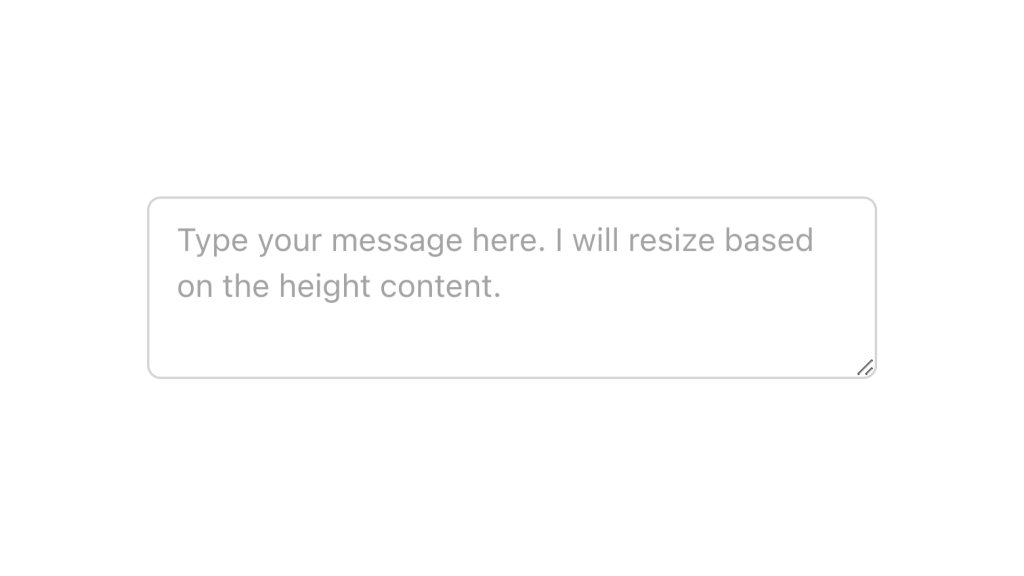
Alpine.js and Tailwind text area component by Pines UI Library.
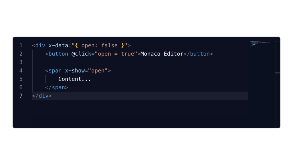
Alpine.js and Tailwind image gallery component by Pines UI Library.
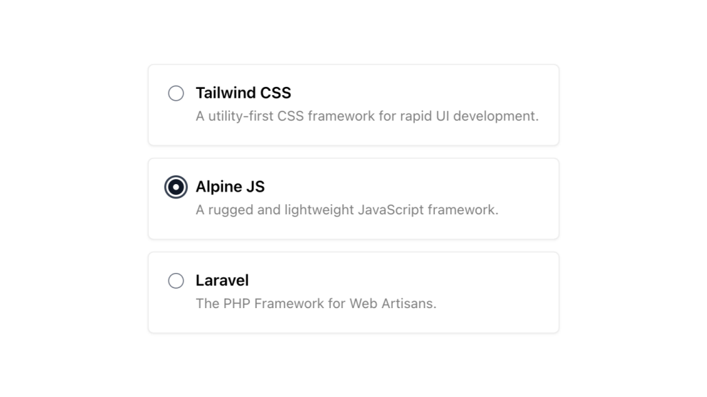
Alpine.js and Tailwind radio group component by Pines UI Library.
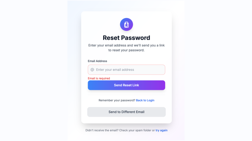
Customizable password reset form built with Tailwind CSS
Production-ready Tailwind components for React, Next.js, Vue & HTML. Responsive, accessible UI blocks optimized for Tailwind v4 with MCP integration.
200+ ready-to-use Tailwind CSS components with MCP integration. Let AI generate complete pages from your prompts — one command, production-ready UI.
Explore Components
Creating visually appealing and user-friendly forms is a fundamental aspect of web development.
Tailwind CSS stands out for its utility-first approach, allowing developers to build custom designs without leaving their HTML. When it comes to forms, this means you can rapidly prototype and style input fields, buttons, selects, and more with consistent spacing, colors, and typography. Tailwind's extensive utility classes make it easier to maintain a cohesive design system across your application.
Rapid Development: Tailwind's utility classes enable quick styling without writing custom CSS.
Consistency: Ensures uniform styling across all form elements, enhancing the user experience.
Customization: Easily tailor forms to match your brand's design language by modifying Tailwind's configuration.
Responsiveness: Simplify the process of making forms look great on all devices with responsive utility classes.
Before diving into building forms, ensure Tailwind CSS is installed and properly configured in your project. Once set up, you can start crafting form components with ease.
A standard form in HTML consists of input fields, labels, and a submit button. With Tailwind, you can enhance these elements to make them more attractive and user-friendly.
<form class="max-w-md mx-auto">
  <div class="mb-4">
    <label class="block text-gray-700">Email Address</label>
    <input type="email" class="mt-1 px-4 py-2 border rounded-md w-full" placeholder="[email protected]">
  </div>
  <button type="submit" class="bg-blue-500 text-white px-4 py-2 rounded-md">Submit</button>
</form>
Note: This is a concise example to illustrate the application of Tailwind classes.
Accessibility is crucial for creating inclusive forms. Tailwind facilitates this by allowing you to easily add ARIA attributes and manage focus states.
Labels: Always associate labels with their corresponding input fields using the for attribute.
Focus States: Utilize Tailwind’s focus utilities to clearly indicate when an input field is active.
<input type="text" class="border border-gray-300 focus:border-blue-500 focus:ring-2 focus:ring-blue-200 rounded-md">Tailwind offers a plethora of utilities to customize form elements meticulously. Below are some common form components and how to style them effectively.
Text inputs are foundational to forms. Tailwind allows you to style them for better usability and appearance.
<input type="text" class="block w-full px-4 py-2 mt-2 border rounded-md focus:outline-none focus:ring-2 focus:ring-blue-400">Tips:
Padding and Margin: Use px-4 py-2 for comfortable spacing within the input.
Border Styling: border and rounded-md provide a subtle border with rounded corners.
Focus Effects: Enhance accessibility with focus:ring utilities.
Dropdowns can benefit from Tailwind’s utilities to achieve a clean and consistent look.
<select class="block w-full px-4 py-2 mt-2 border rounded-md focus:ring-2 focus:ring-blue-400">
  <option>Option 1</option>
  <option>Option 2</option>
</select>
Enhancements:
Consistent Sizing: Ensure all form elements have matching widths and padding.
Hover States: Add hover:border-blue-500 to provide visual feedback on interaction.
For multi-line inputs, textareas are essential. Tailwind makes them both functional and stylish.
<textarea class="block w-full px-4 py-2 mt-2 border rounded-md focus:ring-2 focus:ring-blue-400"></textarea>Considerations:
Resizable: Control the resizing behavior with resize-none if needed.
Placeholder Styling: Use placeholder-gray-500 to style placeholder text.
Even for smaller elements like checkboxes and radio buttons, Tailwind ensures they’re easy to style and integrate.
<label class="inline-flex items-center">
  <input type="checkbox" class="form-checkbox h-5 w-5 text-blue-600">
  <span class="ml-2">Remember me</span>
</label>
Styling Tips:
Size and Color: Adjust size with h-5 w-5 and color with text-blue-600.
Alignment: Use flex utilities like inline-flex and items-center for proper alignment.
While basic styling covers most needs, Tailwind also supports more advanced customization for forms.
Providing visual cues for validation helps users correct errors promptly.
<input type="email" class="border border-red-500 focus:ring-2 focus:ring-red-200">
<p class="text-red-500 text-sm">Please enter a valid email address.</p>
Enhancements:
Error Messages: Use contrasting colors like red to highlight errors.
Success Indicators: Similarly, use green for successful inputs.
Grouping inputs with buttons or icons enhances functionality and design.
<div class="flex">
  <input type="text" class="flex-grow px-4 py-2 border rounded-l-md">
  <button class="px-4 py-2 bg-blue-500 text-white rounded-r-md">Search</button>
</div>
Design Tips:
Flex Layout: Utilize flex and flex-grow to manage the layout.
Rounded Corners: Apply rounded-l-md and rounded-r-md for seamless grouping.
Styling disabled or read-only fields ensures clarity without hindering user experience.
<input type="text" class="bg-gray-100 cursor-not-allowed" disabled>Best Practices:
Visual Distinction: Use background colors like bg-gray-100 to indicate non-interactive fields.
Cursor Styles: cursor-not-allowed communicates that the field isn’t editable.
Ensuring your forms are responsive is essential for a seamless user experience across devices. Tailwind’s responsive utilities make this process straightforward.
<form class="max-w-lg mx-auto p-4">
  <div class="grid grid-cols-1 md:grid-cols-2 gap-4">
    <input type="text" class="px-4 py-2 border rounded-md">
    <input type="email" class="px-4 py-2 border rounded-md">
    <textarea class="col-span-2 px-4 py-2 border rounded-md"></textarea>
    <button class="col-span-2 bg-blue-500 text-white px-4 py-2 rounded-md">Submit</button>
  </div>
</form>
Responsive Techniques:
Grid Layouts: Use grid-cols-1 md:grid-cols-2 to adjust the number of columns based on screen size.
Spacing: Manage gaps with gap-4 to maintain consistent spacing across different devices.
Beyond styling, enhancing the user experience (UX) is crucial for effective forms.
Clear and concise labels, along with helpful placeholders, guide users in filling out forms correctly.
<label class="block text-gray-700">Username</label>
<input type="text" placeholder="Enter your username" class="mt-1 px-4 py-2 border rounded-md">
UX Tips:
Label Visibility: Ensure labels are always visible for better accessibility.
Placeholder Use: Use placeholders to provide examples, not as replacements for labels.
Indicate processing states to inform users that their submission is being handled.
<button class="bg-blue-500 text-white px-4 py-2 rounded-md flex items-center">
  <svg class="animate-spin h-5 w-5 mr-3 text-white" viewBox="0 0 24 24"></svg>
  Loading...
</button>
Enhancement Ideas:
Spinner Icons: Incorporate animated spinners to show activity.
Button States: Disable the button during processing to prevent multiple submissions.
Creating effective forms goes beyond just styling. Here are some best practices to ensure your forms are user-friendly and efficient.
Keep It Simple
Only ask for necessary information to reduce user fatigue and increase form completion rates.
Logical Grouping
Organize related fields together using fieldsets or visual separators to enhance readability.
Clear Call-to-Action
Use prominent and descriptive buttons to guide users towards form submission.
Mobile Optimization
Ensure that form elements are appropriately sized and spaced for touch interactions on mobile devices.
Feedback Mechanisms
Provide immediate feedback for actions like successful submissions or validation errors to keep users informed.
Tailwind CSS offers a powerful and flexible approach to designing form components that are both aesthetically pleasing and highly functional. By leveraging Tailwind's utility classes, you can create responsive, accessible, and customized forms.
You can find answers for commonly asked questions about components.
Yes, Tailwind is highly customizable. You can extend or override the default form styles by modifying the tailwind.config.js file. This allows you to tailor the design system to match your project's specific needs.
Tailwind CSS focuses on styling, so for form validation, you can integrate JavaScript validation libraries or frameworks like React Hook Form or Formik. Use Tailwind’s utility classes to style validation messages and input states based on validation results.
Not necessarily. Tailwind’s comprehensive set of utility classes can handle most layout and styling needs. However, for highly specific designs, you might occasionally need to write custom CSS or use Tailwind’s @apply directive to create reusable component classes.