 HOT
HOTTailkits UI
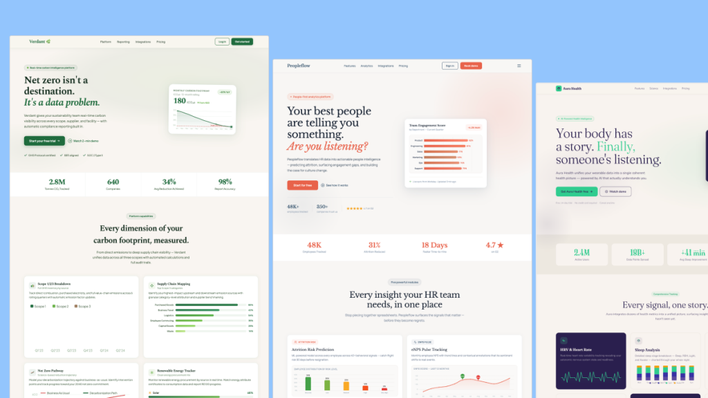
NEWConsistent UI, zero hallucinations
Call to Action components. CTA components are interactive elements designed to prompt users to perform specific tasks, and boosting conversions in your site.
 HOT
HOTConsistent UI, zero hallucinations
 HOT
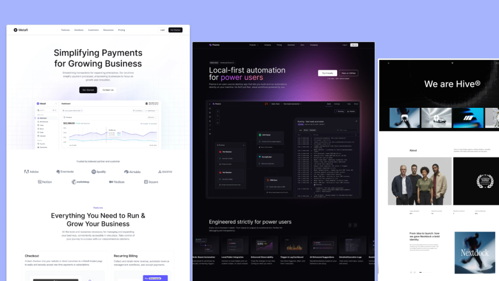
HOT12+ Shadcn Templates
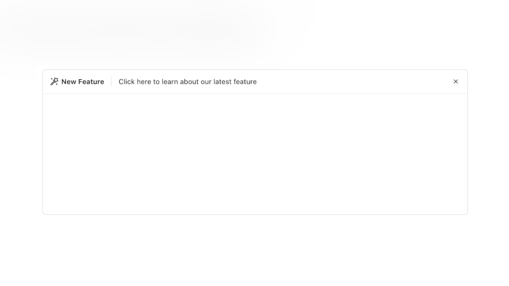
Alpine.js Tailwind banner component to add a sticky CTA on landing pages.
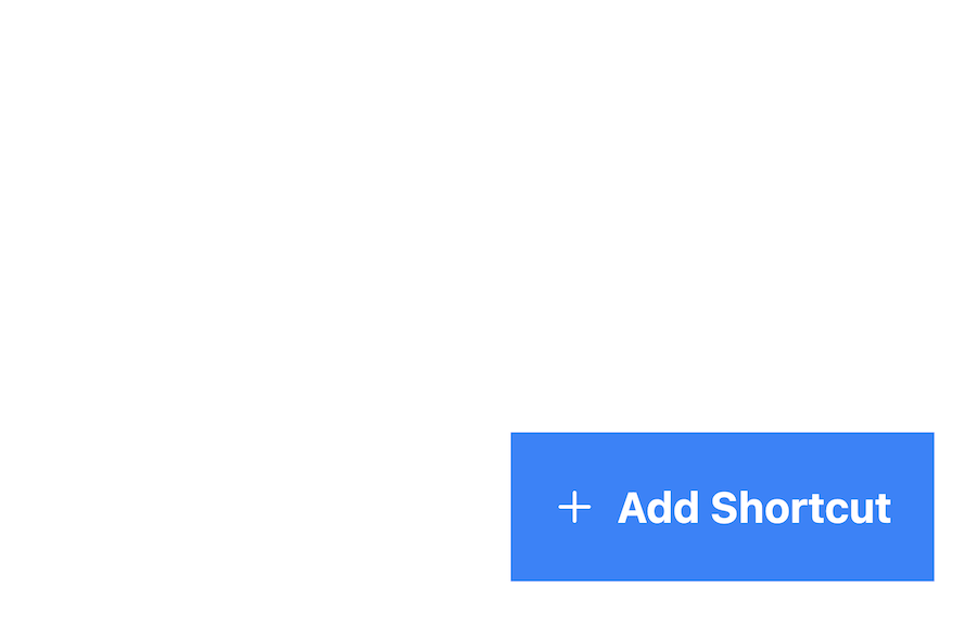
Sticky bottom button for Tailwind CSS
Production-ready Tailwind components for React, Next.js, Vue & HTML. Responsive, accessible UI blocks optimized for Tailwind v4 with MCP integration.
200+ ready-to-use Tailwind CSS components with MCP integration. Let AI generate complete pages from your prompts — one command, production-ready UI.
Explore Components
Have you ever visited a website and felt irresistibly drawn to click a button or sign up for a newsletter? That magnetic pull was likely due to an effective Call to Action (CTA) component doing its job. CTAs are the driving force behind user engagement, guiding visitors to take specific actions that benefit both them and your business.
At their core, Call to Action components are prompts on a website or app that encourage users to take a specific action. This could be anything from "Sign Up Now" to "Download Your Free Guide" or "Add to Cart." They are designed to grab attention and persuade visitors to move further down the conversion funnel.
CTAs can take various forms, including buttons, hyperlinks, banners, or even plain text. The key is that they're action-oriented and stand out from the rest of the content.
1. Guide User Behavior
CTAs serve as signposts, directing users toward the next step you want them to take. Without clear CTAs, visitors may feel lost or unsure about how to proceed, which can lead to higher bounce rates.
2. Increase Conversion Rates
An effective CTA can significantly improve your conversion rates. By compelling users to take a desired action, you're moving them closer to becoming customers or subscribers.
3. Enhance User Experience
By providing clear directions, CTAs enhance the overall user experience. They reduce friction and make it easier for visitors to navigate your site or app.
Understanding the different types of CTAs can help you choose the best ones for your goals.
1. Primary CTAs
These are the main actions you want users to take, such as "Buy Now" or "Sign Up Today." They are usually prominently displayed and designed to grab attention.
2. Secondary CTAs
Secondary CTAs offer alternative actions, like "Learn More" or "Watch Video." They cater to users who may not be ready to commit to the primary action but are still interested.
3. Social Sharing CTAs
Encourage users to share your content on social media with CTAs like "Share on Facebook" or "Tweet this Article."
4. Lead Generation CTAs
Used to collect user information, these CTAs might say "Download Free Ebook" or "Get a Free Quote."
5. Exit CTAs
These appear when a user is about to leave your site, offering a last-minute incentive like "Wait! Get 10% Off Before You Go!"
Creating an effective CTA isn't just about slapping a "Click Here" button on your page. It requires thoughtful consideration of language, design, and placement.
1. Use Action-Packed Verbs
Start your CTA with strong verbs that prompt immediate action. Words like "Download," "Join," "Start," or "Discover" are compelling and direct.
2. Create a Sense of Urgency or Scarcity
Phrases like "Limited Time Offer," "Only a Few Left," or "Offer Ends Tonight" can encourage users to act quickly rather than postpone.
3. Be Clear and Specific
Ambiguity is the enemy of conversion. Make sure your CTA clearly states what the user will get or what action they are taking, such as "Download Your Free Guide" instead of just "Submit."
4. Design Matters
Color Contrast: Use colors that stand out against your site's background. If your site is primarily blue, a bright orange CTA button will catch the eye.
Size and Shape: The CTA should be large enough to notice but not so big that it overwhelms the content. Rounded buttons often perform better than sharp-edged ones.
Whitespace: Give your CTA breathing room. Surrounding it with whitespace can make it more noticeable.
5. Strategic Placement
Position your CTAs where they're most likely to be seen, such as at the top of the page, after a compelling section of content, or near the end of a blog post.
6. Test, Test, Test
A/B testing different versions of your CTAs can provide valuable insights into what works best for your audience. Test variations in text, color, size, and placement.
Even seasoned marketers can slip up when it comes to CTAs. Here are some pitfalls to watch out for:
1. Too Many Choices
Offering multiple CTAs can overwhelm visitors and lead to decision paralysis. Focus on one primary CTA per page to guide users effectively.
2. Weak Copy
Generic phrases like "Click Here" don't inspire action. Make your CTAs compelling and relevant to the user's needs.
3. Ignoring Mobile Users
Ensure your CTAs are mobile-friendly. Buttons should be easily tappable on small screens, and text should be legible without zooming in.
4. Neglecting the Follow-Through
The landing page after the CTA click should match the promise of the CTA. A disconnect here can lead to user frustration and abandonment.
Personalized CTAs can perform significantly better than generic ones. By tailoring the CTA to the user's behavior, location, or preferences, you make the action more appealing.
Behavior-Based CTAs: If a user has viewed certain products, show a CTA like "Ready to Check Out?" or "Complete Your Purchase."
Location-Based CTAs: For users in specific regions, you might offer region-specific promotions, such as "Join Our New York Community Event."
Returning Visitors: Greet returning users with CTAs like "Welcome Back! See What's New."
CTAs aren't just for websites. They play a crucial role across various marketing channels.
1. Email Marketing
Emails should always have a clear CTA, whether it's "Read the Full Article," "Claim Your Offer," or "Update Your Preferences."
2. Social Media
On platforms like Instagram or Facebook, use CTAs in your captions, such as "Double-tap if you agree" or "Tag a friend who needs this."
3. Paid Advertising
CTAs in ads need to be concise and compelling due to space limitations. Phrases like "Shop Now" or "Learn More" are common.
Click-Through Rate (CTR): The percentage of users who clicked on the CTA out of those who saw it.
Conversion Rate: The percentage of users who completed the desired action after clicking the CTA.
Bounce Rate: High bounce rates after a CTA click may indicate a mismatch between the CTA and the landing page.
Use analytics tools to monitor these metrics and make data-driven decisions.
Call to Action components are pivotal in guiding user behavior and driving engagement. By understanding their importance and implementing best practices, you can create CTAs that not only catch the eye but also compel action. Remember, the key is to be clear, concise, and user-focused.
You can find answers for commonly asked questions about components.
While it's possible, having too many CTAs can overwhelm users. It's best to focus on one primary CTA per page to guide users effectively.
Strategic placement ensures your CTA is seen and increases the likelihood of user interaction. Placing it where users' attention naturally falls, like at the end of a blog post, can enhance effectiveness.
Use clear and action-oriented language, design it to stand out visually, and place it strategically on your page. Testing different versions can also help optimize performance.
A Call to Action component is an element on a website or app designed to prompt users to take a specific action, such as signing up for a newsletter, making a purchase, or downloading a resource.